搜索插件、代码仓与 APP 分类

插件详情v1.1.0

responsive_spacing

使用动态间距、边距、内边距、间距、正文大小和列数,让您的应用具有响应性和自适应性。

AndroidiOSWebmacOSWindowsLinux
近 30 天下载
80
喜欢数
27
Pub 分数
150

安装插件

flutter pub add responsive_spacing

插件介绍

基于插件公开信息、社区数据与项目使用情况整理的选型参考。

ResponsiveSpacing 是一个 Flutter/Dart 包,可让开发者通过根据屏幕尺寸动态调整间距、边距、内边距、列间距、正文大小和列布局,创建自适应和响应式用户界面。它简化了在 Android、iOS、Web、macOS、Windows 和 Linux 等多个平台上的响应式设计。通过使用内置的响应式单位和断点,确保无论设备尺寸如何,UI 外观都保持一致。非常适合需要灵活布局而无需编写重复媒体查询逻辑的应用。

适合场景

  • 构建跨平台响应式布局
  • 为不同屏幕尺寸调整用户界面
  • 创建流体网格系统
  • 自动调整填充和边距
  • 设计可扩展的移动和Web界面

主要特点

  • 基于屏幕尺寸的动态间距
  • 内置响应式断点
  • 支持边距、内边距和间距
  • 跨平台兼容性
  • 与现有 Flutter 小部件的轻松集成
  • 灵活的列和正文大小控制

适合对象

  • 开发响应式 Flutter 应用的开发者
  • 针对多个平台的团队
  • 专注于适应性的UI设计师
  • 需要可扩展布局系统的项目
  • 具有复杂响应式需求的应用程序

使用建议

  • 新用户可能需要一个初始的学习曲线
  • 在非常大的小部件树中性能影响
  • 依赖于准确的屏幕尺寸检测
  • 最好与一致的设计系统一起使用
  • 超出提供的响应式单位之外的自定义功能有限

原始 README

以下为关联源码仓库的 README 原文快照,最新内容请访问源码仓库。

This plugin helps to design and develop beautiful responsive and adaptive flutter apps.

Lightweight, Responsive Spacing

All design principles have roughly the same elements. For example, Material Design works with margin, gutter, body and has a responsive 12 column system. Our default values are set by the Material Design Guidelines, but you can also easily set your own breakpoints, margins, and spacing.

You can find spacings everywhere in your Project, don't use Magic Numbers, use the context-oriented spacing class instead.

We have developed this plugin so that you can easily make your app adaptive and responsive.

Simple Spacing

Access your own Spacing-System:

// Example values for a Pixel 7 Pro
context.spacing.xs; // default 2
context.spacing.s; // default 8
context.spacing.m; // default 12
context.spacing.l; // default 16
context.spacing.xl; // default 32
context.spacing.xxl; // default 56

// Example:

// Instead of 
SizedBox(height: 8);

// use
SizedBox(height: context.spacing.s); // Wow!

And whenever your design guru wants to modify the values, you only have to modify it in a single file.

Giga Spacing for all design chads that need more power

Design Gurus are around the world and you will maybe find one in your own company. If you have such a mysterious creature, use the Giga Spacing class for even more fine tuning.

context.gigaSpacing.xxxs; // default 2
context.gigaSpacing.xxs; // default 8
context.gigaSpacing.xs; // default 10
context.gigaSpacing.s; // default 12
context.gigaSpacing.m; // default 16
context.gigaSpacing.l; // default 24
context.gigaSpacing.xl; // default 30
context.gigaSpacing.xxl; // default 40
context.gigaSpacing.xxxl; // default 46
context.gigaSpacing.xxxxl; // default 64
Set Your Custom Spacings

In your main, set the global defaults:


void main() {
  ResponsiveSpacing.setDefaults(
      globalSpacing: MySimpleSpacing(),
  );

  runApp(const MyApp());
}

class MySimpleSpacing extends SpacingCollection {

  @override
  SimpleSpacing get any => const SimpleSpacing(
    xs: 2.0,
    s: 8.0,
    m: 12.0,
    l: 16.0,
    xl: 32.0,
    xxl: 56.0,
  );
}

In the previous Example, we used the any override, this will ignore the layout width. If you want to make the spacings responsive, override the values for xl, lg, md, sm2, sm1 & xs

class MySimpleSpacing extends SpacingCollection {
  @override
  SimpleSpacing get xs => const SimpleSpacing(
        xs: 2.0,
        s: 8.0,
        m: 12.0,
        l: 16.0,
        xl: 32.0,
        xxl: 56.0,
      );

  @override
  SimpleSpacing get sm1 => xs;

  @override
  SimpleSpacing get sm2 => xs;

  @override
  SimpleSpacing get md => const SimpleSpacing(
        xs: 2 * 2.0,
        s: 2 * 8.0,
        m: 2 * 12.0,
        l: 2 * 16.0,
        xl: 2 * 32.0,
        xxl: 2 * 56.0,
      );

  @override
  SimpleSpacing get lg => md;

  @override
  SimpleSpacing get xl => const SimpleSpacing(
        xs: 4 * 2.0,
        s: 4 * 8.0,
        m: 4 * 12.0,
        l: 4 * 16.0,
        xl: 4 * 32.0,
        xxl: 4 * 56.0,
      );
}

Usage

Instead of using a Scaffold, use the ResponsiveScaffold:

ResponsiveScaffold(
  appBar: AppBar(
    title: const Text("The Title"),
  ),
  body: YourWidget()
);

And in your Widget, access the Spacing class with Spacing.of(context) or context.spacingConfig which returns an object of ResponsiveData. The object has all necessary spacings.

context.spacingConfig.margin;
context.spacingConfig.padding;
context.spacingConfig.gutter;
context.spacingConfig.body;
context.spacingConfig.layoutColumns;

// You are now good to use these properties in your layout.

For example with a Card:

Card(
  // use margin
  margin: context.spacingConfig.margin.horizontalEdgeInsets,

  child: Padding(

    // use padding
    padding: context.spacingConfig.padding.allEdgeInsets,
    
    child: Column(
      children: [
        Text("This is a Title"),
        Text("This is the subtitle, usually you explain something")
      ],
    ),
  ),
)

Columns, Gutters & Margins

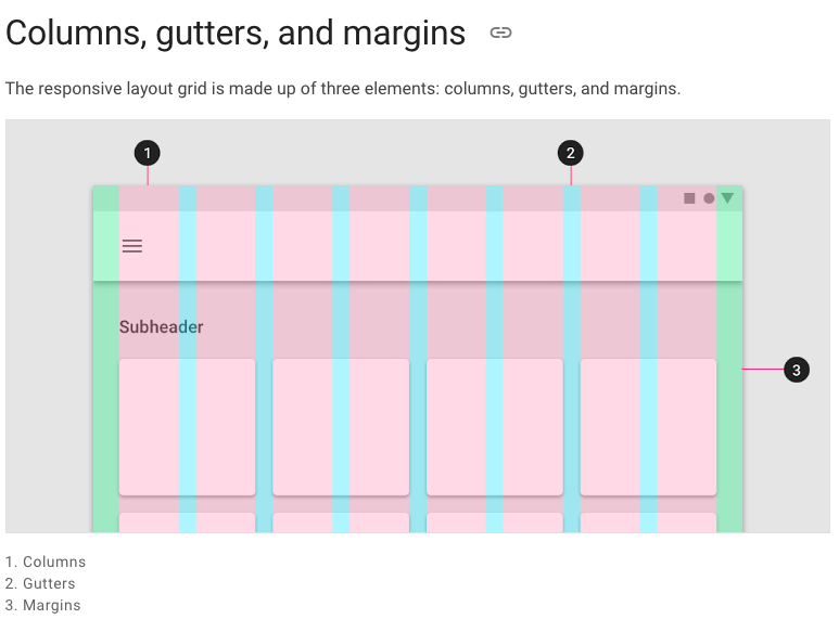
The responsive layout grid is made up of three elements: columns, gutters, and margins. Read everything about Columns, Gutters & Margins on the material guidelines responsive layout page.

columns, gutter, margin
Example: Access global padding setting in your widget:
Spacing.of(context).padding

// or

context.spacingConfig.padding

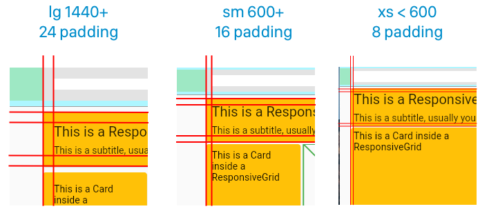
Receive padding for screen sizes:

  • lg = 24
  • md = 24
  • sm = 16
  • xs = 8
columns, gutter, margin

Default Sizes

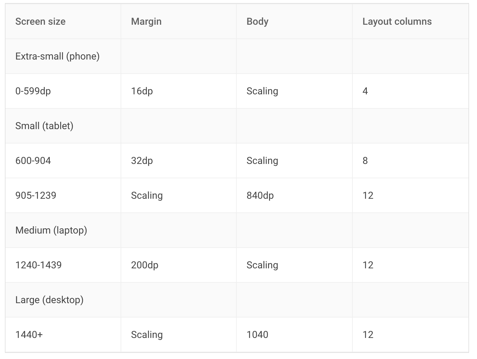
The Material Breakpoints are used for all default values.

default

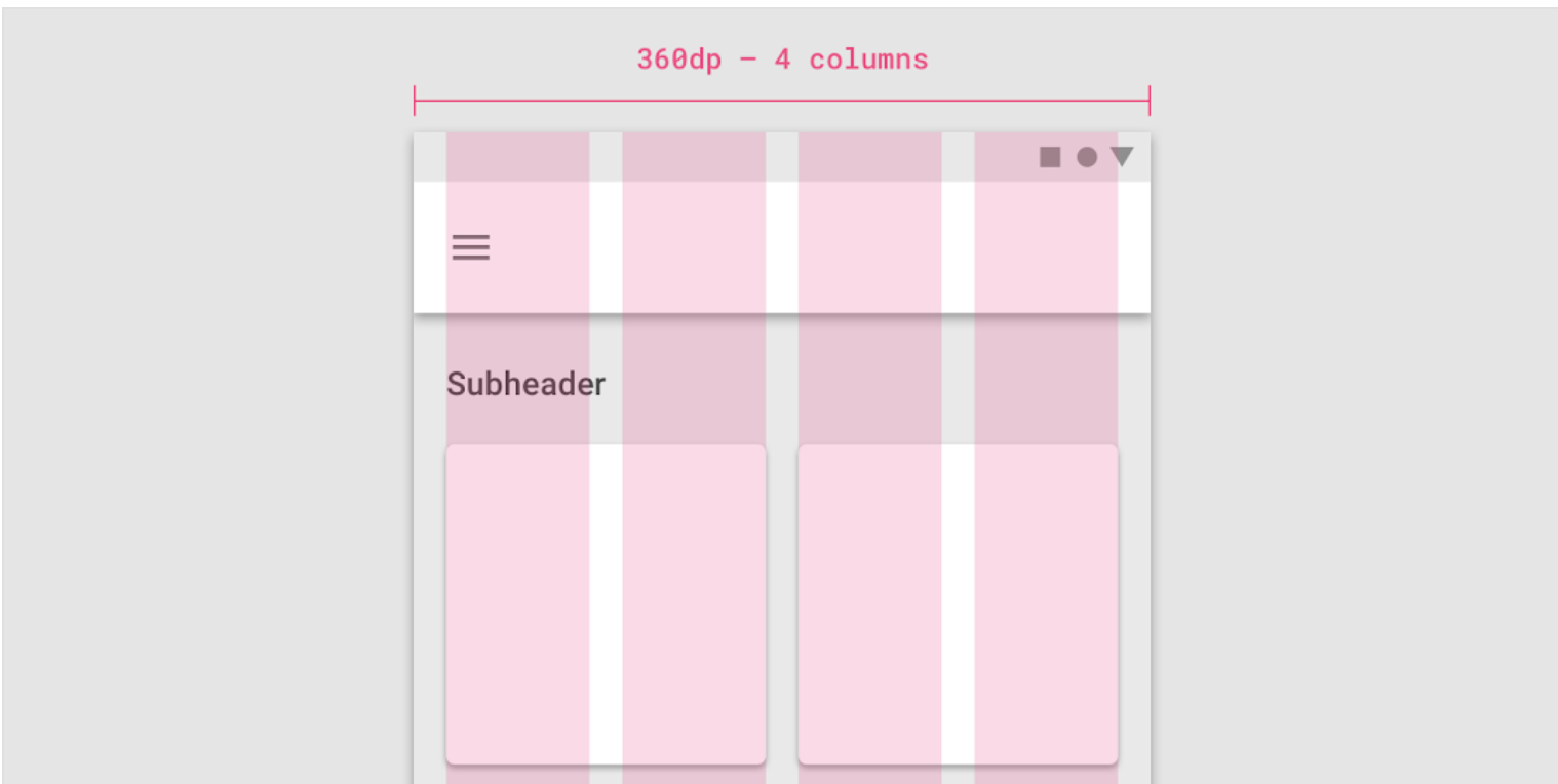
As an example, the 360 size display has 4 columns, a margin of 16, padding of 8 & gutters of 8.

default

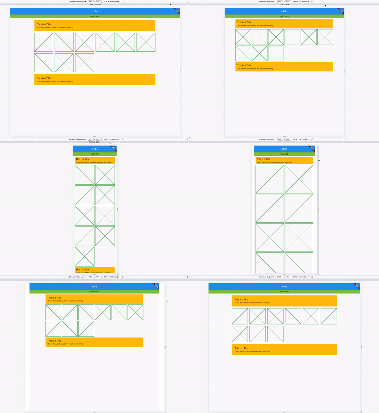
If you combine this now, you get a responsive layout. See it in action:

Responsive App

Custom Adaptive Breakpoints

You can also customize your own breakpoints. The default values are Material Design screen sizes:

  • xl: 1920, disabled
  • lg: 1440, enabled
  • md: 1240, enabled
  • sm2: 905, enabled
  • sm1: 600, enabled
  • xs: from 0 to sm1, always enabled

To customize, use the setDefaults method in your main:

void main() {
  ResponsiveSpacing.setDefaults(
    globalBreakpoints: Breakpoints(
      xl: const BreakpointEntry(2560, enabled: true),
      lg: const BreakpointEntry(1440),
      md: const BreakpointEntry(1240),
      sm2: const BreakpointEntry(905),
      sm1: const BreakpointEntry(600),
    ),
  );

  runApp(const MyApp());
}

Custom Padding, Gutter, Body & Margin

Just like the custom breakpoints, you can also set your own spacing, spaces, and margins. Create your own gutter class by extending ResponsiveCollection:

class MyResponsiveGutters extends ResponsiveCollection {
  @override
  ScaledSize xl(double width) => const ScaledSize(size: 16);

  @override
  ScaledSize lg(double width) => const ScaledSize(size: 16);

  @override
  ScaledSize md(double width) => const ScaledSize(size: 8);

  @override
  ScaledSize sm2(double width) => const ScaledSize(size: 4);

  @override
  ScaledSize sm1(double width) => const ScaledSize(size: 4);

  @override
  ScaledSize xs(double width) => const ScaledSize(size: 2);

  @override
  ScaledSize fallback(double width) => const ScaledSize(size: 2);
}

And overwrite the default global gutters in your main:

void main() {
  // optional setting defaults
  ResponsiveSpacing.setDefaults(
    globalGutter: MyResponsiveGutters(),
    globalPadding: MyResponsivePadding()
  );

  runApp(const MyApp());
}

Data Class

Everything you need is stored in the ResponsiveData class which is accessible via the context.

class ResponsiveData {
  final ScaledSize margin;
  final ScaledSize padding;
  final ScaledSize gutter;
  final ScaledSize body;
  final LayoutColumns layoutColumns;
  // ...
}

Available Responsive Widgets

There are two types of widgets, the data widgets that create the spacing context and widgets that use the spacing context.

Data Widgets

Data widgets create the spacing context and provide responsive values to all widgets created in the tree below. if there are multiple data widgets in the tree, the closest one is taken.

  • ResponsiveScaffold

Widgets

  • ResponsiveCard
  • ResponsiveGrid

所属分类

源码仓库

使用此插件的项目

暂无相关数据。