A flutter package for simplifying responsive layout changes.
Flutter's goal is to allow us to build software for any screen. Mobile
development typically depends on separate templates for varying screen sizes.
The web has to deal with even more screen size scenarios using CSS breakpoints.
Flutter Responsive provides you with tools to create responsive layouts
for any number of screen sizes and with whatever size names you prefer.
Add responsive_toolkit to your list of dependencies in pubspec.yaml
dependencies:responsive_toolkit:^0.0.5
Responsive layouts
ResponsiveLayout Widget
To start building different layouts depending on the screen size, use the
ResponsiveLayout widget. This allows you to specify separate Widgets to
render for each of the provided screen sizes (breakpoints). All responsive
utilities use the Breakpoints class to specify the mapping from breakpoint
sizes to other values and Widgets.
The default breakpoints used for xs through xxl are as follows:
xs: < 576
sm: >= 576
md: >= 768
lg: >= 992
xl: >= 1200
xxl: >= 1400
Not all breakpoints need to be specified. The smallest size xsmust be provided, as
it is always the fallback Widget when the screen width does not match another breakpoint.
When a screen width falls in the range of a size that was not provided, the next smallest
size and Widget are used. In other words, the breakpoints match >= to the widths specified
above, up to the width of the next provided breakpoint. In the following example, a screen size
of 900px would use the Widget provided for the xs screen size:
In some scenarios there may be a one-off width at which you need to adjust your layout without
adding a new breakpoint to the existing 6. You can accomplish this using the custom argument.
This argument is a mapping of int screen widths (using a >= calculation) to Widget for display.
Because all of the Widgets provided as arguments are constructed before ResponsiveLayout but only
one is displayed, you may want to use WidgetBuilders for performance reasons. In this case,
use the named constructor ResponsiveLayout.builder. The builder is not called until a breakpoint
has been chosen so only one Widget will ever be constructed when the layout updates.
In many scenarios you won't need a full different layout for the responsive design you are
trying to accomplish. For instance: you may want to change only a Text Widget's fontSize on
different screen widths. This could create a lot of repeated code:
Now, only the values that change depending on screen width are calculated with no repeated code.
If you'd like to make a choice between multiple values based on screen size without
ResponsiveLayout.value you can also use the choose method on the Breakpoints class. In
this case you can control what width is used for the choice more explicitly.
Up until this point we've mostly talked about screen sizes in terms of width (this is most common).
However, you may want to control layout in the vertical axis as well. ResponsiveLayout,
ResponsiveLayout.builder and ResponsiveLayout.value all support an axis argument. This
defaults to Axis.horizontal (breakpoints on screen width), but you can also use
Axis.vertical to have your breakpoints operate on screen height. Usually you'll have different
expectations for what sizes breakpoints use in the vertical axis. Because cases like this are more
rare, you may be able to just use the custom argument. If you need to use different breakpoints for
the vertical axis more frequently, consider creating your own as shown in
creating your own breakpoints.
It may make sense for some layouts to be dependent on their allotted max width or height. In this
case you can use ResponsiveConstraintLayout that has an API much like ResponsiveLayout
(there is no .value() utility method).
However, the ResponsiveConstraintLayout chooses which Widget to display using the breakpoints
based on the constraints (max width or height) passed to it from parent Widgets. This can be quite
useful in scenarios where you may not know where a Widget will be placed and therefore can't know
what sizes it may be expected to display correctly in. If your Widget starts looking bad when
displayed less than 300px wide – you can control that explicitly.
Sometimes 6 isn't enough. Sometimes you want to rename the sizes and change their widths.
In this case you'll need to create your own class.
The Breakpoints class is actually an extension of another class that allows for any
number of breakpoints. You can extend this base class to create your own names and sizes
(you can even change the name of the custom argument or eliminate it entirely to enforce a design system).
For instance if you wanted names based on screen sizes identifying device type you can copy
Breakpoints code and tweak accordingly:
When extending BaseBreakpoints, the first breakpoint size must be 0. This is enforced by the call to super() but make sure to have a 0 in the breakpoints list argument. The base class also enforces that the smallest breakpoint's Widget/value must not be null. Make sure to prevent any errors by using required for the smallest breakpoint argument in your extending class.
Responsive grid
Web developers will be familiar with the concept of a 12 column grid system (Or Android devs may be more familiar with GridLayout). This is a popular format for providing consistency in design that translates well to code. The columns can span any number of the 12 slots of the grid, offset to create space, and reorder independently of widget code order – all controllable with breakpoints to provide the best layout for the current screen. The toolkit provides a full-fledged responsive grid system including everything previously stated as well as auto-width and fill-width (filling remaining row space) columns with wrapping capabilities.
ResponsiveRow Widget
A grid consists of a series of rows and columns. The ResponsiveRow Widget wraps a group of ResponsiveColumn objects that collectively represent a full grid. As with web-based grid systems like Bootstrap grid, a ResponsiveRow is not visually limited to a single run of items on the screen (like a Flutter Row Widget would be). This is important as you control how much space each column takes up as well as its offset, which allows for precise control of when Widgets wrap to prevent bad visuals and overflow errors.
A simple responsive row with a single column that takes up half the screen would be created like this:
NOTE: A "column" refers more precisely to a grid cell (this is a common responsive grid convention). Despite it being a column, to lay out a vertical series of children within it, use a Flutter Column as its child.
A row lays out its columns in a left to right, top to bottom fashion. If the width of a column is too wide to fit on the same line as the previous columns, it will wrap to a new line. The following arguments to ResponsiveRow help to fully control how the columns are laid out. Many of these will be familiar as their concepts apply to Flutter Widgets like Wrap, Flex, Row and Column.
maxColumns: The number of columns the grid system should support (defaults to 12).
spacing: The space between columns in the horizontal direction (default 0).
runSpacing: The space between runs when columns wrap to a new line within the ResponsiveRow (default 0).
alignment: How the remaining space in a run is distributed (default is ResponsiveAlignment.start).
crossAxisAlignment: How the columns within a run are aligned to one another vertically (default is ResponsiveCrossAlignment.start).
runAlignment: How the runs are aligned vertically within the ResponsiveRow when the total run height is less than the height of the row (default is ResponsiveAlignment.start).
clipBehavior: How to clip columns that overflow the row (default is Clip.none).
breakOnConstraints: When using columns with breakpoints, whether to use the parent constraints to determine breakpoints instead of screen width (default is false).
NOTE: A "run" refers to each new line of children within the ResponsiveRow. "Row" is used to refer to the Widget as a whole.
Why use responsive grid
You may be thinking "why can't I use a Row or Wrap for this?" The answer is ResponsiveRow and ResponsiveColumn together support all of those features plus more. There's a reason many web developers and designers continue to use responsive grids!
Supports
Row
Wrap
ResponsiveRow
Auto width columns
:white_check_mark:
:white_check_mark:
:white_check_mark:
Fixed width columns
:white_check_mark:
:white_check_mark:
:white_check_mark:
Fill width columns
:white_check_mark:
:x:
:white_check_mark:
Match child heights CrossAxisAlignment.stretch
:white_check_mark:
:x:
:white_check_mark:
Wrapping
:x:
:white_check_mark:
:white_check_mark:
12 column paradigm
:x:
:x:
:white_check_mark:
Breakpoints
:x:
:x:
:white_check_mark:
ResponsiveColumn
ResponsiveColumn is actually a definition of a column rather than a Widget. It cannot be rendered independently of ResponsiveRow. Understanding columns, how they're sized and when they wrap is fundamental to taking full advantage of responsive grids.
Column types
There are 3 types of columns which match expectations set by other frameworks and also provide ultimate layout flexibility.
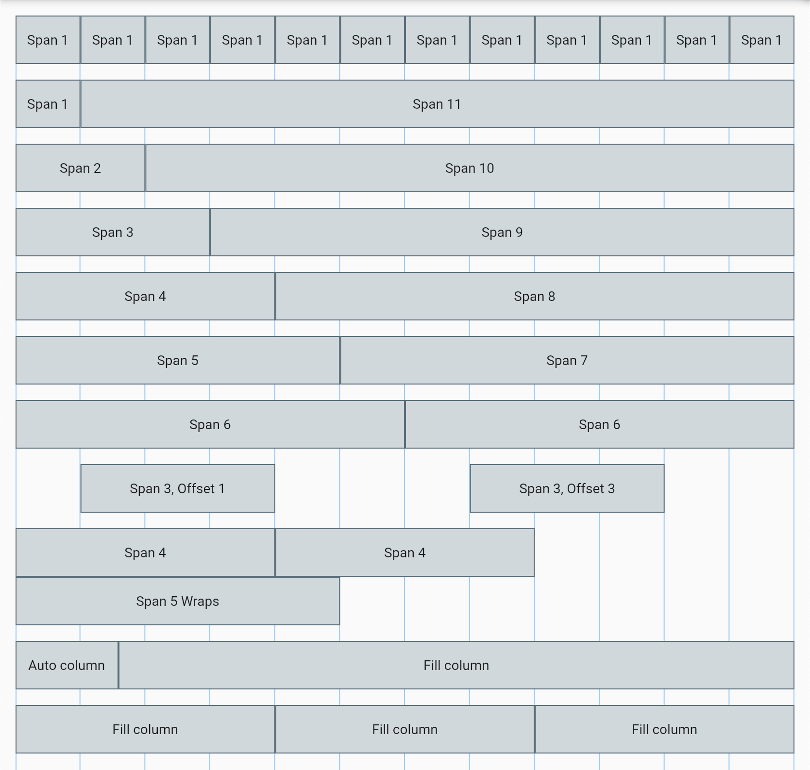
Span
A column that spans a portion of a 12 column grid. A span of 6 would mean it consumes half the width of the row. Similar to Android's android:layout_columnSpan
ResponsiveColumn.span(span: 6, child: ...)
Auto
A column that sizes itself to its child.
ResponsiveColumn.auto(child: ...)
Fill
A column that fills the remaining space in the run. If multiple fill columns are present the remaining space is divided equally among them (similar to them having a flex factor of 1). Fill columns cannot be made smaller than the minIntrinsicWidth of their child. For instance, if dividing the remaining space between 3 fill columns causes one to drop below its child's minIntrinsicWidth, it will remain at its minimum size and the other fill columns will continue to distribute their widths evenly. The result would be that one or more fill columns are different sizes than the others (this is expected flex behavior on web). Only once all fill columns in a run would be sized below their minIntrisicWidth will the last column in the row wrap to a new run.
ResponsiveColumn.fill(child: ...)
Each type of column also supports the ability to offset, order, and control its alignment within the row's cross axis (crossAxisAlignment).
The span argument determines how many columns the child will span. It must be >0 and <=maxColumns of the containing ResponsiveRow. Span only affects layout when the type is ResponsiveColumnType.span.
The offset argument will push the column to the right by the number of columns specified. It must be >0 and <maxColumns of the containing ResponsiveRow.
The order argument allows the column to move to a different position within the ResponsiveRow. The order is relative to the order argument of the sibling columns. By default each column has an order of 0.
The crossAxisAlignment argument allows the column to control its position in the vertical direction independently of the value of crossAxisAlignment on the parent ResponsiveRow. For instance, the row defaults to ResponsiveCrossAlignment.start but an individual column can align itself to the bottom with ResponsiveCrossAlignment.end.
Visual column layout reference
Using Breakpoints with responsive grid
Out of the box, ResponsiveRow provides a lot of flexibility to create layouts. But the most important aspect of responsive design is responding to changes in the screen width. This is where responsive grids really shine. All the above arguments (and column type) can be controlled individually at every breakpoint.
The following example shows how you'd show 4 equal-width Widgets next to one another on large screens, 2 on medium, and stacked on smaller screens.
The other column arguments can all be controlled using a responsive value in the same way. However, if you need to control the column type, or to control multiple arguments together, you'll want to use the generic ResponsiveColumn constructor and ResponsiveColumnConfig object. This saves you from creating separate ResponsiveLayout.value with their own Breakpoints object for each column property.
ResponsiveRow takes a Breakpoints object of ResponsiveColumnConfig and a child. The following example shows how multiple properties of the column can be adjusted at once depending on the screen size.
The ResponsiveColumnConfig are composable, meaning that properties not defined in one are composed up from the smallest breakpoint to the one currently being shown. In the above example, when the screen is size md, the offset is still from the config given for the xs breakpoint (because no offset was specified for md). If a property isn't provided in any of the breakpoints, it will be a column with the defaults of offset/order 0 and typeResponsiveColumnType.auto.
Changing the number of columns in the grid system
A 12-column grid is a standard because it supports many common scenarios for layouts. It can create layouts with up to 12 individual columns, but also easily creates equal-width column layouts of 1,2,3,4, and 6 columns. A relatively-common scenario that often appears is laying out 5 equal-width columns. In this case you'd have to change the 12-column layout to a multiple of 5. This is easy to accomplish with the maxColumns property on ResponsiveRow.
This example generates 5 equal-width columns using a span of 2 in a 10-column grid system.
Text sizing is a common variable which is adjusted across screen sizes. Text sizes are often adjusted on a per-breakpoint basis and stay consistent throughout each breakpoint. However, a more modern approach often uses the concept of fluid text size. This can make designing for screens more consistent in how text behaves and wraps. Fluid typography uses a minimum and maximum font size which is linearly scaled between a min and max screen width.
FluidText Widget
The FluidText widget takes 4 required paramaters to define its behavior. It also accepts all parameters from the existing Text widget.
FluidText(
  'This text scales from 16 to 36 font size between 375-1024 pixel screen width.',
  minFontSize: 16,
  maxFontSize: 36,
  minWidth: 375,
  maxWidth: 1024,
),
FluidText also supports RichText behavior using the rich() named constructor.