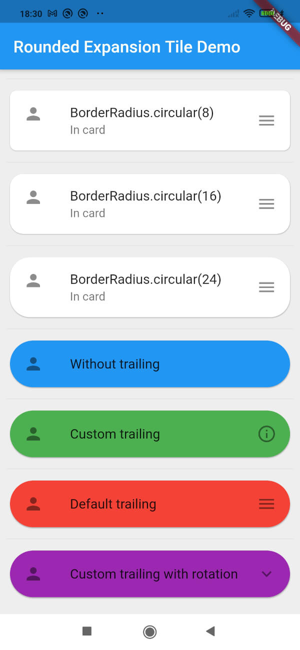
一个 Flutter 包,提供可自定义圆角的增强版 ExpansionTile,为可折叠内容区域提供现代且视觉上吸引人的设计。专为简洁性和集成性而构建,在所有平台上扩展了标准 ExpansionTile 的圆角功能。非常适合在移动和 Web 应用中创建干净、用户友好的界面。该包轻量级,并保持与 Flutter 核心组件的兼容性。
适合场景
在表单中创建样式化的可折叠部分
在仪表板中设计响应式折叠面板
通过圆角交互元素提升UI一致性
构建可访问的导航面板
在电子商务应用中实现可扩展的产品详情
主要特点
可自定义边框圆角
跨平台支持(Android、iOS、Web、macOS、Windows、Linux)
与现有 Flutter 项目的简单集成
扩展标准 ExpansionTile
轻量级且依赖项最少
适合对象
寻求精美用户界面组件的开发者
专注于视觉一致性的UI设计师
需要一致的圆角卡片式扩展的项目
面向多平台的应用程序
Flutter 初学者探索 widget 自定义
使用建议
仅限边框圆角样式
不包括标准 ExpansionTile 之外的其他动画
如需,需要手动处理内容填充
除了默认设置外,没有内置的图标或标题自定义功能
最适合简单的扩展用例,无需复杂的布局
原始 README
以下为关联源码仓库的 README 原文快照,最新内容请访问源码仓库。
Rounded Expansiontile
A simple combination of widgets to provide an Expansiontile with rounded corners.
This widget uses default Flutter widgets only and is available for each platform.
Getting Started
This Widget returns a column with a ListTile and a ListView. It has all properties of the ListTile width a few custom inputfield.
Simply load the widget in your pubspec yaml and start using it.
Inputfields
Default ListTile and ExpansionTile inputfields
autofocus
contentPadding
dense
enabled
enableFeedback
focusColor
focusNode
horizontalTitleGap
hoverColor
isThreeLine
key
leading
minLeadingWidth
minVerticalPadding
mouseCursor
onLongPress
selected
selectedTileColor
shape
subtitle
title
tileColor
trailing
visualDensity
onTap
initiallyExpanded
Extra inputfields and tips
shapeShape()
The shape will be used for the shape of the ListTile, not for the children. This is visible when pressed and will be shown in the ink splash.
Use the RoundedExpansionTile in a Card-widget with the same shape for the best result.
This will be used to show the expansion animation. It is used for the Expansion it self and the rotation / animation of the Icon. By default the duration is 500 milliseconds.
childrenList<Widget>[]
The children that will be displayd when the ListTile is expanded.
childrenPaddingEdgeInsets()
The padding around the children. This is not the same as the contentpadding.
curveCurve()
The curve used for the children animation. By default it uses Curves.fastLinearToSlowEaseIn
trailingWidget()
When provided this will override the default hamburger menu icon (AnimatedIcon). This icon will rotate by default but can be set to false see rotateTrailing.
rotateTrailingbool
Rotate the custom trailing icon when provided. By default this is true. When set to false the icon stays the same. Provide the trailing with an arrow down to make the widget look like the default ExpansionTile.
noTrailing bool
When set to true there will be no trailing at all. Even when provided custom trailing this bool will prevent it from being shown.