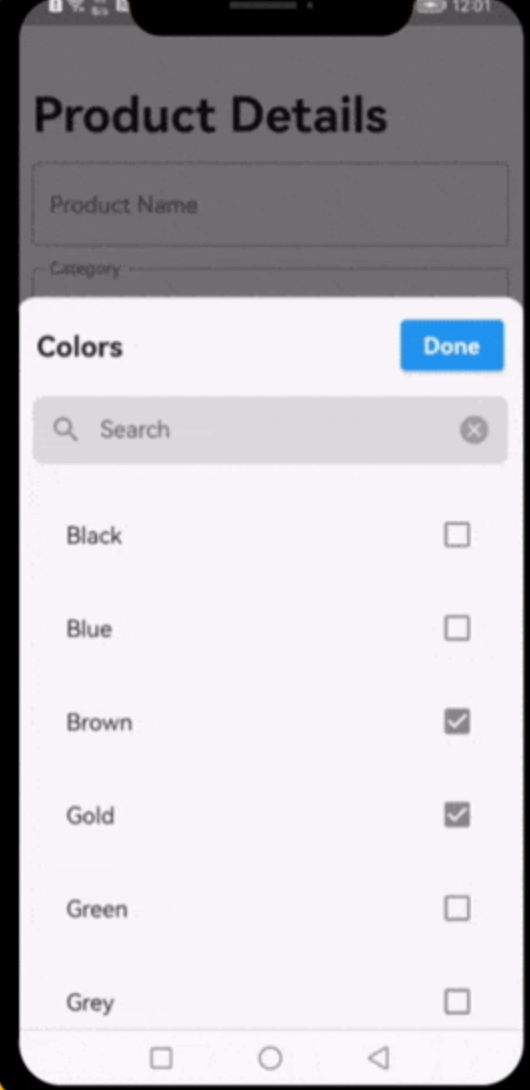
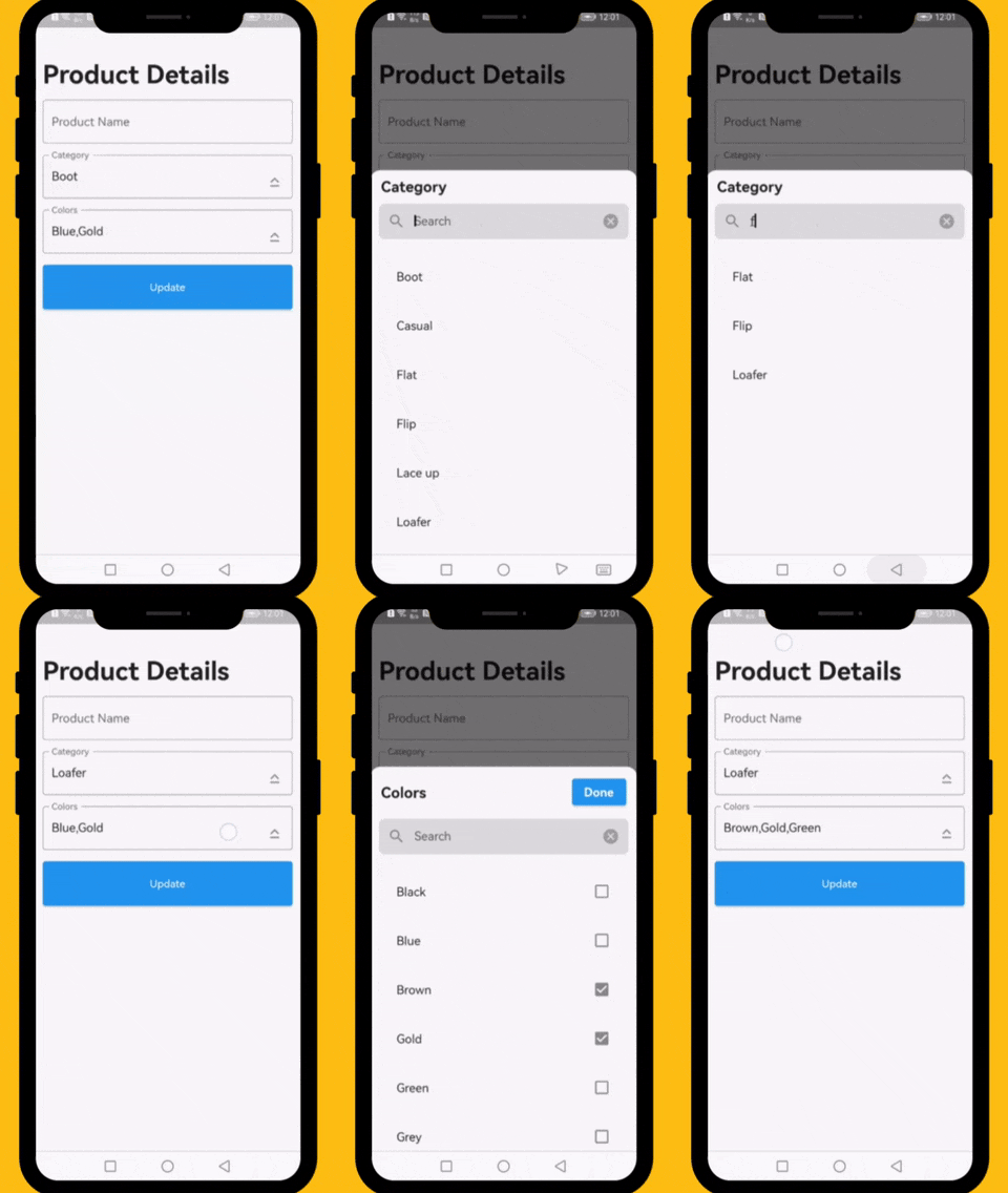
This property takes List as a parameter and it is useful to display items in drop down list.
Optional parameters
listBuilder:
This property takes int value as a parameter. This is use to set the initial segment from [segmentNames].
enableMultipleSelection:
This property takes Color value as a parameter. You can change the background color of animated segment.
bottomSheetTitle:
This gives the bottom sheet title.
submitButtonChild:
You can set your custom submit button when the multiple selection is enabled.
selectedItems:
This will give the call back to the selected items from list.
dropDownBackgroundColor:
This will set the background color to the Dropdown Searchable.
searchWidget:
This property takes TextFormField value as a parameter. [searchWidget] is use to show the text box for the searching. If you are passing your own widget then you must have to add [TextEditingController] for the [TextFormField].
isSearchVisible:
This property takes bool value as a parameter. [isSearchVisible] is use to manage the search widget visibility. by default it is [True] so widget will be visible.
I would be happy if you send us feedback on your projects where you use our component. Just email amir.email@gmail.com and let me know if you have any questions or suggestions about my work.