accordion
An expandable Flutter widget list where each item can be expanded or collapsed simply by clicking on the header.
Simple to use accordion widget with lots of preset properties. Use the maxOpenSections property to automatically close sections when opening a new section. This is especially helpful if you always want your list to look clean -- just set this parameter to 1 and whenever you open a new section the previous one closes. scrollIntoView paramter can be set to fast, slow, or none and makes sure that just opened items will be fully visible. This parameter will only take affect if there are enough items in the list so scrolling is feasible.
Many parameters can be set globally on Accordion as well as individually on each AccordionSection (see list below).
The header consists of the left and right icons (right icon is preset to arrow down). Both can be set globally and individually.
As of version 2.1: the headerText, headerTextStyle & headerTextAlign parameters have been removed and should be replaced with the header widget parameter.
The content area basically provides the container in which you drop whatever you want to display when AccordionSection opens. Background and borders can be set globally or individually per section.
Side note: it is possible to nest an Accordion within an AccordionSection
- see the example app (in the "Accordion within Accordion" section) for further info
Common mistakes
Please avoid wrapping the entire Accordion widget in your state management system since this might cause the opening animation to play each time your state changes.
Instead, only wrap the content of an AccordionSection with your state management that actually requires updating. Better yet, extract the entire content part of an
AccordionSection into its own widget and handle your state management needs there locally.
Enjoy!
The included example
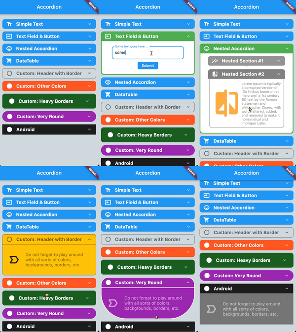
Common Properties
The following properties can be set globally for all sections in Accordion or for each section individually in AccordionSection:
| Property |
Description |
Type |
Required |
Default value |
| headerBackgroundColor |
background color of the section header |
Color |
no |
primaryColor (of theme) |
| headerBackgroundColorOpened |
background color of the section when header is open |
Color |
no |
headerBackgroundColor |
| headerBorderColor |
border color of header when section is closed |
Color |
no |
primaryColor (of theme) |
| headerBorderColorOpened |
border color of header when section is open |
Color |
no |
primaryColor (of theme) |
| headerBorderWidth |
width of header border. Set to 0 if no header border is desired. |
bool |
no |
0 |
| headerPadding |
padding of the title in the section header |
EdgeInsets |
no |
EdgeInsets.symmetric(horizontal: 20, vertical: 10) |
| leftIcon |
widget to the left of the title in the section header |
Widget |
no |
null |
| rightIcon |
widget to the right of the title in the section header |
Widget |
no |
Icon(Icons.keyboard_arrow_down, color: Colors.white60, size: 20) |
| contentBackgroundColor |
background color of the content part of the section |
Color |
no |
Colors.white |
| contentBorderColor |
border color of the content part of the section |
Color |
no |
Colors.white |
| contentBorderWidth |
border width of the content part of the section |
double |
no |
0 |
| contentBorderRadius |
border radius of the content part of the section |
double |
no |
20 |
| contentHorizontalPadding |
horizontal padding within the content part of the section |
double |
no |
10 |
| contentVerticalPadding |
vertical padding within the content part of the section |
double |
no |
10 |
| paddingBetweenClosedSections |
padding below closed sections |
double |
no |
3 |
| paddingBetweenOpenSections |
padding below an open section to visually make it stand out more |
double |
no |
10 |
| scrollIntoViewOfItems |
if a section should automatically be scrolled to the center of the list when opened |
ScrollIntoViewOfItems |
no |
ScrollIntoViewOfItems.fast |
| initialOpeningSequenceDelay |
the delay in milliseconds (when the entire accordion loads) before the individual sections open one after another. Helpful if you go to a new page in your app and then (after the delay) have a nice opening sequence. |
int |
no |
0 |
| sectionOpeningHapticFeedback |
if to play a haptic feedback when opening a section |
SectionHapticFeedback |
no |
SectionHapticFeedback.none |
| sectionClosingHapticFeedback |
if to play a haptic feedback when closing a section |
SectionHapticFeedback |
no |
SectionHapticFeedback.none |
Properties for Accordion
| Property |
Description |
Type |
Required |
Default value |
| maxOpenSections |
maximum number of open sections at any given time. Opening a new section will close the "oldest" open section |
int |
no |
1 |
| children |
the list of AccordionSection |
List |
YES |
[] |
| flipLeftIconIfOpen |
if the left icon in the header should be flipped when section is open |
bool |
no |
false |
| flipRightIconIfOpen |
if the right icon in the header should be flipped when section is open |
bool |
no |
true |
| paddingListTop |
padding of the Accordion list at the top |
double |
no |
20.0 |
| paddingListBottom |
padding of the Accordion list at the bottom |
double |
no |
40.0 |
| paddingListHorizontal |
horizontal padding of the Accordion list |
double |
no |
10.0 |
| disableScrolling |
disables internal scrolling of the Accordion widget. Useful when the Accordion is used within a ListView or something else already scrollable |
bool |
no |
false |
| openAndCloseAnimation |
controls if sections should animate when opened or closed |
bool |
no |
true |
| scaleWhenAnimating |
controls if sections use a scale effectwhen opened or closed |
bool |
no |
true |
Properties for AccordionSection
| Property |
Description |
Type |
Required |
Default value |
| isOpen |
if this section should initially be displayed open or not |
bool |
no |
false |
| header |
the header widget located between leftIcon & rightIcon |
Widget |
no |
|
| content |
the widget you want to display as the visible content when the section is open |
Widget |
YES |
|
| paddingListBottom |
padding of the Accordion list at the bottom |
double |
no |
40.0 |
| paddingListHorizontal |
horizontal padding of the Accordion list |
double |
no |
10.0 |
| onOpenSection |
callback function when this section opens |
Function |
no |
|
| onCloseSection |
callback function when this section closes |
Function |
no |
|

