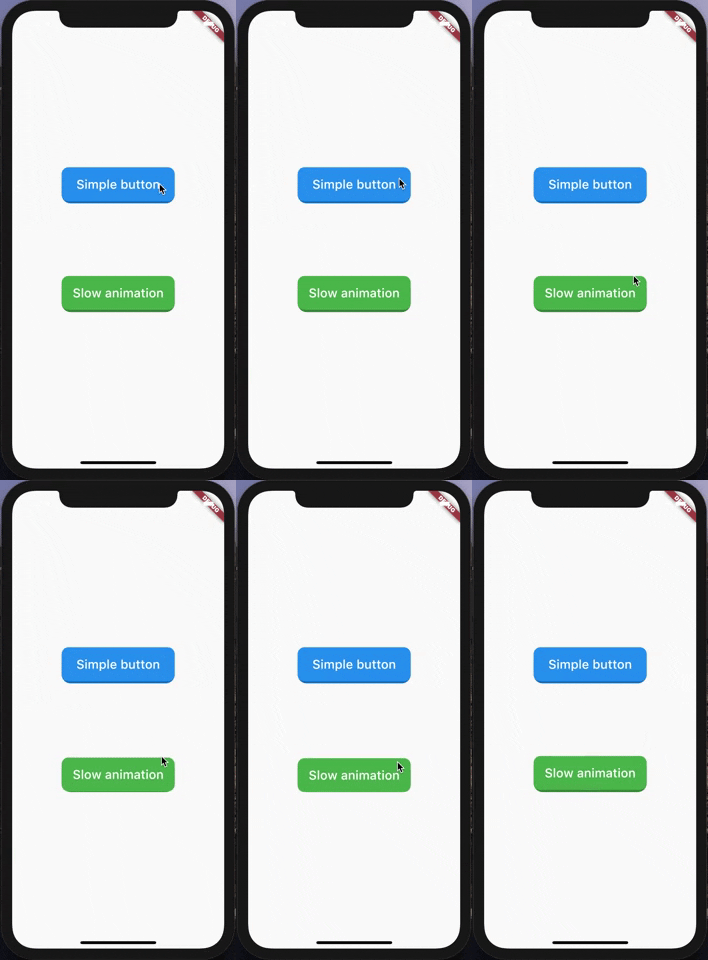
Animated Button
A very simple and customizable animated button.
Providing simple animation, and many customizable attributes such height, width, child, ... etc.
Getting Started
Nothing difficult here, yet!

Simple Example
import 'package:animated_button/animated_button.dart';
import 'package:flutter/material.dart';

void main() => runApp(MyApp());

class MyApp extends StatelessWidget {
  @override
  Widget build(BuildContext context) {
    return MaterialApp(
      title: 'Animated Button Demo',
      theme: ThemeData(
        primarySwatch: Colors.blue,
      ),
      home: Demo(),
    );
  }
}

class Demo extends StatelessWidget {
  @override
  Widget build(BuildContext context) {
    return Scaffold(
      body: Center(
        child:             AnimatedButton(
          onPressed: () {},
          color: Colors.blue,
          enabled: true,
          disabledColor: Colors.grey,
          shadowDegree: ShadowDegree.light,
          borderRadius: 8,
          duration: 85,
          height: 40,
          width: 140,
          child: Text(
            'Animated button',
            style: TextStyle(
              fontSize: 14,
              color: Colors.white,
              fontWeight: FontWeight.w500,
            ),
          ),
        ),
      ),
    );
  }
}
Button attributes
AnimatedButton(
child: ...,
onPressed: () {},
duration: 70,
height: 100,
width: 200,
enabled: true,
shadowDegree: ShadowDegree.dark,
color: Colors.blue,
disabledColor: Colors.grey,
borderRadius: 8,
)
For more examples, check example folder
License
MIT License.