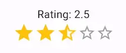
Animated Rating Stars for Flutter


AnimatedRatingStars is a highly customizable animated rating bar widget for Flutter. It allows users to interactively provide ratings by tapping on stars. The package offers a wide range of customization options and is designed to be easy to integrate into your Flutter applications.
Demo
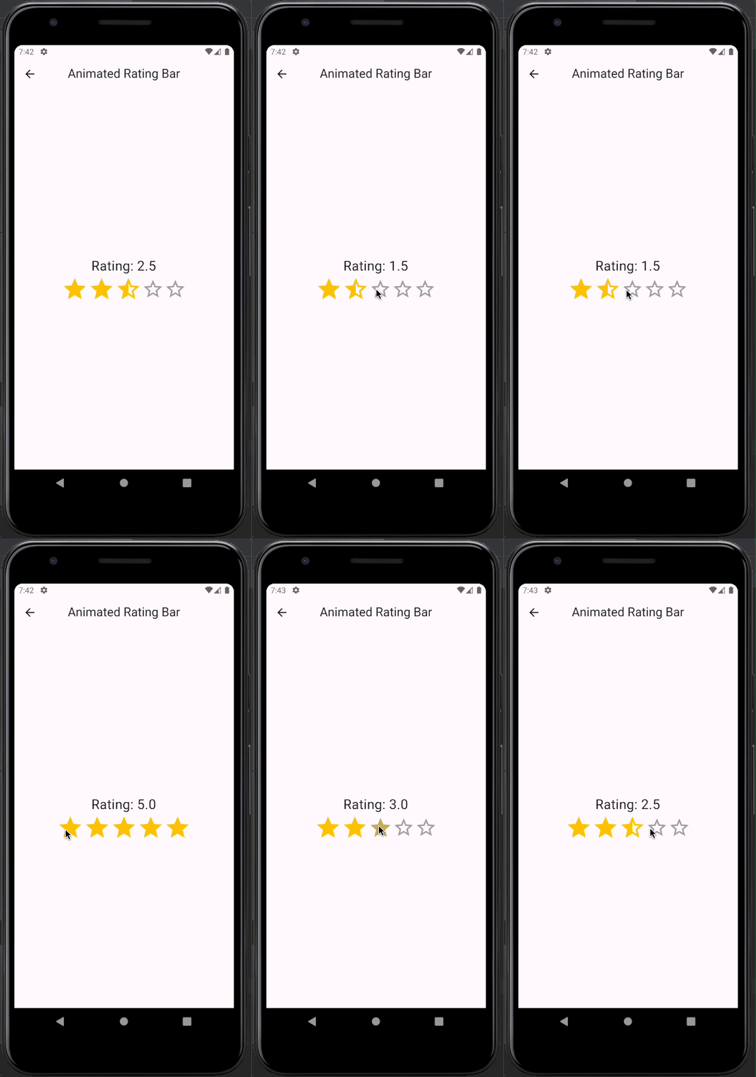
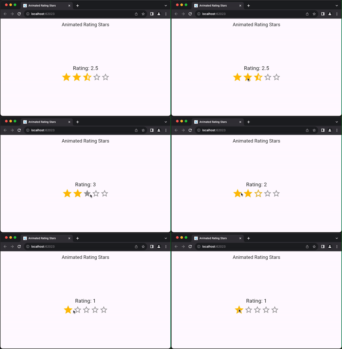
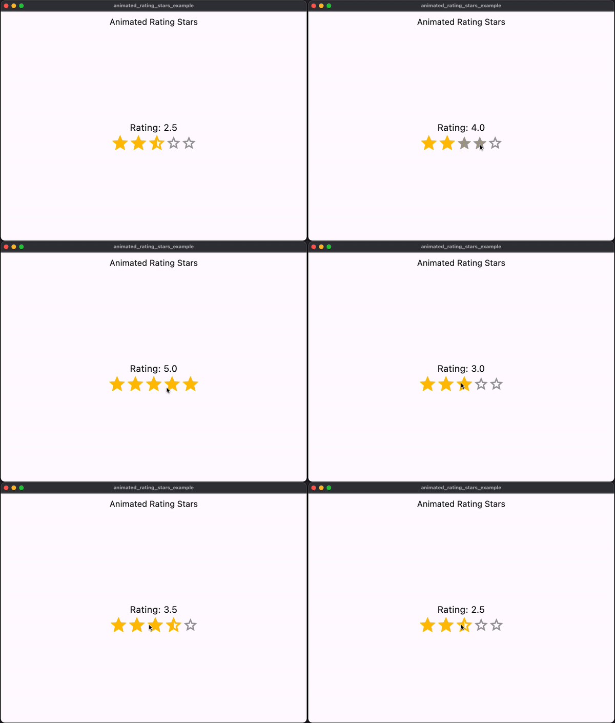
Features
- Create animated rating bars with filled, half-filled, and empty stars.
- Customize star colors, icons, sizes, and animation parameters.
- Display the rating value and enable interactive tooltips for half-filled stars.
- Supports both read-only and interactive modes.
Installation
To use this package, add animated_rating_stars as a dependency in your pubspec.yaml file:
dependencies:
  animated_rating_stars: ^1.0.1
Then, run flutter pub get to fetch the package.
Usage
Import the package in your Dart code:
import 'package:animated_rating_stars/animated_rating_stars.dart';
Now, you can use the AnimatedRatingStars widget in your Flutter app:
AnimatedRatingStars(
initialRating: 3.5,
minRating: 0.0,
maxRating: 5.0,
filledColor: Colors.amber,
emptyColor: Colors.grey,
filledIcon: Icons.star,
halfFilledIcon: Icons.star_half,
emptyIcon: Icons.star_border,
onChanged: (double rating) {
print('Rating: $rating');
},
displayRatingValue: true,
interactiveTooltips: true,
customFilledIcon: Icons.star,
customHalfFilledIcon: Icons.star_half,
customEmptyIcon: Icons.star_border,
starSize: 30.0,
animationDuration: Duration(milliseconds: 300),
animationCurve: Curves.easeInOut,
readOnly: false,
)
Customize the properties according to your requirements. The onChanged callback is called when the rating changes.
For more examples and usage details, refer to the examples directory included with this package.
Customization
You can customize the appearance and behavior of the rating bar using the following properties:
initialRating: The initial rating value.minRating: The minimum rating value.maxRating: The maximum rating value.filledColor: The color for filled stars.emptyColor: The color for empty stars.filledIcon: The icon used for filled stars.halfFilledIcon: The icon used for half-filled stars.emptyIcon: The icon used for empty stars.displayRatingValue: Show or hide the rating value.interactiveTooltips: Enable interactive tooltips for half-filled stars.customFilledIcon: Use a custom icon for filled stars.customHalfFilledIcon: Use a custom icon for half-filled stars.customEmptyIcon: Use a custom icon for empty stars.starSize: Set the size of each star.animationDuration: Adjust the duration of the animation when the rating changes.animationCurve: Define the animation curve for the rating change.readOnly: Make the widget read-only.
Customization
Contributions and feedback are welcome! If you encounter any issues or have feature requests, please open an issue on GitHub.
License
This package is distributed under the MIT License. See LICENSE for details.
For more Flutter packages and development resources, visit pub.dev.