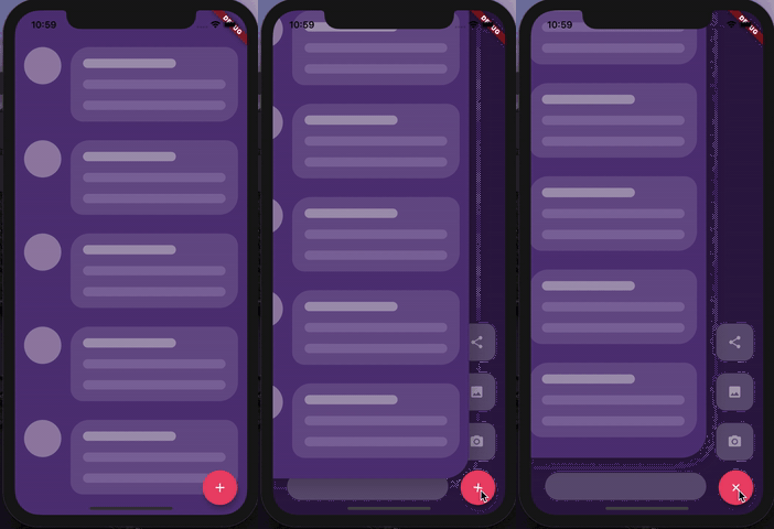
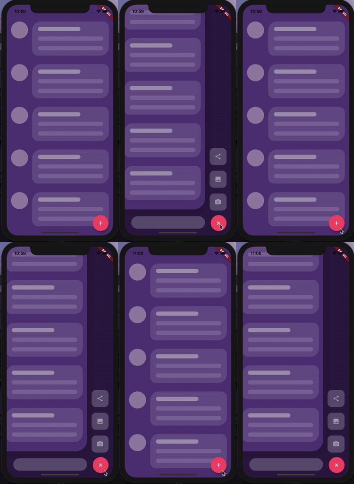
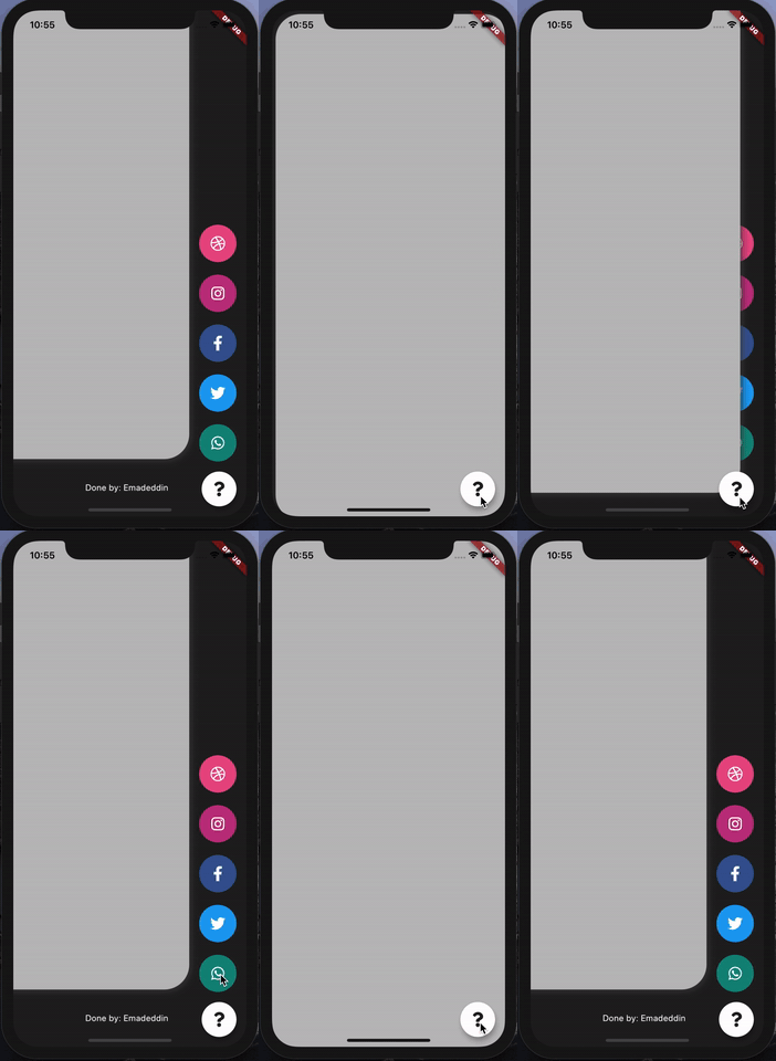
AnimatedStack 是一个 Flutter 包,可实现自定义动画堆叠页面,非常适合设计带有平滑过渡效果的交互式侧边菜单按钮。它为构建动态导航界面提供了灵活的基础,允许开发者叠加小部件并动画化其可见性和位置。该包支持 Android、iOS、Web、macOS、Windows 和 Linux 等多个平台,适用于跨平台应用。通过直观的配置选项,它通过流畅的动画和响应式设计提升了用户体验。其轻量级特性确保了在各种设备上的高效性能。
适合场景
自定义侧边菜单实现
交互式导航界面
动画页面过渡
浮动操作按钮增强功能
跨平台 UI 组件
主要特点
流畅的动画堆叠
可自定义的页面过渡
多平台支持
轻量且高效
与现有 UI 的轻松集成
灵活的控件层叠
适合对象
开发自定义导航抽屉的开发者
寻求动画交互的UI设计师
跨平台应用程序创建者
需要动态布局更改的应用程序
专注于打造精致用户体验的团队
使用建议
可能需要额外的样式才能实现复杂布局
性能取决于动画的复杂程度
除了基本用法外,文档有限
未针对极大型堆栈进行优化
最适合中等动画强度
原始 README
以下为关联源码仓库的 README 原文快照,最新内容请访问源码仓库。
Animated Stack
Custom animated stacked pages, to create customisable side menu buttons.
Providing simple menu for sharing buttons, side menu, message sending, about page, ... etc.
Getting Started
At first, you have to create Foreground and Background Widgets.
Here is a simple example to meet minimum requirements.
AnimatedStack(
backgroundColor: ...,     // Background Container color
foregroundWidget: ...,    // Foreground Container color

columnWidget: ...,        // Right Widget, (use Column for best results)
bottomWidget: ...,        // Bottom Widget, (use Row for best results)

scaleHeight: 100,         // Sliding animation height, default is 60
scaleWidth: 100,          // Sliding animation width, default is 60


buttonIcon: ...,          // FAB icon (IconData)
fabIconColor: ...,        // FAB icon color
animateButton: false,     // Sometimes, we don't want to animate the button!
fabBackgroundColor: ...,  // FAB background color

slideAnimationDuration: ..., // Animation Duration, default is 800 Milliseconds
buttonAnimationDuration: ...,// Animation Duration, default is 240 Milliseconds

openAnimationCurve: ...,    // Animation Curve, default is ElasticOutCurve(0.9)
closeAnimationCurve: ...,   // Animation Curve, default is ElasticInCurve(0.9)
enableClickToDismiss: true, // Enable Click on Main Widget to close
preventForegroundInteractions: true, // Prevent Clicks on Main Widget
onForegroundCallback: () => print('on Close Callback'), // On Close Callback
);