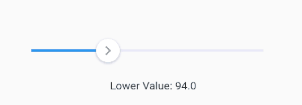
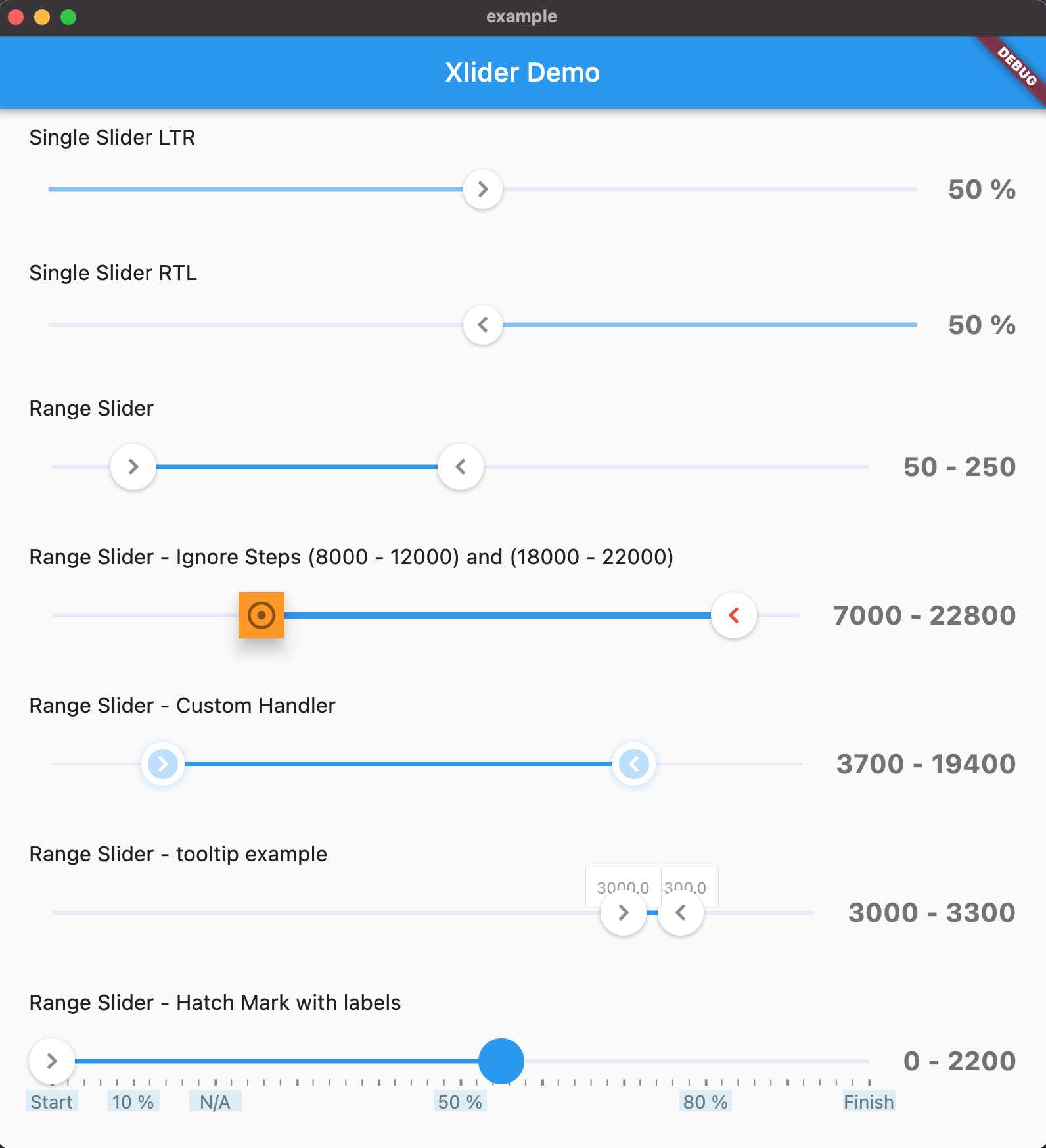
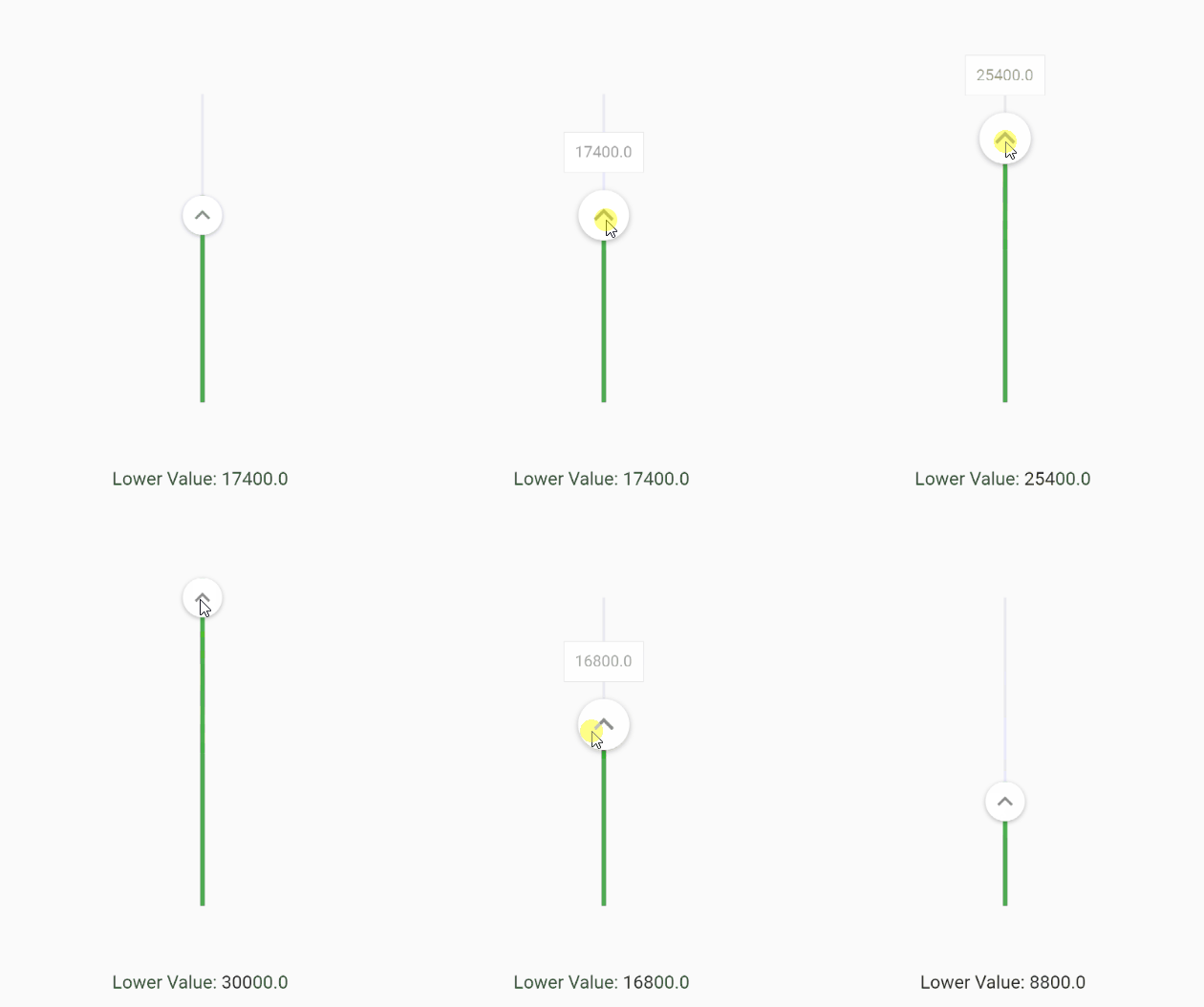
Another Xlider 是一个可自定义的 Material Design 滑块和范围滑块,适用于 Flutter,支持水平和垂直方向,并完全兼容从右到左(RTL)布局。它提供了丰富的样式、行为和交互选项,非常适合需要精确用户输入控制的应用程序。该包跨平台,可在 Android、iOS、Web、macOS、Windows 和 Linux 上无缝运行。通过直观的 API 和丰富的自定义功能,它在各种应用环境中提升了 UI 一致性与用户体验。
适合场景
带有值选择的表单输入
交互式设置滑块
可自定义范围选择器
RTL语言界面支持
跨平台 UI 组件
主要特点
水平和垂直滑块支持
RTL 布局兼容性
丰富的自定义选项
Material Design 兼容性
支持范围选择
跨平台可用性
适合对象
开发国际化应用的开发者
需要灵活滑块 UI 的设计师
需要精确输入控制的应用程序
具有复杂表单交互的 Flutter 项目
面向多个平台的团队
使用建议
可能需要为非 Material 主题添加额外的样式
大量实例带来的性能影响
除了基本用法外,文档有限
自定义可能会增加构建复杂性
未针对极高频率的更新进行优化
原始 README
以下为关联源码仓库的 README 原文快照,最新内容请访问源码仓库。
another_xlider
(Flutter Slider) A material design slider and range slider, horizontal and vertical, with rtl support and lots of options and customizations for flutter
IMPORTANT: Breaking Changes!
Flutter Version 2.x - Take any version up to 1.1.1
You can change the axis of your slider by setting axis to Axis.vertical. Default is horizontal
FlutterSlider(
  ...
  axis: Axis.vertical,
  ...
)
Handlers
You can customize handlers using handler and rightHandler properties.
Both handler and rightHandler accept FlutterSliderHandler class which has following properties:
child: is a widget
disabled: to disable the handler
decoration, foregroundDecoration and transform are come from Container() widget
You can control the scale animation type of your handlers, it's duration and it's scale size using handlerAnimation handlerAnimation accepts a FlutterSliderHandlerAnimation class which has 4 properties as following
If you want to have a non-linear slider with different steps, simply use rangeStep feature.
FlutterSlider(
  min: 0,
  max: 1000000,
  ...
  step: FlutterSliderStep(
    step: 1, // default
    isPercentRange: true, // ranges are percents, 0% to 20% and so on... . default is true
    rangeList: [
      FlutterSliderRangeStep(from: 0, to: 20, step: 10000),
      FlutterSliderRangeStep(from: 20, to: 100, step: 200000),
    ]
  ),
  ...
)
Ignore Steps
If your configurations requires that some steps are not available, you can use ignoreSteps property.
this property accepts a simple class to define from and to ranges.
FlutterSlider(
  ...
    ignoreSteps: [
      FlutterSliderIgnoreSteps(from: 8000, to: 12000),
      FlutterSliderIgnoreSteps(from: 18000, to: 22000),
    ],
  ...
)
Fixed Values
If you want to have an array of fixed items and slide through it, you can use fixedValues property. use FlutterSliderFixedValue to add your fixed values. FlutterSliderFixedValue has following properties:
percent: (int) ( between 0..100 inclusive). the position of fixed item
value: (dynamic) the value of fixed item
when using fixedValues, values of values property, must be within 0..100
using above example, you get (string) 10K as upperValue or lowerValue (depends on handler), when you reach to 10 percent of the slider,
you get (int) 50000 when you reach 50 percent of the slider and so on...
when using fixedValues, min and max are ignored
Minimum Distance
When using range slider, the minimum distance between two handlers can be defined using minimumDistance option
FlutterSlider(
  ...
    minimumDistance: 300,
  ...
)
Maximum Distance
This is the opposite of minimum distance, when using range slider, the maximum distance between two handlers can be defined using maximumDistance option
FlutterSlider(
  ...
    maximumDistance: 300,
  ...
)
Locked Handlers
If you want to lock your handlers by a certain value, you can use lockHandlers and lockDistance properties
You can display a Hatch Mark underneath or beside of your slider based on axis. In order to display hatch mark you must
use FlutterSliderHatchMark class which has following properties:
linesDistanceFromTrackBar: The distance of lines from slider. can be negative
bigLine: The widget of big lines in hatch mark
smallLine: The widget of small lines in hatch mark
linesAlignment: the direct of lines, right or left which works as top or bottom on horizontal slider
density: The number of lines per percent. 1 is default. any number less or more than 1 will decrease and increase lines respectively
smallDensity: The number of small lines between any two big lines. 4 is default. any number less or more than 4 will decrease and increase lines respectively.
displayLines: to display lines. by default is false for the sake of optimization
labels: If you want to display some label or text at certain percent in your hatch mark, you can use labels
labelBox: The widget of label box, however, you can define a widget for each label and have it's own style
labelsDistanceFromTrackBar: The distance of labels from slider. can be negative
disabled: to disabled the whole hatchmark ( hide )