搜索插件、代码仓与 APP 分类

插件详情v1.0.2

bottom_personalized_dot_bar

底部个性化点状栏,拖放您的所有项目,以最佳方式自定义底部导航。

近 30 天下载
51
喜欢数
98
Pub 分数
30

安装插件

flutter pub add bottom_personalized_dot_bar

插件介绍

基于插件公开信息、社区数据与项目使用情况整理的选型参考。

一个可自定义的底部导航栏,适用于 Flutter,允许用户通过拖放项目来自定义布局。它提供动态、交互式的体验,让用户完全控制导航图标外观和行为。适用于需要灵活导航模式的应用程序,该包通过直观的自定义功能提升用户参与度。该导航栏支持平滑过渡和响应式设计,非常适合现代移动应用程序。

适合场景

  • 可自定义的应用导航
  • 用户驱动的界面布局
  • 交互式底部栏
  • 移动应用个性化
  • 动态UI重新排列

主要特点

  • 拖放项目重新排序
  • 完全可自定义的点状指示器
  • 响应式设计支持
  • 与 Flutter 的轻松集成
  • 支持自定义样式

适合对象

  • 寻求交互式导航的开发者
  • 以用户为中心的设计的应用程序
  • 可定制的移动界面
  • 需要动态底部栏的Flutter项目
  • 注重设计的应用程序开发

使用建议

  • 有限的平台特定文档
  • 除了基本转换外,没有内置动画
  • 需要手动处理状态管理
  • 未针对大量项目进行优化
  • 可能需要为复杂主题添加额外的样式

原始 README

以下为关联源码仓库的 README 原文快照,最新内容请访问源码仓库。

Bottom Personalized Dot Bar

A bottom navigation bar that you can customize with the options you need, without any limits. You can also customize the appearance of the navigation bar.

The development was inspired by the following design: personalized-tab-bar

You can see the source code of this lib inside the /lib folder.

Show some ❤️ and star the repo to support this project

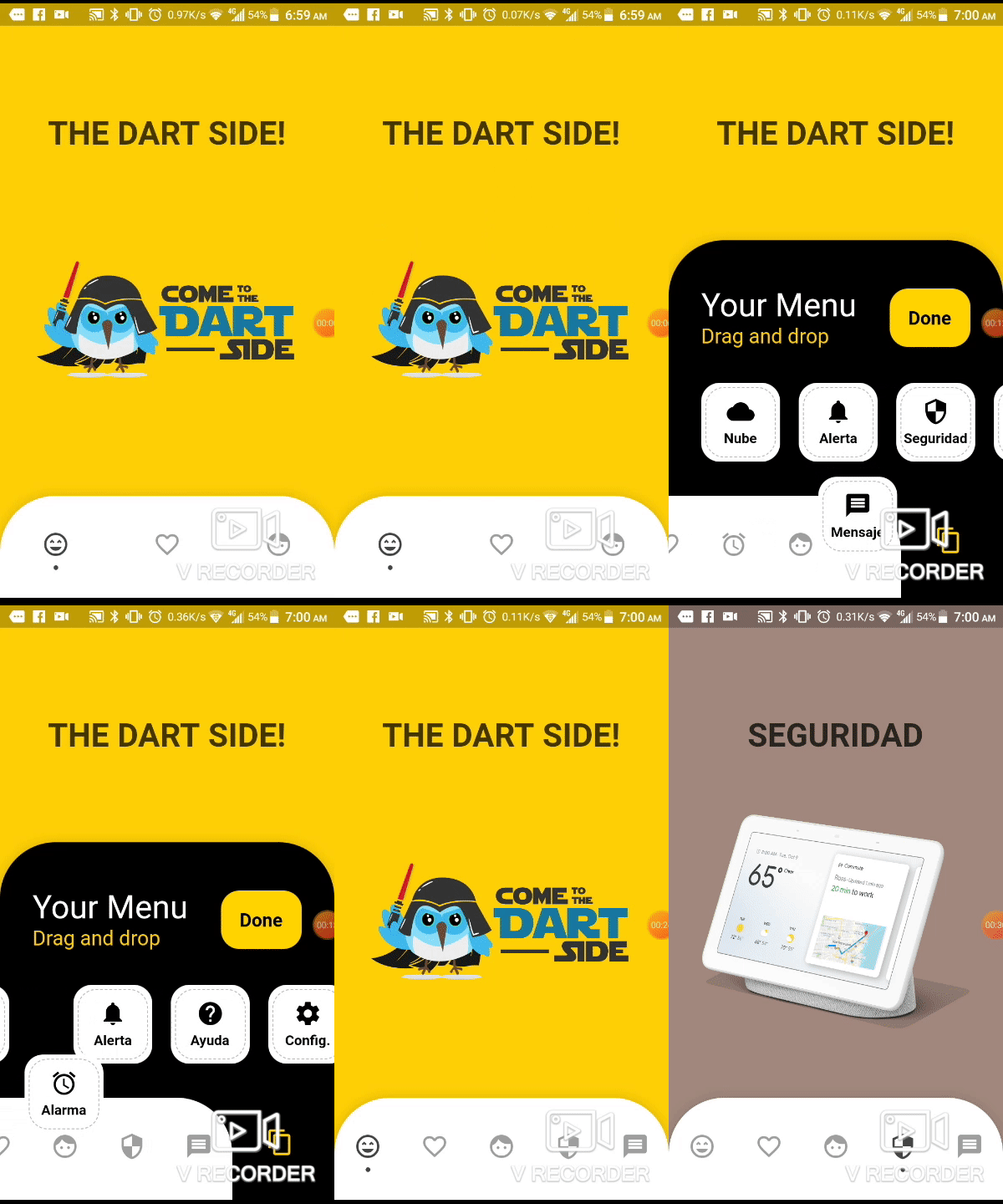
Demo example (Mobile)

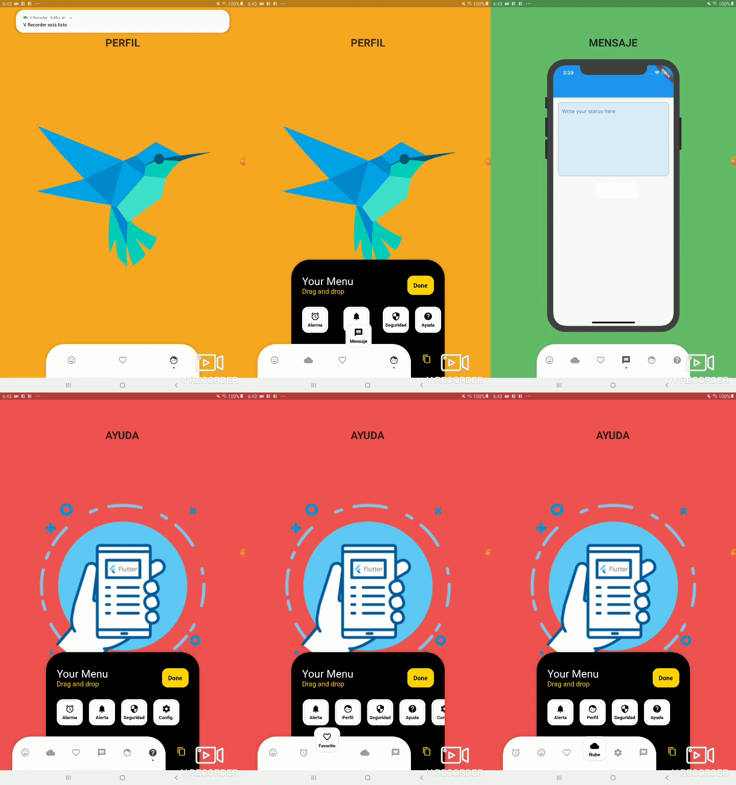
Demo example (Tablet 1)

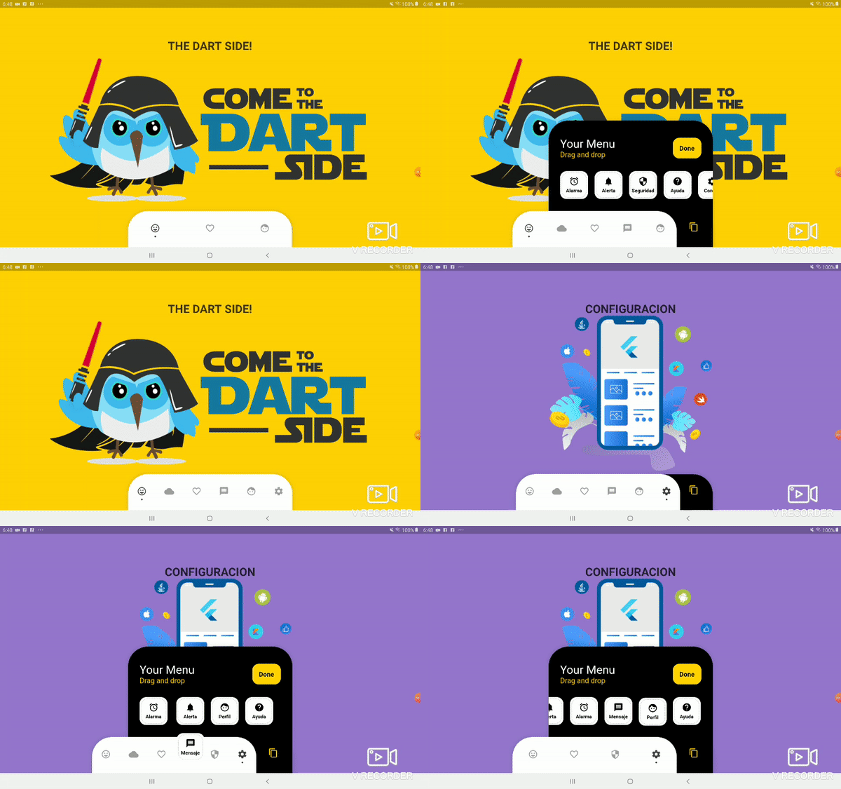
Demo example (Tablet 2)

Package overview

  • [x] Drag and Drop your options!
  • [x] Change icon colors
  • [x] Listen to events 'Sort, Insert and Delete'
  • [x] Dynamically change the selected option
  • [x] Custom options
  • [x] Unlimit options
  • [x] Option to define custom item background color
  • [x] And more ...

Getting Started

Add the plugin:
dependencies:
  ...
  bottom_personalized_dot_bar: ^1.0.2
Import the package
import 'package:bottom_personalized_dot_bar/bottom_personalized_dot_bar.dart';
How to use?

Important! dont use 'bottomNavigationBar' of Scaffold, because it occupies the entire screen, you need to add it inside a Stack.

To add the Options list, you must create BottomPersonalizedDotBarItem, and each must have the unique attribute 'keyItem'.

To modify the selected option, you must update the attribute keyItemSelected of the BottomPersonalizedDotBar

String _itemSelected = 'item-1';
...
..
.
Scaffold(
  body: Stack(
    children: <Widget>[
      .... // Your App Home
      BottomPersonalizedDotBar(
          keyItemSelected: _itemSelected,
          doneText: 'Done',
          settingTitleText: 'Your Menu',
          settingSubTitleText: 'Drag and drop options',
          iconSettingColor: const Color(0xFFFFD201),
          buttonDoneColor: const Color(0xFFFFD500),
          settingSubTitleColor: const Color(0xFFFECE02),
          hiddenItems: <BottomPersonalizedDotBarItem>[
              BottomPersonalizedDotBarItem('item-4', icon: Icons.cloud, name: 'Nube', onTap: (itemSelected) { /* event selected */ }),
              BottomPersonalizedDotBarItem('item-5', icon: Icons.access_alarm, name: 'Alarma', onTap: (itemSelected) { /* event selected */ }),
              BottomPersonalizedDotBarItem('item-6', icon: Icons.message, name: 'Mensaje', onTap: (itemSelected) { /* event selected */ }),
              BottomPersonalizedDotBarItem('item-7', icon: Icons.notifications, name: 'Alerta', onTap: (itemSelected) { /* event selected */ }),
              BottomPersonalizedDotBarItem('item-8', icon: Icons.security, name: 'Seguridad', onTap: (itemSelected) { /* event selected */ }),
              BottomPersonalizedDotBarItem('item-9', icon: Icons.help, name: 'Ayuda', onTap: (itemSelected) { /* event selected */ }),
              BottomPersonalizedDotBarItem('item-10', icon: Icons.settings, name: 'Config.', onTap: (itemSelected) { /* event selected */ }),
          ],
          items: <BottomPersonalizedDotBarItem>[
              BottomPersonalizedDotBarItem('item-1', icon: Icons.sentiment_very_satisfied, name: 'Flutter', onTap: (itemSelected) { /* event selected */ }),
              BottomPersonalizedDotBarItem('item-2', icon: Icons.favorite_border, name: 'Favorito', onTap: (itemSelected) { /* event selected */ }),
              BottomPersonalizedDotBarItem('item-3', icon: Icons.face, name: 'Perfil', onTap: (itemSelected) { /* event selected */ }),
          ],
      ),
    ],
  ),
);

Customization

BottomPersonalizedDotBar
Attribute Description
items List of items to be displayed in the navigation bar
hiddenItems List of items that will be hidden
keyItemSelected Item key that is selected
width Navigation bar width
height Navigation bar height
borderRadius Navigation bar radius
selectedColorIcon Selected Icon color
unSelectedColorIcon Unselected Icon color
navigatorBackground Navigator Container Background color
settingBackground Setting Container Background color (Hidden items)
iconSetting Settings button icon
iconSettingColor Settings button icon color
settingTitleText Setting Title Text
settingTitleColor Setting Title color
settingSubTitleText Setting Sub-Title Text
settingSubTitleColor Setting Sub-Title color
doneText Done button Text
textDoneColor Text Done Color
buttonDoneColor Button done color
hiddenItemBackground Background of hidden item
iconHiddenColor Icon Hidden Color
textHiddenColor Text Hidden Color
dotColor Selection Indicator Color (Dot
boxShadow Shadow of container
onOrderHideItems Event when you sort the hidden options, this has as parameter the list of hidden options with the new order. onOrderHideItems: (List<BottomPersonalizedDotBarItem> hiddenItems) { /* Your action */ }
onOrderItems Event when ordering browser options, this has as parameter the list of options with the new order onOrderItems: (List<BottomPersonalizedDotBarItem> items) { /* Your action */ }
onAddItem Event when you add a new option to the navigation bar, this has as parameters the item you add and the list of options. onAddItem: (BottomPersonalizedDotBarItem itemAdd, List<BottomPersonalizedDotBarItem> items) { /* Your action */ }
onRemoveItem Event when you delete an option from the navigation bar, this has as parameters the element to delete and the list of hidden options. onRemoveItem: (BottomPersonalizedDotBarItem itemRemove, List<BottomPersonalizedDotBarItem> hiddenItems) { /* Your action */ }
BottomPersonalizedDotBarItem
Attribute Description
keyItem Unique key
icon Item icon
name Item name
onTap Event with you press the item. onTap: (String keyItem) { /* Your action */ }

所属分类

依赖

依赖清单 1 项

源码仓库

使用此插件的项目

暂无相关数据。