Dotted Border

A flutter package to easily add dotted borders around widgets.
Installing
To use this package, add dotted_border as a dependency in your pubspec.yaml file.
Usage
Wrap DottedBorder widget around the child widget
DottedBorder(
  child: Text(
    'Rectangular Border',
    style: TextStyle(
      fontWeight: FontWeight.bold,
    ),
  ),
)
BorderTypes
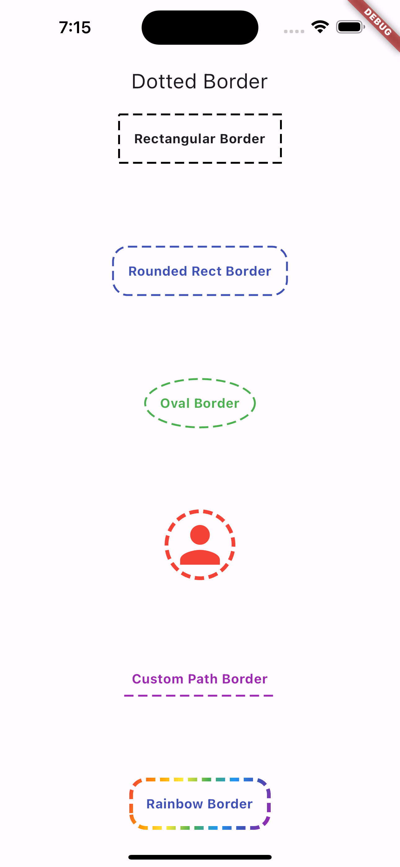
This package supports the following border options
- CustomPath
- RoundedRect
- Rect
- Circular
- Oval
Example
DottedBorder(
  options: RectDottedBorderOptions(
    dashPattern: [10, 5],
    strokeWidth: 2,
    padding: EdgeInsets.all(16),
  ),
  child: Text(
    'Rectangular Border',
    style: TextStyle(
      fontWeight: FontWeight.bold,
    ),
  ),
)
Dash Pattern
You can also specify the Dash Sequence by passing in an Array of Doubles
Example
RectDottedBorderOptions(
  dashPattern: [10, 5],
  strokeWidth: 2,
  padding: EdgeInsets.all(16),
)
The above code block will render a dashed border with the following pattern:
- 10 pixel wide dash
- 5 pixel wide space
Custom Path Border
You can also specify a customPath property and it will draw it for you using the provided dash pattern.
Example
DottedBorder(
  options: CustomPathDottedBorderOptions(
    padding: const EdgeInsets.all(8),
    color: Colors.purple,
    strokeWidth: 2,
    dashPattern: [10, 5],
    customPath: (size) => Path()
      ..moveTo(0, size.height)
      ..relativeLineTo(size.width, 0),
  ),
  child: const Text(
    'Custom Path Border',
    style: TextStyle(
      color: Colors.purple,
      fontWeight: FontWeight.bold,
    ),
  ),
)
Output
Credits