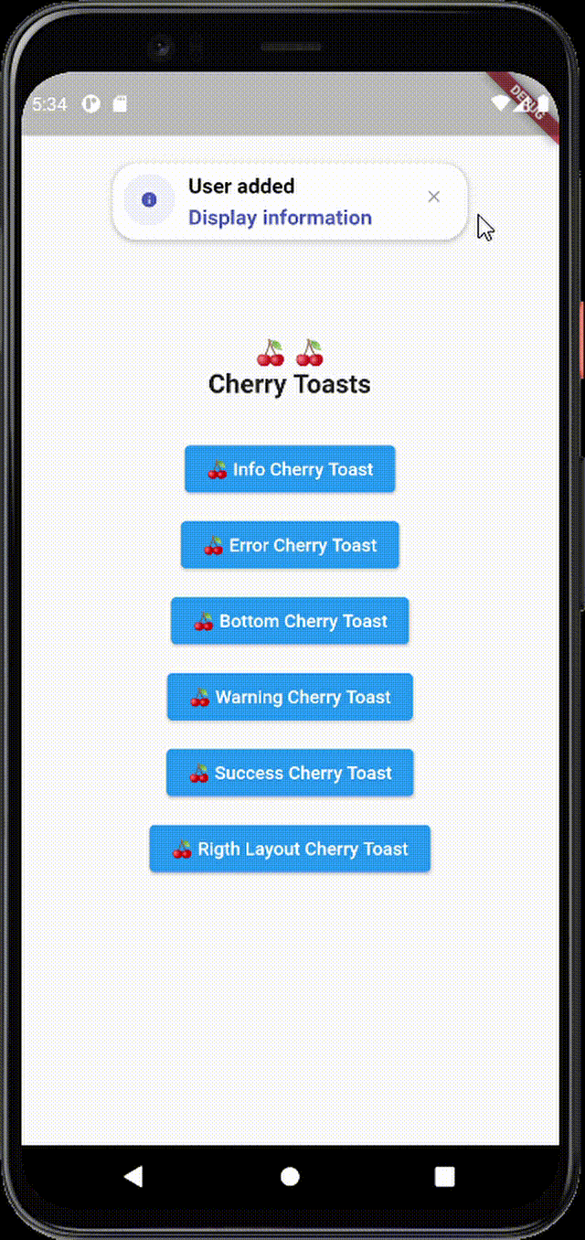
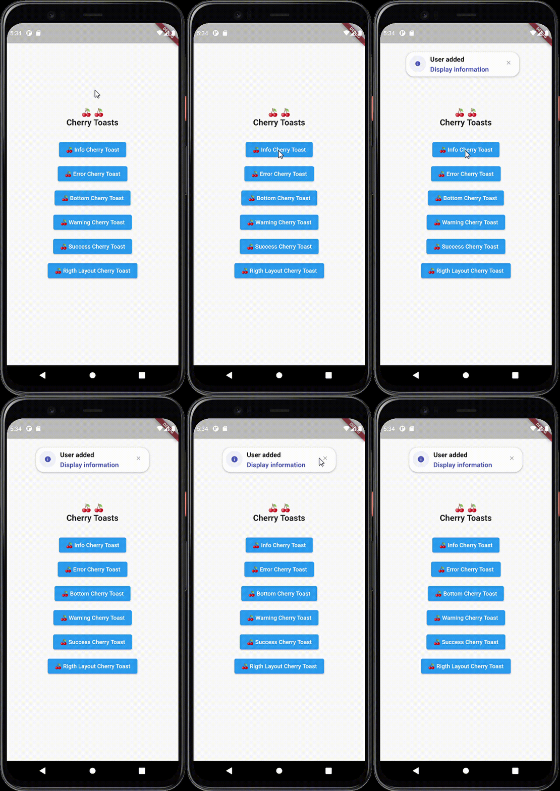
Cherry Toast 是一个 Flutter 包,提供了一种现代且视觉上吸引人的方法来显示 Toast,具有平滑的动画和可自定义的设计。专为寻求优雅替代标准 Flutter Toast 的开发者而打造,它通过微妙但时尚的反馈提升了用户体验。该包支持 Android、iOS、Web、macOS、Windows 和 Linux 多个平台,确保在各种设备上行为一致。凭借直观的 API 和对美学的关注,Cherry Toast 简化了在 Flutter 应用中集成美观通知的过程。
适合场景
在操作后显示用户反馈
显示成功或错误消息
通过动画通知增强用户界面
提供轻量级状态更新
通过视觉魅力提升应用质感
主要特点
优雅且现代的设计
平滑动画
跨平台支持
可自定义外观
简单 API 集成
支持多种类型的提示
适合对象
Flutter 开发者优先考虑 UI 美学
需要完善用户反馈的应用程序
致力于现代通知样式的项目
想要易于使用的吐司解决方案的开发者
专注于用户体验提升的团队
使用建议
可能需要额外的样式以支持深色模式
与功能齐全的通知系统相比,自定义选项有限
依赖外部动画库
不适合复杂的通知工作流
最适合简单、简短的消息
原始 README
以下为关联源码仓库的 README 原文快照,最新内容请访问源码仓库。
Cherry Toast
A new way to display toasts in Flutter in an elegant design and animations
Cherry Toast
Support all platforms
Top and Bottom display position
Customizable background color
Support RTL layout rendering (for arabic text)
Multiple built-in themes
Built-in animations
Support null safety
Elegant design
Full customizable
Heartbeat animation on icons
Customizable icon size and color and display
Dismissable notification
Customizable toast constraints, height and width
Installation
To add cherry toast to your project add this line to your pubspec.yaml file
dependencies:cherry_toast:^1.13.0
Parameters
/// Text widget displayed as a title in the toast/// required parameter for all toast typesfinalText? title;
/// Text widget displayed as a description in the toastfinalText? description;
/// The action button displayed below descriptionfinalText? action;
/// The toast icon, it's required when using the default constructorlateIconData icon;
/// The Icon color/// this parameter is only available on the default constructor/// for the built-in themes the color will be set automaticallylateColor iconColor;
/// Background color of containerfinalColor backgroundColor;
/// Box shadow color of containerfinalColor shadowColor;
/// Custom widget displayed at the place of the predefined iconsfinalWidget? iconWidget;
/// The icon size/// this parameter is available in default constructorlatedouble iconSize;
/// The toast display postion, possible values/// ```dart/// {/// top,/// bottom/// }/// ```finalPosition toastPosition;
/// The color that will be applied on the circle behind the icon/// for better rendering the action button must have the same colorlateColor themeColor;
/// The function invoked when clicking on the action buttonfinalFunction? actionHandler;
/// The duration of the animation by default it's 1.5 secondsfinalDuration animationDuration;
/// The animation curve by default it's set to `Curves.ease`.finalCubic animationCurve;
/// The animation type applied on the toast/// ```dart/// {/// fromTop,/// fromLeft,/// fromRight/// }/// ```finalAnimationType animationType;
/// Indicates whether the toast will be hidden automatically or not.finalbool autoDismiss;
/// The duration of the toast if [autoDismiss] is truefinalDuration toastDuration;
/// The layout of the toast/// ```dart/// {/// ltr,/// rtl/// }/// ```finalTextDirection textDirection;
/// Display / Hide the close button iconfinalbool displayCloseButton;
/// Define the border radius applied on the toastfinaldouble borderRadius;
/// Define whether the icon will be rendered or notfinalbool displayIcon;
/// Define wether the animation on the icon will be rendered or notfinalbool enableIconAnimation;
/// The attribute is declaring a final variable named "width" of type double with a nullable value./// width attribute define the toast widthfinaldouble? width;
/// The attribute is declaring a final variable named "height" of type double with a nullable type/// modifier./// height attribute define the toast heightfinaldouble? height;
/// Enable taost constraints customization (by default it's null)finalBoxConstraints? constraints;
/// Indicate whether the toast animation is enabled or not/// by default the toast animation is enabledfinalbool disableToastAnimation;
/// Indicate toast should inherit theme colors sheme, to apply in background/// and shadow color.finalbool inheritThemeColors;
/// Callback invoked when toast get dismissed (closed by button or dismissed automtically)finalFunction()? onToastClosed;
/// Horizontal alignment display of the toast contentfinalCrossAxisAlignment horizontalAlignment;
/// The space rendered between the title and description widgets.finaldouble titleDescriptionMargin;
/// The space rendered between the description and actions widgets.finaldouble descriptionActionMargin;