搜索插件、代码仓与 APP 分类

contained_tab_bar_view 封面
插件详情v0.8.0

contained_tab_bar_view

将 TabController、TabBar 和 TabBarView 封装成一个可自定义的 Widget。

AndroidiOSWebmacOSWindowsLinux
近 30 天下载
5950
喜欢数
189
Pub 分数
160

安装插件

flutter pub add contained_tab_bar_view

插件介绍

基于插件公开信息、社区数据与项目使用情况整理的选型参考。

ContainedTabBarView 是一个可自定义的 Flutter 小部件,将 TabController、TabBar 和 TabBarView 组合成一个统一的组件。它通过自动处理状态管理和布局,简化了标签界面的实现,使开发者能够专注于设计和内容。该包支持所有主要平台,包括 Android、iOS、Web、macOS、Windows 和 Linux,非常适合跨平台应用。凭借简洁直观的 API,它提升了代码可读性并减少了样板代码。特别适用于创建包含多个标签的导航密集型 UI。

适合场景

  • 在移动和网页应用中创建标签导航
  • 简化复杂的标签界面实现
  • 在项目间构建可重用的标签组件
  • 实现动态标签布局
  • 设计响应式标签页仪表板

主要特点

  • TabController、TabBar 和 TabBarView 的单个控件封装
  • 标签页的内置状态管理
  • 可自定义的外观和行为
  • 跨平台支持
  • 所需的最小样板
  • 支持动态添加/删除标签页

适合对象

  • 寻求简化标签界面的开发者
  • 需要一致制表符导航的项目
  • 跨平台 Flutter 应用
  • 需要可重用标签逻辑的UI组件
  • 注重可维护代码的团队

使用建议

  • 可能需要额外的样式设置以实现高级自定义
  • 仅限标准标签页模式,不支持深度自定义
  • 依赖于 Flutter 的内置标签控件
  • 不太适合高度非标准的标签页行为
  • 最适合典型的基于标签的导航流程

原始 README

以下为关联源码仓库的 README 原文快照,最新内容请访问源码仓库。

ContainedTabBarView

pub package

ContainedTabBarView encapsulates TabController, TabBar and TabBarView into a single, easy to use Widget and lets you customize its appearance without worrying about internal workings of "TabBar ecosystem".


Usage

All of the below examples can be found under example, each written as a simple StatelessWidget.

Basic

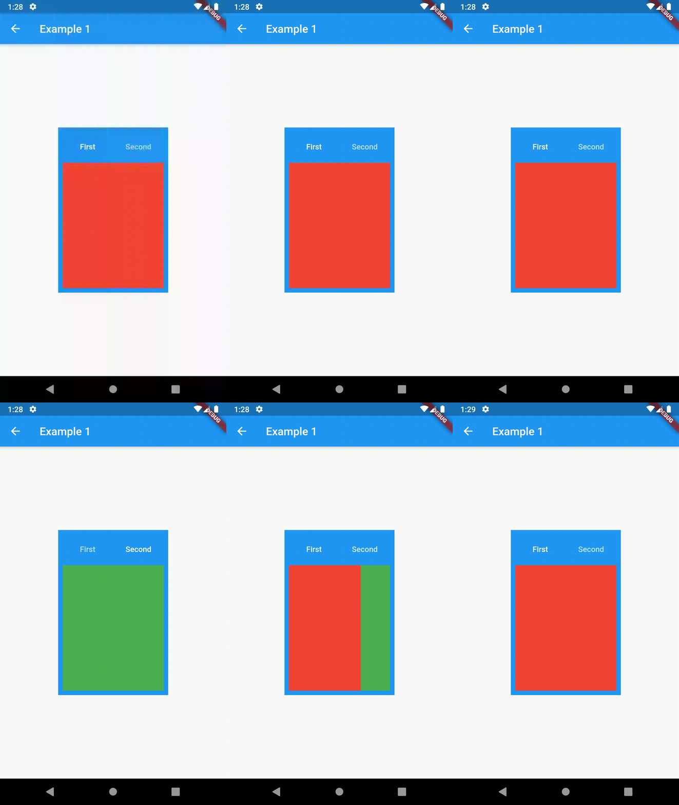
Basic usage includes putting a ContainedTabBarView into a Container whose constraints it will obey. Putting a ContainedTabBarView directly into a body of a Scaffold will, expectedly, draw it full-screen.

// Example 1
import 'package:contained_tab_bar_view/contained_tab_bar_view.dart';

...

Container(
  padding: const EdgeInsets.all(8.0),
  color: Colors.blue,
  width: 200,
  height: 300,
  child: ContainedTabBarView(
    tabs: [
      Text('First'),
      Text('Second'),
    ],
    views: [
      Container(color: Colors.red),
      Container(color: Colors.green)
    ],
    onChange: (index) => print(index),
  ),
),

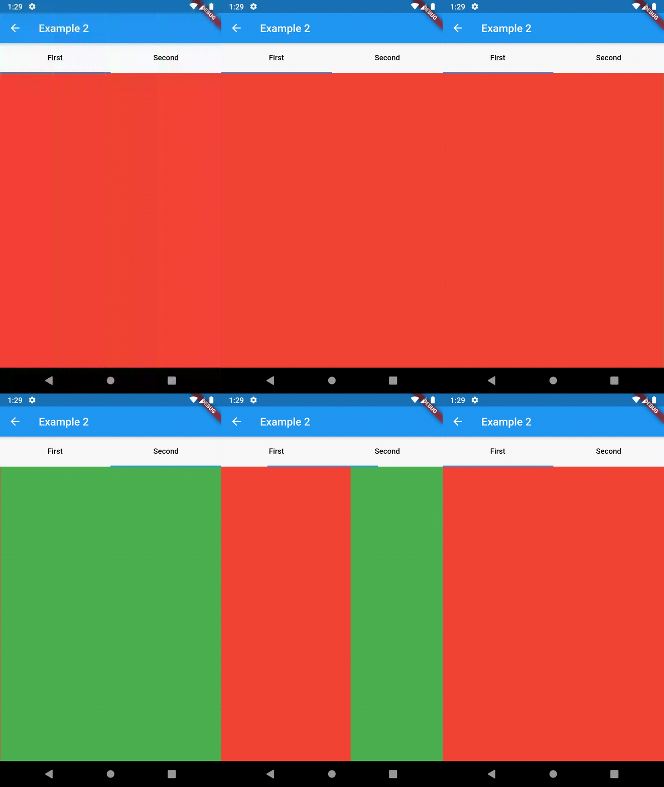
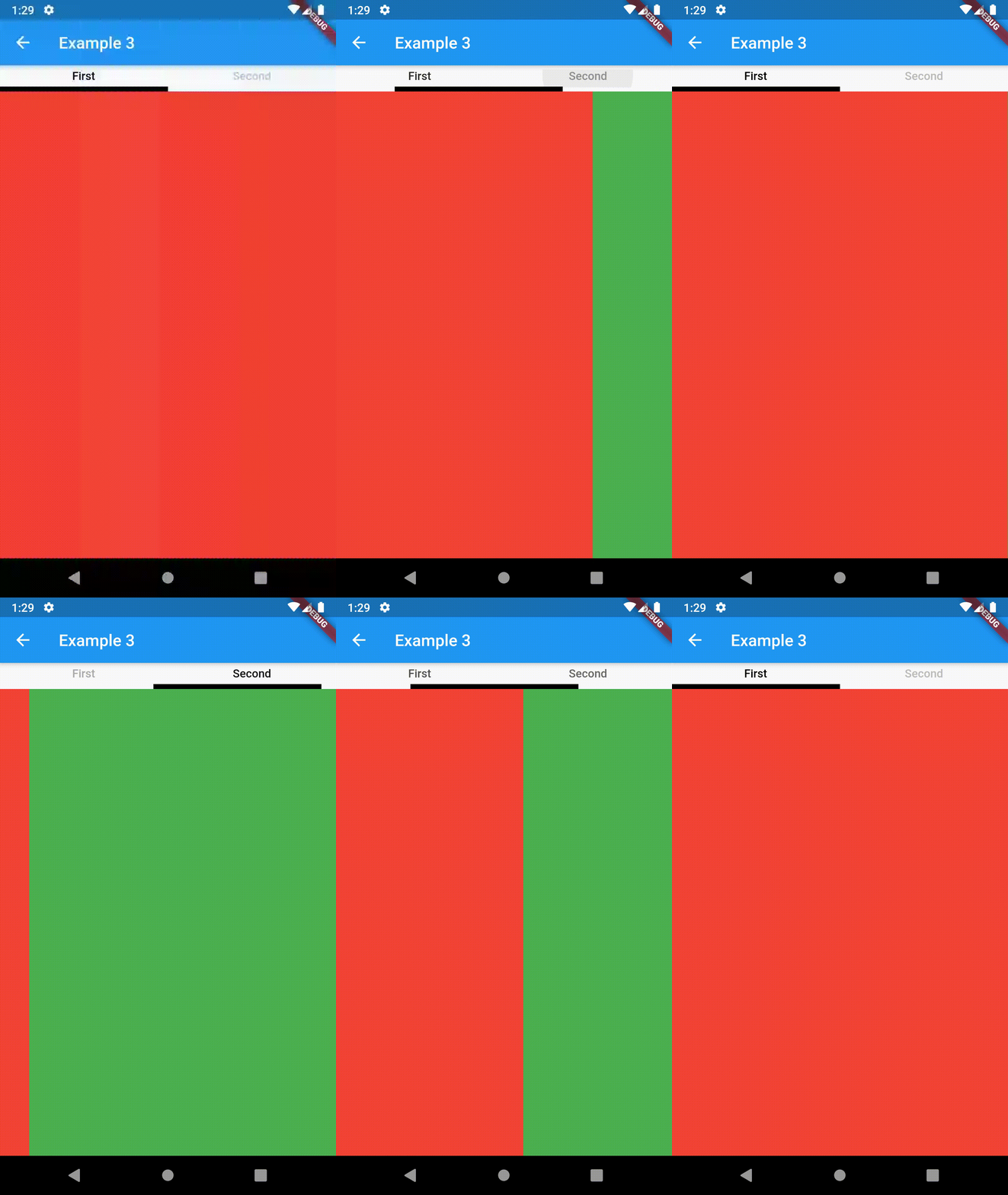
example 1 example 2 example 3

Intermediate

TabBarProperties

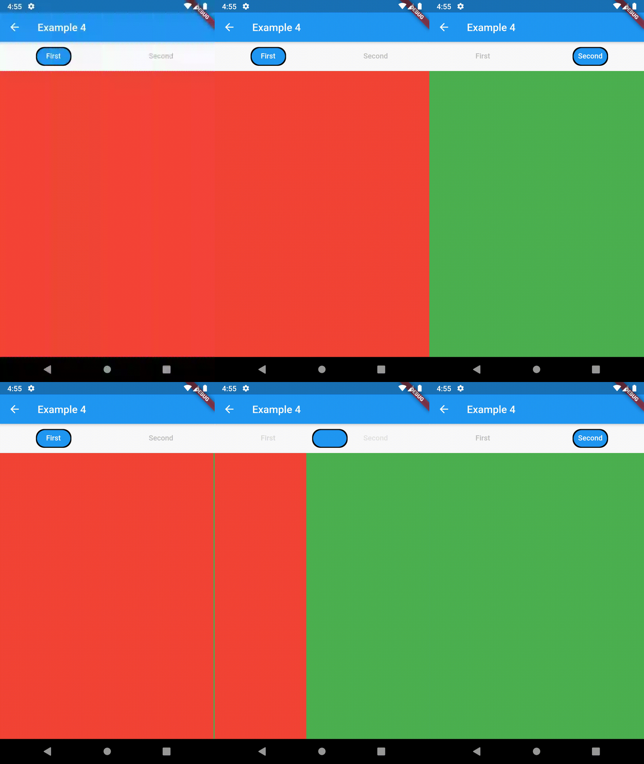
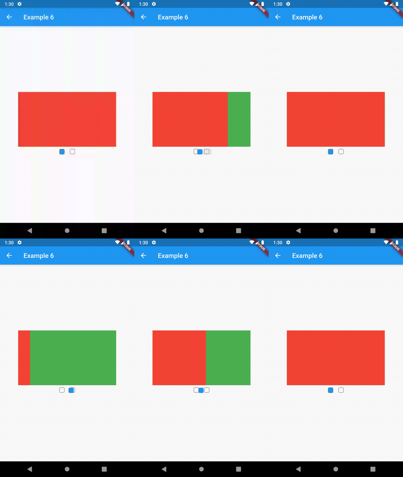
All the properties that can be set for a TabBar are accessible for setting via tabBarProperties. Also, there are many more for the customization of TabBar's appearance. To create your own ("container-based") indicator, you can use ContainerTabIndicator decoration (see examples 4 and 6) which is a part of this package, but also a separate package whose documentation can be found here. Of course, you can use any other tab bar indicator of your liking.

Property Type Default value Description
width double / The width of TabBar. If not set, it's full available width.
height double kToolbarHeight The height of TabBar. The TabBarView takes the available height minus this value.
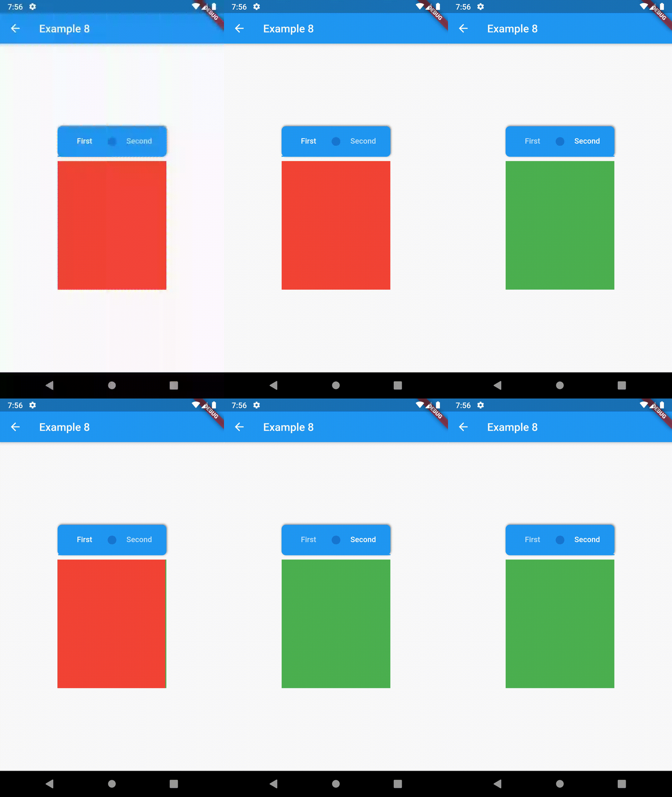
background Container / Container that is behind the tabs. See example 8.
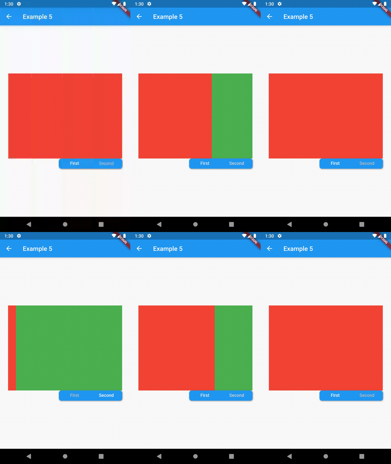
position TabBarPosition TabBarPosition.top Position of TabBar in respect to it's TabBarView. See example 5.
alignment TabBarAlignment TabBarAlignment.center Alignment of TabBar (if it's width is not full available) within TabBar-TabBarView flex. See example 5.
padding EdgeInsets const EdgeInsets.all(0.0) The TabBars padding. See example 4.
margin EdgeInsets const EdgeInsets.all(0.0) The TabBars margin. See example 8.
indicator Decoration / The decoration for the active tab. You can use ContainerTabIndicator for various customization. See example 4. Also, see TabBar documentation
indicatorColor Color / see TabBar documentation
indicatorPadding EdgeInsetsGeometry const EdgeInsets.all(0.0) see TabBar documentation
indicatorSize TabBarIndicatorSize / see TabBar documentation
indicatorWeight double 2.0 see TabBar documentation
isScrollable bool false see TabBar documentation
labelColor Color / see TabBar documentation
labelPadding EdgeInsetsGeometry const EdgeInsets.all(0.0) see TabBar documentation
labelStyle TextStyle / see TabBar documentation
unselectedLabelColor Color / see TabBar documentation
unselectedLabelStyle TextStyle / see TabBar documentation
TabBarViewProperties

All the properties that can be set for a TabBarView are accessible for setting via tabBarViewProperties.

Property Type Default value Description
dragStartBehavior DragStartBehavior DragStartBehavior.start See TabBarView documentation
physics ScrollPhysics (platform specific) See TabBarView documentation

For example, if you want to disable swiping behavior on the TabBarView, set the option like this:

ContainedTabBarView(
  ...
  tabBarViewProperties: TabBarViewProperties(
    physics: NeverScrollableScrollPhysics(),
  ),
)
TabBarPosition
enum TabBarPosition { top, bottom, left, right }
TabBarAlignment
enum TabBarAlignment { start, center, end }
Intermediate Examples
// Example 5
ContainedTabBarView(
  tabs: [
      Text('First'),
      Text('Second'),
  ],
  tabBarProperties: TabBarProperties(
    width: 200,
    height: 32,
    background: Container(
      decoration: BoxDecoration(
        color: Colors.blue,
        borderRadius: BorderRadius.all(Radius.circular(8.0)),
        boxShadow: [
          BoxShadow(
            color: Colors.black.withOpacity(0.4),
            spreadRadius: 0.5,
            blurRadius: 2,
            offset: Offset(1, -1),
          ),
        ],
      ),
    ),
    position: TabBarPosition.bottom,
    alignment: TabBarAlignment.end,
    indicatorColor: Colors.transparent,
    labelColor: Colors.white,
    unselectedLabelColor: Colors.grey[400],
  ),
  views: [
    Container(color: Colors.red),
    Container(color: Colors.green),
  ],
)

example 4 example 5 example 6

Advanced

Change tab from another Widget

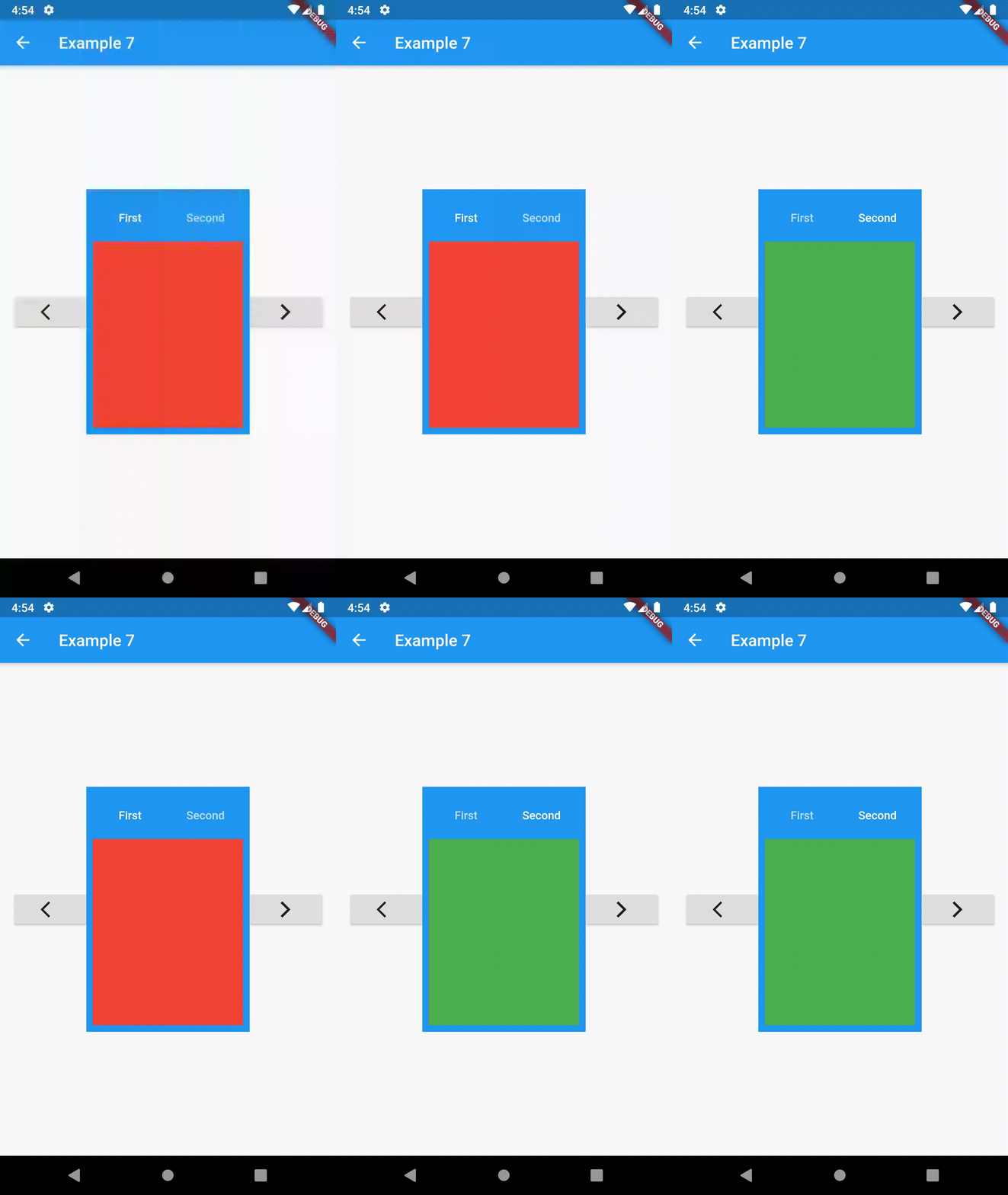
To control the state, i.e. move to another tab, from outside of ContainedTabBarView create it with a GlobalKey and then use methods exposed from state: animateTo(), next() and previous().

// Example 7
class Example7 extends StatelessWidget {
  @override
  Widget build(BuildContext context) {
    GlobalKey<ContainedTabBarViewState> _key = GlobalKey();
    ContainedTabBarView containedTabBarView = ContainedTabBarView(
      key: _key,
      tabs: [
        Text('First'),
        Text('Second'),
      ],
      views: [
        Container(color: Colors.red),
        Container(color: Colors.green),
      ],
    );

    return Scaffold(
      appBar: AppBar(
        title: Text('Example 7'),
      ),
      body: Row(
        mainAxisAlignment: MainAxisAlignment.center,
        children: [
          ElevatedButton(
            onPressed: () => _key.currentState?.previous(),
            child: Icon(Icons.arrow_back_ios),
          ),
          Center(
            child: Container(
              padding: const EdgeInsets.all(8.0),
              color: Colors.blue,
              width: 200,
              height: 300,
              child: containedTabBarView,
            ),
          ),
          ElevatedButton(    
            onPressed: () => _key.currentState?.next(),
            child: Icon(Icons.arrow_forward_ios),
          ),
        ],
      ),
    );
  }
}
Advanced Examples

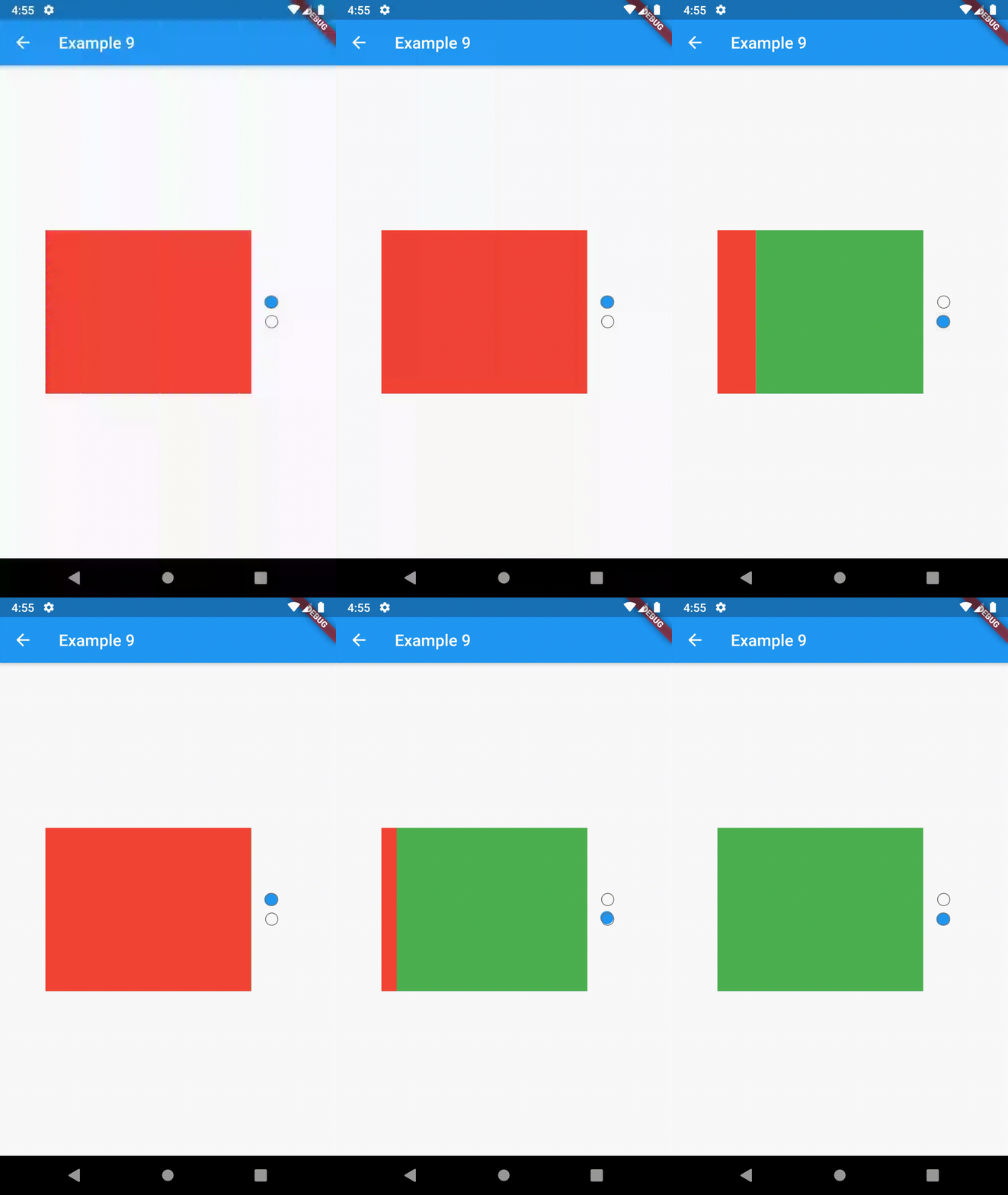
example 7 example 8 example 9

Contributing

This package is still in early stages. If you notice any bugs, please file an issue. If you are willing to fix or enhance things yourself, you are very welcome to make a pull request.

所属分类

依赖

依赖清单 1 项

源码仓库

使用此插件的项目