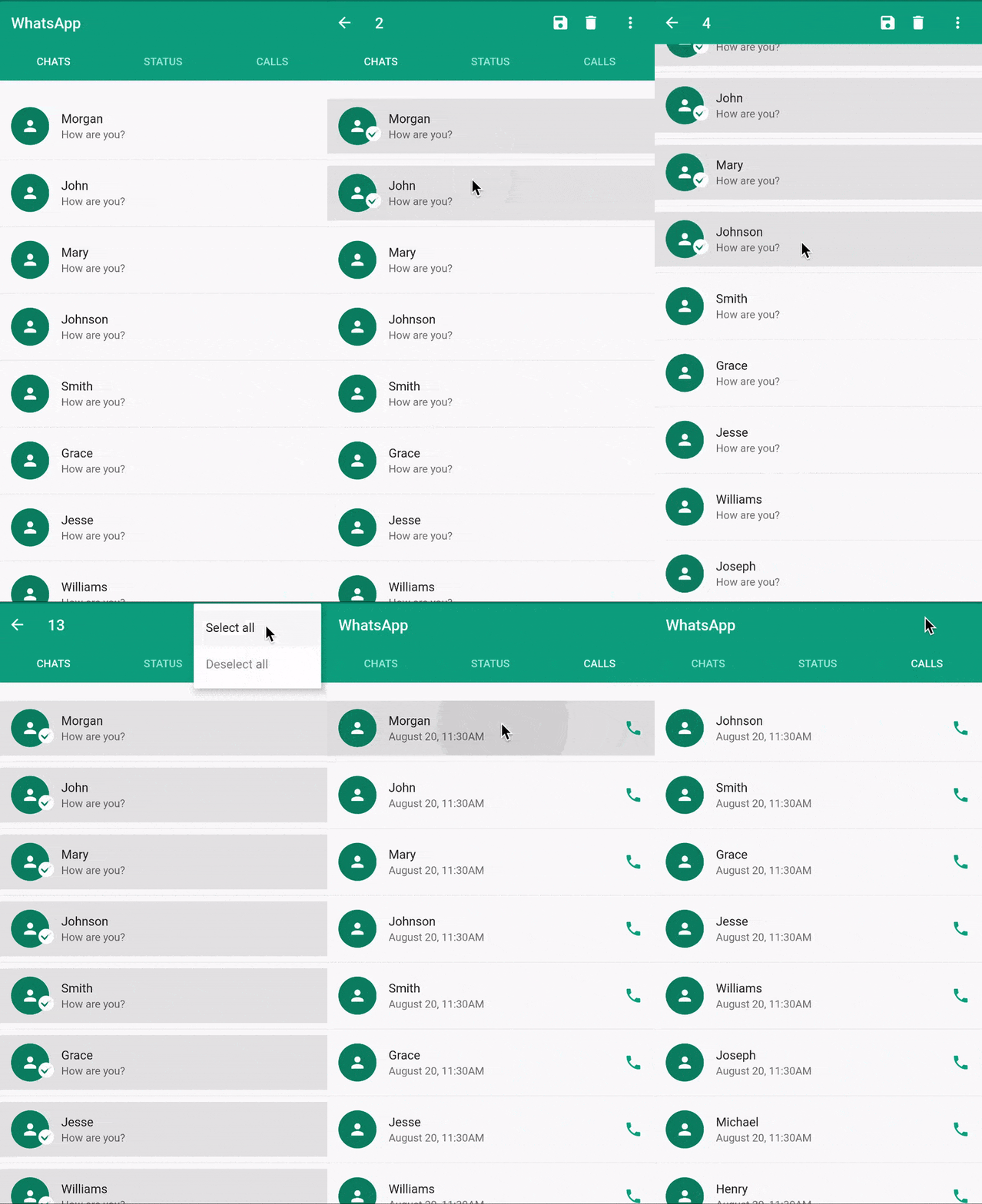
contextualactionbar 包提供了一种实现 Flutter 中上下文操作栏(CAB)的变通方法,可动态替换标准应用栏,以在选中项目时显示上下文相关的操作。该包专为 Android、iOS、Web、macOS、Windows 和 Linux 等多个平台设计,通过在选择模式下提供针对性控件来增强用户交互体验。该包可无缝集成到现有的 Flutter 应用中,并支持自定义样式和行为。在需要执行批量操作的列表或网格界面中尤为实用。
适合场景
列表中的批量项目选择
网格中的上下文相关操作
移动应用中的增强用户交互
可自定义的操作叠加层
跨平台实现
选择模式UI增强
主要特点
动态替换应用栏
对多个平台的支持
可自定义的操作按钮
与选择模式的集成
轻量且易于实现
适用于所有设备的响应式设计
适合对象
开发交互式列表界面的开发者
需要批量操作的应用程序
跨平台移动应用
基于选择的工作流界面
寻求跨平台CAB解决方案的团队
需要上下文操作支持的 Flutter 项目
使用建议
需要手动处理选择状态
有限的内置动画
可能需要额外的样式以保持一致性
依赖于与可滚动元素的正确集成
不适合简单的静态UI
最好与状态管理模式一起使用
原始 README
以下为关联源码仓库的 README 原文快照,最新内容请访问源码仓库。
Flutter contextual action bar(CAB)
CAB & Flutter
CAB is a top app bar that replace the application app bar to provide contextual actions to selected items. Check the material implementation and requirement here
Flutter does not natively support CAB yet. see issue
Until CAB is natively supported, this package should provide you with an elegant way to implement the contextual action bar in flutter.
How it works
ContextualScaffold
ContextualAppBar
ContextualAction
ContextualActionWidget
ContextualScaffold<?>
The ContextualScaffold<?> is similar to the normal material Scaffold except that it also takes
a required contextualAppBar.
You can provide multiple ContextualScaffold as needed
ContextualAppBar<?>
The ContextualAppBar<?> is similar to the normal material Appbar but takes a counterBuilder instead of title and also a contextualActions instead of actions.
You can use the ContextualActionWidget anywhere in the ContextualActionScaffold body to notify ContextualActionScaffold that an item have been selected in order to show the ContextualAppBar.
Note: It is important that the child widget does not handle onLongPress.
A closer look at ContextualActionWidget<?>
The ContextualActionWidget<?> takes other optional parameters like
selectedColor
selectedWidget
unselectedWidget
The selectedColor is the color of the background for the selected item, it defaults to the splash color, if not provided. The selectedColor works well with ListTile.
selectedWidget and unselectedWidget are stacked on top of the provided child widget. By default, they are positioned at the center of the provided child widget.
Since They are stacked, you can use Row, Align, Positioned Widget or any other combination of widgets to position them where desired.
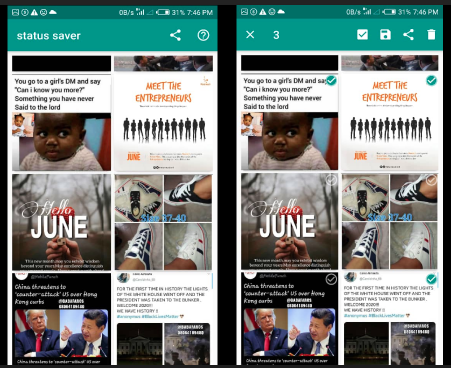
The selectedWidget is shown when the ActionMode is enabled and the item is selected, while the unselectedWidget is shown when ActionMode is enabled and the item is not selected. See example(status_saver) image below with both the selectedWidget and unselectedWidget aligned to the top-right corner.
ActionMode
This contextual action bar workaround does not support zero item in the ActionMode.
Use the ActionMode.addItem<?> to add an item to the selected items. If this is the first selection, the ActionMode is will be enabled.
Use the ActionMode.addItems<?> to add a list of items.
Use the ActionMode.disable<?> to disable and deselect all selected items.
Use the ActionMode.enabledStream<?> to emit true or false depending on if the Action mode is enabled or disabled respectively.
Note: In most cases, you won't need to use ActionMode.disable<?> because the package already do that for you where needed.
Study complete examples at example page.
If you like the project, don't forget to star ⭐️