搜索插件、代码仓与 APP 分类

cr_calendar 封面
插件详情v1.3.0

cr_calendar

功能强大的日历,支持自定义、范围选择和事件显示。

AndroidiOSWebmacOSWindowsLinux
近 30 天下载
158
喜欢数
113
Pub 分数
150

安装插件

flutter pub add cr_calendar

插件介绍

基于插件公开信息、社区数据与项目使用情况整理的选型参考。

cr_calendar 是一个可自定义的 Flutter 日历包,支持范围选择、事件高亮和广泛的样式选项。它提供了一个简洁现代的界面,可在 Android、iOS、Web、macOS、Windows 和 Linux 等多个平台上显示日期和事件。该包允许开发者根据各种使用场景(如日程安排、预订系统或个人计划)定制日历的外观和行为。内置对日期范围和事件标记的支持,简化了 Flutter 应用中的日期管理。

适合场景

  • 安排预约
  • 预订系统
  • 事件跟踪
  • 个人计划
  • 日期范围选择
  • 基于日历的仪表板

主要特点

  • 可自定义的 UI
  • 范围日期选择
  • 事件标记
  • 多平台支持
  • 灵活的日期格式化
  • 主题集成

适合对象

  • 开发预约应用的开发者
  • 创建预订界面的团队
  • 需要日期可视化的应用
  • 具有日历需求的Flutter项目
  • 以用户界面为重点的日期选择器

使用建议

  • 需要手动管理事件数据
  • 有限的内置本地化支持
  • 无原生时间选择
  • 样式可能需要自定义代码
  • 平台特定的渲染细微差别
  • 依赖外部状态管理

原始 README

以下为关联源码仓库的 README 原文快照,最新内容请访问源码仓库。

CrCalendar

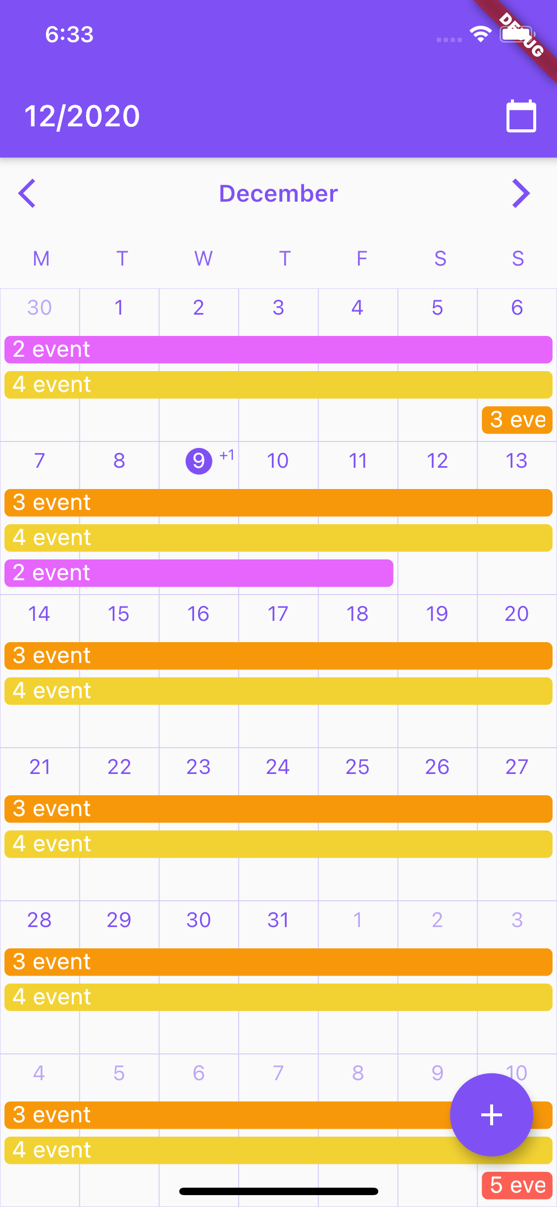
Customizable Flutter calendar inspired by Google Calendar app.

Features:
  • CrCalendar widget for displaying horizontally scrollable month view, with events lines over days.
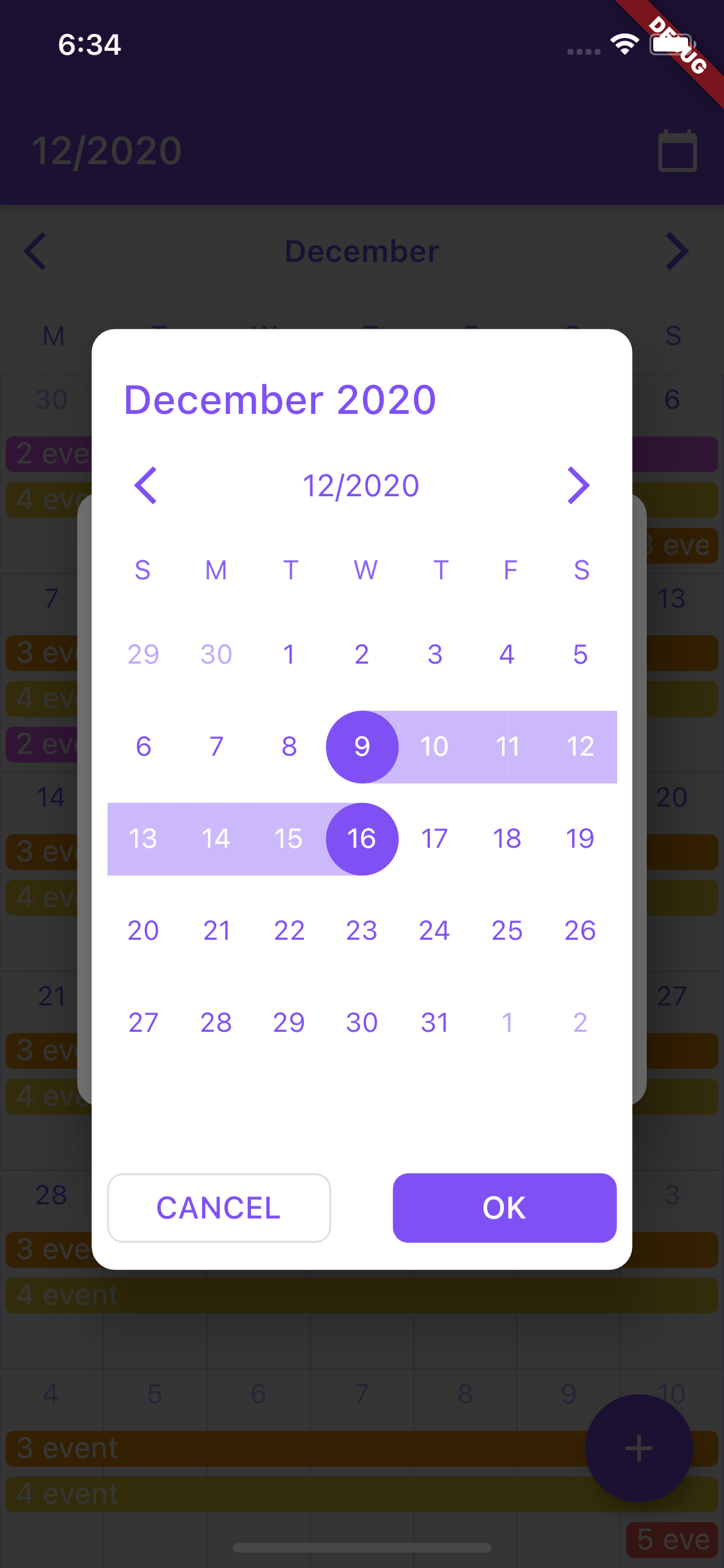
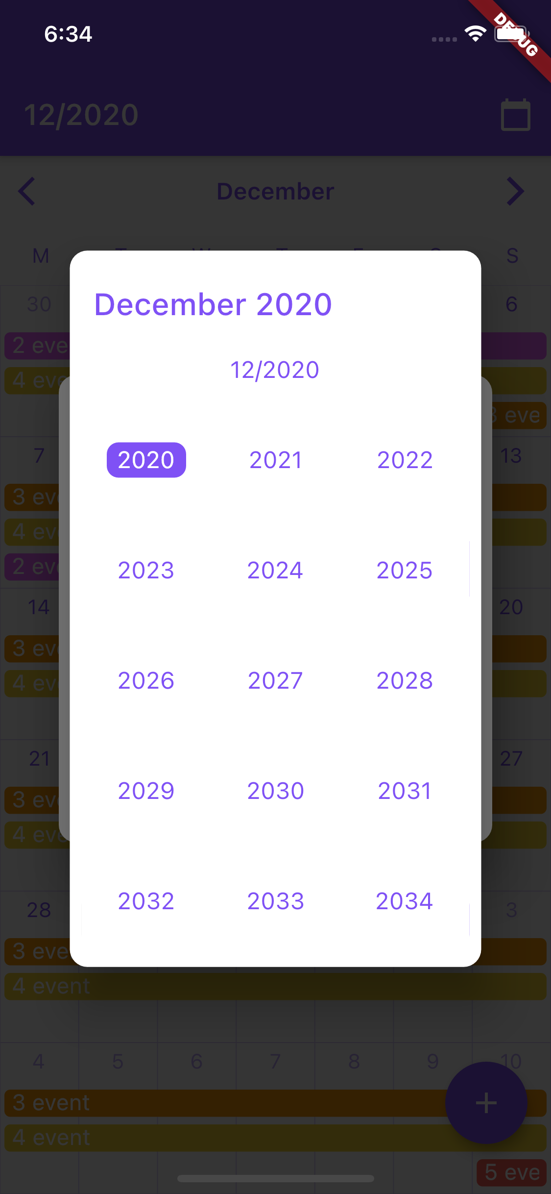
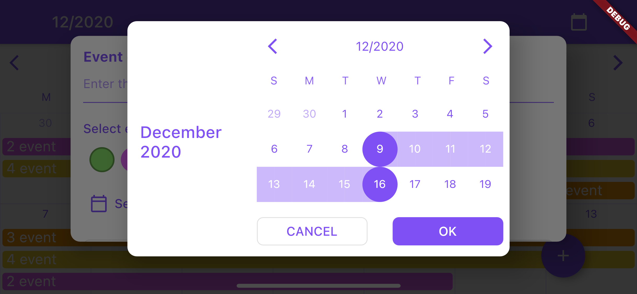
  • date selection dialog (uses CrCalendar widget in range selection mode) with customization of buttons, texts and look of the CrCalendar widget.
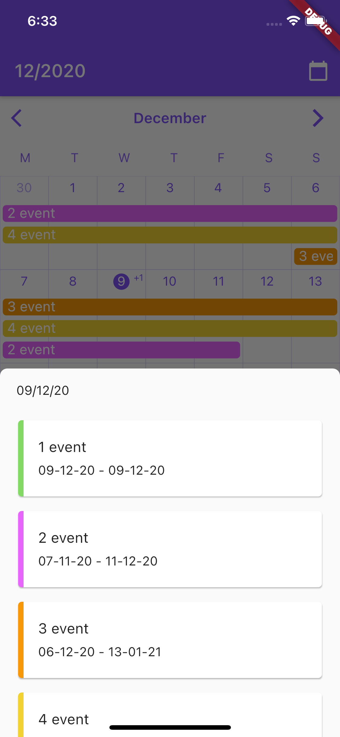
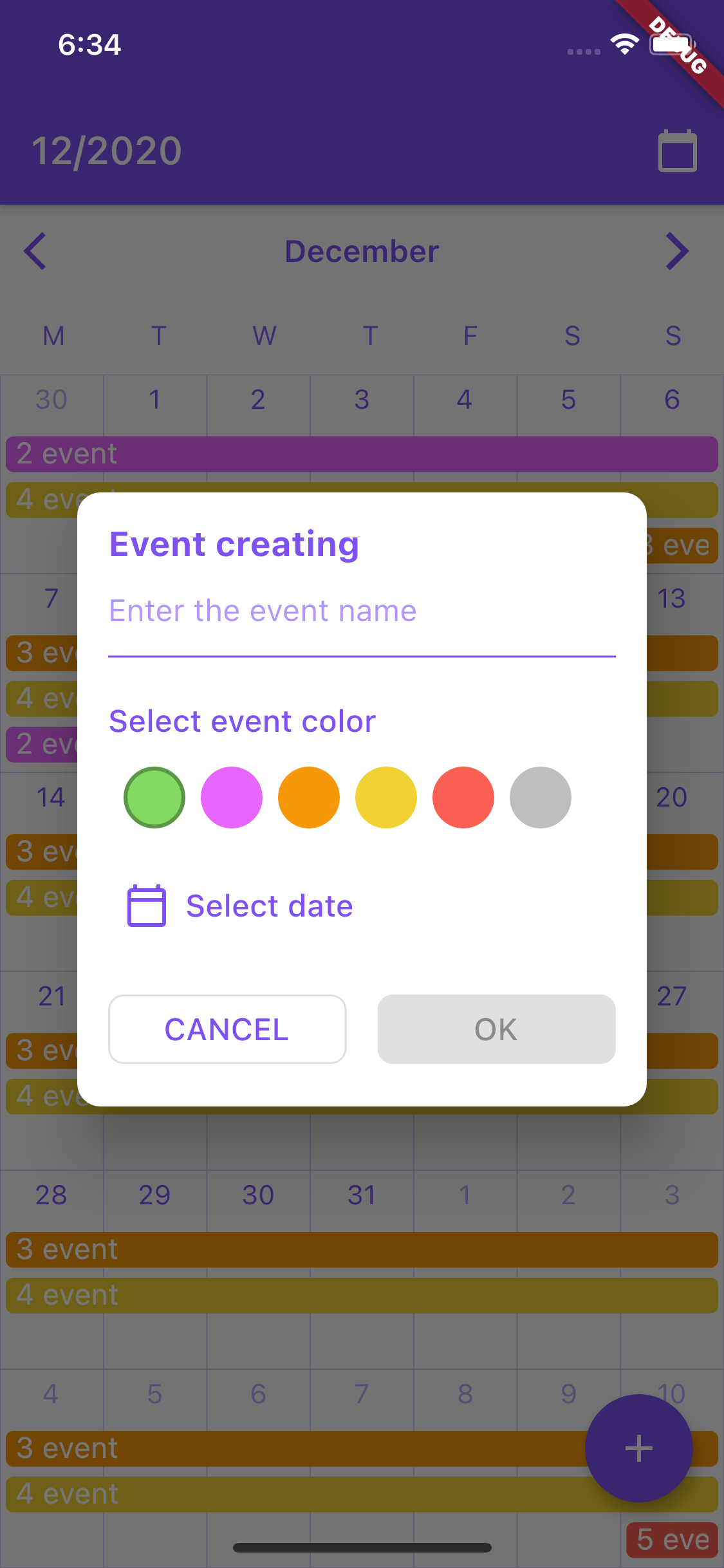
Screenshots of example app:

Installation

Add cr_calendar as a dependency in pubspec.yaml.

Then import it to your project:

import 'package:cr_calendar/src/cr_calendar.dart';


Usage of CrCalendar
CrCalendar parameters:
Type Name Description Default value
CrCalendarController controller Calendar controller -
DateTime initialDate Initial date to be showed when calendar created -
OnTapCallback onDayClicked Callback fired when calendar day is tapped in calendar with TouchMode.singleTap touch mode. -
WeekDays firstDayOfWeek Sets day from which week begins WeekDays.sunday
WeekDaysBuilder weekDaysBuilder Builder for customization week days row at top of the calendar widget. -
DayItemBuilder dayItemBuilder Builder for customization of days cells. -
bool forceSixWeek Force calendar to display sixth row in month view even if this week is not in current month. false
Color backgroundColor Background color of the calendar -
int maxEventLines Number of events widgets to be displayed over day item cell 4
EventBuilder eventBuilder Event widget builder -
TouchMode touchMode Touch mode of calendar. -
double eventsTopPadding Padding over events widgets to for correction of their alignment. -
OnRangeSelectedCallback onRangeSelected Callback for receiving selected range when calendar is used as date picker. -
int onSwipeCallbackDebounceMs Time in milliseconds for debounce CrCalendarController onSwipe callback. -
DateTime minDate Earliest allowable date. -
DateTime maxDate Latest allowable date. -
Base usage:
class MyApp extends StatefulWidget {
  @override
  _MyAppState createState() => _MyAppState();
}

class _MyAppState extends State<MyApp> {
  CrCalendarController _controller = CrCalendarController();

  @override
  Widget build(BuildContext context) {
    return MaterialApp(
      home: Scaffold(
        body: CrCalendar(
          initialDate: DateTime.now(),
          controller: _controller,
        ),
      ),
    );
  }
}

Note: avoid using setState calls frequently on the page where the CrCalendar widget is used to improve performance.

Usage of CrCalendar date picker dialog
DatePickerProperties parameters:
Type Name Description Default value
Color backgroundColor Background color for date picker dialog and year selection widget. Colors.white
DateTime initialPickerDate Initial date to be opened on dialog creation. -
EdgeInsets padding Picker dialog padding. EdgeInsets.all(8)
DayItemBuilder dayItemBuilder Builder for day item in dialog. -
TouchMode pickerMode Picker selection mode. -
WeekDaysBuilder weekDaysBuilder Builder for row of days over month view. -
DateTitleBuilder pickerTitleBuilder Title builder for widget on top of picker dialog. -
Alignment pickerTitleAlignInLandscape Alignment of picker title in landscape mode. Alignment.centerLeft
Widget backButton Back button for picker control bar. -
Widget forwardButton Forward button for picker control bar. -
DateTitleBuilder controlBarTitleBuilder Builder for control bar title showed between backButton and forwardButton. -
bool showControlBar Option for hiding control bar. true
YearPickerItemBuilder yearPickerItemBuilder Builder for confirm selection button. -
PickerButtonBuilder okButtonBuilder Builder for confirm selection button. -
PickerButtonBuilder cancelButtonBuilder Builder for cancel button. -
bool forceSixWeek Force showing six week rows in month view. false
WeekDays firstWeekDay First day of date picker calendar. WeekDays.sunday
DateTime minDate Earliest allowable date. -
DateTime maxDate Latest allowable date. -
LandscapeDaysResizeMode landscapeDaysResizeMode LandscapeDaysResizeMode.adaptive - days cells will change their height according to parent height LandscapeDaysResizeMode.scrollable - days cells will change their height according to parent height as long as it is larger than the cells width. The month scrolls if there is not enough space LandscapeDaysResizeMode.adaptive
Base usage:
  /// Show calendar in pop up dialog for selecting date range for calendar event.
  void _showDatePicker(BuildContext context) {
    showCrDatePicker(
      context,
      properties: DatePickerProperties(
        firstWeekDay: WeekDays.monday,
        okButtonBuilder: (onPress) =>
            ElevatedButton(child: const Text('OK'), onPressed: onPress),
        cancelButtonBuilder: (onPress) =>
            OutlinedButton(child: const Text('CANCEL'), onPressed: onPress),
        initialPickerDate: DateTime.now(),
      ),
    );
  }

所属分类

依赖

依赖清单 3 项

源码仓库

使用此插件的项目

暂无相关数据。