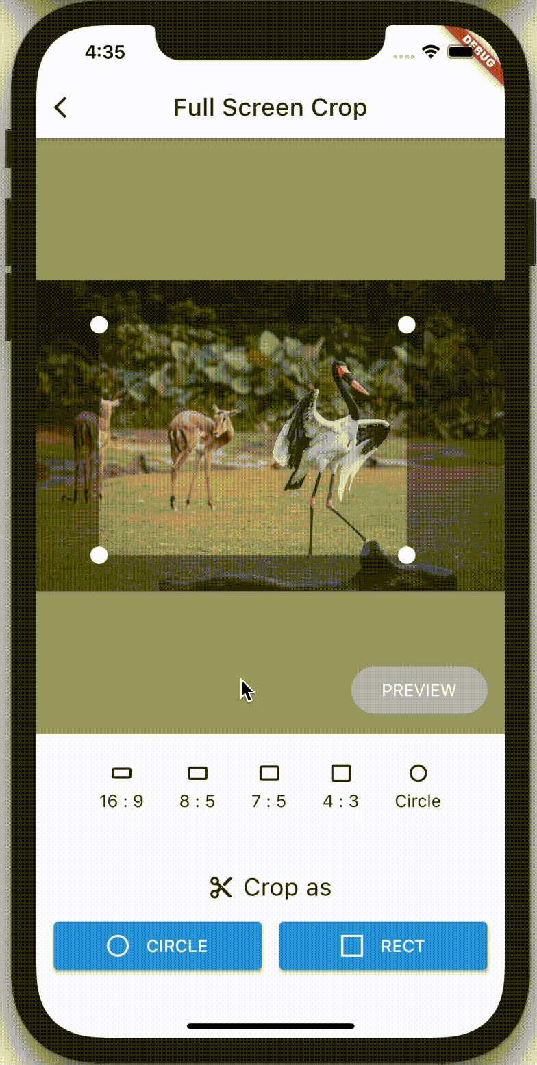
crop_your_image 是一个 Flutter 包,可让开发者使用可自定义的控件将图像裁剪功能集成到他们的应用程序中。它提供了一种简单的方法,可在应用界面内直接选择和裁剪图像,支持 Android、iOS、Web、macOS、Windows 和 Linux 等多种平台。该包设计简洁易用,设置简单,可轻松集成到现有项目中。它利用 Flutter 的控件系统,提供灵活且响应迅速的裁剪体验。
适合场景
照片应用中的图像编辑
用户个人资料图片裁剪
内容创作工具
社交媒体上传预处理
文档图像裁剪
主要特点
内置裁剪控件
支持多个平台
可自定义的纵横比
响应式UI设计
与 Flutter 的轻松集成
实时预览
适合对象
开发图像密集型应用的开发者
需要用户图像自定义的应用程序
跨平台图像处理功能
专注于用户体验的前端团队
移动和网络应用
使用建议
需要额外的权限才能访问图像
可能需要自定义样式以保持外观一致
仅限基本裁剪,不支持高级滤镜
依赖外部依赖项以实现完整功能
未针对非常大的图像进行优化
原始 README
以下为关联源码仓库的 README 原文快照,最新内容请访问源码仓库。
crop_your_image
A flutter plugin that provides Crop widget for cropping images.
Philosophy
crop_your_image provides flexible and customizableCrop widget that can be placed at anywhere in your well designed apps.
As Crop is a simple widget displaying minimum cropping UI, Crop can be placed anywhere such as, for example, occupying entire screen, at top half of the screen, or even on dialogs or bottom sheets. It's totally up to you!
Users' cropping operation is also customizable. By default, images are fixed on the screen and users can move crop rect to decide where to crop. Once configured interactive mode, images can be zoomed/panned, and crop rect can be configured as fixed.
CropController enables you to control crop rect from outside of Crop. The controller allows you to run cropping (or related actions) from anywhere on your codebase.
Enjoy building your own cropping UI with crop_your_image!
Features
Minimum UI restrictions
Flexible Crop widget that can be placed anywhere on your widget tree
CropController to control Crop
Zooming / panning images
Crop with rect or circle whichever you want
Fix aspect ratio
Configure Rect of crop rect programmatically
Detect events of users' operation
Undo / Redo operation
(advanced) Cropping backend logics are also customizable
Note that this package DON'T
read / download image data from any storages, such as gallery, internet, etc.
resize, tilt, or other conversions which can be done with image package directly.
provide UI parts other than cropping editor, such as buttons to control. Building UI is fully UP TO YOU!
Usage
Basics
Place Crop Widget wherever you want to place image cropping UI.
final _controller = CropController();
@overrideWidgetbuild(BuildContext context) {
returnCrop(
image: _imageData,
controller: _controller,
onCropped: (result) {
switch(result) {
caseCropResult.success(:final croppedImage):
// do something with cropped image data caseCropResult.error(:final error):
// do something with error
}
}
);
}
Then, Crop widget will automatically display cropping editor UI on users screen with given image.
By passing CropController instance to controller argument of Crop's constructor, you can control the Crop widget from anywhere on your source code.
For example, when you want to crop the image with the current crop rect, you can just call _controller.crop() whenever you want, such like the code below.
Because _controller.crop() only kicks the cropping process, this method returns immediately without any cropped image data. You can obtain the result of cropping images via onCropped callback of Crop Widget.
Undo / Redo
CropController also provides undo and redo methods.
You can also detect history of crop rect changes via onHistoryChanged callback of Crop Widget. This callback exposes History object, which contains undoCount and redoCount, that indicates how many times undo / redo operation is available.
final _controller = CropController();
Widgetbuild(BuildContext context) {
returnCrop(
image: _imageData,
controller: _controller,
onCropped: (result) {
switch(result) {
caseCropResult.success(:final croppedImage):
// do something with cropped image data caseCropResult.error(:final error):
// do something with error
}
},
aspectRatio: 4 / 3,
initialRectBuilder: InitialRectBuilder.withBuilder((viewportRect, imageRect) {
returnRect.fromLTRB(
viewportRect.left + 24,
viewportRect.top + 32,
viewportRect.right - 24,
viewportRect.bottom - 32,
);
}),
// initialRectBuilder: InitialRectBuilder.withArea(// ImageBasedRect.fromLTWH(240, 212, 800, 600),// ),// initialRectBuilder: InitialRectBuilder.withSizeAndRatio(// size: 0.5,// aspectRatio: 4 / 3,// ),// withCircleUi: true,
baseColor: Colors.blue.shade900,
maskColor: Colors.white.withAlpha(100),
overlayBuilder: (context, rect) {
returnCustomPaint(painter: MyPainter(rect));
},
progressIndicator: constCircularProgressIndicator(),
radius: 20,
onMoved: (newRect) {
// do something with current crop rect.
},
onImageMoved: (newImageRect) {
// do something with current image rect.
},
onStatusChanged: (status) {
// do something with current CropStatus
},
willUpdateScale: (newScale) {
// if returning false, scaling will be canceledreturn newScale < 5;
},
cornerDotBuilder: (size, edgeAlignment) => constDotControl(color: Colors.blue),
clipBehavior: Clip.none,
interactive: true,
// fixCropRect: true,// formatDetector: (image) {},// imageCropper: myCustomImageCropper,// imageParser: (image, {format}) {},
);
}
argument
type
description
image
Uint8List
Original image data to be cropped. The result of cropping operation can be obtained via onCropped callback.
onCropped
void Function(CropResult)
Callback called when cropping operation is completed. The result is exposed as CropResult object. CropResult.success() contains cropped image data, and CropResult.error() contains error object.
controller
CropController
Controller for managing cropping operation.
aspectRatio
double?
Initial aspect ratio of crop rect. Set null or just omit if you want to crop images with any aspect ratio. aspectRatio can be changed dynamically via setter of CropController.aspectRatio. (see below)
initialSize
double?
is the initial size of crop rect. 1.0 (or null, by default) fits the size of image, which means crop rect extends as much as possible. 0.5 would be the half. This value is also referred when aspectRatio changes via CropController.aspectRatio.
initialRectBuilder
InitialRectBuilder?
An object preserving configuration for building the initial crop rect. InitialRectBuilder.withBuilder enables you to configure the rect with a function to decide initial Rect of crop rect based on viewport of Crop itself. InitialRectBuilder.withArea enables you to configure the rect with ImageBasedRect which is based on actual image size. InitialRectBuilder.withSizeAndRatio enables you to configure the rect with size and aspectRatio.
withCircleUi
bool
Flag to decide the shape of cropping UI. If true, the shape of cropping UI is circle and aspectRatio is automatically set 1.0. Note that this flag does NOT affect to the result of cropping image. If you want cropped images with circle shape, call CropController.cropCircle instead of CropController.crop.
maskColor
Color?
Color of the mask widget which is placed over the cropping editor.
baseColor
Color?
Color of the base color of the cropping editor.
overlayBuilder
Widget Function(BuildContext, ViewportBasedRect)?
Builder function to build Widget placed over the cropping rect. rect of argument is current ViewportBasedRect of crop rect.
radius
double?
Corner radius of crop rect.
onMoved
void Function(ViewportBasedRect)?
Callback called when crop rect is moved regardless of its reasons. newRect of argument is current ViewportBasedRect of crop rect.
onImageMoved
void Function(ViewportBasedRect)?
Callback called when image is moved regardless of its reasons. newImageRect of argument is current ViewportBasedRect of image.
onHistoryChanged
void Function(History)?
Callback called when history of crop rect is changed. This history allows you to undo / redo feature is available or not.
onStatusChanged
void Function(CropStatus)?
Callback called when status of Crop is changed.
willUpdateScale
bool Function(double)?
Callback called before scale changes on interactive mode. By returning false to this callback, updating scale will be canceled.
cornerDotBuilder
Widget Function(Size, EdgeAlignment)?
Builder function to build Widget placed at four corners used to move crop rect. The builder passes size which widget must follow and edgeAlignment which indicates the position.
progressIndicator
Widget?
Widget for showing preparing image is in progress. Nothing (SizedBox.shrink() actually) is shown by default.
interactive
bool?
Flag to enable interactive mode that users can move / zoom images. false by default
fixCropRect
bool?
Flag if crop rect should be fixed on interactive mode. false by default
clipBehavior
Clip?
Decide clipping strategy for Crop. Clip.hardEdge by default
filterQuality
FilterQuality?
Decide filter quality for Image showing target image. FilterQuality.low by default
for Web
argument
type
description
scrollZoomSensitivity
double?
Sensitivity for zoom gesture using mouse-wheel. For web applications only.
Advanced
crop_your_image also allows you to customize backend logic for
detecting the format of the image
detecting detail information (width / height) of the image
cropping
by passing the arguments below.
argument
type
description
formatDetector
ImageFormat Function(Uint8List)?
Function to detect the format of original image. By detecting the format before imageParser parses the original image from Uint8List to ImageDetail, imageParser will sufficiently parse the binary, which means the initializing operation speeds up. defaultFormatDetector is used by default
imageParser
ImageDetail Function(Uint8List, {ImageFormat})?
Function for parsing original image from Uint8List to ImageDetail, which preserve height, width and parsed image with generic type <T>. image is passed to imageCropper with Rect to be cropped. defaultImageParser is used by default
imageCropper
ImageCropper?
By implementing ImageCropper<T> and passing its instance to this argument, you can exchange cropping logic. defaultImageCropper is used by default
You can find several examples with executable source codes here.
Contact
If you have anything you want to inform me (@chooyan-eng), such as suggestions to enhance this package or functionalities you want etc, feel free to make issues on GitHub or send messages on X @tsuyoshi_chujo (Japanese @chooyan_i18n).