搜索插件、代码仓与 APP 分类

custom_navigation_bar 封面
插件详情v0.8.2

custom_navigation_bar

带有气泡点击效果的自定义导航栏。灵感来自《无聊的Flutter开发秀》第35集。

AndroidiOSWebmacOSWindowsLinux
近 30 天下载
1120
喜欢数
534
Pub 分数
140

安装插件

flutter pub add custom_navigation_bar

插件介绍

基于插件公开信息、社区数据与项目使用情况整理的选型参考。

一个可自定义的底部导航栏,具有气泡点击效果,灵感来自《无聊的Flutter开发秀》第35集。它通过流畅的动画和点击时的视觉反馈增强了用户交互体验。该包支持包括Android、iOS、Web、macOS、Windows和Linux在内的多个平台,非常适合跨平台应用。开发者可以轻松地调整其外观和行为,以匹配其应用的设计语言。

适合场景

  • 跨平台移动和网页应用
  • 需要动画导航反馈的应用
  • 带有交互元素的自定义UI设计
  • 增强底部导航中的用户体验
  • 将有趣的动画融入导航栏

主要特点

  • 气泡点击动画效果
  • 高度可定制的外观
  • 支持多个平台
  • 与 Flutter 的轻松集成
  • 流畅的触觉反馈
  • 可配置的项目间距和大小

适合对象

  • 寻求动画导航栏的Flutter开发者
  • 注重设计的应用程序
  • 需要交互式UI组件的项目
  • 受《无聊的Flutter开发秀》启发的开发者
  • 针对多平台部署的应用程序

使用建议

  • 可能会影响低端设备的性能
  • 需要仔细规划颜色和尺寸以获得最佳视觉效果
  • 有限的内置辅助功能
  • 动画可能不适合所有设计风格
  • 不适合极简或扁平化设计主题

原始 README

以下为关联源码仓库的 README 原文快照,最新内容请访问源码仓库。

custom_navigation_bar

A custom navigation bar with bubble click effect.

pub package License: MIT Star on Github Star on Github

Overview

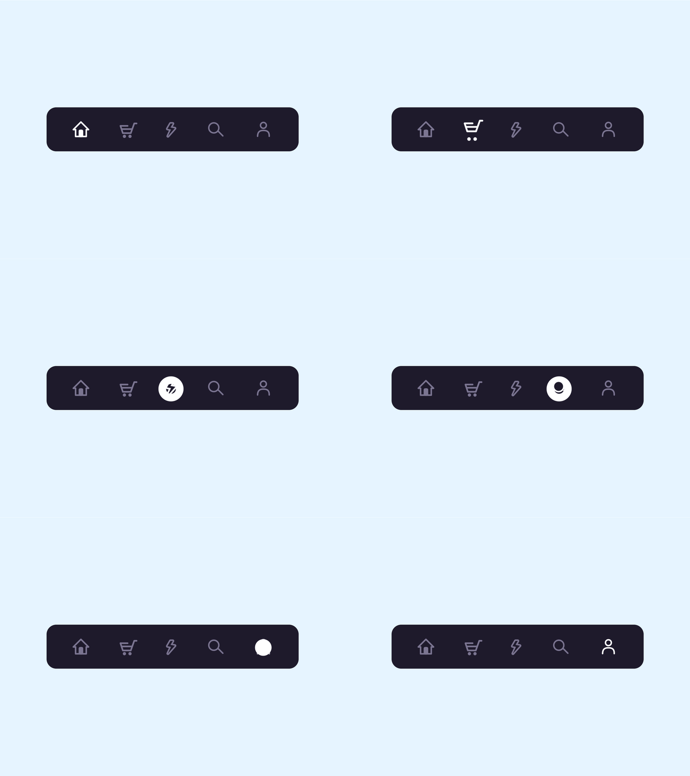
This project is inspired by this post from Dribbble and The Boring Flutter Development Show, Ep. 35

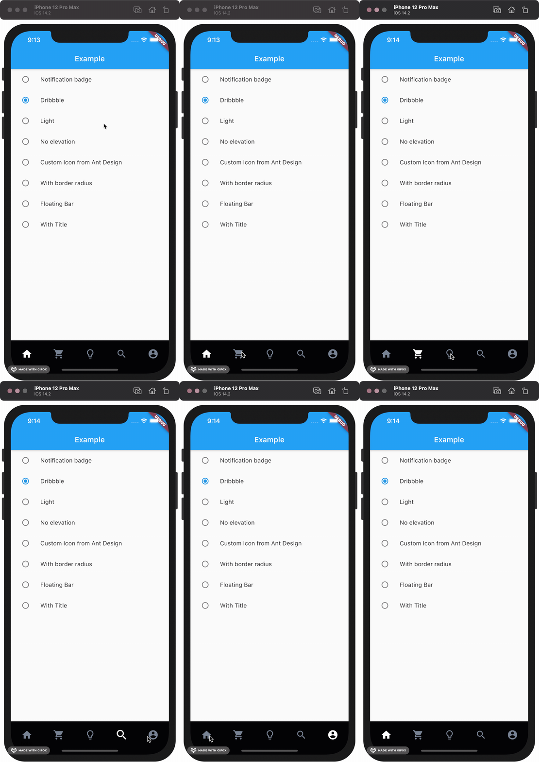
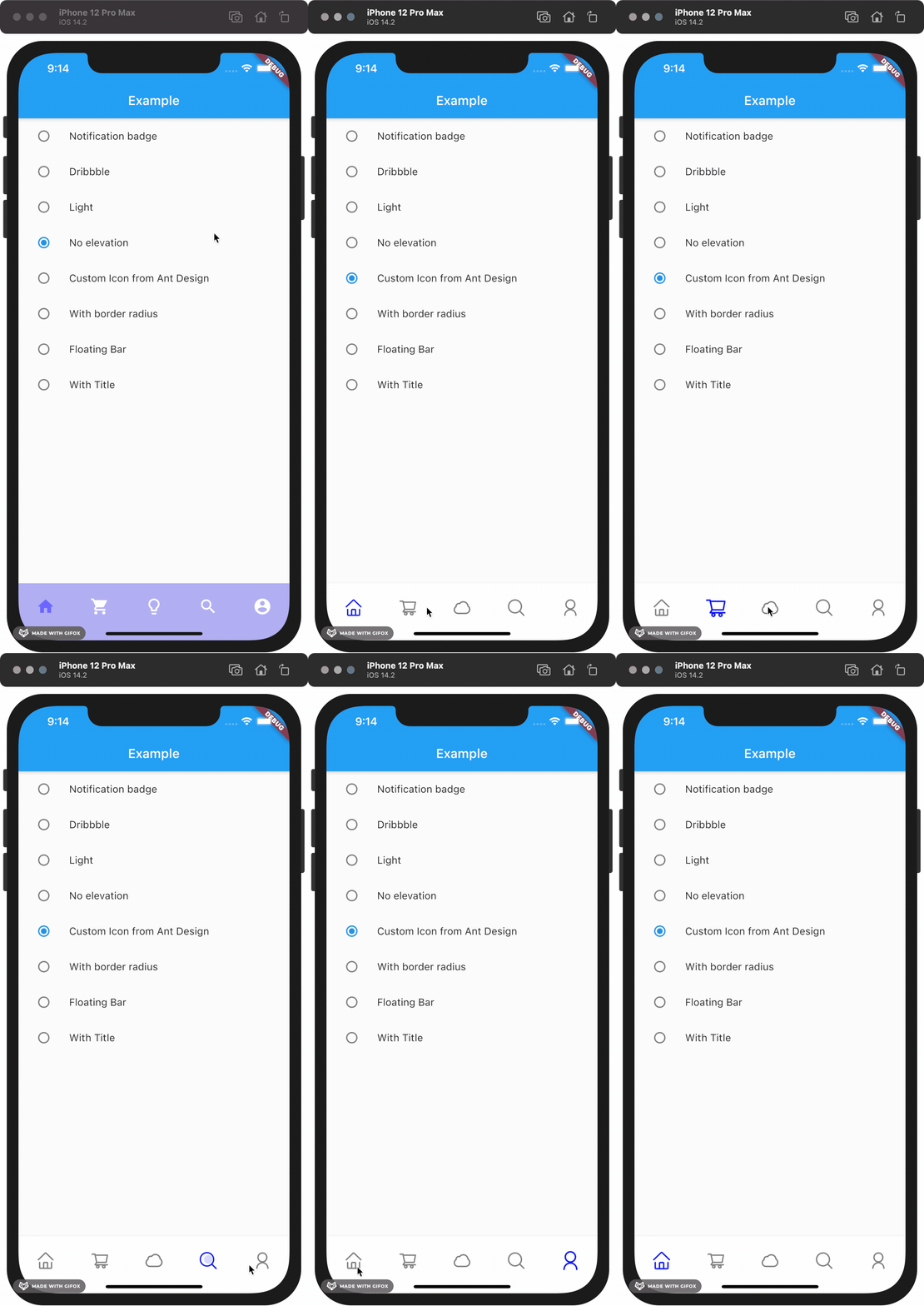
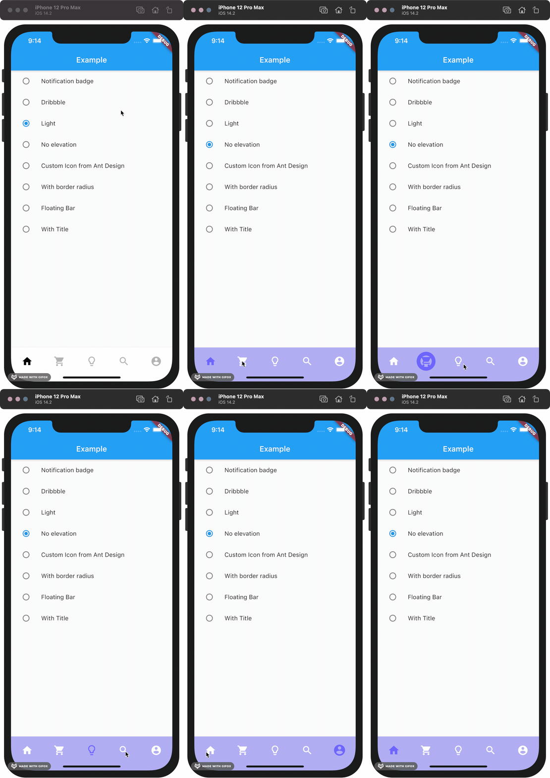
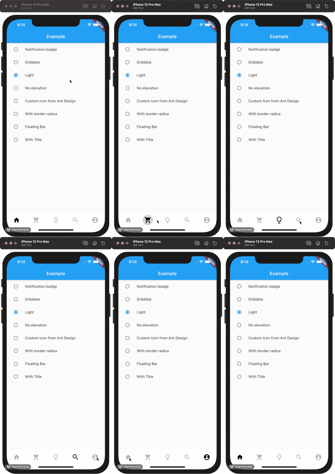
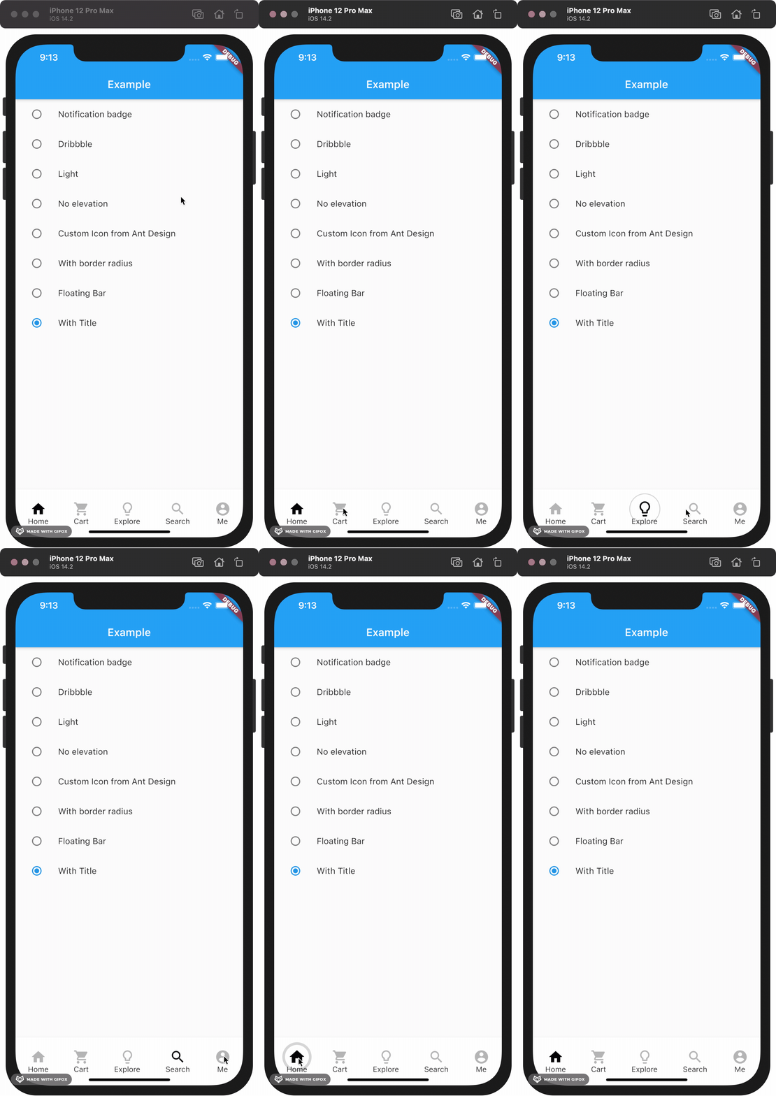
This package gives you a cute bubble effect when you click on the navigation bar.

Dribbble:

Implemented:

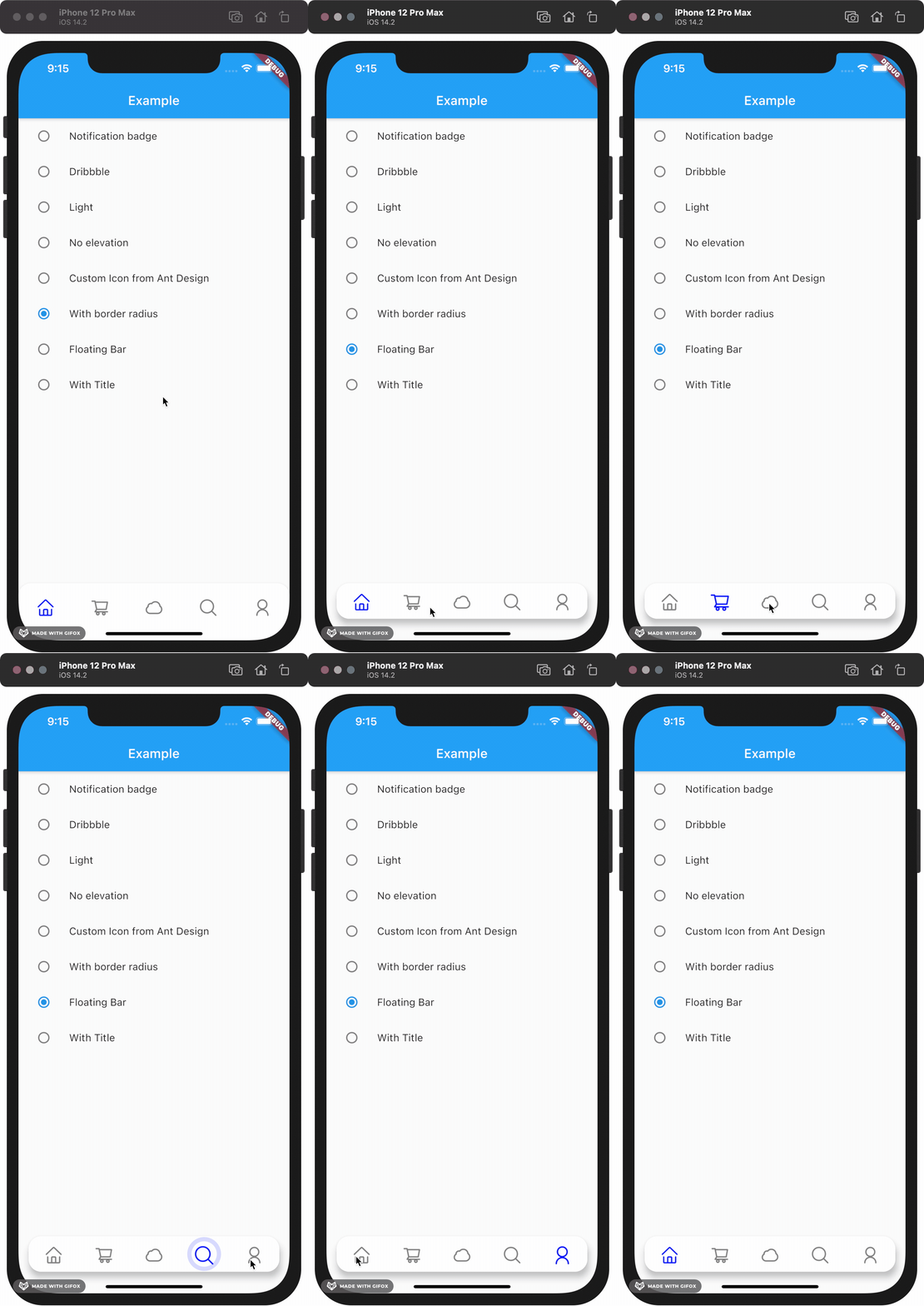
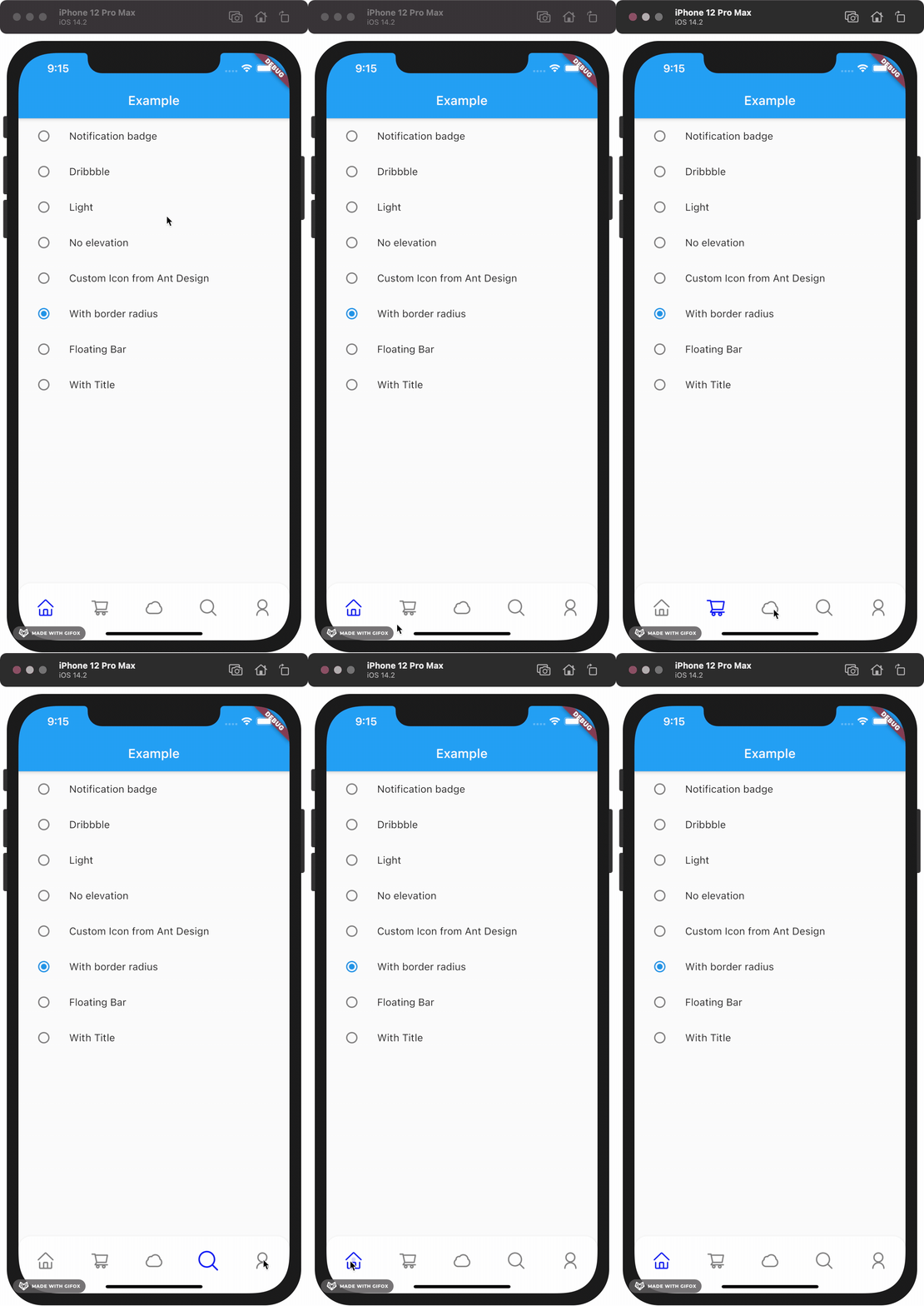
Gallery

How to install

Add this to your package's pubspec.yaml file:

dependencies:
  custom_navigation_bar: lastest version

Documentation

Attention

If you update from version under 0.6.0, there are some breaking changes in the version 0.6.0. The icon in CustomNavigationBarItem has changed from IconData to Widget.

old version

CustomNavigationBarItem(
      {@required this.icon,
      IconData selectedIcon,
      this.selectedTitle,
      this.unSelectedTitle,
      this.badgeCount = 0,
      this.showBadge = true})
      : selectedIcon = selectedIcon ?? icon;

  ///
  /// The icon of the item
  /// Typically the icon is an [Icon].
  ///
  final IconData icon;

new version

CustomNavigationBarItem(
      {@required this.icon,
      Widget selectedIcon,
      this.title,
      Text selectedTitle,
      this.badgeCount = 0,
      this.showBadge = false})
      : selectedIcon = selectedIcon ?? icon,
        selectedTitle = selectedTitle ?? title;

  ///
  /// The icon of the item
  /// Typically the icon is an [Icon].
  ///

  final Widget icon;      
You can customize these attributes in the navigation bar.
Attributes Type Description Default
scaleFactor double scale factor for the icon scale animation. 0.2
elevation double The z-coordinate of this CustomNavigationBar 8.0
items List item data in CustomNavigationBar required
selectedColor Color [Color] when [CustomNavigationBarItem] is selected [blueAccent]
unSelectedColor Color [Color] when [CustomNavigationBarItem] is not selected. grey[600]
onTap Function(int) callback function when item tapped null
currentIndex int current index of navigation bar. 0
iconSize double size of icon. also represent the max radius of bubble effect animation. 24.0
backgroundColor Color Background color of [CustomNavigationBar] Colors.white
strokeColor Color stroke color blueAccent
bubbleCurve Curve animation curve of bubble effect linear
scaleCurve Curve animation curve of scale effect linear
borderRadius Radius border radius of navigation bar Radius.zero
isFloating bool control if CustomNavigationBar is floating false
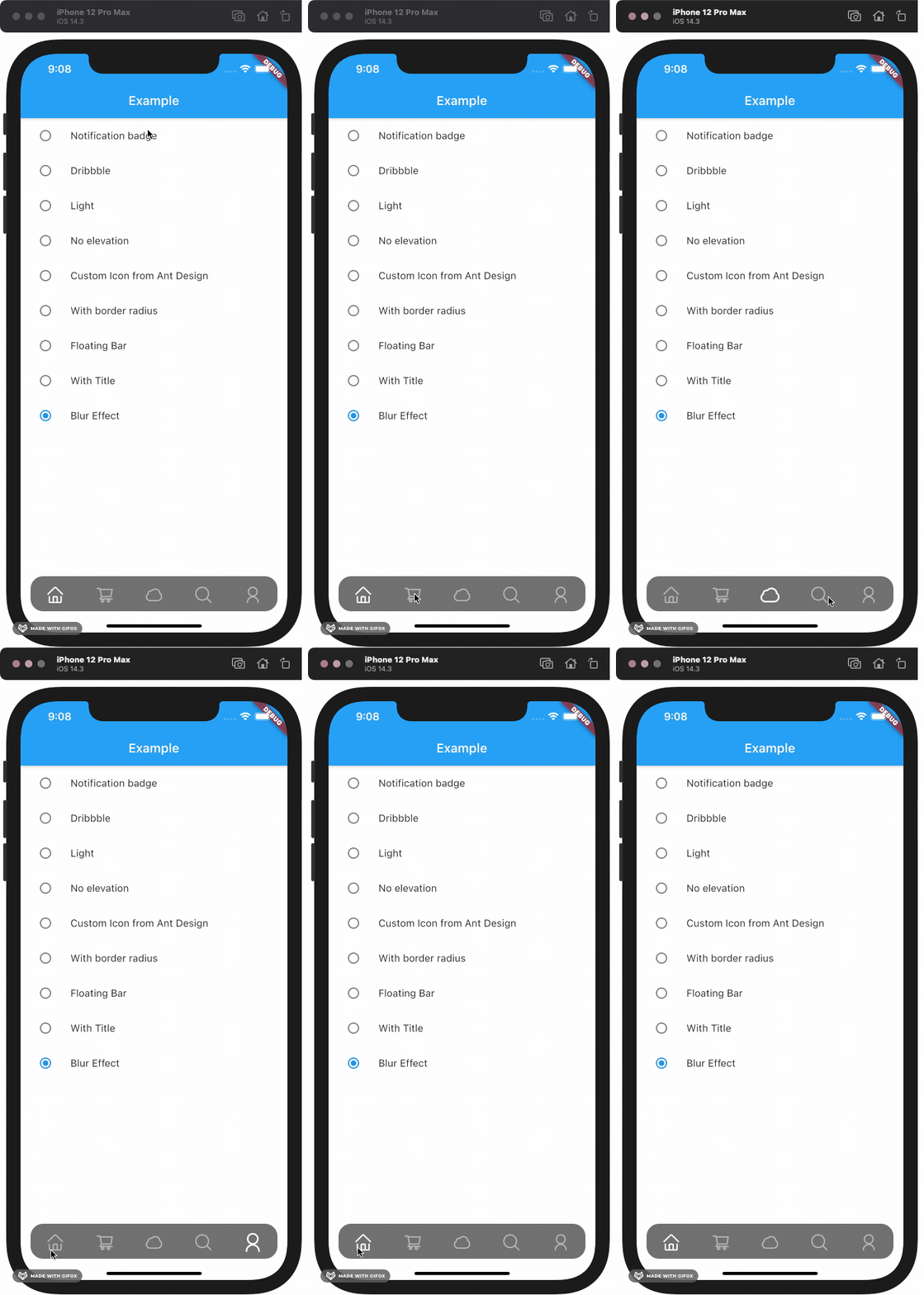
blurEffect bool control if CustomNavigationBar show blur effect false
opacity double control CustomNavigationBar blur effect opacity when blurEffect is true 0.8
brightness Brightness describes the contrast of a theme or color palette. If you want adaptive system display setting like iOS dark mode , you should set Brightness.dark or Brightness.light . if this attribute be set , other attributes with "*Color" (like selectedColor) will not take effect , should use lightThemeData or darkThemeData null
lightThemeData CustomNavigationBarThemeData when brightnessis light,you can custom the light theme color if you want it null
darkThemeData CustomNavigationBarThemeData when brightnessis dark,you can custom the dark theme color if you want it null

Attention: If you set isFloating to true, I would recommand you to set extendBody to true in Scaffold for a better performance.

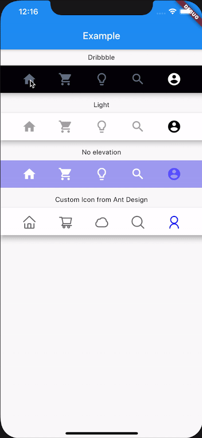
And for customize icon in the navigation bar, just put the icons you want in the CustomNavigationBarItem like this.

CustomNavigationBar(
        ...
        items: [
          CustomNavigationBarItem(
          icon: Icon(Icons.home),
          title: Text("hello"),
        ),
        CustomNavigationBarItem(
          icon: Icon(Icons.shopping_cart),
        ),
        CustomNavigationBarItem(
          icon: Icon(Icons.lightbulb_outline),
        ),
        CustomNavigationBarItem(
          icon: Icon(Icons.search),
        ),
        CustomNavigationBarItem(
          icon: Icon(Icons.account_circle),
        ),
        ],
        ...
      )

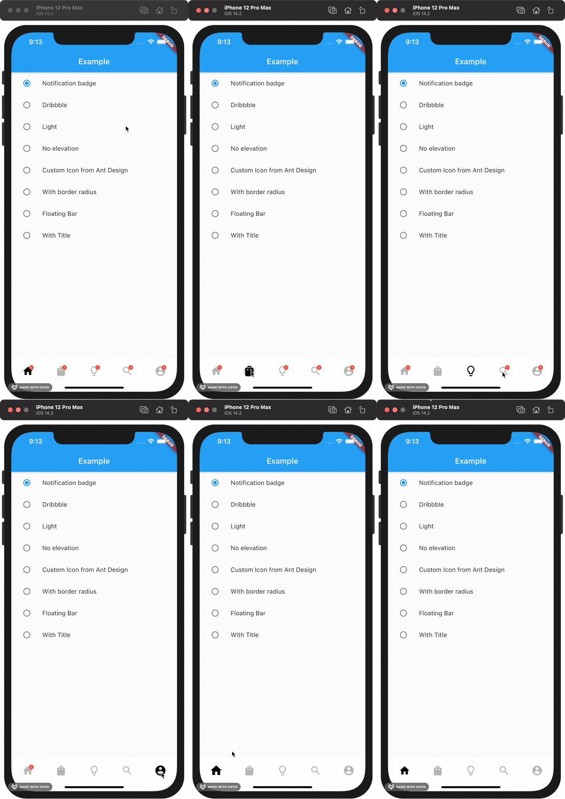
If you want add notification badge, just use like this

CustomNavigationBar(
        ...
        items: [
        CustomNavigationBarItem(
          icon: Icon(Icons.home),
          badgeCount: _badgeCounts[0],
          showBadge: _badgeShows[0],
        ),
        CustomNavigationBarItem(
          icon: Icon(Icons.shopping_bag),
          badgeCount: _badgeCounts[1],
          showBadge: _badgeShows[1],
        ),
        CustomNavigationBarItem(
          icon: Icon(Icons.lightbulb_outline),
          badgeCount: _badgeCounts[2],
          showBadge: _badgeShows[2],
        ),
        CustomNavigationBarItem(
          icon: Icon(Icons.search),
          badgeCount: _badgeCounts[3],
          showBadge: _badgeShows[3],
        ),
        CustomNavigationBarItem(
          icon: Icon(Icons.account_circle),
          badgeCount: _badgeCounts[4],
          showBadge: _badgeShows[4],
        ),
      ],
        ...
      )

To clear a badge, set showBadge to false

If you want add title under icon, just use like this

CustomNavigationBar(
      iconSize: 30.0,
      selectedColor: Color(0xff040307),
      strokeColor: Color(0x30040307),
      unSelectedColor: Color(0xffacacac),
      backgroundColor: Colors.white,
      items: [
        CustomNavigationBarItem(
          icon: Icon(Icons.home),
          title: Text("Home"),
        ),
        CustomNavigationBarItem(
          icon: Icon(Icons.shopping_cart),
          title: Text("Cart"),
        ),
        CustomNavigationBarItem(
          icon: Icon(Icons.lightbulb_outline),
          title: Text("Explore"),
        ),
        CustomNavigationBarItem(
          icon: Icon(Icons.search),
          title: Text("Search"),
        ),
        CustomNavigationBarItem(
          icon: Icon(Icons.account_circle),
          title: Text("Me"),
        ),
      ],
      currentIndex: _currentIndex,
      onTap: (index) {
        setState(() {
          _currentIndex = index;
        });
      },
    );

Example

Check example app for more details.

Contribute

Issues and pull requests are welcomed!!

Future Plans
  • [x] Code format
  • [x] Make it more like native navigation bar in Flutter.
  • [x] Better documentation
  • [ ] More customizations!! And more...

所属分类

源码仓库

使用此插件的项目

暂无相关数据。