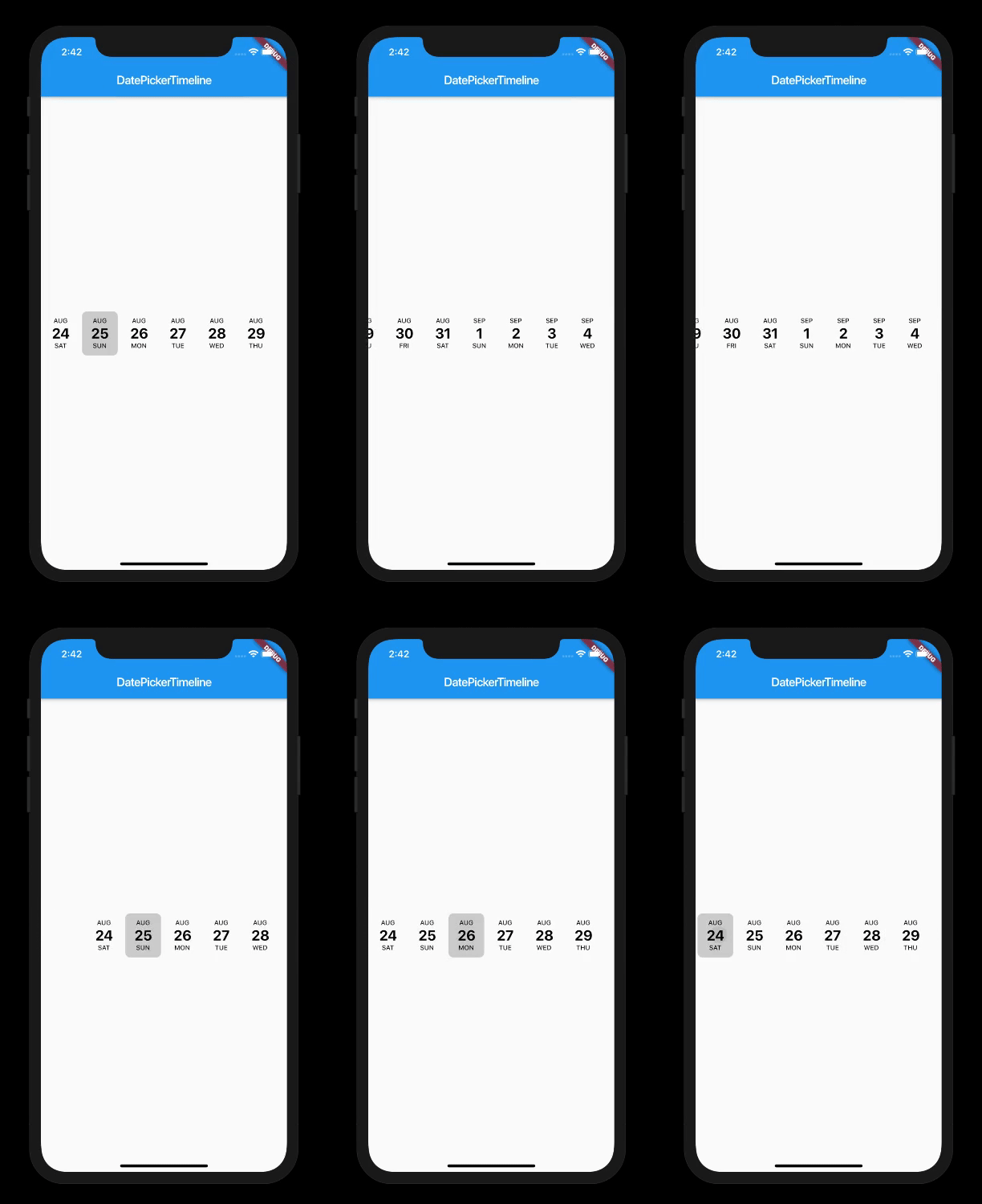
Flutter Date Picker Library that provides a calendar as a horizontal timeline.
Design showcase
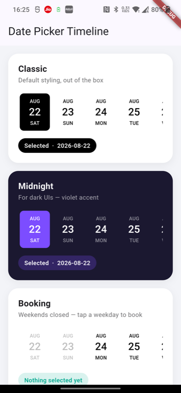
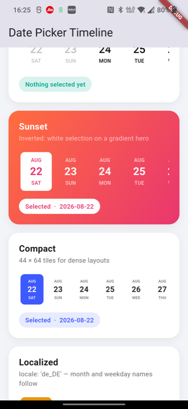
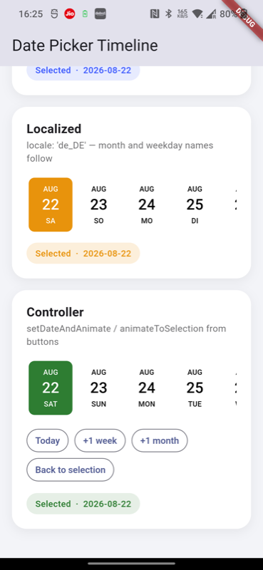
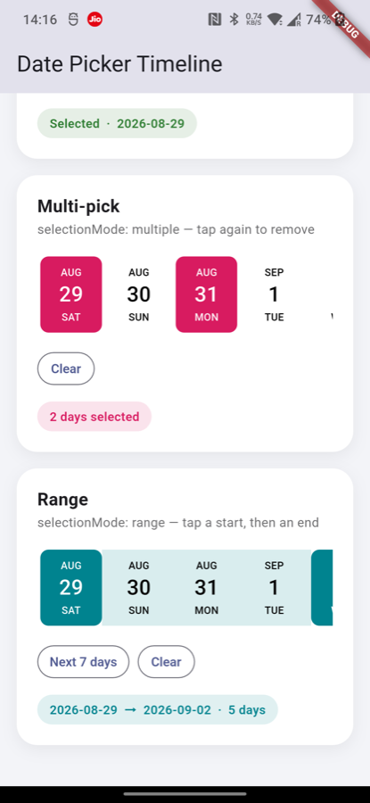
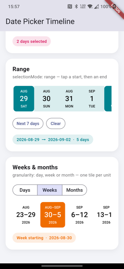
The example app contains eleven ready-made designs
you can copy into your project — Classic, Past & future (showPastDates),
Midnight (dark theme), Booking (weekends disabled), Sunset (gradient hero),
Compact, Localized, a controller playground, Multi-pick
(selectionMode: multiple), Range (selectionMode: range), and
Weeks & months (granularity):
Date highlighted when the picker first builds. single mode only — use selectedDates with the other modes
selectionColor
Color
Color(0x30000000)
Background color of the selected tile
selectedTextColor
Color
Colors.white
Text color inside the selected tile
deactivatedColor
Color
Color(0xFF666666)
Text color for deactivated dates
monthTextStyle
TextStyle
11px, w500, black
Style for the month label
dateTextStyle
TextStyle
24px, w500, black
Style for the day-of-month number
dayTextStyle
TextStyle
11px, w500, black
Style for the weekday label
inactiveDates
List<DateTime>?
null
These dates are greyed out and can't be selected (e.g. weekends, holidays). In week/month granularity one entry deactivates its whole unit
activeDates
List<DateTime>?
null
Only these dates can be selected; everything else is deactivated. Can't be combined with inactiveDates
selectionMode
SelectionMode
single
single, multiple (tapping a selected day removes it) or range (first tap sets the start, second the end; an earlier second tap swaps the endpoints)
selectedDates
List<DateTime>?
null
Seeds the selection and adopts the list again whenever its contents change between builds. In range mode it holds [start, end]. null = the picker owns its selection; pass [] to clear
onSelectionChange
void Function(List<DateTime>)?
null
Called with the whole selection after every tap, in every mode. In range mode it fires with one date after the first tap and two after the second
rangeColor
Color
Color(0x1F000000)
Band painted behind the days between the range endpoints
rangeTextColor
Color?
null
Text color for the days between the endpoints; defaults to the normal text styles
daysCount
int
500
How many tiles to render — days, weeks or months depending on granularity
granularity
DateGranularity
day
One tile per day (default), per week, or per month. Week/month tiles select and emit the first day of their unit. Gregorian calendar only
firstDayOfWeek
int?
null
First day of the week for granularity: week, as a DateTime.monday..DateTime.sunday constant. Defaults to the ambient locale's first day of week (Sunday for en_US); ignored in the other granularities
showScrollbar
bool
false
Shows an always-visible horizontal scrollbar in its own 12px gutter below the tiles (total height becomes height + 12). Style it with an ancestor ScrollbarTheme
showPastDates
bool
false
Also show past dates: half of daysCount falls before startDate, the picker opens with the selection (or startDate) centered, and controller methods scroll dates to the center instead of the leading edge
onDateChange
void Function(DateTime)?
null
Called with the tapped date whenever the selection changes. Fires in single mode only — use onSelectionChange for multiple and range
locale
String
"en_US"
Locale for month and weekday names (e.g. "de_DE", "fr_FR")
calendarType
CalendarType
gregorianDate
gregorianDate or persianDate (Jalali). persianDate supports day granularity only
directionality
TextDirection?
null
Overrides scroll direction; defaults to RTL for the Persian calendar, LTR otherwise
Time-of-day components are ignored everywhere — dates are compared by
calendar day, so passing DateTime.now() is always safe.
Multiple and range selection
// Any number of days — tapping a selected day removes it:DatePicker(
DateTime.now(),
selectionMode: SelectionMode.multiple,
selectedDates: _picked,
onSelectionChange: (dates) => setState(() => _picked = dates),
)
// A start/end pair — the days in between get a translucent band:DatePicker(
DateTime.now(),
selectionMode: SelectionMode.range,
selectedDates: _range, // [], [start] or [start, end]
rangeColor: Colors.teal.withValues(alpha: 0.15),
onSelectionChange: (dates) => setState(() => _range = dates),
)
The range endpoints keep the selectionColor pill; the days in between are
painted with rangeColor and keep the normal text styles (rangeTextColor
overrides them). Deactivated days inside a range stay grey and untappable but
the band runs through them. onSelectionChange reports the endpoints,
never the expanded span — expand it when you need every day:
final days = [
  for (var d = range.first;
      !d.isAfter(range.last);
      d = DateUtils.addDaysToDate(d, 1))
    d,
];
Passing selectedDates makes the picker a controlled component: pass the
value received in onSelectionChange back in, or push a different list to
override what the user picked (e.g. to enforce a maximum). A parent that
rebuilds with an equal list leaves the picker's own state untouched.
Weeks and months
DatePicker(
  DateTime.now(),
  granularity: DateGranularity.week, // one tile per week
  firstDayOfWeek: DateTime.monday,   // optional; defaults to the locale's
  daysCount: 26,                     // number of week tiles
  width: 72,                         // give day spans a little more room
  onDateChange: (weekStart) => ...,  // always the unit's first day
)
Week tiles read AUG / 22–28 / 2026 (or AUG–SEP / 30–5 when a week crosses
months); month tiles read 2026 / SEP. The three rows use the existing
monthTextStyle / dateTextStyle / dayTextStyle, so every styling recipe
works unchanged. Selection modes compose — a range of weeks paints the band
across the weeks in between — and any date passed to the picker or the
controller addresses its containing unit: animateToDate scrolls to the
unit's tile, setDateAndAnimate selects the unit, selectedDates reports
unit start dates, and an inactiveDates entry deactivates its whole unit.
DatePickerController
Attach a controller to move the timeline from code:
final _controller = DatePickerController();

DatePicker(
  DateTime.now(),
  controller: _controller,
  ...
)

// Somewhere in your code:
_controller.animateToSelection();                 // scroll back to the selected date
_controller.jumpToSelection();                    // same, without animation
_controller.animateToDate(someDate);              // scroll to a date (selection unchanged)
_controller.setDateAndAnimate(someDate);          // select a date AND scroll to it
Member
Description
jumpToSelection()
Jumps instantly to the selected date
animateToSelection({duration, curve})
Animates to the selected date
animateToDate(date, {duration, curve})
Animates to date without changing the selection
setDateAndAnimate(date, {duration, curve})
Selects date, repaints the highlight, and animates to it
isAttached
Whether the controller is attached to a mounted DatePicker
selectedDates
Unmodifiable snapshot of the selection, oldest-first ([start, end] in range mode)
select(date)
Adds date per the current mode (replaces in single, adds in multiple, sets or completes the range)
deselect(date)
Removes date from the selection (single/multiple modes)
clearSelection()
Empties the selection in every mode
selectRange(start, end)
Sets both range endpoints at once, swapping them when reversed
All methods are safe no-ops when the controller isn't attached, nothing is
selected yet, or the target date is outside the rendered range. With
showPastDates: true every method centers the target date in the viewport
instead of aligning it to the leading edge. jumpToSelection and
animateToSelection target the most recently tapped or programmatically
selected date. Controller methods change the selection silently —
onDateChange/onSelectionChange fire for user taps only.
Recipes
Timeline with history — today opens centered, past on the left:
DatePicker(
  DateTime.now(),
  showPastDates: true,   // 60 past days + 60 future days
  daysCount: 120,
  initialSelectedDate: DateTime.now(),
  ...
)
Disable weekends (Booking design):
final weekends = [
  for (var i = 0; i < 60; i++)
    if (DateUtils.addDaysToDate(DateTime.now(), i).weekday >= DateTime.saturday)
      DateUtils.addDaysToDate(DateTime.now(), i),
];

DatePicker(
  DateTime.now(),
  inactiveDates: weekends,
  daysCount: 60,
  ...
)
Dark theme (Midnight design) — provide explicit text styles, since the
defaults are black: