搜索插件、代码仓与 APP 分类

dialogs 封面
插件详情v0.0.7

dialogs

此 Flutter 包提供经过精心设计的对话框,具有自定义选项。

AndroidiOSWebmacOSWindowsLinux
近 30 天下载
137
喜欢数
26
Pub 分数
130

安装插件

flutter pub add dialogs

插件介绍

基于插件公开信息、社区数据与项目使用情况整理的选型参考。

dialogs 包为 Flutter 应用程序提供了一组设计精美、可自定义的对话框组件。该包注重细节和用户体验,确保在所有平台上提供一致且现代的对话框界面。开发者可以轻松集成并调整对话框以匹配其应用的设计语言,支持样式、动画和行为的自定义选项。该包支持 Android、iOS、Web、macOS、Windows 和 Linux,确保跨平台兼容性。非常适合以精致的方式显示警告、确认和自定义模态框。

适合场景

  • 显示警告消息
  • 处理用户确认
  • 创建自定义模态对话框
  • 显示加载指示器
  • 实现表单验证反馈
  • 增强跨平台的UI一致性

主要特点

  • 美观、现代的设计
  • 丰富的自定义选项
  • 跨平台支持
  • 与 Flutter 的轻松集成
  • 内置动画
  • 响应式布局处理

适合对象

  • 寻求精美对话框的Flutter开发人员
  • 需要在跨平台保持一致的用户界面的应用程序
  • 强调用户体验的项目
  • 希望快速实现对话的开发者
  • 专注于设计一致性的团队
  • 需要轻量级对话解决方案的应用程序

使用建议

  • 仅限对话组件
  • 自定义可能需要学习特定的 API
  • 不适合复杂的导航流程
  • 依赖于 Flutter 的 Material 或 Cupertino 主题
  • 可能需要额外的样式来处理非标准用例
  • 无内置国际化支持

原始 README

以下为关联源码仓库的 README 原文快照,最新内容请访问源码仓库。

Dialogs - dialogs

This flutter package provides aesthetically designed dialog box with customization options.

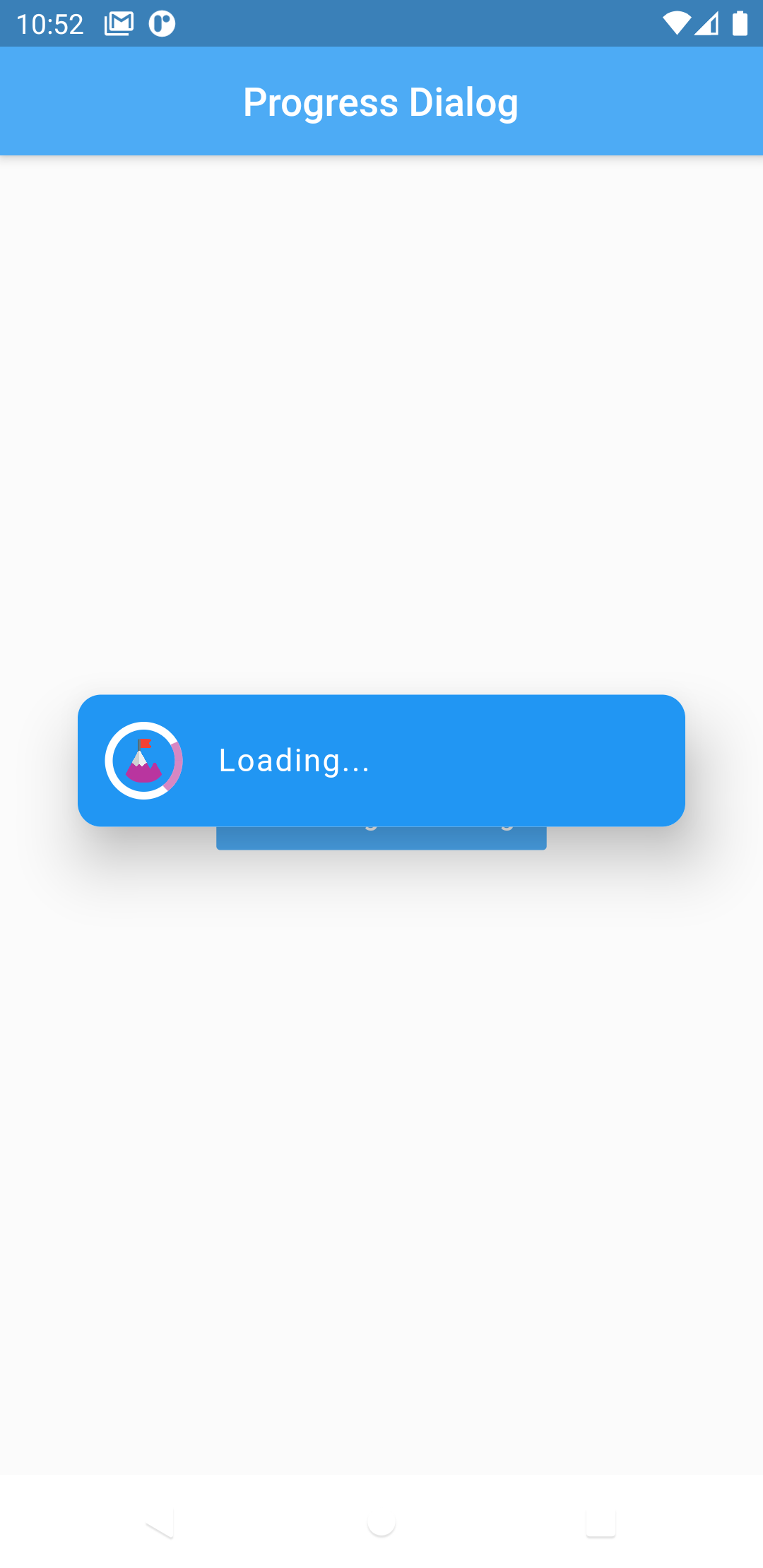
Now comes with legacy_progress_dialog

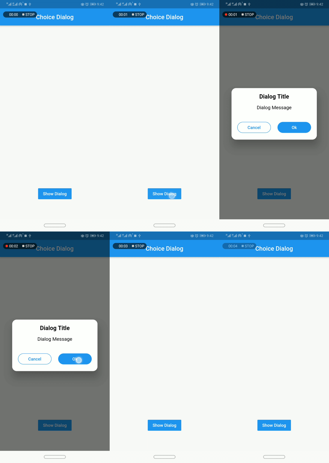
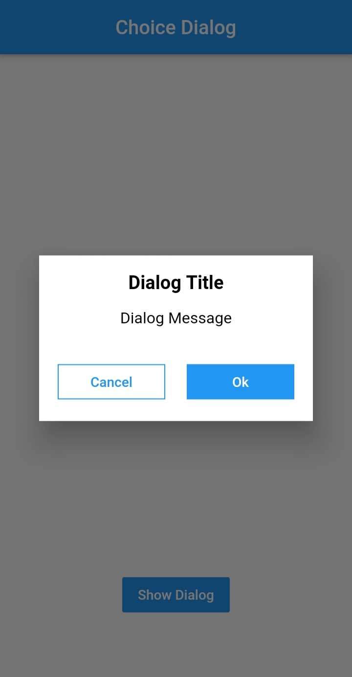
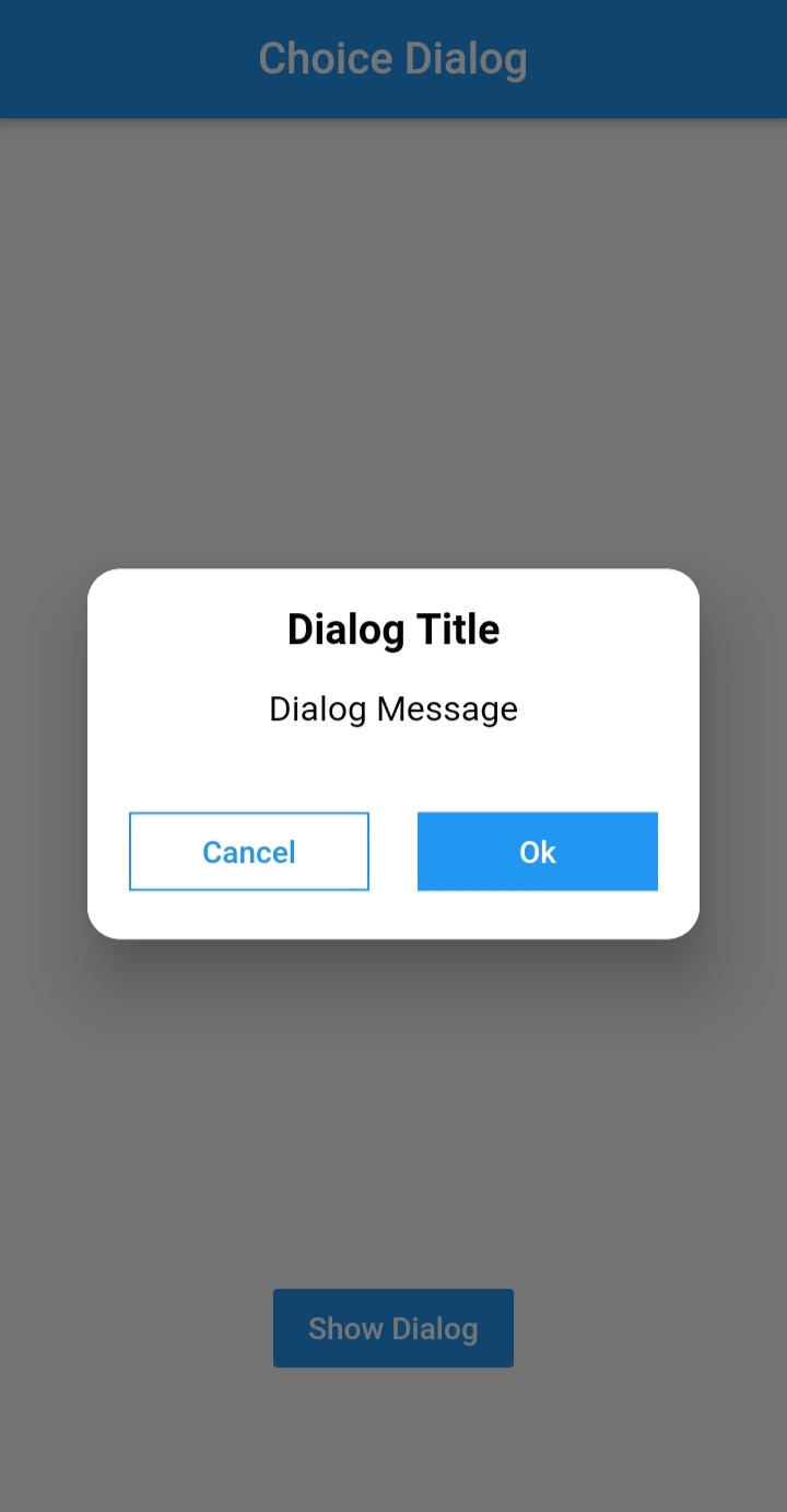
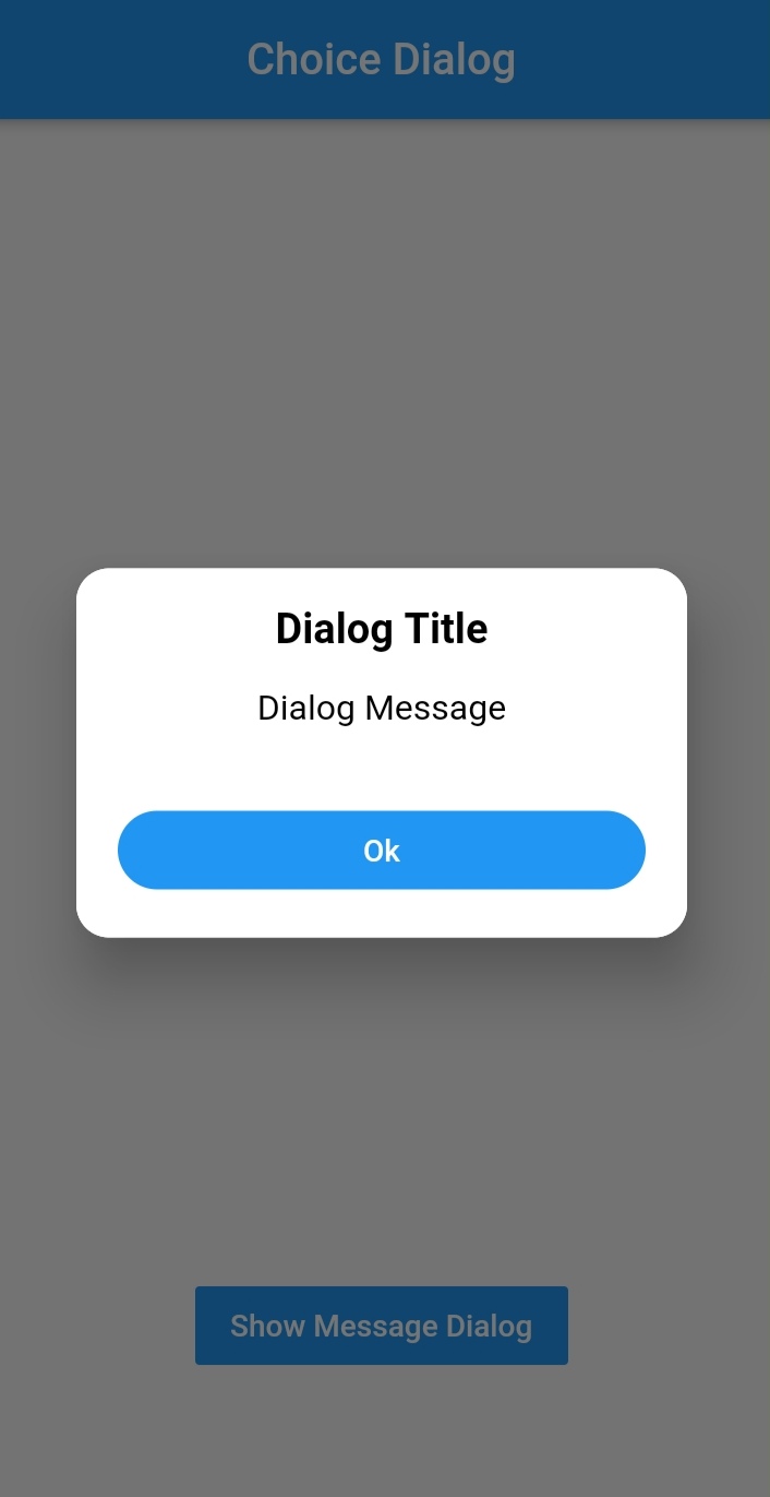
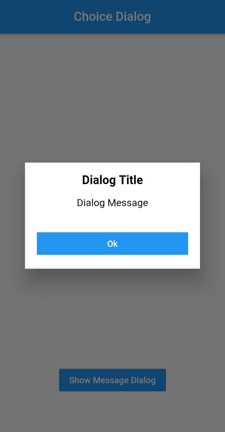
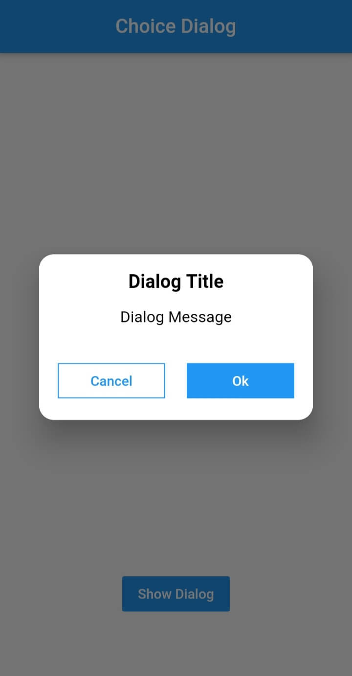
Choice Dialog

Choice Dialog Choice Dialog Rectangular Choice Dialog Rectangular Buttons

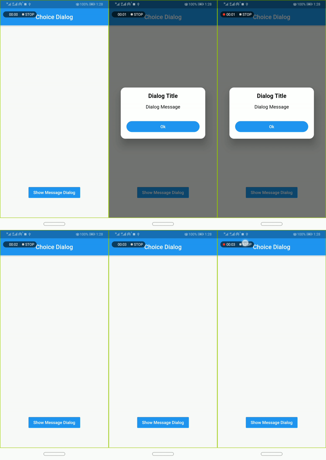
Message Dialog

Message Dialog Gif Message Dialog Message Dialog

Pub Version GitHub Workflow Status Github Stars GitHub

Simple Usage

To use this plugin, add dialogs as a dependency in your pubspec.yaml file.

Implementation:
  • import 'package:dialogs/dialogs.dart';
ChoiceDialog
  • use ChoiceDialog().show() function to display the dialog.

ChoiceDialog().show(context);

##OR


final choiceDialog = ChoiceDialog();
choiceDialog.show(context);

MessageDialog
  • use MessageDialog().show() function and call the Choice Dialog .

MessageDialog().show(context);

OR


final messageDialog = MessageDialog();
choiceDialog.show(context);

Show progress dialog :
//Create an instance of ProgressDialog
ProgressDialog progressDialog = ProgressDialog(
                  context: context,
                  backgroundColor: Colors.blue,
                  textColor: Colors.White,
                );
// show dialog
progressDialog.show();

//close dialog
progressDialog.dismiss();

You are good to go 💯


In order to add the ChoiceDialog, MessageDialog to your app, there are several attributes that are important parameters that you might need frequently:

Attribute Type Default Required Description
buttonOkOnPressed Function() Navigator.pop(context) No This function will be registered as the callback of 'Ok' button.
buttonCancelOnPressed Function() Navigator.pop(context) No This function will be registered as the callback of 'Cancel' button.
dialogRadius double 15.0 No Determines the borderRadius of dialog box.
buttonRadius double 18.0 No Determines the borderRadius of action buttons.
iconButtonOk Icon null No Renders a FlatButton with the provided icon for positive action.
iconButtonCancel Icon null No Renders a FlatButton with the provided icon for negative action.


show() also provides some useful parameters of showDialog() function

Attribute Type Default Required Description
context BuildContext Null Yes The context argument is used to look up the Navigator and Theme for the dialog.
barrierDismissible bool true No Indicates whether tapping on the barrier will dismiss the dialog.
barrierColor Color Colors.black54 No Specifies the color of the modal barrier that darkens everything below the dialog.

CREDITS

Contributors

Made with contributors-img.

所属分类

源码仓库

使用此插件的项目

暂无相关数据。