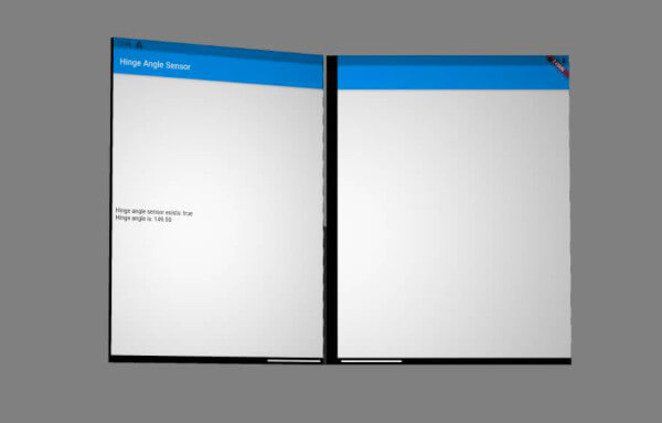
dual_screen 包为可折叠和双屏设备提供 Flutter 支持,使开发者能够构建自适应用户界面。它包含 TwoPane 小部件,用于在两个屏幕上管理布局,并提供铰链角度传感器数据访问,使应用程序能够动态响应设备的折叠状态。该包专为 Android 设计,有助于在 Microsoft 的 Surface Duo 等设备上创建无缝体验。该包与 Flutter 的渲染管道集成,确保根据物理设备变化实现流畅过渡和响应式布局。
适合场景
为可折叠设备构建自适应用户界面
使用 TwoPane 创建分屏布局
响应铰链角度变化
为双屏优化应用布局
开发多窗格导航模式
主要特点
用于双屏布局的 TwoPane 小部件
合页角度传感器数据集成
Android 特定的可折叠设备支持
动态布局适应
Flutter 原生性能
适合对象
面向可折叠 Android 设备的开发者
需要分屏或多窗格界面的应用程序
为 Microsoft Surface Duo 开发的团队
专注于自适应布局的UI设计师
需要双屏逻辑的跨平台应用
使用建议
仅限Android平台
需要兼容的硬件进行测试
可能需要额外的布局逻辑来处理边缘情况
取决于设备制造商对铰链传感器的实现
不适用于非折叠设备
原始 README
以下为关联源码仓库的 README 原文快照,最新内容请访问源码仓库。
Flutter Dual Screen
This contains Microsoft's offerings to streamline foldable and dual-screen development using Flutter. This plugin will work on any platform, but only Android actually has foldable and dual screen devices.
Flutter already has support for foldable and dual-screen devices in the form of MediaQuery Display Features. In addition to that, this plugin offers:
The TwoPane widget, which relies on display features coming from MediaQuery.
Access to the hinge angle sensor data, which for performance concerns, was not included in MediaQuery.
TwoPane Widget
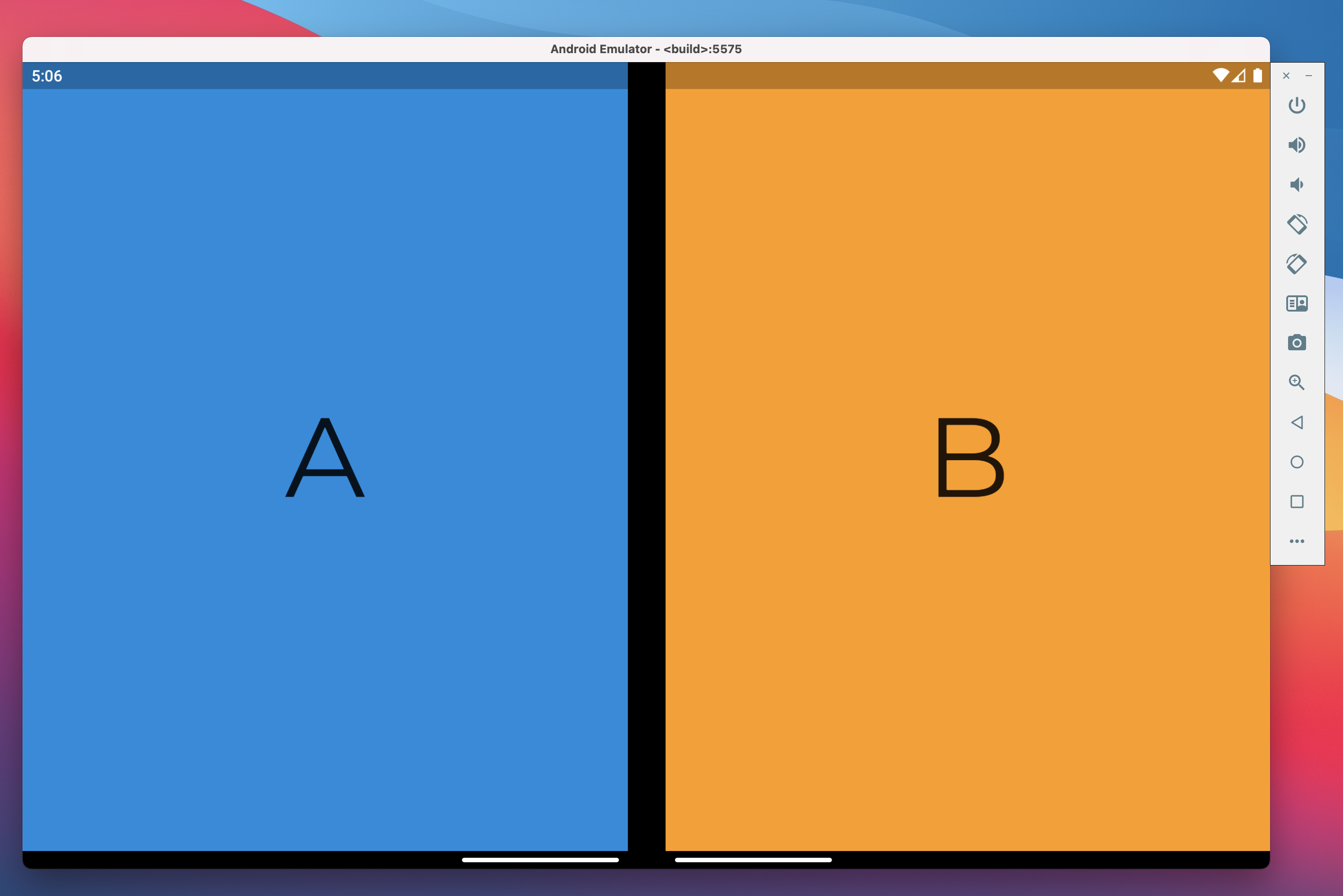
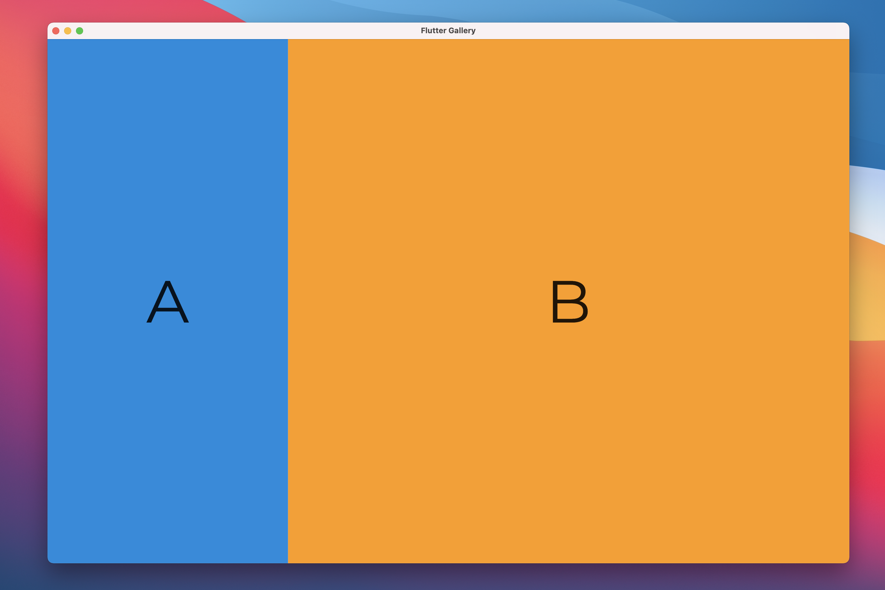
This layout has two child panes, which can be shown side-by-side, above-and-below, or a single pane can be prioritized. The relative size of the two pane widgets can be adjusted proportionally; and on dual-screen devices the boundary snaps to the hinge area.
startPane - Start pane, which can sit on the left for left-to-right layouts, or at the top for top-to-bottom layouts. If panePriority is start and there is no hinge, this is the only visible pane.
endPane - End pane, which can sit on the right for left-to-right layouts, or at the bottom for top-to-bottom layouts. If panePriority is end, and there is no hinge, this is the only visible pane.
paneProportion - Proportion of the screen occupied by the start pane. The end pane takes over the rest of the space. A value of 0.5 will make the two panes equal. This property is ignored for displays with a hinge, in which case each pane takes over one screen.
panePriority - Whether to show only one the start pane, end pane, or both. This property is ignored for displays with a hinge, in which case both panes are visible.
direction - Whether to stack the two panes verticaly or horizontaly, similar to Flex direction. This property is ignored for displays with a hinge, in which case the direction is horizontal for vertical hinges and vertical for horizontal hinges.
textDirection - When panes are laid out horizontally, this determines which one goes on the left. Behaves the same as Flex textDirection
verticalDirection - When panes are laid out vertically, this determines which one goes at the top. Behaves the same as Flex verticalDirection
padding - The padding between TwoPane and the edges of the screen. If there is spacing between TwoPane and the root MediaQuery, padding is used to correctly align the two panes to the hinge.
allowedOverrides - The parameters that TwoPane is allowed to override when a separating display feature is found. By default, it contains paneProportion, direction and panePriority, allowing all possible overrides.
Most of the parameters provided to TwoPane are ignored when the device has a hinge. This means that you can focus on how the layout works on large screens like tablets and desktops, while also having it adapt well to the dual-screen form factor by default.
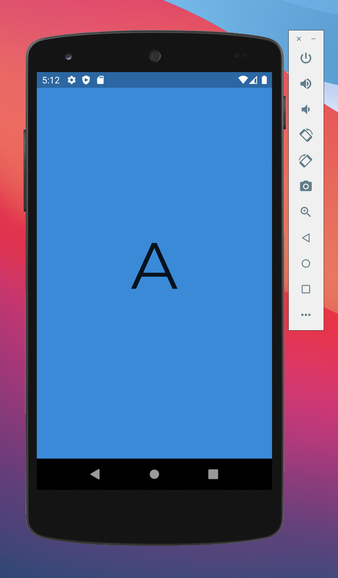
This sample code produces the results at the beginning of this article:
On Surface Duo, widget A and widget B both take one screen.
On a tablet or desktop, widget A takes 30% of the screen while widget B takes the remaining 70%.
On a small phone which is less than 500 logical pixels wide, only widget A is visible.
Hinge angle sensor
Foldable and dual-screen devices have a hinge between the two moving parts of the screen. This hinge has a sensor, reporting the angle between the parts of the screen. For example, when these parts lay flat to form a continuous surface, the hinge angle reports a 180 deg angle.
The hinge angle is used to determine the device posture. If you're looking to write code that depends on the device posture, we recommend using the functionality provided by MediaQuery Display Features instead.
Hinge angle API
To use this plugin, add dual_screen as a dependency in your pubspec.yaml file.
This will allow you to import DualScreenInfo import 'package:dual_screen/dual_screen.dart';
DualScreenInfo exposes 2 static properties:
hingeAngleEvents: Broadcast stream of events from the device hinge angle sensor. If the device is not equipped with a hinge angle sensor, the stream produces no events.
hasHingeAngleSensor: Future returning true if the device has a hinge angle sensor. Alternatively, if your app already uses MediaQuery.displayFeatures or MediaQuery.hinge to adapt to foldable or dual-screen form factors, you can safely assume the hinge angle sensor exists and that hingeAngleEvents produces usable values.
Examples on how to mock the hinge angle or display features can be found in the test folder.
Testing the hinge angle sensor functionality can be done using the Surface Duo emulator or one of the foldable emulators available in Android Studio. Both emulators provide a hinge angle virtual sensor. The Surface Duo emulator is the only one with two separate screens.
Contributing
This project welcomes contributions and suggestions. Most contributions require you to agree to a
Contributor License Agreement (CLA) declaring that you have the right to, and actually do, grant us
the rights to use your contribution. For details, visit https://cla.opensource.microsoft.com.
When you submit a pull request, a CLA bot will automatically determine whether you need to provide
a CLA and decorate the PR appropriately (e.g., status check, comment). Simply follow the instructions
provided by the bot. You will only need to do this once across all repos using our CLA.
This project has adopted the Microsoft Open Source Code of Conduct.
For more information see the Code of Conduct FAQ or
contact [opencode@microsoft.com](mailto:opencode@microsoft.com) with any additional questions or comments.
Trademarks
This project may contain trademarks or logos for projects, products, or services. Authorized use of Microsoft
trademarks or logos is subject to and must follow
Microsoft's Trademark & Brand Guidelines.
Use of Microsoft trademarks or logos in modified versions of this project must not cause confusion or imply Microsoft sponsorship.
Any use of third-party trademarks or logos are subject to those third-party's policies.