搜索插件、代码仓与 APP 分类

插件详情v0.0.2

easy_dashboard

一个用于轻松创建仪表板布局和其他导航功能的包。旨在使响应式仪表板的制作变得简单。

AndroidiOSLinuxmacOSWebWindows
近 30 天下载
84
喜欢数
51
Pub 分数
150

安装插件

flutter pub add easy_dashboard

插件介绍

基于插件公开信息、社区数据与项目使用情况整理的选型参考。

Easy Dashboard 是一个 Flutter 包,旨在简化响应式仪表板布局和导航界面的创建。它通过内置的响应式设计模式支持,使开发者能够快速构建在移动设备、网页和桌面端都能无缝运行的自适应 UI。该包专注于减少样板代码,提升开发复杂仪表板系统时的生产力。

适合场景

  • 构建管理面板
  • 创建响应式数据仪表板
  • 设计多屏幕导航
  • 开发跨平台监控应用
  • 基于布局的仪表板实现

主要特点

  • 响应式布局支持
  • 内置的导航工具
  • 跨平台兼容性
  • 所需的最小设置
  • Flexible widget 组合

适合对象

  • Flutter 开发人员构建管理界面
  • 需要快速原型设计仪表板的团队
  • 需要在各种设备上实现响应式UI的项目
  • 专注于UI一致性的开发人员
  • 具有复杂导航结构的应用程序

使用建议

  • 可能需要针对高度独特的布局进行自定义
  • 除了基本示例外,文档有限
  • 最适合标准仪表板模式
  • 不适合非仪表板界面
  • 依赖于 Flutter 的渲染性能

原始 README

以下为关联源码仓库的 README 原文快照,最新内容请访问源码仓库。

Easy Dashboard

Pub

easy dashboard

Provides an easy way to build dashboard layout for your app , but still yet very customizable .

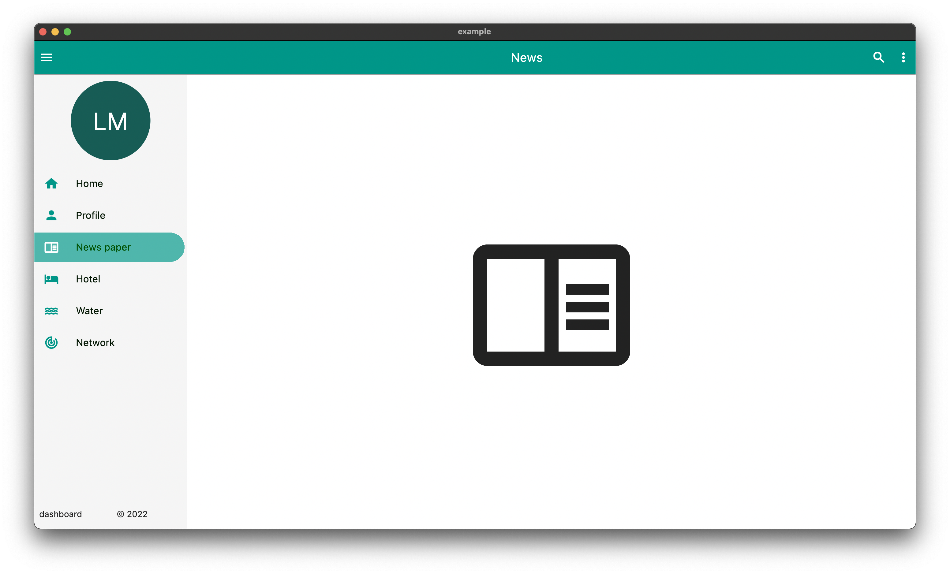
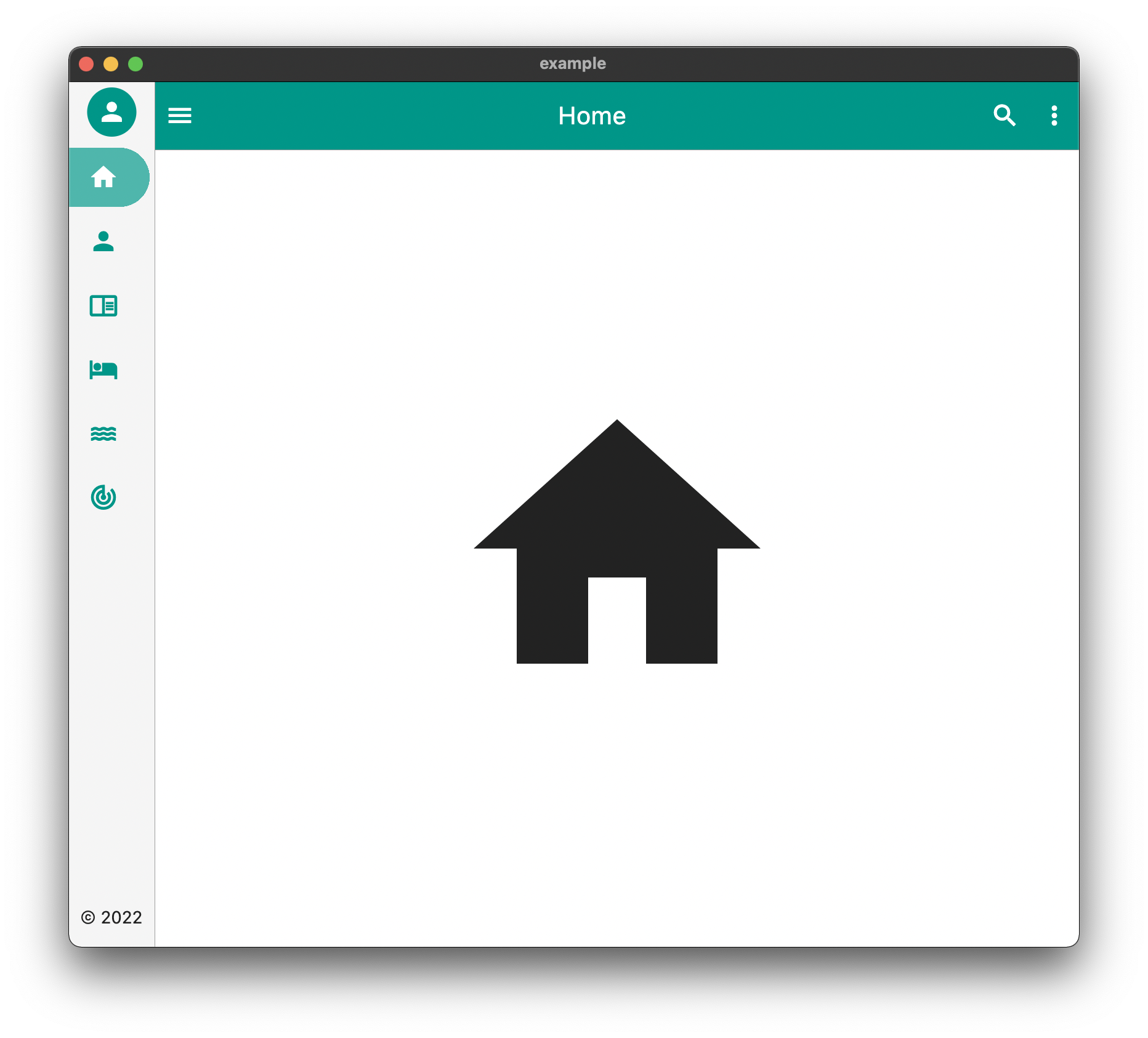
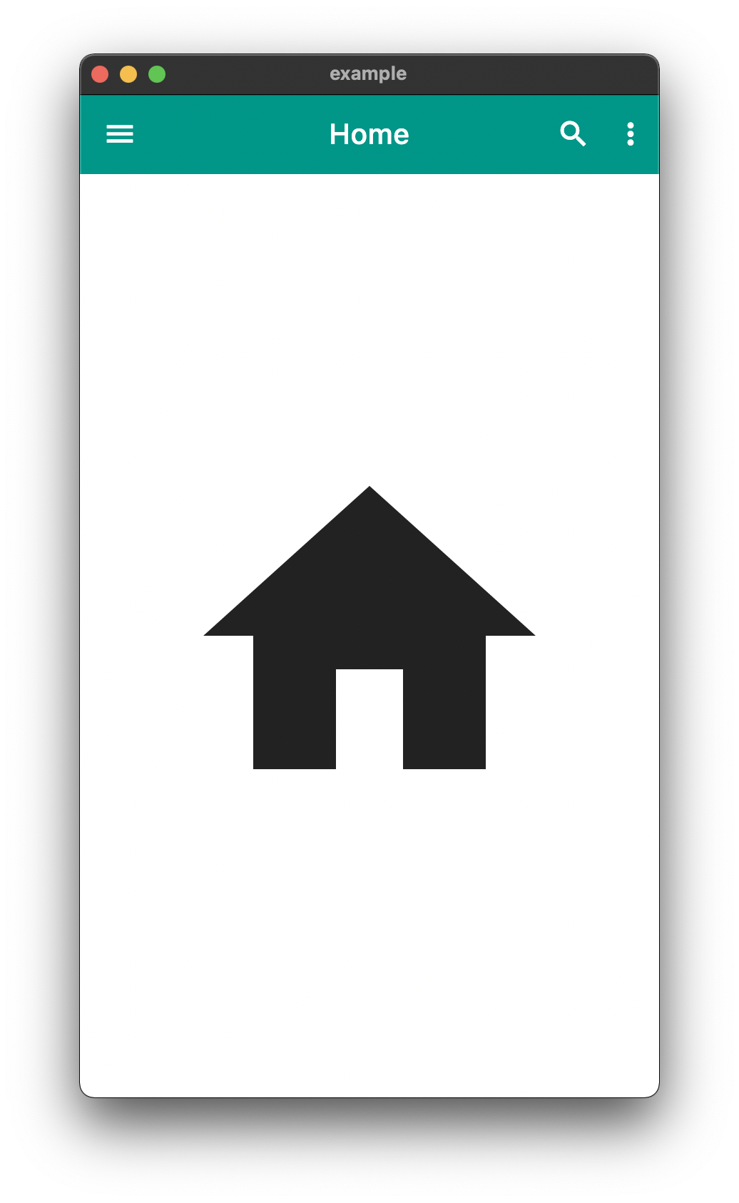
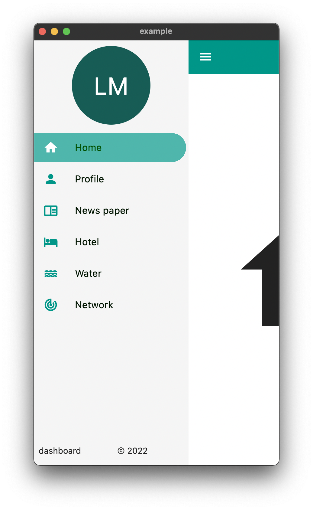
DeskTop Tablet Mobile

The above is an example of an app created with the package

Example Usage

  Widget build(BuildContext context) {
    return EasyDashboard(
      controller: controller,
      navigationIcon: const Icon(Icons.menu, color: Colors.white),
      appBarActions: actions,
      centerTitle: true,
      appBarColor: Colors.teal,
      sideBarColor: Colors.grey.shade100,
      tabletView: const TabletView(
        fullAppBar: false,
        border: BorderSide(width: 0.5, color: Colors.grey),
      ),
      desktopView: const DesktopView(
        fullAppBar: true,
        border: BorderSide(width: 0.5, color: Colors.grey),
      ),
      drawer: (Size size, Widget? child) {
        return EasyDrawer(
          iconColor: Colors.teal,
          hoverColor: Colors.grey.shade300,
          tileColor: Colors.grey.shade100,
          selectedColor: Colors.black.withGreen(80),
          selectedIconColor: Colors.white,
          textColor: Colors.black.withGreen(20),
          selectedTileColor: Colors.teal.shade400.withOpacity(.8),
          tiles: tiles,
          topWidget: SideBox(
            scrollable: true,
            height: 150,
            child: topOpenWidget,
          ),
          bottomWidget: SideBox(
            scrollable: false,
            height: 50,
            child: bottomOpenWidget,
          ),
          bottomSmallWidget: SideBox(
            height: 50,
            child: bottomSmallWidget,
          ),
          topSmallWidget: SideBox(
            height: 50,
            child: topSmallWidget,
          ),
          size: size,
          onTileTapped: (body) {
            controller.switchBody(body);
          },
        );
      },
    );
  }

The above example can be found in the /example folder

API

component usage
body The default body for the dashboard
duration The Duration of the animation when the [EasyDashboard] is opened or closed among others.
mobileBreakpoint The pixels at which the ui breaks into the mobile view
tabletBreakpoint The pixels at which the ui breaks into the tablet view
mobileView Display properties while in tablet view such as dashboard style
tabletView Display properties while in tablet view such as dashboard style
desktopView Display properties while in desktop view such as dashboard style
tabletMode What to show when the mobile break point is reached,
mobileMode What to show when the tablet break point is reached
desktopMode What to show when the desktop break point is reached
floatingActionButtonLocation Floating Action Button Location
floatingActionButton Floating Action Button
systemOverlayStyle System Overlay Style
floatingActionButtonAnimator Floating Action Button Animator
appBarHeight The height of the app bar
centerTitle Whether or not the appbar title is centered
backgroundColor General background color of the [EasyDashboard]
navigationIcon The icon that will control the responsive navigation of the [EasyDashboard]
navigationIconSplashRadius The splash radius of the navigation icon when pressed
appBarColor The color of the app bar
sideBarColor The color of the sidebar navigation
appBarActions A list of Widgets for the [AppBar]actions
drawer An drawer widget that will be displayed on the left side of the [EasyDashboard].
You can use the pre-built [EasyDrawer] to create a faster easier drawer .

Issues and Feedback

This is a fairly new package
Please feel free to report any issues you face
Also PR's and additional feedback is appreciated

所属分类

源码仓库

使用此插件的项目

暂无相关数据。