搜索插件、代码仓与 APP 分类

easy_loading_button 封面
插件详情v0.4.0

easy_loading_button

一个简单、易于使用且可自定义的进度/加载 _Material Flutter 按钮_,支持多种按钮样式(突出显示、轮廓线、文本)。

AndroidiOSWebmacOSWindowsLinux
近 30 天下载
787
喜欢数
70
Pub 分数
150

安装插件

flutter pub add easy_loading_button

插件介绍

基于插件公开信息、社区数据与项目使用情况整理的选型参考。

EasyLoadingButton 是一个 Flutter 包,提供一种简单、可自定义的进度/加载按钮,支持多种样式,包括突出显示、轮廓和文本按钮。它通过在异步操作期间无缝显示加载状态来提升用户体验。该按钮易于集成和配置,可在正常状态和加载状态之间实现平滑过渡。非常适合用于表单、操作以及任何需要在处理过程中提供反馈的 UI 元素。

适合场景

  • 表单提交
  • 异步操作触发
  • 登录/注册按钮
  • 支付处理
  • 数据保存操作

主要特点

  • 多种按钮样式
  • 可自定义的加载指示器
  • 平滑的状态转换
  • 轻松集成
  • 支持所有 Flutter 平台
  • 可配置的颜色和尺寸

适合对象

  • 初学者 Flutter 开发者
  • 简单的应用界面
  • 快速原型设计
  • 用户友好的表单
  • 需要在异步任务期间提供清晰反馈的应用程序

使用建议

  • 有限的高级自定义选项
  • 可能需要额外的样式设置以实现复杂设计
  • 不适合高度动态或动画按钮
  • 依赖于 Material 设计原则
  • 最适合用于基于标准 Material 的应用

原始 README

以下为关联源码仓库的 README 原文快照,最新内容请访问源码仓库。

easy_loading_button

GitHub repo size GitHub code size in bytes GitHub top language GitHub issues GitHub license

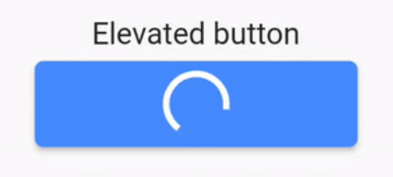
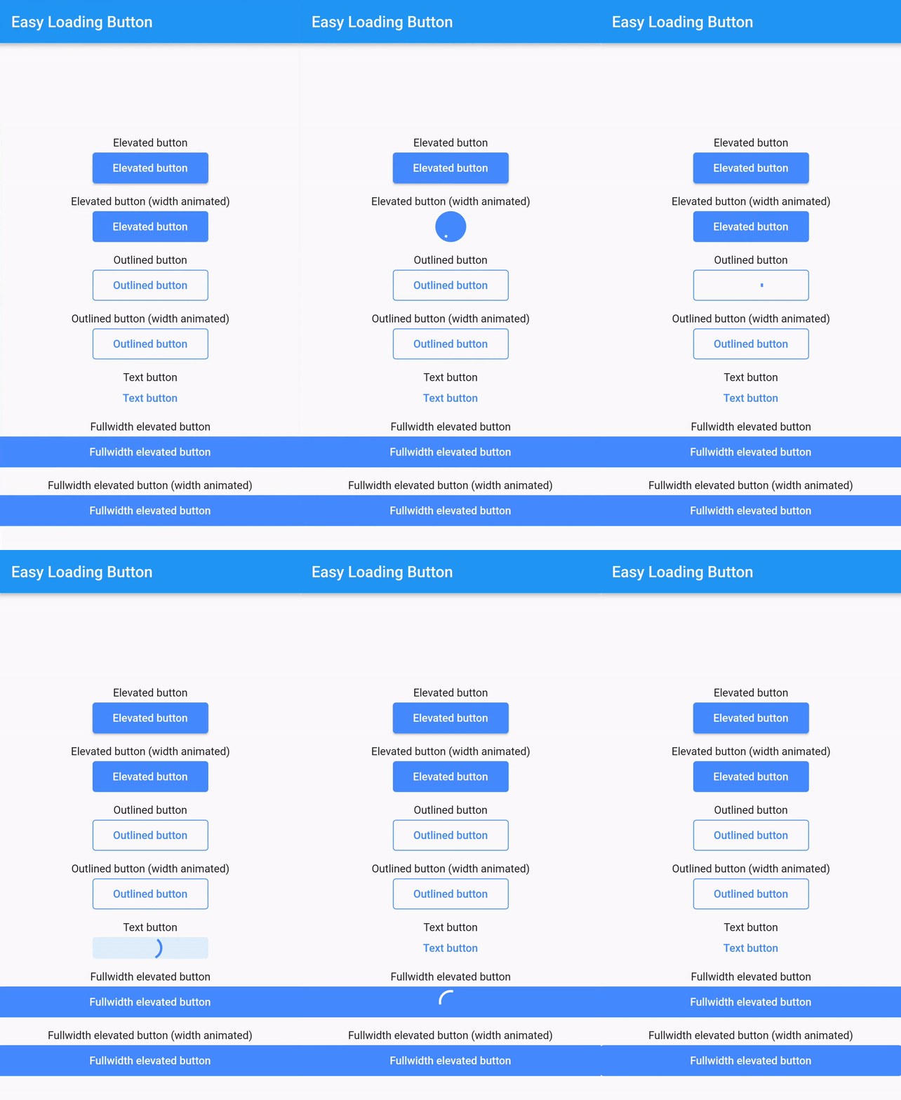
easy_loading_button is a simple, easy to use, and customizeable progress/loading Material Flutter Button that supports variety of button styles (elevated, outlined, text).

Or try the demo on DartPad

Get started

Depend on it

Add this to your package's pubspec.yaml file:

easy_loading_button: ^0.3.2
Install it

You can install packages from the command line:

$ flutter pub get

Alternatively, your editor might support flutter pub get.

Import it

Now in your Dart code, you can use:

import 'package:easy_loading_button/easy_loading_button.dart';

How to use

Add EasyButton to your widget tree:

EasyButton(
  type: EasyButtonType.elevated,

  // Content inside the button when the button state is idle.
  idleStateWidget: const Text(
    'Elevated Button',
    style: TextStyle(
      color: Colors.white,
    ),
  ),

  // Content inside of the button when the button state is loading.
  loadingStateWidget: const CircularProgressIndicator(
    strokeWidth: 3.0,
    valueColor: AlwaysStoppedAnimation<Color>(
      Colors.white,
    ),
  ),

  // Whether or not to animate the width of the button. Default is `true`.
  // If this is set to `false`, you might want to set the `useEqualLoadingStateWidgetDimension` parameter to `true`.
  useWidthAnimation: true,

  // Whether or not to force the `loadingStateWidget` to have equal dimension. Default is `true`.
  // This is useful when you are using `CircularProgressIndicator` as the `loadingStateWidget`.
  // This parameter might also be useful when you set the `useWidthAnimation` parameter to `true` combined with `CircularProgressIndicator` as the value for `loadingStateWidget`.
  useEqualLoadingStateWidgetDimension: true,

  // If you want a fullwidth size, set this to double.infinity
  width: 150.0,

  height: 40.0,
  borderRadius: 4.0,

  // The elevation of the button.
  // This will only be applied when the type parameter value is EasyButtonType.elevated
  elevation: 0.0,

  // The gap between button and it's content.
  // This will be ignored when the `type` parameter value is set to `EasyButtonType.text`
  contentGap: 6.0,

  // Color for the button.
  // For [EasyButtonType.elevated]: This will be the background color.
  // For [EasyButtonType.outlined]: This will be the border color.
  // For [EasyButtonType.text]: This will be the text color.
  buttonColor: Colors.blueAccent,

  onPressed: () {},
),

More parameters:

const EasyButton({
  Key? key,
  required this.idleStateWidget,
  required this.loadingStateWidget,
  this.type = EasyButtonType.elevated,
  this.useWidthAnimation = true,
  this.useEqualLoadingStateWidgetDimension = true,
  this.width = double.infinity,
  this.height = 40.0,
  this.contentGap = 0.0,
  this.borderRadius = 0.0,
  this.elevation = 0.0,
  this.buttonColor = Colors.blueAccent,
  this.onPressed,
}) : super(key: key);

Three types supported:

enum EasyButtonType {
    elevated,
    outlined,
    text,
}

Source

Source code and example of this library can be found in git:

$ git clone https://github.com/usefulteam/easy_loading_button.git

License

MIT License

Credits

Thanks to Yang JIANG for the flutter_progress_button package.

My package was based on it. You can also visit their package pub.dev page.

所属分类

源码仓库

使用此插件的项目

暂无相关数据。