搜索插件、代码仓与 APP 分类

el_tooltip 封面
插件详情v2.2.1

el_tooltip

ElTooltip,一个智能定位的提示工具。用于在提示工具中显示可自定义的 widget。

AndroidiOSWebmacOSWindowsLinux
近 30 天下载
6760
喜欢数
163
Pub 分数
150

安装插件

flutter pub add el_tooltip

插件介绍

基于插件公开信息、社区数据与项目使用情况整理的选型参考。

ElTooltip 是一个可自定义的、智能定位的工具提示小部件,适用于 Flutter 应用程序。它允许开发者在工具提示中显示个性化内容,该内容会根据可用空间和屏幕边界自动调整位置。非常适合通过上下文信息增强用户体验,而不会使用户界面杂乱。该包支持 Android、iOS、Web、macOS、Windows 和 Linux 多个平台,确保在不同设备上行为一致。通过 pub add 简单集成,提供一种优雅的解决方案,只需最少设置即可添加工具提示。

适合场景

  • 添加上下文帮助文本
  • 悬停或轻触时显示额外信息
  • 增强用户界面的可访问性
  • 提供对交互元素的反馈
  • 在跨平台应用程序中创建工具提示

主要特点

  • 智能自动定位
  • 可自定义的提示内容
  • 跨平台兼容性
  • 与 pub 的轻松集成
  • 支持触摸和悬停交互
  • 所需配置最少

适合对象

  • 寻求轻量级工具提示的开发者
  • 需要可访问性 UI 增强功能的应用程序
  • 面向多个平台的项目
  • 希望灵活设置提示框样式的设计师
  • 注重快速实施的团队

使用建议

  • 可能需要手动处理复杂布局
  • Tooltip 的可见性取决于父级 widget 的约束条件
  • 有限的内置动画选项
  • 最适合用于简单或中等复杂度的提示工具
  • 高频使用场景下的性能影响

原始 README

以下为关联源码仓库的 README 原文快照,最新内容请访问源码仓库。

ElTooltip - a smart positioned tooltip

Why el_tooltip?

  • 📦 Add widget elements to your tooltip
  • ↔️ Chose the preferred position for the tooltip to appear relative to the button
  • ↩️ The position changes automagically if the desired one doesn't fit the screen
  • ✅ No external dependencies
  • ❤️ Customizable layout
  • 🛡️ Null safety

Getting Started

🍭 Installation

Add to your pubspec.yaml

dependencies:
  el_tooltip: <last_version>

Import the library and call the Widget ElTooltip() with the required fields child and content

import 'package:flutter/material.dart';
import 'package:el_tooltip/el_tooltip.dart';

void main() {
  runApp(MaterialApp(
    title: 'Flutter Demo',
    theme: ThemeData(
      primarySwatch: Colors.blue,
    ),
    home: const SafeArea(
      child: Center(
        child: ElTooltip(
          child: Icon(Icons.info_outline),
          content: Text('This is a tooltip'),
        ),
      ),
    ),
  ));
}

Full example

🏷️ El Tooltip widget properties
Properties Required Default Description
content true What will appear inside the tooltip.
child true Widget that represent the button to activate the tooltip (no click method required).
color false Colors.white Background color of the bubble and the arrow.
distance false 10.0 Space between the child button and the tooltip.
padding false EdgeInsets.all(14.0) Tooltip padding around the content widget.
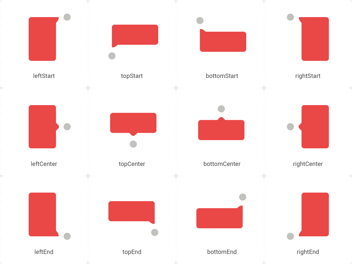
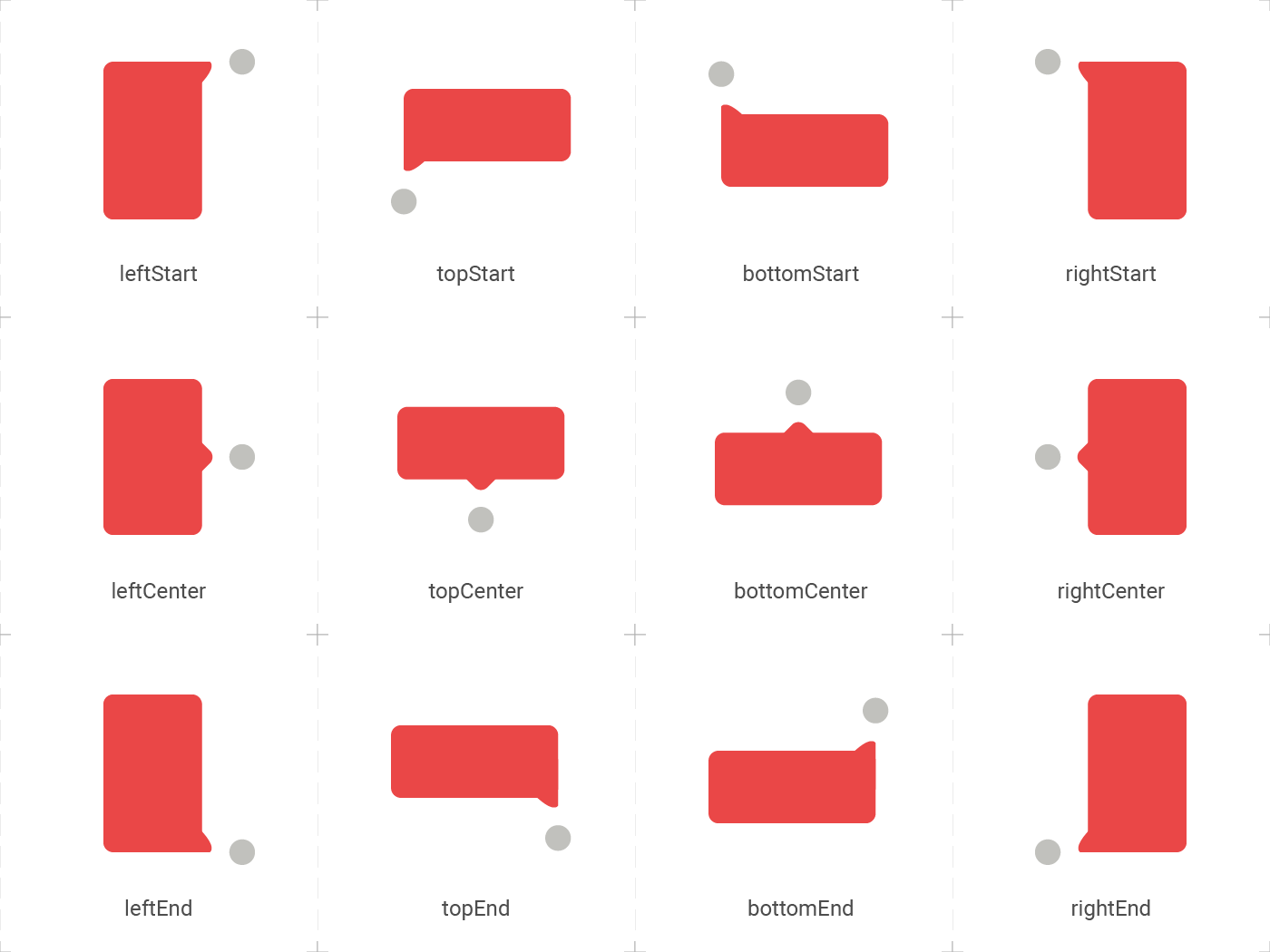
position false topCenter Desired position based on the Enum ElTooltipPosition. Can be topStart, topCenter, topEnd, rightStart, rightCenter, rightEnd, bottomStart, bottomCenter, bottomEnd, leftStart, leftCenter, leftEnd,
radius false Radius.circular(8.0) Border radius of the tooltip.
showModal false true Displays a fullscreen dark layer behind the tooltip.
showArrow false true Displays the arrow pointing to the child widget.
showChildAboveOverlay false true Repeats the child above the tooltip overlay.
modalConfiguration false ModalConfiguration() Configures the modal color and opacity if showModal is true.
timeout false Duration.zero (only disappears on click) How many time to wait for the tooltip to disappear.
appearAnimationDuration false Duration.zero (does not animate) Fade In animation duration.
disappearAnimationDuration false Duration.zero (does not animate) Fade Out animation duration.
controller false null ElTooltipController to show and hide the tooltip.
↔️ El Tooltip available positions

El tooltip header image was created using macrovector illustration on Freepik

Contributors ✨

Thanks goes to these wonderful people:


Marcelo Gil

💻

Matteo Pietro Dazzi

💻

Grzegorz Leoniec

💻

所属分类

源码仓库

使用此插件的项目