搜索插件、代码仓与 APP 分类

flexible_scrollbar 封面
插件详情v0.1.3

flexible_scrollbar

适用于 Flutter 的灵活滚动条。通过此包,您可以创建具有不同预设行为的自定义滚动条。

AndroidiOSWebmacOSWindowsLinux
近 30 天下载
1520
喜欢数
29
Pub 分数
150

安装插件

flutter pub add flexible_scrollbar

插件介绍

基于插件公开信息、社区数据与项目使用情况整理的选型参考。

一个 Flutter 包,使开发者能够创建具有预定义行为的可自定义滚动条。它在样式和功能方面提供了灵活性,允许在不同平台上实现独特的滚动条设计。适用于需要定制化滚动体验的应用程序,支持所有主要平台,包括 Android、iOS、Web、macOS、Windows 和 Linux。该包通过在滚动过程中提供视觉反馈来增强用户交互,同时保持简洁、响应迅速的界面。

适合场景

  • Web 应用程序中的自定义滚动条设计
  • 提升移动可滚动列表的用户体验
  • 为桌面应用程序定制滚动指示器
  • 改进长内容屏幕的可访问性
  • 创建平台特定的滚动条样式
  • 在可滚动控件中添加视觉反馈

主要特点

  • 可配置的滚动条外观
  • 预定义的行为模式
  • 跨平台兼容性
  • 对自定义动画的支持
  • 与 ScrollViews 的轻松集成
  • 跨设备的响应式设计

适合对象

  • 寻求视觉定制的UI设计师
  • 开发滚动密集型界面的开发者
  • 面向多个平台的应用程序
  • 需要可访问滚动的项目
  • 专注于完善用户体验的团队

使用建议

  • 可能需要额外的样式才能达到最佳性能
  • 行为自定义需要理解 ScrollController
  • 不适合没有滚动反馈的极简设计
  • 嵌套滚动视图中的潜在布局冲突
  • 与原生滚动条相比,内置主题有限

原始 README

以下为关联源码仓库的 README 原文快照,最新内容请访问源码仓库。

A Flexible Scrollbar for Flutter

pub package
A flexible solution for custom scroll bars.


Foreword

A package has been designed to allow the creation of complex scroll bars. You can customize the scroll thumb, scroll line and add a label, that is positioned by the center of the scroll thumb by default, but you can customize its position as well. As those three things are created by builders called every time the scroll state is changed, you can add custom animations.

How to use

The usage is as simple as a built-in Scrollbar, only you can customize it a lot more.

Install

To install this package simply add the flexible_scrollbar to your dependencies in pubspec.yaml

# pubspec.yaml
dependencies:
  flexible_scrollbar:
import 'package:flexible_scrollbar/flexible_scrollbar.dart';

Basic usage

To get a scrollbar simply wrap a scrollable widget with FlexibleScrollbar and pass a ScrollController to both FlexibleScrollbar and a scrollable widget:

FlexibleScrollbar(
     controller: scrollController,
     child: GridView.builder(
        controller: scrollController,

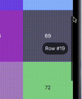
You will get a defaul scroll thumb and settings:

But it's very simple and we are here to make complex scroll bars so let's see how.

Customization

For the main customization the FlexibleScrollbar widget has three builders: scrollThumbBuilder, scrollLineBuilder and scrollLabelBuilder. Each one of them has a ScrollbarInfo as a parameter and rebuild each time any of the fields of the ScrollbarInfo model has changed.

ScrollbarInfo model has the following properties:

Properties Description
bool isScrolling Changes when the user starts/strops the scroll body scrolling. The isDragging is not affected by it.
bool isDragging Changes when the user starts/strops to drag the scroll thumb. The isScrolling is not affected by it.
double thumbMainAxisSize Contains the calculated depending on the scroll body size thumb length.
double thumbMainAxisOffset Contains the offset in pixels of the scroll thumb from the starting position.
AxisDirection scrollDirection Has the scroll body scroll direction in it (up/down/left/right)

Using those builders you can make custom scrollbars such as the one shown in the example at the beginning. The scroll thumb from the example has been created with the following code:
scrollThumbBuilder: (ScrollbarInfo info) {
     return AnimatedContainer(
       width: info.isDragging
           ? thumbDragWidth
           : thumbWidth,
       height: info.thumbMainAxisSize,
       decoration: BoxDecoration(
         borderRadius: BorderRadius.circular(5),
         color: Colors.black.withOpacity(info.isDragging ? 1 : 0.6),
       ),
       duration: animationDuration,
     );
},
Other parameters

There is some more customization that you can do with the other than builders properties of the FlexibleScrollbar:

Properties Description
bool alwaysVisible Default value is false. If true prevents the scroll thumb from disappearing after the set time.
bool jumpOnScrollLineTapped Default value is true. If false prevents the scroll position change on the scroll line tap.
bool draggable Default value is true. If false prevents user from dragging the scroll thumb.
bool autoPositionLabel Default value is true. If false the label is set to (0, 0) position and can be moved using Positioned widget.
double? scrollLineOffset The offset in pixels of the scroll line from the side defined by the barPosition and the scroll direction.
double? thumbMainAxisMinSize The minimal size of the scroll thumb in case you are using the ScrollbarInfo thumbMainAxisSize and the scroll body is too big.
double? scrollLineCrossAxisSize The cross axis size of the scroll line. Defaults to the scroll thumb size. The scroll thumb cross axis size can not be bigger then this field.
double? scrollLabelOffset The offset in pixels of the label from the side defined by the barPosition and the scroll direction.
Duration? thumbFadeStartDuration Defines the time after which the scroll thumb will start its fade animation.
Duration? thumbFadeDuration The time that takes the scroll thumb to completely fade.
BarPosition barPosition Defines whether the scroll line position at the start or the end of the scroll body cross axis.
ValueChanged<DragStartDetails>? onDragStart This callback is called when the user starts dragging the scroll thumb.
ValueChanged<DragEndDetails>? onDragEnd This callback is called when the user ends dragging the scroll thumb.
ValueChanged<DragUpdateDetails>? onDragUpdate This callback is called during the user's scroll thumb drag process.

License

This package is licensed under the Apache License 2.0 - see the LICENSE file for details.

所属分类

源码仓库

使用此插件的项目