搜索插件、代码仓与 APP 分类

floating_draggable_widget 封面
插件详情v2.3.0

floating_draggable_widget

一个用于浮动可拖动小部件的 Flutter 包。通过此包,开发者可以实现一个可以在屏幕上自由拖动的小部件。

AndroidiOSWebmacOSWindowsLinux
近 30 天下载
6580
喜欢数
133
Pub 分数
140

安装插件

flutter pub add floating_draggable_widget

插件介绍

基于插件公开信息、社区数据与项目使用情况整理的选型参考。

一个 Flutter 包,使开发者能够在应用界面中创建可浮动且可自由拖动的控件。这允许用户通过直观的触摸或指针交互将控件移动到屏幕上的任意位置。非常适合用于交互式 UI 元素,如浮动面板、快速访问工具或可自定义的叠加层。该包支持所有主要平台,包括 Android、iOS、Web、macOS、Windows 和 Linux,确保在各种设备上行为一致。

适合场景

  • 创建可移动的浮动面板
  • 实现拖放快速操作工具
  • 设计可自定义的用户界面叠加层
  • 构建交互式仪表板组件
  • 启用用户控制的小部件定位

主要特点

  • 自由格式屏幕拖动
  • 跨平台兼容性
  • 与现有小部件的简单集成
  • 平滑拖拽动画
  • 对多平台的支持

适合对象

  • 开发交互式 UI 的开发者
  • 需要可移动浮动元素的应用程序
  • 针对多个平台的项目
  • UX 设计师在原型设计动态布局

使用建议

  • 可能需要额外的逻辑来处理边界约束
  • 复杂嵌套组件带来的性能影响
  • 有限的内置手势自定义
  • 未针对高频拖拽场景进行优化
  • 在拖动过程中需要谨慎处理控件生命周期

原始 README

以下为关联源码仓库的 README 原文快照,最新内容请访问源码仓库。

Features
  • Support Android, IOS, Web etc.
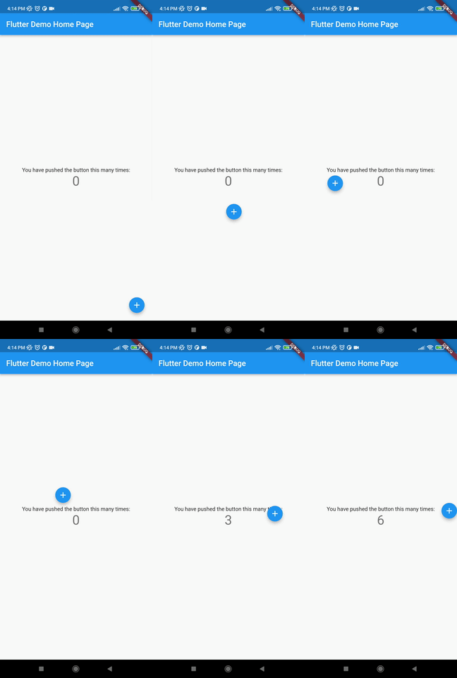
  • This package is used to make a widget movable or draggable around the screen freely;
  • Works fine for any Widget;
  • Does not affect the functionality or performance of the particular widget;
  • Used physics law supported animation to make it more attractive;

Demo

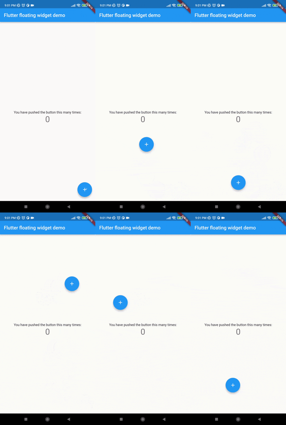
Without auto align Initially "autoAlign" is false.

    autoAlign = false

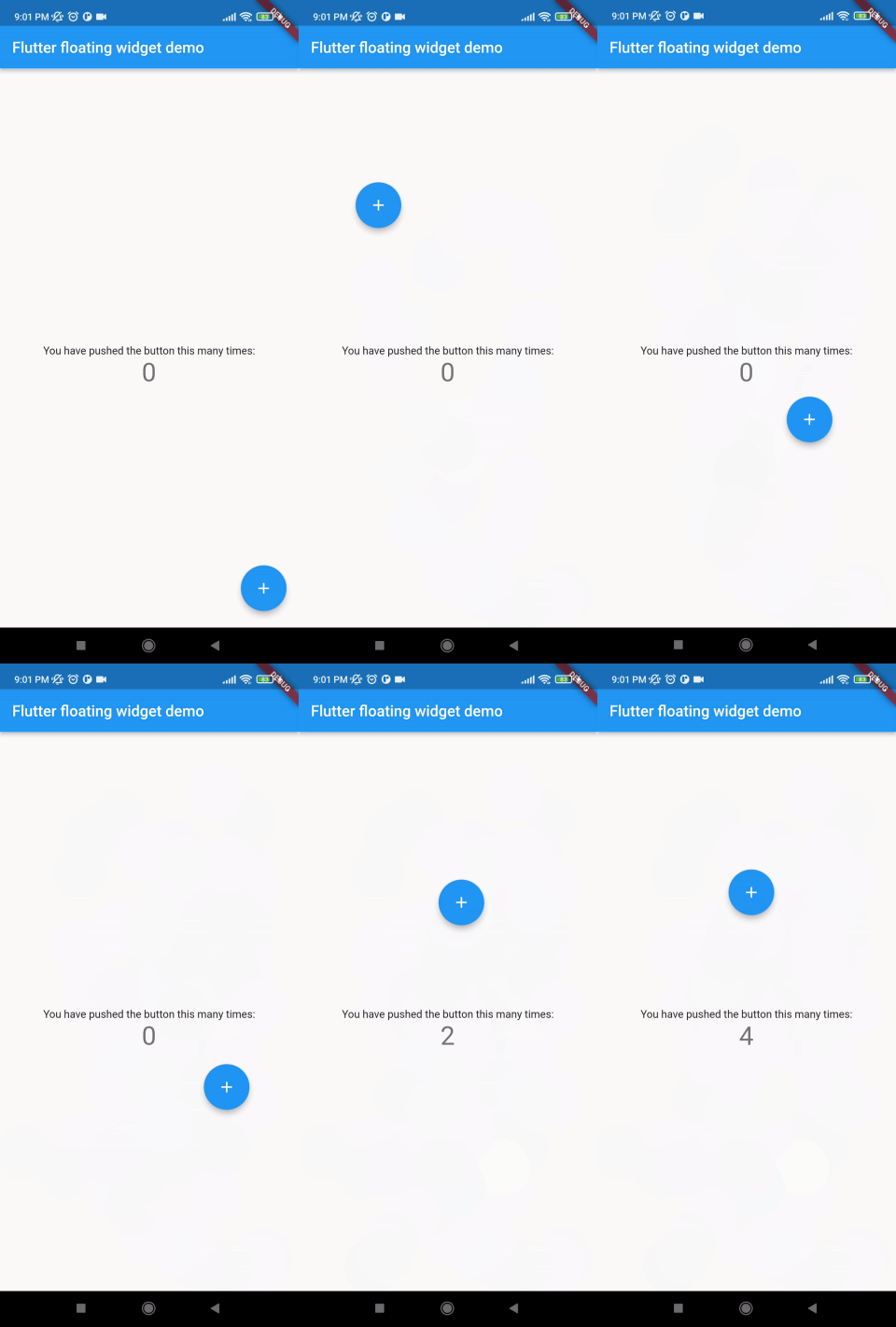
Auto align activated Add this to your code.

    autoAlign = true

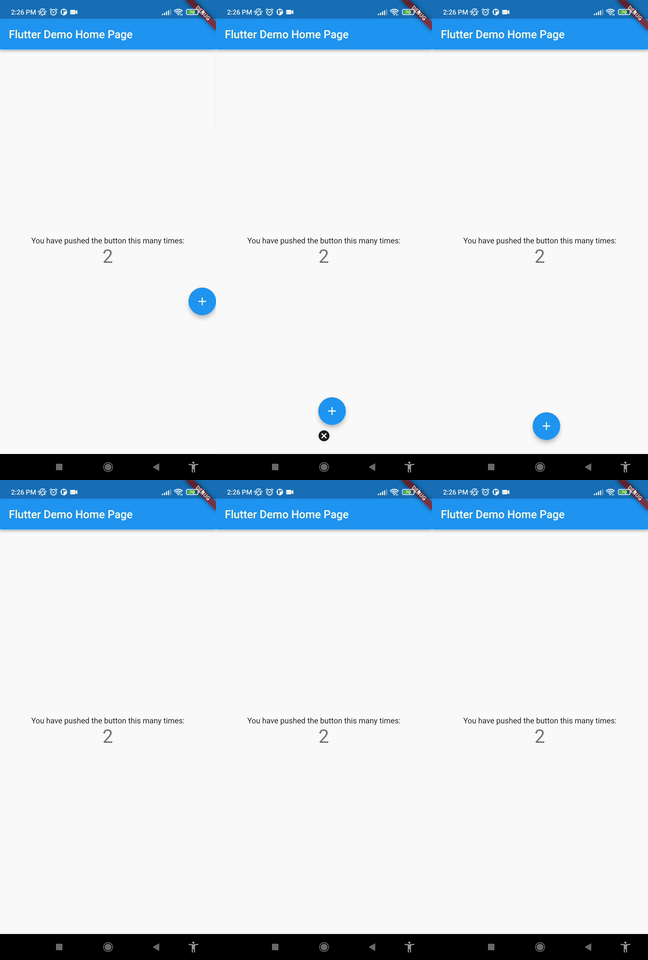
Deletion of the widget Add this to your code.

    deleteWidget: Icon(Icons.cancel),

Getting started
Install

add this in your pubspec.yaml floating_draggable_widget: ^latest_version

Class

This is the constructor of the class.

     FloatingDraggableWidget({
        required this.mainScreenWidget,
        required this.floatingWidget,
        required this.floatingWidgetWidth,
        required this.floatingWidgetHeight,
        this.dy,
        this.dx,
        this.screenHeight,
        this.screenWidth,
        this.speed,
        this.isDraggble = true,
        this.autoAlign = false,
        this.deleteWidgetAlignment = Alignment.bottomCenter,
        this.deleteWidgetAnimationDuration = 200,
        this.hasDeleteWidgetAnimationDuration = 300,
        this.deleteWidgetAnimationCurve = Curves.easeIn,
        this.deleteWidgetHeight = 50,
        this.deleteWidgetWidth = 50,
        this.isCollidingDeleteWidgetHeight = 70,
        this.isCollidingDeleteWidgetWidth = 70,
        this.deleteWidgetDecoration,
        this.deleteWidgetPadding = const EdgeInsets.only(bottom: 8),
        this.onDragging,
        this.widgetWhenDragging,
    });
Where:
  • mainScreenWidget is required and it accept any widget. This is actually the base Widget or the parent widget on where the floating widget will be dragged or moved.
  • floatingWidget is also required and it accept any widget. This is actually the particular widget which will be floated and can be mode or dragged around the screen.
  • floatingWidgetWidth is also required and it accepts a double value which is the width of the floating widget above mentioned.
  • floatingWidgetHeight is also required and it accepts a double value which is the height of the floating widget above mentioned.
  • onDragEvent is a function is not required, which is a event listener of the current position of floating widget, which provides only the x axis as dx and y axis as xy.
  • autoAlignType is a enum type. which has 3 type. onlyRight, onlyLeft, both. by default it is both. if autoAlign is true then this determines the on which side the floating widget will land after dragging ends.
  • disableBounceAnimation is a bool type. if autoAlign is true then then setting true to disableBounceAnimation can disable the bounce animation.
  • dy accepts a double value which is the distance from the top of the screen where floating widget will be positioned initially.
  • dx accepts a double value which is the distance from the left of the screen where floating widget will be positioned initially.
  • screenHeight accepts a double value which is the height of the screen initially.
  • screenWidth accepts a double value which is the width of the screen initially.
  • speed accepts a double value which is the speed factor of the floating widget after it will be let go. The more speed will be provided the slower the object will move after the user let the widget go freely.
  • isDraggable accepts a boolean value which determines if the widget is draggable or not.
  • autoAlign accepts a boolean value which determines if the widget will be auto aligns on the left or right after it is being dragged.
  • deleteWidget accepts a widget which is used to delete the floating widget.
  • onDeleteWidget accepts a function which is used to delete the floating widget.
  • deleteWidgetAlignment accepts an alignment value which is used to align the delete widget.
  • deleteWidgetAnimationCurve accepts an animation curve value which is used to animate the delete widget.
  • deleteWidgetAnimationDuration accepts an animation duration value which is used to animate the delete widget
  • hasDeleteWidgetAnimationDuration accepts an animation duration value which is used to animate the delete widget when it is dragging with the delete widget.
  • deleteWidgetHeight accepts a double value which is used to set the height of the delete widget.
  • deleteWidgetWidth accepts a double value which is used to set the width of the delete widget.
  • isCollidingDeleteWidgetHeight accepts a double value which is used to set the height of the delete widget.
  • isCollidingDeleteWidgetWidth accepts a double value which is used to set the width of the delete widget.
  • boxDecoration optionally accepts a box decoration value which is used to set the decoration of the delete widget.
  • deleteWidgetPadding optionally accepts a padding value which is used to set the padding of the delete widget.
Usage 
import 'package:flutter/material.dart';
import 'package:floating_animated_widget/floating_draggable_widget.dart';
void main() {
  runApp(const MyApp());
}

class MyApp extends StatelessWidget {
  const MyApp({Key? key}) : super(key: key);

  // This widget is the root of your application.
  @override
  Widget build(BuildContext context) {
    return MaterialApp(
      title: 'Flutter Demo',
      theme: ThemeData(

        primarySwatch: Colors.blue,
      ),
      home: const MyHomePage(title: 'Flutter Demo Home Page'),
    );
  }
}

class MyHomePage extends StatefulWidget {
  const MyHomePage({Key? key, required this.title}) : super(key: key);

  final String title;

  @override
  State<MyHomePage> createState() => _MyHomePageState();
}

class _MyHomePageState extends State<MyHomePage> {
  int _counter = 0;

  void _incrementCounter() {
    setState(() {

      _counter++;
    });
  }

  @override
  Widget build(BuildContext context) {

    return FloatingDraggableWidget(
      child: Scaffold(
        appBar: AppBar(

          title: Text(widget.title),
        ),
        body: Center(

          child: Column(

            mainAxisAlignment: MainAxisAlignment.center,
            children: <Widget>[
              const Text(
                'You have pushed the button this many times:',
              ),
              Text(
                '$_counter',
                style: Theme.of(context).textTheme.headline4,
              ),
            ],
          ),
        ),
      ),
      floatingWidget: FloatingActionButton(
        onPressed: _incrementCounter,
        tooltip: 'Increment',
        child: const Icon(Icons.add),
      ),
      floatingWidgetHeight: 40,
      floatingWidgetWidth: 40,
      dx: 200,
      dy: 300
    );
  }
}

Known Limitations
  • Doesn't have functionality of floating on other apps.
  • It does not automatically calculate the size of the parent widget it always takes the whole screen to float around.
  • It does not automatically calculate the size of the floating widget
End

所属分类

源码仓库

使用此插件的项目

暂无相关数据。