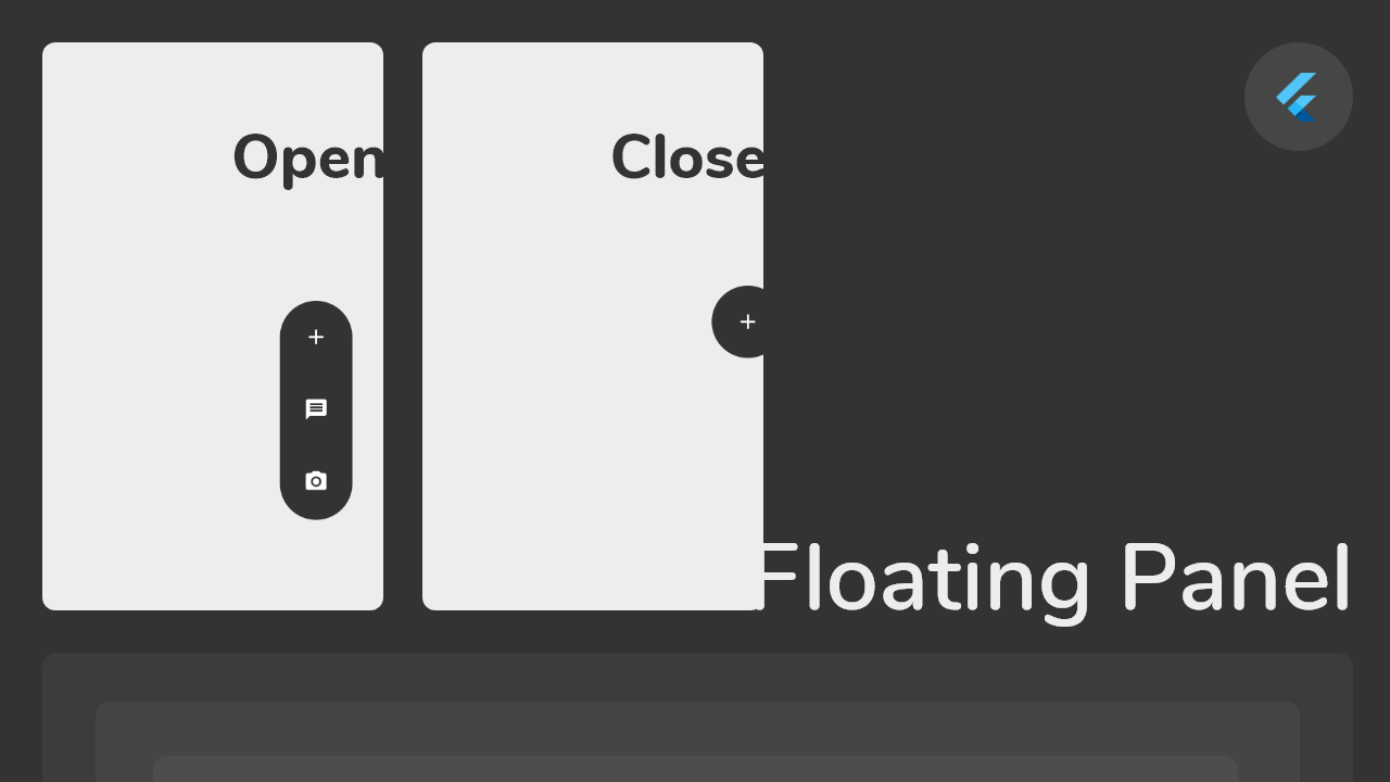
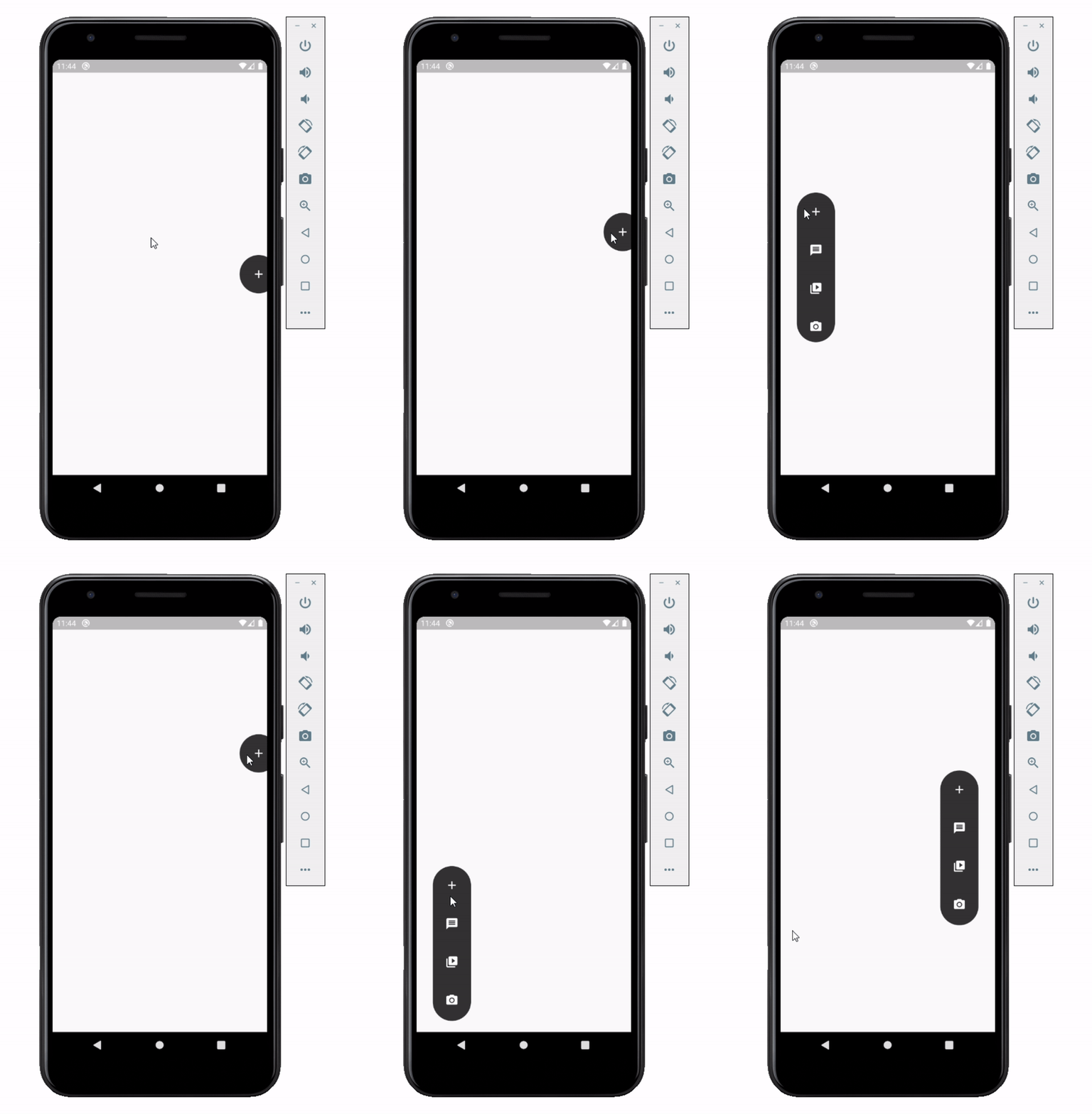
Float box is a true floating panel for your app, which can be docked to either edges of the screen (horizontally).
Code - Basic:
This is what you needs to get the widget working. Import Widget -> Add 'FloatBoxPanel' at the bottom of your stack widget. Add icons inside the "buttons" list.
import'package:widgets/float_box.dart'; // Import Float Box WidgetStack(
children: [
...
// Add Float Box Panel at the bottom of the 'stack' widget.FloatBoxPanel(
buttons: [
// Add Icons to the buttons list.Icons.message,
Icons.photo_camera,
Icons.video_library
]
);
]
);
Code - All Properties:
These are all the properties you can customize of the floating panel.
import'package:widgets/float_box.dart'; // Import Float Box WidgetStack(
children: [
...
// Add Float Box Panel at the bottom of the 'stack' widget.FloatBoxPanel(
positionTop: 0.0, // Initial Top Position
positionLeft: 0.0, // Initial Left Position
backgroundColor: Color(0xFFEDEDED), // Color of the panel
contentColor: Colors.black, // Color of the icons
panelShape: PanelShape.rectangle, // 'PanelShape.rectangle' or 'PanelShape.rounded', border radius property doesn't work in the rounded shape
borderRadius: BorderRadius.circular(8.0), // Border radius of the panel
dockType: DockType.inside, // 'DockType.inside' or 'DockType.outside', weather to dock the panel outside or inside the edge of the screen
dockOffset: 5.0, // Offset the dock from the edge depending on the 'dockType' property
panelAnimDuration: 300, // Duration for panel open and close animation
panelAnimCurve: Curves.easeOut, // Curve for panel open and close animation
dockAnimDuration: 300, // Auto dock to the edge of screen - animation duration
dockAnimCurve: Curves.easeOut, // Auto dock animation curve
panelOpenOffset: 20.0, // Offset from the edge of screen when panel is open
panelIcon: Icons.menu, // Panel open/close icon
size: 70.0, // Size of single button in the panel
iconSize: 24.0, // Size of icons
borderWidth: 1.0, // Width of panel border
borderColor: Colors.black, // Color of panel border
onPressed: (index) {
print("Clicked on item: $index");
}
buttons: [
// Add Icons to the buttons list.Icons.message,
Icons.photo_camera,
Icons.video_library
]
);
]
);