搜索插件、代码仓与 APP 分类

flutter_animated_reaction 封面
插件详情v0.0.2

flutter_animated_reaction

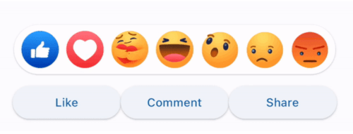
Flutter 动画反应是一个动画反应叠加层(例如,Facebook、LinkedIn),可使用您自己的反应图标(图片/GIF)进行自定义。

AndroidiOSWebmacOSWindowsLinux
近 30 天下载
36
喜欢数
34
Pub 分数
130

安装插件

flutter pub add flutter_animated_reaction

插件介绍

基于插件公开信息、社区数据与项目使用情况整理的选型参考。

Flutter Animated Reaction 是一个可自定义的动画叠加层,用于社交媒体风格的反应,类似于 Facebook 或 LinkedIn。它允许开发者在用户与内容互动时显示动画反应图标(如图片或 GIF)。该包支持 Android、iOS、Web、macOS、Windows 和 Linux 等多个平台,非常适合跨平台应用。通过 pub add 简单集成,它通过动态视觉反馈增强了用户参与度。

适合场景

  • 社交媒体应用互动
  • 用户反应动画
  • 互动帖子动态
  • 以参与度为导向的用户界面元素
  • 实时反馈在消息应用中

主要特点

  • 可自定义的表情符号
  • 支持图片和GIF
  • 跨平台兼容性
  • 与 Flutter 的简单集成
  • 动画叠加效果

适合对象

  • 开发社交网络应用的开发者
  • 寻求互动反馈的UI设计师
  • 需要实时用户反应的应用程序
  • 针对多个平台的项目
  • 希望使用轻量级动画解决方案的团队

使用建议

  • 需要对图标进行适当的资产管理
  • 性能可能因复杂的 GIF 而有所不同
  • 除了图标和动画样式外,自定义选项有限
  • 最适合中等规模的动画
  • 可能需要额外的状态管理来处理复杂的工作流

原始 README

以下为关联源码仓库的 README 原文快照,最新内容请访问源码仓库。

Flutter Animated Reaction

Flutter Animated Reaction is an animated reaction overlay(Example: Facebook, LinkedIn) which can be customized using your own reaction icons(images/gifs). Wherever your reaction button is on the screen, this package helps you to pop up an animated reaction overlay at the right location on the screen with your preferred reactions icon.

Demo

animated

Features

  • Customized reaction icon i.e. images, gifs can be added in the list
  • Cool animation to display the reaction overlay
  • Dragging any reaction icon generates nice animation
  • In built facebook reaction icons
  • Reaction sound feature

Getting started

import 'package:flutter_animated_reaction/flutter_animated_reaction.dart';

Usage

For better understanding, you can see example application.

AnimatedFlutterReaction().showOverlay(context: context,
                                      key: key,
                                      onReaction: (val){
                                         print(val);
                                      });
Parameters
Parameter Description
Key Global Key used in the reaction button . It is used to find the renderBox and measure it's position.
reactions List of all reaction icons which you want to show in the overlay.(Image/Gifs path)
onReaction(int) It is triggered when any of the reaction is tapped
backgroundColor It describes overlay background color
overlaySize It specifies overlay width
iconSize It can set the size of reaction icons. Default size is (45,45)

How to Contribute

  1. Fork it
  2. Create your feature branch (git checkout -b new-feature)
  3. Commit your changes (git commit -m 'Add some feature')
  4. Push to the branch (git push origin new-feature)
  5. Create new Pull Request

所属分类

依赖

依赖清单 1 项

源码仓库

使用此插件的项目

暂无相关数据。