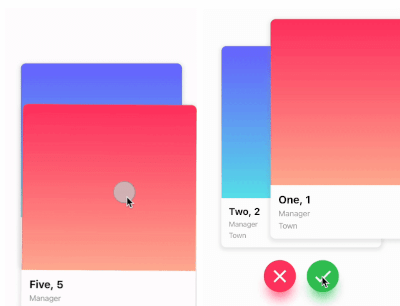
一个 Flutter 包,支持左右上下手势的 Tinder 风格卡片滑动。开发者可以为每个滑动方向定义自定义逻辑,非常适合用于约会应用、产品展示或内容发现界面。该包跨平台,可在 Android、iOS、Web、macOS、Windows 和 Linux 上无缝运行。它提供流畅且可定制的滑动体验,内置动画和手势处理。
适合场景
约会应用界面
产品或商品发现
内容推荐系统
互动叙事
用户偏好收集
主要特点
类似 Tinder 的滑动操作
每方向可自定义滑动逻辑
跨平台兼容性
内置动画
手势识别
可扩展的控件设计
适合对象
开发基于滑动的用户界面的开发者
需要用户通过刷卡进行交互的应用程序
需要直观导航模式的项目
原型设计交互式卡片体验
使用建议
需要仔细处理滑动状态管理
可能需要额外的样式来处理复杂的布局
大型数据集的性能影响
仅限基于卡片的交互
未针对垂直滚动列表进行优化
原始 README
以下为关联源码仓库的 README 原文快照,最新内容请访问源码仓库。
flutter_card_swiper
This is a Flutter package for a Tinder-like card swiper. ✨
It allows you to swipe left, right, up, and down and define your own business logic for each direction.
Very smooth animations supporting Android, iOS, Web & Desktop.
Why?
We built this package because we wanted to:
Have a fully customizable slider
Swipe in any direction
Undo swipes as many times as you want
Choose your own settings such as duration, angle, padding and more
Trigger swipes in any direction with the controller
Add callbacks while swiping, on end, or when the swiper is disabled
Detect the direction (left, right, top, bottom) the card was swiped
Show Cases
Swipe in any direction
Trigger swipes
Unswipe the cards
Fully customizable
Installation
Add this to your package's pubspec.yaml file:
card_swiper:...
OR run
flutterpubaddflutter_card_swiper
in your project's root directory.
Usage
You can place your CardSwiper inside of a Scaffold like we did here. Optional parameters can be defined to enable different features. See the following example:
Index of the first card when the swiper is initialized
false
isDisabled
false
Set to true if swiping should be disabled, has no impact when triggered from the outside
false
isLoop
true
Set to true if the stack should loop
false
maxAngle
30
Maximum angle that the card can reach during swiping
false
allowedSwipeDirection
AllowedSwipeDirection.all
Sets the direction in which the card can be swiped. It can be set to any combination of left, right up or down.
false
numberOfCardsDisplayed
2
Number of cards displayed at the same time
false
onEnd
-
Callback when there are no more cards left to swipe
false
onSwipe
-
Callback when the user swipes a card. If the function returns false, the swipe action is canceled. If it returns true, the swipe action is performed as expected
false
onTapDisabled
-
Callback when a card is tapped and isDisabled is true
false
onUndo
-
Callback when the controller calls undo. If the function returns false, the undo action is canceled. If it returns true, the undo action is performed as expected
A callback containing the horizontal and vertical swipe direction
false
showBackCardOnUndo
-
If true, the previous card will be shown in the background when swiping, and the swipe action will trigger an undo
false
undoSwipeThreshold
50
The horizontal swipe distance threshold, in pixels, after which the back card switches to the previous card. Only active when showBackCardOnUndo is true
false
undoDirection
UndoDirection.left
The direction of the swipe to trigger an undo
false
Controller
The Controller is used to swipe the card from outside of the widget. You can create a controller called CardSwiperController and save the instance for further usage. Please have a closer look at our Example for the usage.