搜索插件、代码仓与 APP 分类

flutter_pannable_rating_bar 封面
插件详情v2.7.2+1

flutter_pannable_rating_bar

一个功能强大且可自定义的 Flutter 评分条。此评分条与其他评分条不同之处在于,它支持选择任意小数值。支持拖动、点击和悬停事件。

AndroidiOSWebmacOSWindowsLinux
近 30 天下载
50
喜欢数
35
Pub 分数
150

安装插件

flutter pub add flutter_pannable_rating_bar

插件介绍

基于插件公开信息、社区数据与项目使用情况整理的选型参考。

一个高度可定制的 Flutter 评分条,支持选择任意分数的评分值。与传统的评分条不同,它通过拖拽、点击和悬停事件实现流畅的交互,为各种设备提供响应迅速且直观的用户体验。非常适合需要精确反馈输入的应用程序,例如评论或调查。该包与所有主要平台兼容,包括 Android、iOS、Web、macOS、Windows 和 Linux。

适合场景

  • 用户评分与细粒度评分
  • 交互式调查界面
  • 应用中的反馈收集
  • 实时评分调整
  • 触控友好的用户界面组件

主要特点

  • 支持小数评分
  • 拖拽、点击和悬停交互
  • 高度可定制的设计
  • 跨平台兼容性
  • 流畅的动画过渡
  • 可配置的步长

适合对象

  • 开发交互式反馈系统的开发者
  • 需要精确评分输入的应用程序
  • 希望触摸优化的用户界面的设计人员
  • 针对多个平台的项目
  • 需要动态评分控件的原型

使用建议

  • 可能需要为复杂主题添加额外的样式
  • 大型评分条列表上的性能影响
  • 需要仔细处理手势冲突
  • 除了基本用法外,文档有限
  • 未针对极高频率的更新进行优化

原始 README

以下为关联源码仓库的 README 原文快照,最新内容请访问源码仓库。

pub package

PannableRatingBar

Introducing a new and improved rating bar for Flutter, offering versatility and full customization. Unlike other rating bars, this one allows for any value to be selected, not just full or half ratings when interacted. Tap, drag and hover gestures are seamlessly supported, providing a smooth user experience.

Features

  • Offers fractional values for rating
  • High degree of customization for the rating widgets, which can be of different sizes, shapes, and colors.
  • Precise hit testing, as the child widget's render object is utilized to determine the results.
  • Allows for filtering gestures with either tapOnly, dragOnly or tapAndDrag options.
  • Rating reports on cursor hovering supported.
  • Built on Flutter's Wrap widget, offering a variety of supported layouts, including consideration of Wrap properties such as textDirection and verticalDirection when painting the indicators.

Getting started

First import the widget

import 'package:flutter_pannable_rating_bar/flutter_pannable_rating_bar.dart';

Usage

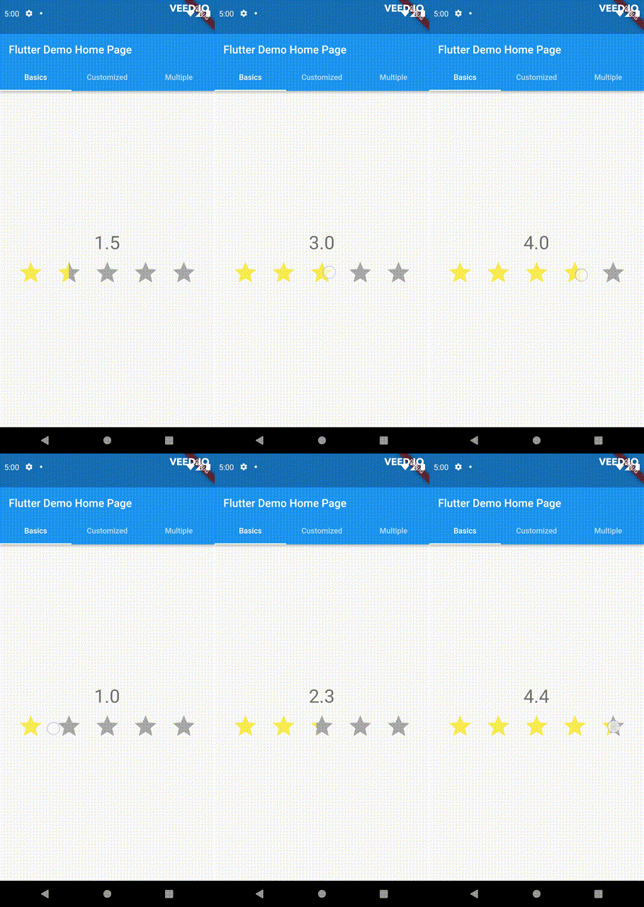
This widget is stateless and highly flexible, allowing you to easily manipulate values and customize the display of the PannableRatingBar. Simply rebuild the widget with the value provided in the onChanged callback or onHover callback and the widget will automatically adjust the rating distribution across each rating widget.

double rating = 0.0;

PannableRatingBar(
  rate: rating,
  items: List.generate(5, (index) =>
    const RatingWidget(
      selectedColor: Colors.yellow,
      unSelectedColor: Colors.grey,
      child: Icon(
        Icons.star,
        size: 48,
      ),
    )),
  onChanged: (value) { // the rating value is updated on tap or drag.
    setState(() {
      rating = value;
    });
  },
)

The widget also supports getting the rate value by hovering with the onHover callback. It works best on devices that support a mouse cursor, including desktop web browsers.

double rating = 0.0;

PannableRatingBar(
  rate: rating,
  items: List.generate(5, (index) =>
    const RatingWidget(
      selectedColor: Colors.yellow,
      unSelectedColor: Colors.grey,
      child: Icon(
        Icons.star,
        size: 48,
      ),
    )),
  onHover: (value) { // the rating value is updated every time the cursor moves over a new item.
    setState(() {
      rating = value;
    });
  },
)

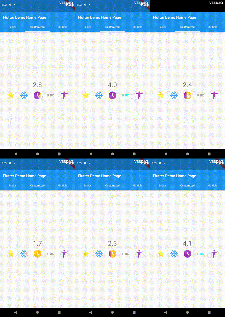
Utilize your own custom widgets as the rating indicators. With complete customization freedom, they don't have to be uniform in size, color, or any other aspect.

double rating = 0.0;

PannableRatingBar(
  rate: rating,
  onChanged: (value) {
    setState(() {
      rating = value;
    });
  },
  items: const [
    RatingWidget(
      selectedColor: Colors.yellow,
      unSelectedColor: Colors.grey,
      child: Icon(
        Icons.star,
        size: 48,
      ),
    ),
    RatingWidget(
      selectedColor: Colors.blue,
      unSelectedColor: Colors.red,
      child: Icon(
        Icons.ac_unit,
        size: 48,
      ),
    ),
    RatingWidget(
      selectedColor: Colors.purple,
      unSelectedColor: Colors.amber,
      child: Icon(
        Icons.access_time_filled,
        size: 48,
      ),
    ),
    RatingWidget(
      selectedColor: Colors.cyanAccent,
      unSelectedColor: Colors.grey,
      child: Icon(
        Icons.abc,
        size: 48,
      ),
    ),
    RatingWidget(
      selectedColor: Colors.tealAccent,
      unSelectedColor: Colors.purple,
      child: Icon(
        Icons.accessibility_new_sharp,
        size: 48,
      ),
    ),
  ],
)
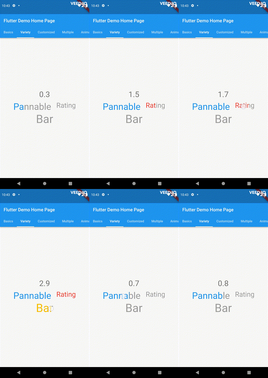
double rating = 0;
PannableRatingBar(
  rate: rating,
  onChanged: (value){
    setState((){
      rating = value;
    });
  },
  spacing: 20,
  items: const [
    RatingWidget(
      selectedColor: Colors.blue,
      child: Text(
        "Pannable",
        style: TextStyle(color: Colors.grey, fontSize: 40),
      ),
    ),
    RatingWidget(
      selectedColor: Colors.red,
      child: Text(
        "Rating",
        style: TextStyle(color: Colors.grey, fontSize: 30),
      ),
    ),
    RatingWidget(
      selectedColor: Colors.amber,
      child: Text(
        "Bar",
        style: TextStyle(color: Colors.grey, fontSize: 50),
      ),
    ),
  ],
),

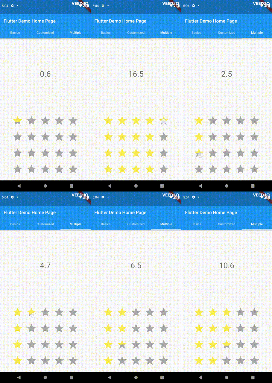
This widget utilizes the layout capabilities of Flutter's built-in Wrap widget, allowing for a wide range of possible layouts to be achieved. The properties of the Wrap widget, such as textDirection and verticalDirection, are also considered when painting the indicators, giving you even greater control over the final look and feel of the rating bar.

double rating = 0.0;

PannableRatingBar.builder(
  rate: rating,
  alignment: WrapAlignment.center,
  spacing: 20,
  runSpacing: 10,
  itemCount: 20,
  direction: Axis.vertical,
  itemBuilder: (context, index) {
    return const RatingWidget(
      selectedColor: Colors.yellow,
      unSelectedColor: Colors.grey,
      child: Icon(
        Icons.star,
        size: 48,
      ),
    );
  },
  onChanged: (value) {
    setState(() {
      rating = value;
    });
  },
)

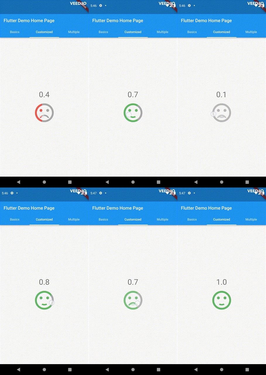
Customize the appearance of the rating indicators based on their values.

double rating = 0;

PannableRatingBar(
    rate: rating,
    spacing: 20,
    onChanged: (value){
      setState((){
        rating = value;
      });
    },
    items: [
      RatingWidget(
        selectedColor: rating <= 0.5 ? Colors.red : Colors.green,
        unSelectedColor: Colors.grey,
        child: AnimatedSwitcher(
          duration: const Duration(milliseconds: 300),
          child: rating <= 0.5
              ? const Icon(
                  Icons.sentiment_very_dissatisfied,
                  key: ValueKey("sad"),
                  size: 100,
                )
              : const Icon(
                  Icons.sentiment_satisfied,
                  key: ValueKey("happy"),
                  size: 100,
                ),
        ),
      ),
    ],
),

For ease of transforming / mutating rating values, the library support using functions to do as such, used as a parameter in PannableRatingBar.

Return null from this will cause the current rating value skipped in all callbacks.

typedef RatingValueTransformer = double? Function(double value);

Some of the pre-built RatingValueTransformers available are:

// Rounding to nearest single fractional digit. This is also the default one that 
// `PannableRatingBar` used.
double singleFractionalValueTransformer(double value);
// Rounding to nearest .5.
double halfFractionalValueTransformer(double value);
// Leave the rating as is.
double rawValueTransformer(double value);

Additional information

For more, checkout and play with the example file. If you have any suggestions for improvement, simply create an issue in the repository!

所属分类

源码仓库

使用此插件的项目

暂无相关数据。