搜索插件、代码仓与 APP 分类

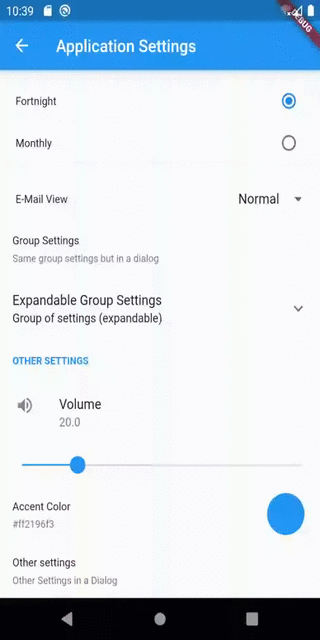
flutter_settings_screens 封面
插件详情v0.3.5

flutter_settings_screens

一个简单的插件,用于为您的 Flutter 应用实现设置 UI 屏幕。自定义您想要的内容,从 UI 元素、行为到底层存储库。

AndroidiOSWebmacOSWindowsLinux
近 30 天下载
3630
喜欢数
194
Pub 分数
150

安装插件

flutter pub add flutter_settings_screens

插件介绍

基于插件公开信息、社区数据与项目使用情况整理的选型参考。

一个轻量级的Flutter包,旨在简化设置UI屏幕的创建。它提供了可自定义的组件,用于构建直观的设置界面,使开发者能够定制UI元素、行为和存储机制。适用于需要在多个平台上实现简洁、结构化设置体验的应用程序。该包支持原生类似的交互,并可无缝集成到现有的Flutter项目中。

适合场景

  • 构建应用设置屏幕
  • 自定义用户偏好设置界面
  • 实现主题和语言设置
  • 创建可配置的应用程序行为
  • 管理用户数据持久性
  • 设计跨平台设置界面

主要特点

  • 高度可定制的 UI 组件
  • 对多种存储后端的支持
  • 跨平台兼容性
  • 与 Flutter 应用轻松集成
  • 模块化和可扩展的设计
  • 对常见设置类型的内置支持

适合对象

  • 开发功能丰富的移动应用程序的开发者
  • 需要一致设置用户体验的团队
  • 需要跨平台设置的项目
  • 具有用户偏好管理的应用程序
  • 专注于前端的Flutter开发者
  • 设置界面的快速原型设计

使用建议

  • 需要手动设置以用于自定义存储
  • 有限的内置验证
  • 可能需要额外的状态管理
  • 未针对非常大的设置树进行优化
  • 自定义样式需要熟悉 Flutter 小部件
  • 依赖于外部存储实现的选择

原始 README

以下为关联源码仓库的 README 原文快照,最新内容请访问源码仓库。

flutter_settings_screens

pub package License: MIT

This is a simple flutter plugin for easily creating app settings screens. The unique thing about this library is that it is not dependent upon any specific storage library used to store settings.

Inspired by the shared_preferences_settings plugin.

Update: Now with Null-safety & Material3 support

Features

  • A collection of settings widgets to make a settings page in a few seconds and get going.
    • Normal:
      • SimpleSettingsTile
      • Switch/Toggle setting
      • Checkbox setting
      • Drop down setting
      • Radio selection Setting
      • Slider setting
      • Color choice panel
      • Text Input Setting
    • Advanced:
      • SettingsScreen:

        A Flutter Widget/Page which can contain all settings widget.

      • ExpandableSettingsTile

        A settings widget which can hold a set of widgets in a section which is collapsible

      • SettingsContainer

      A Settings widget that helps any flutter widget fit into the settings page

      • SettingsGroup

      A Container widget that creates a section with a title to separate settings inside this from other settings

  • Settings saved via "CacheProvider" library of your choice
    • default version uses SharedPreferences.
  • Widgets with conditional visibility of some other settings.
    • for example, A set of settings is only visible if a switch or a checkbox is enabled.

Examples

Initializing the plugin

Initialize the plugin as following:

await Settings.init(cacheProvider: _customCacheProvider);

Note: The plugin must be initialized before Navigating to the settings page.

It is recommended that Settings.init() should be called before runApp() is called in the main file. However, anywhere before showing the settings page is fine.

Cache Provider Interface

Cache Provider is an interface by which the plugin accesses the underlying caching storage.

This plugin includes an implementation of the CacheProvider using the SharedPreferences library by flutter. If cacheProvider parameter is not given explicitly then the default implementation will be used to store the settings.

However, if you wish to use other means for storing the data, you can implement one by yourself.

All you have to do is create a class as follows:

import 'package:flutter_settings_screens/flutter_settings_screens.dart';

class CustomCacheProvider extends CacheProvider {
    ///...
    ///implement the methods as you want
    ///...
}

for example,

/// A cache access provider class for shared preferences using shared_preferences library
class SharePreferenceCache extends CacheProvider {
    //...
}

OR

/// A cache access provider class for shared preferences using Hive library
class HiveCache extends CacheProvider {
    //...
}

Once you implement the class, use an instance of this class to initialize the Settings class.

Accessing/Retrieving data

You can use static methods of Settings class to access any data from the storage.

Get value:

 Settings.getValue<T>(cacheKey, defaultValue);

Set value(no UI updates):

 await Settings.setValue<T>(cacheKey, newValue);

Set value(with UI updates):

 await Settings.setValue<T>(cacheKey, newValue, notify: true);

T represents any of the following:

  • String
  • bool
  • int
  • double
  • Object

For example if you want to access a String value from the storage: Get value:

 Settings.getValue<String>(cacheKey, defaultValue);

Set value:

 await Settings.setValue<String>(cacheKey, newValue, notify: true);
Special-Note:

Since, Color or MaterialColor is a Flutter object, we need to convert it to string version of the color before saving it to cache & convert string version to color while fetching it from the cache.

For that the plugin exposes ConversionUtils class with utility method to do that needed.

From color to string:

 String colorString = ConversionUtils.stringFromColor(Colors.blue);

From string to color:

 Color color = ConversionUtils.colorFromString('#0000ff');

Tile widgets

SimpleSettingsTile

SimpleSettingsTile is a simple settings tile that can open a new screen by tapping the tile.

Example:

SimpleSettingsTile(
  title: 'Advanced',
  subtitle: 'More, advanced settings.'
  screen: SettingsScreen(
    title: 'Sub menu',
    children: <Widget>[
      CheckboxSettingsTile(
        settingsKey: 'key-of-your-setting',
        title: 'This is a simple Checkbox',
      ),
    ],
  ),
);
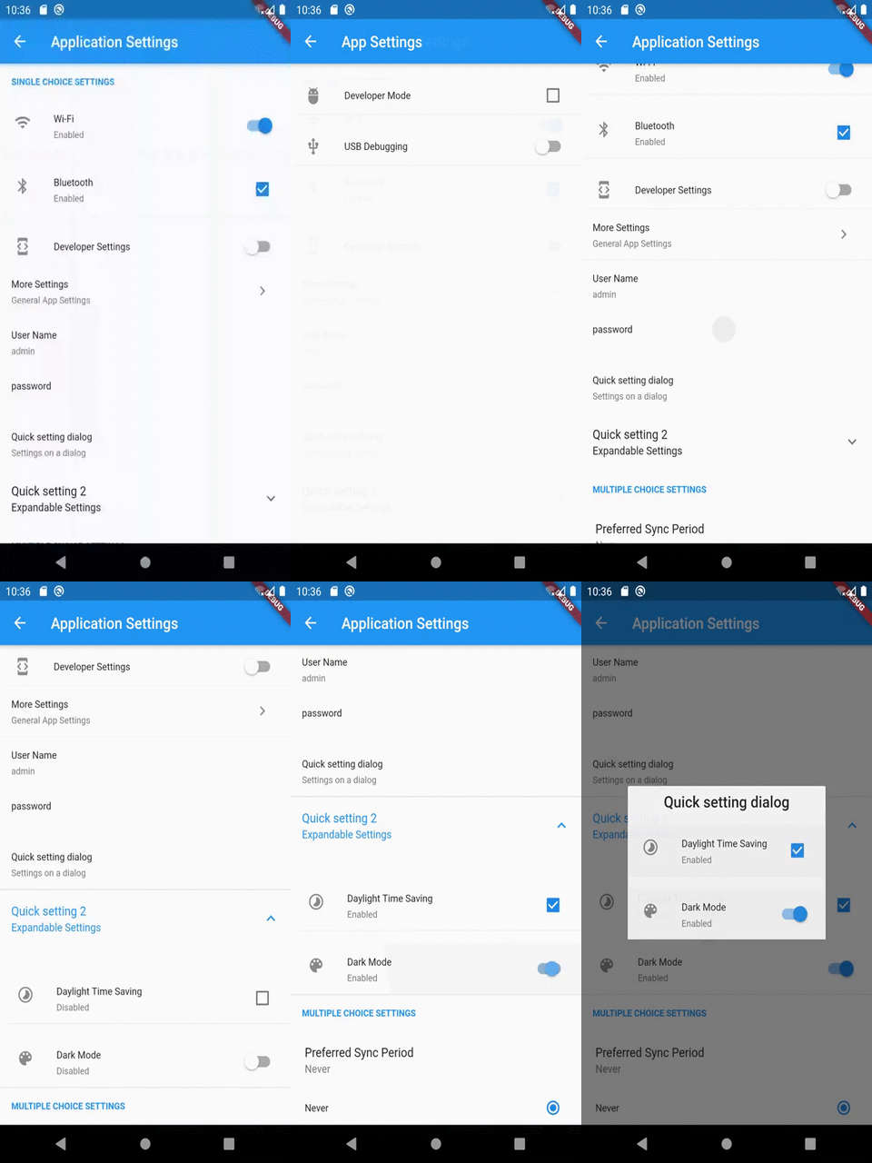
SettingsTileGroup

SettingsGroup is a widget that contains multiple settings tiles and other widgets together as a group and shows a title/name of that group.

All the children widget will have small padding from the left and top to provide a sense that they in a separate group from others

Example:

SettingsGroup(
   title: 'Group title',
   children: <Widget>[
      CheckboxSettingsTile(
        settingKey: 'key-day-light-savings',
        title: 'Daylight Time Saving',
        enabledLabel: 'Enabled',
        disabledLabel: 'Disabled',
        leading: Icon(Icons.timelapse),
      ),
      SwitchSettingsTile(
        settingKey: 'key-dark-mode',
        title: 'Dark Mode',
        enabledLabel: 'Enabled',
        disabledLabel: 'Disabled',
        leading: Icon(Icons.palette),
      ),
     ],
 );
ExpandableSettingsTile

ExpandableSettingsTile is a wrapper widget that shows the given children when expanded by clicking on the tile.

Example:

 ExpandableSettingsTile(
   title: 'Quick setting dialog2',
   subtitle: 'Expandable Settings',
   children: <Widget>[
     CheckboxSettingsTile(
       settingKey: 'key-day-light-savings',
       title: 'Daylight Time Saving',
       enabledLabel: 'Enabled',
       disabledLabel: 'Disabled',
       leading: Icon(Icons.timelapse),
     ),
     SwitchSettingsTile(
       settingKey: 'key-dark-mode',
       title: 'Dark Mode',
       enabledLabel: 'Enabled',
       disabledLabel: 'Disabled',
       leading: Icon(Icons.palette),
     ),
   ],
 );
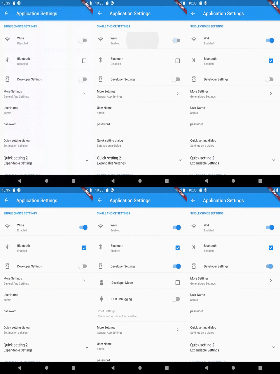
CheckboxSettingsTile

CheckboxSettingsTile is a widget that has a Checkbox with given title, subtitle and default value/status of the Checkbox

This widget supports an additional list of widgets to display when the Checkbox is checked. This optional list of widgets is accessed through childrenIfEnabled property of this widget.

This widget works similar to SwitchSettingsTile.

Example:

 CheckboxSettingsTile(
  leading: Icon(Icons.developer_mode),
  settingKey: 'key-check-box-dev-mode',
  title: 'Developer Settings',
  onChange: (value) {
    debugPrint('key-check-box-dev-mode: $value');
  },
  childrenIfEnabled: <Widget>[
    CheckboxSettingsTile(
      leading: Icon(Icons.adb),
      settingKey: 'key-is-developer',
      title: 'Developer Mode',
      onChange: (value) {
        debugPrint('key-is-developer: $value');
      },
    ),
    SwitchSettingsTile(
      leading: Icon(Icons.usb),
      settingKey: 'key-is-usb-debugging',
      title: 'USB Debugging',
      onChange: (value) {
        debugPrint('key-is-usb-debugging: $value');
      },
    ),
  ],
 );
SwitchSettingsTile

SwitchSettingsTile is a widget that has a Switch with given title, subtitle and default value/status of the switch

This widget supports an additional list of widgets to display when the switch is enabled. This optional list of widgets is accessed through childrenIfEnabled property of this widget.

This widget works similar to CheckboxSettingsTile.

Example:

 SwitchSettingsTile(
  leading: Icon(Icons.developer_mode),
  settingKey: 'key-switch-dev-mode',
  title: 'Developer Settings',
  onChange: (value) {
    debugPrint('key-switch-dev-mod: $value');
  },
  childrenIfEnabled: <Widget>[
    CheckboxSettingsTile(
      leading: Icon(Icons.adb),
      settingKey: 'key-is-developer',
      title: 'Developer Mode',
      onChange: (value) {
        debugPrint('key-is-developer: $value');
      },
    ),
    SwitchSettingsTile(
      leading: Icon(Icons.usb),
      settingKey: 'key-is-usb-debugging',
      title: 'USB Debugging',
      onChange: (value) {
        debugPrint('key-is-usb-debugging: $value');
      },
    ),
    SimpleSettingsTile(
      title: 'Root Settings',
      subtitle: 'These settings is not accessible',
      enabled: false,
    )
  ],
 );
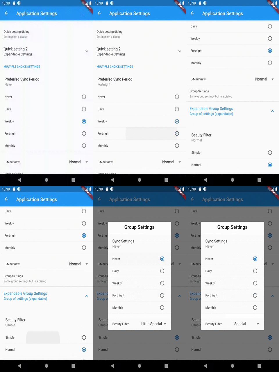
RadioSettingsTile

RadioSettingsTile is a widget that has a list of Radio widgets with given title, subtitle and default/group value which determines which Radio will be selected initially.

This widget supports Any type of values which should be put in the preference.

However, since any type of value is supported, the input for this widget is a Map to the required values with their string representation.

For example, if the required value type is a boolean then the values map can be as following:

<bool, String> {
   true: 'Enabled',
   false: 'Disabled'
}

So, if the Enabled value radio is selected then the value true will be stored in the preference

Complete Example:

RadioSettingsTile<int>(
  title: 'Preferred Sync Period',
  settingKey: 'key-radio-sync-period',
  values: <int, String>{
    0: 'Never',
    1: 'Daily',
    7: 'Weekly',
    15: 'Fortnight',
    30: 'Monthly',
  },
  selected: 0,
  onChange: (value) {
    debugPrint('key-radio-sync-period: $value days');
  },
)
DropDownSettingTile

DropDownSettingsTile is a widget that has a list of DropdownMenuItems with given title, subtitle and default/group value which determines which value will be set to selected initially.

This widget supports Any type of values which should be put in the preference.

However, since any type of value is supported, the input for this widget is a Map to the required values with their string representation.

For example, if the required value type is a boolean then the values map can be as following:

 <bool, String> {
    true: 'Enabled',
    false: 'Disabled'
 }

So, if the Enabled value is selected then the value true will be stored in the preference

Complete Example:

DropDownSettingsTile<int>(
  title: 'E-Mail View',
  settingKey: 'key-dropdown-email-view',
  values: <int, String>{
    2: 'Simple',
    3: 'Adjusted',
    4: 'Normal',
    5: 'Compact',
    6: 'Squizzed',
  },
  selected: 2,
  onChange: (value) {
    debugPrint('key-dropdown-email-view: $value');
  },
);
SliderSettingsTile

SliderSettingsTile is a widget that has a slider given title, subtitle and default value which determines what the slider's position will be set initially.

This widget supports double and integer types of values which should be put in the preference.

Example:

SliderSettingsTile(
 title: 'Volume',
 settingKey: 'key-slider-volume',
 defaultValue: 20,
 min: 0,
 max: 100,
 step: 1,
 leading: Icon(Icons.volume_up),
 onChange: (value) {
   debugPrint('key-slider-volume: $value');
 },
);

Modal widgets

RadioModalSettingsTile

RadioModalSettingsTile widget is the dialog version of the RadioSettingsTile widget.

The use of this widget is similar to the RadioSettingsTile, only the displayed widget will be in a different position.

i.e instead of inside the settings screen, it will be shown in a dialog above the settings screen.

Example:

RadioModalSettingsTile<int>(
  title: 'Preferred Sync Period',
  settingKey: 'key-radio-sync-period',
  values: <int, String>{
    0: 'Never',
    1: 'Daily',
    7: 'Weekly',
    15: 'Fortnight',
    30: 'Monthly',
  },
  selected: 0,
  onChange: (value) {
    debugPrint('key-radio-sync-period: $value days');
  },
);
SliderModalSettingsTile

SliderModalSettingsTile widget is the dialog version of the SliderSettingsTile widget.

The use of this widget is similar to the SliderSettingsTile, only the displayed widget will be in a different position.

i.e instead of inside the settings screen, it will be shown in a dialog above the settings screen.

Example:

SliderSettingsTile(
 title: 'Volume',
 settingKey: 'key-slider-volume',
 defaultValue: 20,
 min: 0,
 max: 100,
 step: 1,
 leading: Icon(Icons.volume_up),
 onChange: (value) {
   debugPrint('key-slider-volume: $value');
 },
);
TextInputSettingsTile

A Setting widget which allows user a text input in a TextFormField.

Example:

TextInputSettingsTile(
  title: 'User Name',
  settingKey: 'key-user-name',
  initialValue: 'admin',
  validator: (String username) {
    if (username != null && username.length > 3) {
      return null;
    }
    return "User Name can't be smaller than 4 letters";
  },
  borderColor: Colors.blueAccent,
  errorColor: Colors.deepOrangeAccent,
);

OR

TextInputSettingsTile(
  title: 'password',
  settingKey: 'key-user-password',
  obscureText: true,
  validator: (String password) {
    if (password != null && password.length > 6) {
      return null;
    }
    return "Password can't be smaller than 7 letters";
  },
  borderColor: Colors.blueAccent,
  errorColor: Colors.deepOrangeAccent,
);
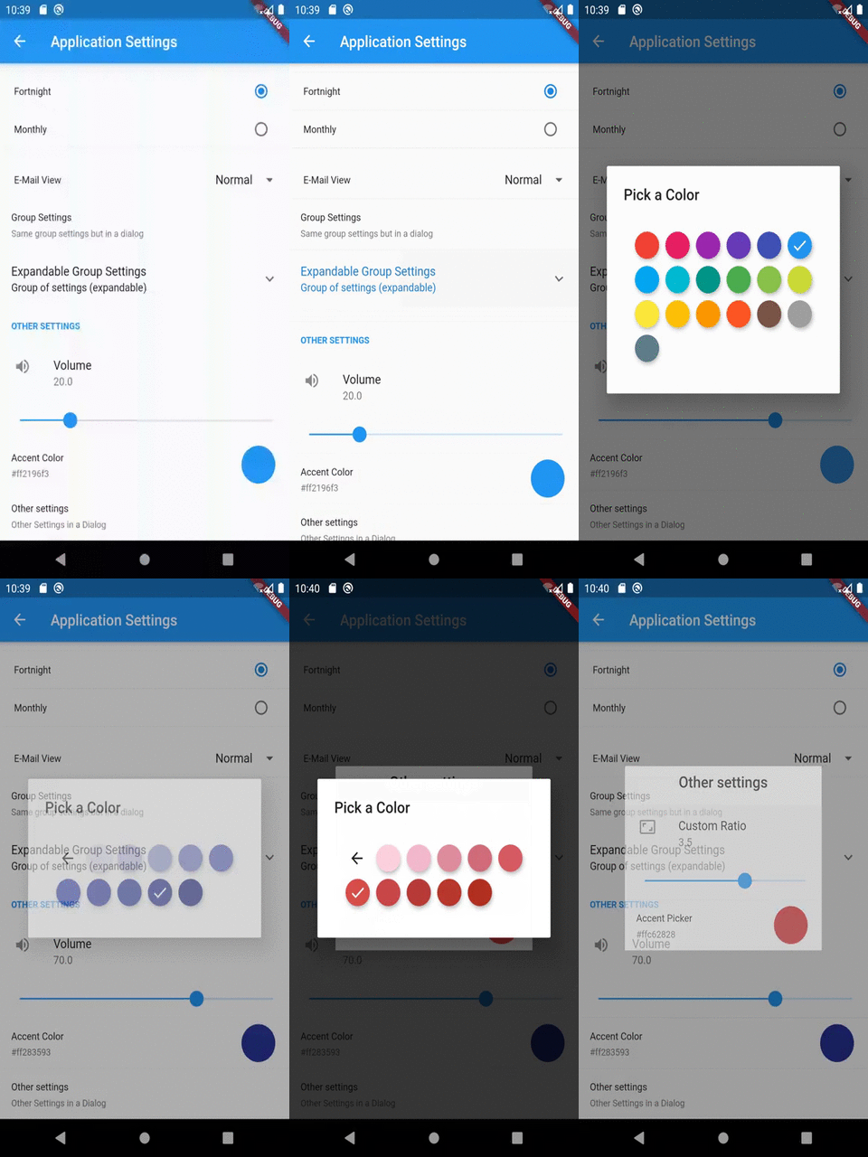
ColorPickerSettingsTile

ColorPickerSettingsTile is a widget which allows user to select a color from a set of Material color choices.

Since, Color is an in-memory object type, the serialized version of the value of this widget will be a Hex value String of the selected color.

For example, If selected color is red then the stored value will be "#ffff0000", but when retrieved, the value will be an instance of Color with properties of red color.

This conversion string <-> color, makes this easy to check/debug the values from the storage/preference manually.

The color panel shown in the widget is provided by the flutter_material_color_picker library.

Example:

 ColorPickerSettingsTile(
   settingKey: 'key-color-picker',
   title: 'Accent Color',
   defaultValue: Colors.blue,
   onChange: (value) {
     debugPrint('key-color-picker: $value');
   },
 );

Utility widgets

SettingsScreen

A simple Screen widget that may contain settings tiles or other widgets. The following example shows how you can create an empty settings screen with a title:

SettingsScreen(
    title: "Application Settings",
    children: [],
);

Inside the children parameter, you can define settings tiles and other widgets. In this example we create a screen with a simple CheckboxSettingsTile in it:

SettingsScreen(
    title: "Application Settings",
    children:
        CheckboxSettingsTile(
            settingKey: 'key-of-your-setting',
            title: 'This is a simple Checkbox',
        ),
    ,
);
SettingsContainer

A widget that helps its child or children to fin in the settings screen. It is helpful if you want to place other widgets than settings tiles in the settings screen body. The following example shows how you can create a container with one Text widget:

SettingsContainer(
    child: Text('Hello world'),
);

In this example, we create a container with multiple Text widgets:

SettingsContainer(
    children:
        Text('First line'),
        Text('Second line'),
    ],
);

Alternate widgets

SimpleRadioSettingsTile

SimpleRadioSettingsTile is a simpler version of the RadioSettingsTile. Instead of a Value-String map, this widget just takes a list of String values.

In this widget, the displayed value and the stored value will be the same.

Example:

SimpleRadioSettingsTile(
  title: 'Sync Settings',
  settingKey: 'key-radio-sync-settings',
  values: <String>[
    'Never',
    'Daily',
    'Weekly',
    'Fortnight',
    'Monthly',
  ],
  selected: 'Daily',
  onChange: (value) {
    debugPrint('key-radio-sync-settings: $value');
  },
);
SimpleDropDownSettingsTile

SimpleDropDownSettingsTile is a simpler version of the DropDownSettingsTile. Instead of a Value-String map, this widget just takes a list of String values.

In this widget, the displayed value and the stored value will be the same.

Example:

SimpleDropDownSettingsTile(
  title: 'Beauty Filter',
  settingKey: 'key-dropdown-beauty-filter',
  values: <String>[
    'Simple',
    'Normal',
    'Little Special',
    'Special',
    'Extra Special',
    'Bizarre',
    'Horrific',
  ],
  selected: 'Special',
  onChange: (value) {
    debugPrint('key-dropdown-beauty-filter: $value');
 },
);

Contribution/Support

  • File an issue on the repository, if something is not working as expected.
    • Please follow the issue template used in flutter-sdk's repository, may be we'll integrate that here as well.
  • File an issue in the repository, If you have any suggestions and/or feature requests, use [Suggestion] or [FeatureRequest] tags in issue titles.
  • To support you just have to help out fellow developers on of the filed issues in this repository.
  • To contribute, just follow the standard open source contributions instructions, maybe we can follow the ones used in the flutter sdk. We'll see how it goes.

All help, issues, support and contributions are most welcome.

If any one is interested in helping me maintain this library then please reach to me via comment on this issue.

所属分类

依赖

依赖清单 3 项

源码仓库

使用此插件的项目