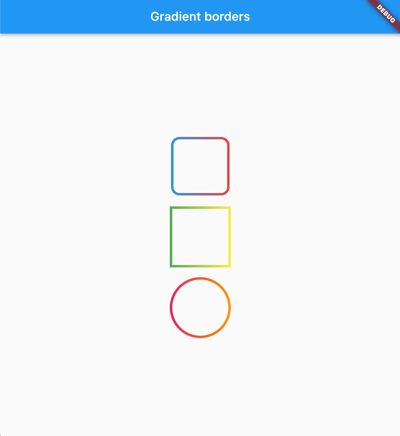
Gradient borders
Various borders that use gradient instead of boring plain colors.
Usage
Box borders:
Change your container borders to use fancy gradients:
Container (
width: 100 ,
height: 100 ,
decoration: BoxDecoration (
border: const GradientBoxBorder (
gradient: LinearGradient (colors: [Colors .blue, Colors .red]),
width: 4 ,
),
borderRadius: BorderRadius .circular (16 )
),
),
Works with both: border radius, and with BoxShape.circle
Parameters
Parameter
Type
Default
Description
gradientGradientrequired
The gradient to use for the border color.
widthdouble1.0The width of the border.
strokeAligndoubleBorderSide.strokeAlignInsideThe alignment of the stroke relative to the border edge. Use BorderSide.strokeAlignInside (-1), BorderSide.strokeAlignCenter (0), or BorderSide.strokeAlignOutside (1).
Input borders
You can use GradientOutlineInputBorder as a part of your input decoration:
TextField (
decoration: InputDecoration (
border: GradientOutlineInputBorder (
gradient: LinearGradient (colors: [Colors .red, Colors .blue]),
width: 2 ,
),
focusedBorder: GradientOutlineInputBorder (
gradient: LinearGradient (colors: [Colors .yellow, Colors .green]),
width: 2
),
label: Text ("Example" ),
),
),
Parameters
Parameter
Type
Default
Description
gradientGradientrequired
The gradient to use for the border color.
widthdouble1.0The width of the border.
gapPaddingdouble4.0Horizontal padding around the label cutout in the border.
borderRadiusBorderRadiusBorderRadius.all(Radius.circular(4))The border radius of the rounded corners.
borderAlignmentOutlineBorderAlignmentOutlineBorderAlignment.onEdgeControls where the stroke is drawn relative to the widget edge. onEdge draws the border centered on the widget boundary; inside draws it fully inside.
You can also use GradientUnderlineInputBorder as part of your input decoration:
TextField (
decoration: InputDecoration (
border: GradientOutlineInputBorder (
gradient: LinearGradient (colors: [Colors .red, Colors .blue]),
width: 2 ,
),
focusedBorder: GradientUnderlineInputBorder (
gradient: LinearGradient (colors: [Colors .yellow, Colors .green]),
width: 2
),
label: Text ("Example" ),
),
),
Sponsored by
The Code Brothers