搜索插件、代码仓与 APP 分类

group_button 封面
插件详情v5.3.4

group_button

Flutter 自定义小部件,用于创建一组按钮。包含单选按钮和复选框按钮。

AndroidiOSWebmacOSWindowsLinux
近 30 天下载
26.9万
喜欢数
622
Pub 分数
160

安装插件

flutter pub add group_button

插件介绍

基于插件公开信息、社区数据与项目使用情况整理的选型参考。

一个 Flutter 自定义小部件,可创建分组按钮,支持单选和复选框样式。它简化了在干净、可重用的格式中实现互斥或多选选项的过程。非常适合表单、筛选器和设置界面,用户需要从一组选项中选择一个或多个选项。该包适用于所有主要平台,并可无缝集成到现有的 Flutter 项目中。

适合场景

  • 带有分组选择的表单输入
  • UI 中的筛选选项
  • 用户偏好设置
  • 多选或单选按钮组
  • 动态表单构建器

主要特点

  • 支持单选按钮和复选框按钮类型
  • 与 Flutter 的轻松集成
  • 跨平台兼容性
  • 可自定义样式
  • 用于组选择的内置状态管理
  • 适用于所有设备的响应式设计

适合对象

  • 开发交互式表单的开发者
  • 需要分组按钮组件的UI设计师
  • 需要筛选或偏好选择的应用程序
  • 面向多个平台的项目

使用建议

  • 需要手动处理选择回调
  • 有限的内置验证
  • 样式可能需要额外的自定义
  • 不适合没有额外逻辑的复杂动态分组

原始 README

以下为关联源码仓库的 README 原文快照,最新内容请访问源码仓库。

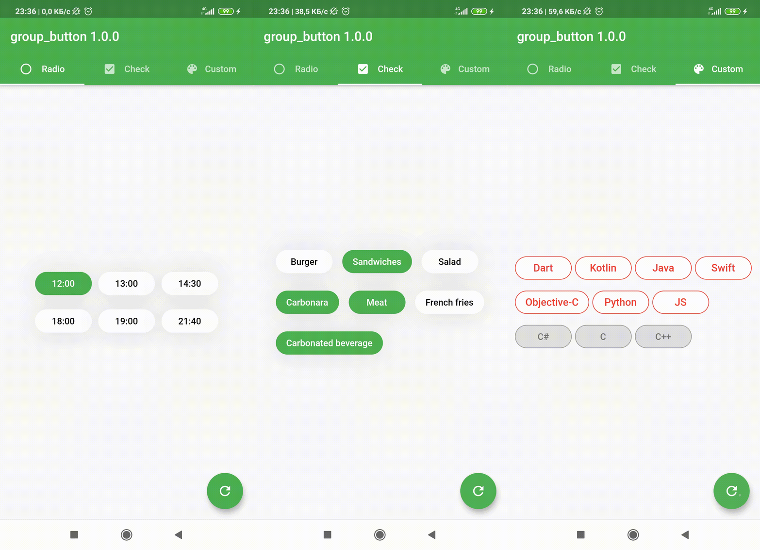
Flutter widget to create a group of buttons fast 🚀

Included Radio and CheckBox buttons models with custom groping types 🤤
Show some ❤️ and star the repo to support the project!

Pub License: MIT Repository views Pub

Pub likes Pub popularity Pub points


GroupButtonController GroupButtonBuilder GroupButtonOptions

Getting Started

Follow these steps to use this package

Add dependency
dependencies:
  group_button: ^5.4.0
Add import package
import 'package:group_button/group_button.dart';
Easy to use

Simple example of use GroupButton
Put this code in your project at an screen and learn how it works 😊

GroupButton(
    isRadio: false,
    onSelected: (index, isSelected) => print('$index button is selected'),
    buttons: ["12:00", "13:00", "14:30", "18:00", "19:00", "21:40"],
)
Controller

Starting from version 4.1.0
You can control your Group Button using the controller

final controller = GroupButtonController();

Column(
  children: [
    GroupButton.checkbox(
      controller: controller,
      buttons: ['12:00', '13:00', '14:00'],
      onSelected: (i, selected) => debugPrint('Button #$i $selected'),
    ),
    TextButton(
      onPressed: () => controller.selectIndex(1),
      child: const Text('Select 1 button'),
    )
  ],
),
Generic button value

In new 5.0.0 version you can set custom buttons value type
It can be int, DateTime, double or YourCustomClass
Button text will be result of .toString() model method in common button display case

GroupButton<DateTime>(
  buttons: [DateTime(2022, 4, 9), DateTime(2022, 4, 10)],
)
Button builders

Also you can use generic button values with cutsom buttonBuilder
In order to turn values into any widget

GroupButton<DateTime>(
  buttons: [DateTime(2022, 4, 9), DateTime(2022, 4, 10)],
  buttonBuilder: (selected, date, context) {
    return Text('${date.year}-${date.month}-${date.day}');
  },
),

In this package, there are four different possibilities for customizing your buttons through builders

  • 1 buttonBuilder It will build a fully custom button based on the value parameter
  • 2 buttonIndexedBuilder same as buttonBuilder. But based on button index.
  • 3 buttonTextBuilder It will replace the text of your button, which is constructed based on the style parameters passed in GroupButtonOptions. The appearance of the button remains the same, but the text is changed. Based on button value.
  • 4 buttonIndexedTextBuilder same as buttonTextBuilder. But based on button index.
Fully Customize

In order to customize your buttons inside GroupButton you can use GroupButtonOptions

GroupButtonOptions(
  selectedShadow: const [],
  selectedTextStyle: TextStyle(
    fontSize: 20,
    color: Colors.pink[900],
  ),
  selectedColor: Colors.pink[100],
  unselectedShadow: const [],
  unselectedColor: Colors.amber[100],
  unselectedTextStyle: TextStyle(
    fontSize: 20,
    color: Colors.amber[900],
  ),
  selectedBorderColor: Colors.pink[900],
  unselectedBorderColor: Colors.amber[900],
  borderRadius: BorderRadius.circular(100),
  spacing: 10,
  runSpacing: 10,
  groupingType: GroupingType.wrap,
  direction: Axis.horizontal,
  buttonHeight: 60,
  buttonWidth: 60,
  mainGroupAlignment: MainGroupAlignment.start,
  crossGroupAlignment: CrossGroupAlignment.start,
  groupRunAlignment: GroupRunAlignment.start,
  textAlign: TextAlign.center,
  textPadding: EdgeInsets.zero,
  alignment: Alignment.center,
  elevation: 0,
),

Examples

You can check more examples of using this package here


Thanks to all contributors of this package


For help getting started with 😍 Flutter, view online documentation, which offers tutorials, samples, guidance on mobile development, and a full API reference.

所属分类

源码仓库

使用此插件的项目