搜索插件、代码仓与 APP 分类

插件详情v1.0.4

grouped_buttons

一个简单的包,使分组复选框和单选按钮变得更加容易。

近 30 天下载
302
喜欢数
82
Pub 分数
30

安装插件

flutter pub add grouped_buttons

插件介绍

基于插件公开信息、社区数据与项目使用情况整理的选型参考。

一个轻量级的 Flutter 包,可简化分组复选框和单选按钮的创建与管理。它提供了一种简洁、可重复使用的方法来处理多个选择选项,具有统一的样式和状态管理。适用于表单或设置,用户需要从预定义集合中选择一个或多个项目。该包通过抽象常见模式,减少了样板代码,提升了开发人员的生产力。

适合场景

  • 具有多个选项的表单输入
  • 用户偏好设置
  • 调查或测验界面
  • 动态选项选择
  • 简化分组的状态处理
  • 切换选项的统一用户界面

主要特点

  • 轻松分组复选框和单选按钮
  • 内置状态管理
  • 可自定义外观
  • 最小化样板代码
  • 支持单选和多选
  • 简洁、可读的 API

适合对象

  • 使用选项组构建表单的开发者
  • 寻求一致切换组件的UI设计师
  • 需要简单但可扩展的选择控件的项目
  • 注重代码可维护性的团队
  • Flutter 初学者学习表单处理

使用建议

  • 仅限复选框和单选按钮类型
  • 无内置验证
  • 不支持嵌套组
  • 需要手动样式设置以实现复杂设计
  • 不适用于超出选择之外的高级表单逻辑

原始 README

以下为关联源码仓库的 README 原文快照,最新内容请访问源码仓库。

grouped_buttons

pub package

A set of Flutter widgets that makes grouping Checkboxes and Radio Buttons much easier!

Installing

Add the following to your pubspec.yaml file:

dependencies:
  grouped_buttons: ^1.0.4

Simple Usage

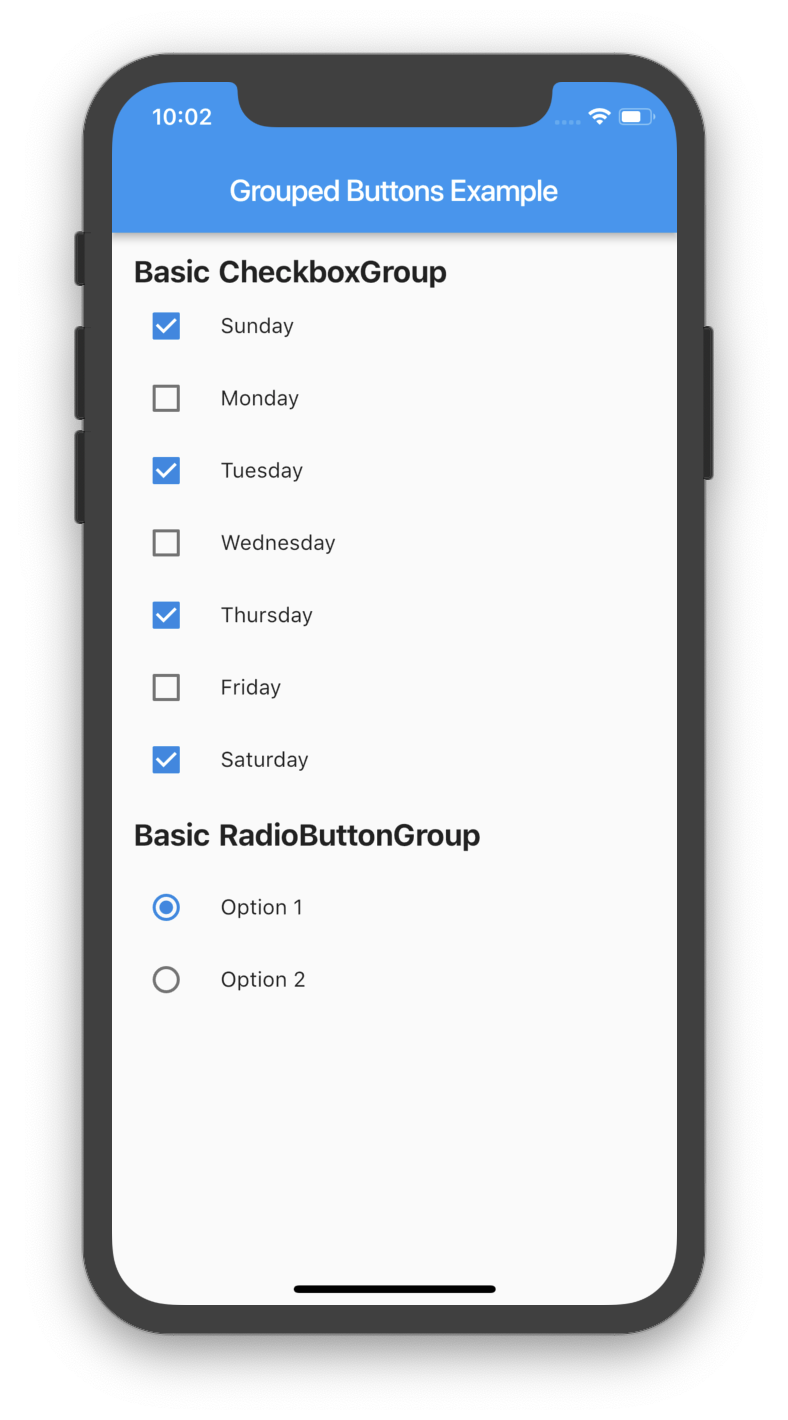
Creating a basic CheckboxGroup
CheckboxGroup(
  labels: <String>[
    "Sunday",
    "Monday",
    "Tuesday",
    "Wednesday",
    "Thursday",
    "Friday",
    "Saturday",
    "Sunday",
  ],
  onSelected: (List<String> checked) => print(checked.toString())
);
Creating a basic RadioButtonGroup
RadioButtonGroup(
  labels: <String>[
    "Option 1",
    "Option 2",
  ],
  onSelected: (String selected) => print(selected)
);
Screenshot
Basic Usage

Custom Usage

There are several options that allow for more control.

Custom CheckboxGroup
Properties Description
activeColor The color to use when a Checkbox is checked.
checkColor The color to use for the check icon when a Checkbox is checked.
checked Specifies which boxes to be automatically checked. Every element must match a label. This is useful for clearing all selections (set it to []). If this is non-null, then the user must handle updating this list; otherwise, the state of the CheckboxGroup won't change.
disabled Specifies which boxes should be disabled. If this is non-null, no boxes will be disabled. The strings passed to this must match the labels.
itemBuilder Called when needed to build a CheckboxGroup element.
labels (required) A list of strings that describes each Checkbox. Each label must be distinct.
labelStyle The style to use for the labels.
margin Empty space surrounding the CheckboxGroup.
onChange Called when the value of the CheckboxGroup changes.
onSelected Called when the user makes a selection.
orientation Specifies the orientation to display elements. Either GroupedButtonsOrientation.HORIZONTAL or GroupedButtonsOrientation.VERTICAL.
padding Empty space in which to inset the CheckboxGroup.
tristate If true the checkbox's value can be true, false, or null.
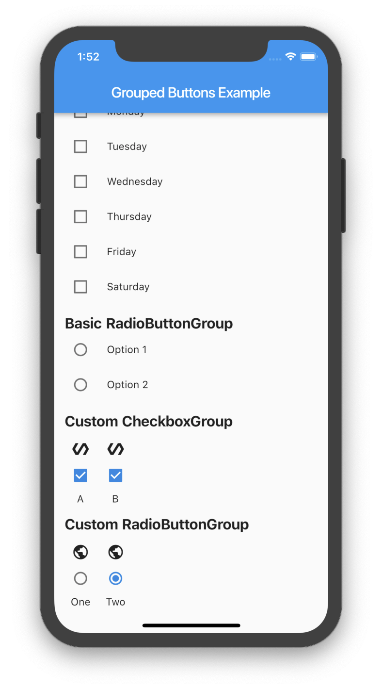
List<String> _checked = ["A", "B"];

CheckboxGroup(
  orientation: GroupedButtonsOrientation.HORIZONTAL,
  margin: const EdgeInsets.only(left: 12.0),
  onSelected: (List selected) => setState((){
    _checked = selected;
  }),
  labels: <String>[
    "A",
    "B",
  ],
  checked: _checked,
  itemBuilder: (Checkbox cb, Text txt, int i){
    return Column(
      children: <Widget>[
        Icon(Icons.polymer),
        cb,
        txt,
      ],
    );
  },
);
Custom RadioButtonGroup
Properties Description
activeColor The color to use when a Radio button is checked.
disabled Specifies which buttons should be disabled. If this is non-null, no buttons will be disabled. The strings passed to this must match the labels.
itemBuilder Called when needed to build a RadioButtonGroup element.
labels (required) A list of strings that describes each Radio button. Each label must be distinct.
labelStyle The style to use for the labels.
margin Empty space surrounding the RadioButtonGroup.
onChange Called when the value of the RadioButtonGroup changes.
onSelected Called when the user makes a selection.
orientation Specifies the orientation to display elements. Either GroupedButtonsOrientation.HORIZONTAL or GroupedButtonsOrientation.VERTICAL.
padding Empty space in which to inset the RadioButtonGroup.
picked Specifies which Radio button to automatically pick. Every element must match a label. This is useful for clearing what is picked (set it to ""). If this is non-null, then the user must handle updating this; otherwise, the state of the RadioButtonGroup won't change.
String _picked = "Two";

RadioButtonGroup(
  orientation: GroupedButtonsOrientation.HORIZONTAL,
  margin: const EdgeInsets.only(left: 12.0),
  onSelected: (String selected) => setState((){
    _picked = selected;
  }),
  labels: <String>[
    "One",
    "Two",
  ],
  picked: _picked,
  itemBuilder: (Radio rb, Text txt, int i){
    return Column(
      children: <Widget>[
        Icon(Icons.public),
        rb,
        txt,
      ],
    );
  },
);
Screenshot
Basic Usage

所属分类

源码仓库

使用此插件的项目

暂无相关数据。