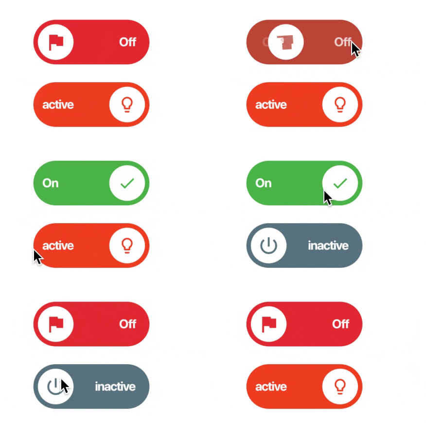
Lite Rolling Switch 是一个可自定义的 Flutter 开关小部件,具有流畅且视觉上吸引人的动画效果。它允许开发者根据应用的设计需求调整颜色、图标和其他视觉元素。完全兼容空安全,支持 Android、iOS、Web、macOS、Windows 和 Linux 等多个平台。该包轻量且易于集成,非常适合需要引人入胜的切换界面但又不想增加过多开销的应用。
适合场景
表单中的自定义切换开关
交互式设置面板
仪表板中的动画UI元素
用户偏好切换
移动和网页应用中的视觉反馈
主要特点
平滑滚动动画
可自定义的颜色和图标
空值安全支持
跨平台兼容性
轻量且高效
与 Flutter 的轻松集成
适合对象
寻求动画开关的开发者
注重设计的应用程序
需要交互式切换的 App
Flutter 初学者探索组件
面向多个平台的项目
使用建议
仅限外观自定义
无内置状态管理
不适合复杂的表单逻辑
需要手动处理 onToggle 事件
仅适用于简单的切换功能
原始 README
以下为关联源码仓库的 README 原文快照,最新内容请访问源码仓库。
lite_rolling_switch
Full customable rolling switch widget for flutter apps based on Pedro Massango's 'crazy-switch' widget https://github.com/pedromassango/crazy-switch
About
Custom Switch button with attractive animation,
made to allow you to customize colors, icons and other cosmetic content. Manage the widget states in the same way you do with the classical material's switch widget.
NOTE: Currently, you cannot directly change the widget height properties. This feature will be available soon.
Previews
Basic Implementation
import'package:lite_rolling_switch/lite_rolling_switch.dart';
LiteRollingSwitch(
//initial value
value: true,
textOn: 'disponible',
textOff: 'ocupado',
colorOn: Colors.greenAccent[700],
colorOff: Colors.redAccent[700],
iconOn: Icons.done,
iconOff: Icons.remove_circle_outline,
textSize: 16.0,
onChanged: (bool state) {
//Use it to manage the different statesprint('Current State of SWITCH IS: $state');
},
),
Tests
To executed included unit tests run flutter test. Feel free to Pull Request your own Unit Test to improve this package!