搜索插件、代码仓与 APP 分类

loader_overlay 封面
插件详情v5.0.0

loader_overlay

一个简单的包,用于简化屏幕管理。在加载任何异步任务时,该包会阻止用户与屏幕交互,直到异步任务完成。

AndroidiOSWebmacOSWindowsLinux
近 30 天下载
7万
喜欢数
567
Pub 分数
160

安装插件

flutter pub add loader_overlay

插件介绍

基于插件公开信息、社区数据与项目使用情况整理的选型参考。

LoaderOverlay 是一个 Flutter 包,可简化异步操作期间的屏幕管理。它会显示一个加载遮罩,防止用户在执行 API 调用或数据处理等任务时进行交互。该遮罩可以轻松开启和关闭,确保在任务完成前阻止输入,从而提供流畅的用户体验。支持所有主要平台,包括 Android、iOS、Web、macOS、Windows 和 Linux。非常适合在加载状态下提升用户体验,而无需复杂的自定义实现。

适合场景

  • 在异步操作期间阻止UI
  • 防止加载期间意外点击
  • 在表单中显示加载指示器
  • 管理长时间运行的后台任务
  • 提高应用程序的响应速度
  • 简化加载状态处理

主要特点

  • 简单覆盖激活
  • 自动UI阻塞
  • 跨平台支持
  • 轻松集成异步任务
  • 可自定义的加载外观
  • 非侵入式设计

适合对象

  • 寻求快速加载覆盖层的开发者
  • 频繁异步操作的应用程序
  • 需要清晰加载反馈的 UI
  • 注重用户体验一致性的团队
  • 项目需要最少的样板代码

使用建议

  • 可能需要手动关闭叠加层
  • 有限的自定义选项
  • 频繁切换可能带来的性能影响
  • 不适合复杂的加载动画
  • 依赖于正确的异步任务协调

原始 README

以下为关联源码仓库的 README 原文快照,最新内容请访问源码仓库。

Buy Me A Coffee

Introduction

Have you ever found yourself in the situation of doing some async processing your screen and wanting to prevent the user from interacting with the screen while the application is loading? If so, this package was made just for you.

Basic Usage

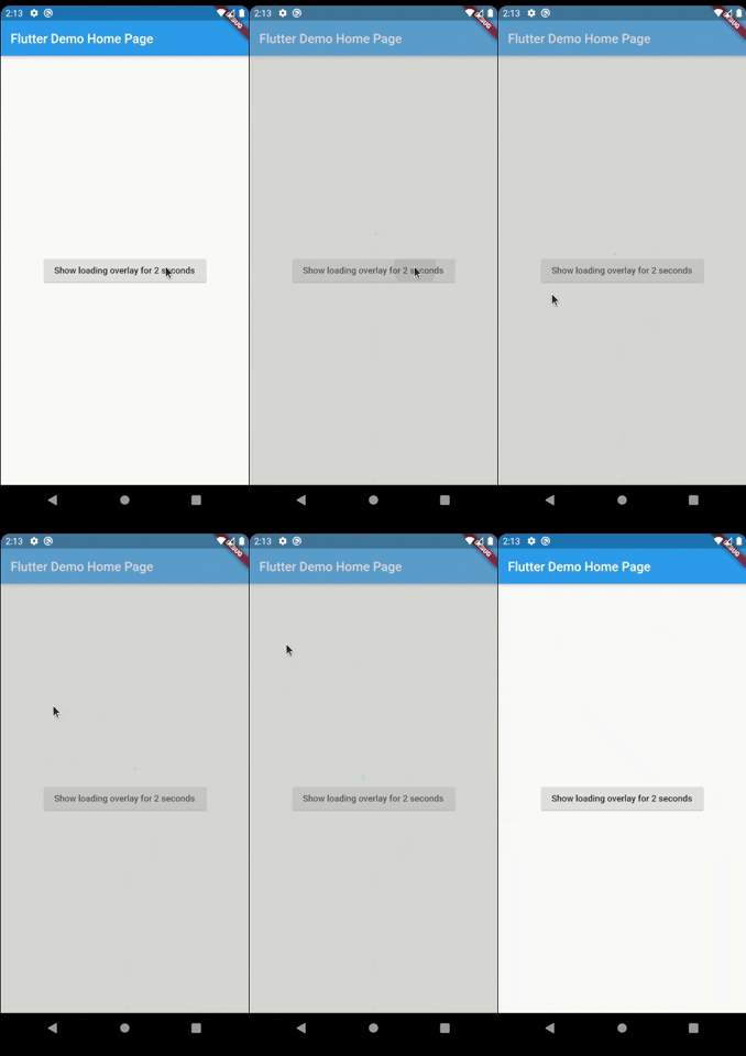
The most simple usage is just wrap the widget that you want an overlay on LoaderOverlay. Default loader will be shown.

class MyApp extends StatelessWidget {
  @override
  Widget build(BuildContext context) {
    return MaterialApp(
      title: 'Flutter Demo',
      theme: ThemeData(
        primarySwatch: Colors.blue,
      ),
      home: LoaderOverlay(
        child: MyHomePage(title: 'Flutter Demo Home Page'),
      ),
    );
  }
}

This simple step will already configure the loader overlay for use.

After that configuration you can just call:

context.loaderOverlay.show();

This will show the overlay with the default loading indicator. The default loading configured is to just show a centered CircularProgressIndicator

To hide the overlay (after the async processing, for example), just call:

context.loaderOverlay.hide();

You can check if overlay is visible:


final isVisible = context.loaderOverlay.visible;

*Note: You will always need the context to show or hide the loader overlay

Simple Overlay

Basic Usage on Navigation

To use this package with named routes you can just wrap your MaterialApp with GlobalLoaderOverlay. This widget has all the features of LoaderOverlay but it is provided for all the routes of the app.

@override
Widget build(BuildContext context) {
  return GlobalLoaderOverlay(
    child: MaterialApp(
      debugShowCheckedModeBanner: false,
      title: 'Flutter Demo',
      theme: ThemeData(primarySwatch: Colors.teal, fontFamily: 'Baloo'),
      initialRoute: '/',
      routes: {
        '/': (context) => Page1(),
        '/page2': (context) => Page2(),
      },
    ),
  );
}

Customization

Your overlay loader widget can be any widget you want. For example you can import the package flutter_spinkit and customise your widget like this. To do that just pass your widget to overlayWidget and set useDefaultLoading to false.

class MyApp extends StatelessWidget {
  @override
  Widget build(BuildContext context) {
    return MaterialApp(
      title: 'Flutter Demo',
      theme: ThemeData(
        primarySwatch: Colors.blue,
      ),
      home: LoaderOverlay(
        useDefaultLoading: false,
        overlayWidgetBuilder: (_) { //ignored progress for the moment
          return Center(
            child: SpinKitCubeGrid(
              color: Colors.red,
              size: 50.0,
            ),
          );
        },
        child: MyHomePage(title: 'Flutter Demo Home Page'),
      ),
    );
  }
}

Simple Custom Overlay

Another customisation you can do is configure the color and opacity of the overlay. The default opacity is grey with 0.4 opacity, but you can change it with the overlayColor: Colors.yellow.withValues(alpha: 0.8).

class MyApp extends StatelessWidget {
  @override
  Widget build(BuildContext context) {
    return MaterialApp(
      title: 'Flutter Demo',
      theme: ThemeData(
        primarySwatch: Colors.blue,
      ),
      home: LoaderOverlay(
        useDefaultLoading: false,
        overlayWidgetBuilder: (_) { //ignored progress for the moment
          return Center(
            child: SpinKitCubeGrid(
              color: Colors.red,
              size: 50.0,
            ),
          );
        },
        overlayColor: Colors.yellow.withValues(alpha: 0.8),
        child: MyHomePage(title: 'Flutter Demo Home Page'),
      ),
    );
  }
}

This is a much opaque yellow overlay:

Simple More Custom Overlay

You may want to have several different loaders in your app. In this case just pass any widget to the loaderOverlay.show:

class ReconnectingOverlay extends StatelessWidget {
  String? progress;

  ReconnectingOverlay(this.progress);

  @override
  Widget build(BuildContext context) =>
      Center(
        child: Column(
          mainAxisSize: MainAxisSize.min,
          mainAxisAlignment: MainAxisAlignment.center,
          children: [
            CircularProgressIndicator(),
            SizedBox(height: 12),
            Text(
              'Reconnecting...',
            ),
            SizedBox(height: 12),
            Text(
              progress ?? '',
            ),
          ],
        ),
      );
}
context.loaderOverlay.show(
  widgetBuilder: (progress) {
    return ReconnectingOverlay(
      progress != null ? progress as String : null,
    );
  },
);

If you pass widget to context.loaderOverlay.show, then defaultLoader and widgetOverlay will be ignored;

Simple More Custom Overlay

Progress

If you want to show some progress while the loader overlay is visible, you can do it with the context.loaderOverlay.show(progress: 'Doing progress #0',) for an initial progress, and with context.loaderOverlay.progress('Doing progress #1'); every time the progress need to change. Both this methods pass the progress to the current widgetBuilder on every call.

Setting up the builder to use the progress

class MyApp extends StatelessWidget {
  @override
  Widget build(BuildContext context) {
    return MaterialApp(
      title: 'Flutter Demo',
      theme: ThemeData(
        primarySwatch: Colors.blue,
      ),
      home: LoaderOverlay(
        useDefaultLoading: false,
        overlayWidgetBuilder: (dynamic? progress) {
          return Column(
            mainAxisAlignment: MainAxisAlignment.center,
            children: [
              SpinKitCubeGrid(
                color: Colors.red,
                size: 50.0,
              ),
              SizedBox(
                height: 50,
              ),
              if (progress != null) Text(progress)
            ],
          );
        },
        child: MyHomePage(title: 'Flutter Demo Home Page'),
      ),
    );
  }
}

Once the builder is configured, you can call it and update the progress by calling:

context.loaderOverlay.show(
  progress: 'Doing progress #0',
);

await Future.delayed(Duration(seconds: 1));
context.loaderOverlay.progress('Doing progress #1');
await Future.delayed(Duration(seconds: 1));
context.loaderOverlay.progress('Doing progress #2');
await Future.delayed(Duration(seconds: 1));
context.loaderOverlay.progress('Doing progress #3');
await Future.delayed(Duration(seconds: 1));

if (_isLoaderVisible) {
  context.loaderOverlay.hide();
}

This will have as result:

Progress Overlay

You can also remove by complete the overlayColor (set to transparent), set the useDefaultLoading to false, and use a fully personalized overlayWidgetBuilder to make your own 100% customizable overlay.

    LoaderOverlay(
      overlayColor: Colors.transparent,
      useDefaultLoading: false,
      overlayWidgetBuilder: (progress) {
        return BackdropFilter(
          filter: ImageFilter.blur(
            sigmaX: 4.5,
            sigmaY: 4.5,
          ),
          child: Center(
            child: Container(
              width: 100,
              height: 100,
              color: Colors.purple,
              child: Column(
                mainAxisAlignment: MainAxisAlignment.center,
                children: [
                  CircularProgressIndicator(),
                  Text(
                    'Doing stuff... bip...bup',
                    textAlign: TextAlign.center,
                  )
                ],
              ),
            ),
          ),
        );
      },
    )

Complete Custom Overlay

Breaking changes

1 - Since version 3.0.0 the overlay widget's got changed by a builder to manage the progress.

Before:

      LoaderOverlay(
        //...
        useDefaultLoading: false,
        overlayWidget: Center(
          child: SpinKitCubeGrid(
            color: Colors.red,
            size: 50.0,
          ),
        ),
        //...      
      )

After:

      LoaderOverlay(
        //...
        useDefaultLoading: false,
        overlayWidgetBuilder: (_) {
          return Center(
            child: SpinKitCubeGrid(
              color: Colors.red,
              size: 50.0,
            ),
          );
        },
        //...
      )

2 - overlayOpacity was removed. Now use the opacity direct in the overlayColor

Before:

      LoaderOverlay(
        //...
        overlayColor: Colors.black,
        overlayOpacity: 0.8,
        //...
      )

After:

      LoaderOverlay(
        //...
        overlayColor: Colors.black.withValues(alpha: 0.8),
        //...
      )

Animation

By default, the overlay does not animate in or out. You can enable animations by passing the appropriate parameters to LoaderOverlay. Internally, an AnimatedSwitcher is used to manage animations, so the parameters are passed directly to the AnimatedSwitcher. By specifying a duration and reverseDuration, the overlay will animate in and out using a fade (the default transition used by AnimatedSwitcher). You can also pass curves, a transition builder and a layout builder for further customisation.

class MyApp extends StatelessWidget {
  @override
  Widget build(BuildContext context) {
    return MaterialApp(
      title: 'Flutter Demo',
      theme: ThemeData(
        primarySwatch: Colors.blue,
      ),
      home: LoaderOverlay(
        duration: const Duration(milliseconds: 250),
        reverseDuration: const Duration(milliseconds: 250),
        // switchInCurve,
        // switchOutCurve,
        // transitionBuilder,
        // layoutBuilder,
        child: MyHomePage(title: 'Flutter Demo Home Page'),
      ),
    );
  }
}

Todo

  • [ ] Tests

Suggestions & Bugs

For any suggestions or bug report please head to issue tracker.

所属分类

依赖

依赖清单 1 项

源码仓库

使用此插件的项目