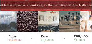
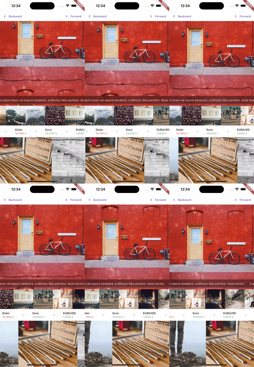
MarqueeR 是一个可自定义的 Flutter 小部件,支持平滑的多方向滚动文本,并提供用户交互和程序控制功能。适用于在有限空间内显示长文本内容,具有灵活的动画选项和跨平台的响应式行为。该小部件设计直观且高度可配置,允许开发者调整滚动速度、方向和交互处理方式。它可在 Android、iOS、Web、macOS、Windows 和 Linux 上无缝运行,非常适合需要动态文本显示的跨平台应用。
适合场景
显示长标题或通知
创建动画横幅
实现滚动字幕
通过动态文本元素增强用户界面
构建可访问的文本轮播
主要特点
多方向滚动(左、右、上、下)
对滚动状态的程序化控制
用户交互支持(点击、拖动)
可定制的滚动速度和延迟
跨设备的响应式设计
平滑的动画过渡
适合对象
开发跨平台应用的开发者
需要动态文本效果的UI设计师
需要可访问滚动内容的应用程序
文本显示空间有限的项目
交互式仪表板和自助服务终端
使用建议
可能会影响非常长文本的性能
需要仔细调整滚动速度以确保可读性
仅限文本内容(不包括图片或小部件)
不适合静态或非滚动文本
最适合短到中等长度的字符串
原始 README
以下为关联源码仓库的 README 原文快照,最新内容请访问源码仓库。
The Marqueer package is a versatile Flutter widget designed to create smooth and customizable marquee effects. Whether you're building a news ticker, scrolling advertisements, or any animated content display, Marqueer offers flexibility, performance, and user interaction controls.
With support for infinite scrolling, dynamic item generation, and highly customizable animation behavior, Marqueer ensures an engaging and fluid user experience.
Package Features
Directional Scrolling: Scroll content in any direction—right-to-left, left-to-right, top-to-bottom, or bottom-to-top.
Infinite or Finite Scrolling: Display unlimited content or stop after a specific item count.
Customizable Speed: Control scroll speed with a pps (pixels per second) parameter.
Interactive Control: Pause and resume scrolling based on user interactions.
Dynamic Content: Use the builder constructor for generating items dynamically.
Responsive: Automatically adapts to screen size changes and other layout updates.
Stable Animation: Animation continues smoothly even when parent widget rebuilds via setState. Only restarts when pps, direction, or infinity parameters change.
Updated Infinity Behavior
infinity: When true, the widget creates an endless loop by either:
Duplicating the content after the original list ends and continuing seamlessly.
Reversing the animation direction when the list ends.
By adjusting the infinity parameter, you can control how the marquee behaves at its boundaries, ensuring a smooth experience regardless of content length.
Constructor Parameters
Core Parameters
direction: Defines the scroll direction. Options include:
rtl (Right-to-Left)
ltr (Left-to-Right)
ttb (Top-to-Bottom)
btt (Bottom-to-Top)
pps: Pixels per second, controlling the speed of the scroll animation. For instance, pps: 15.0 means 15 pixels are scrolled every second.
infinity: A bool determining how the scroll behaves after reaching the end of the list. When enabled, it either duplicates the content or reverses the animation.
autoStart: A bool controlling whether the marquee starts automatically when the widget is built.
Interactivity
interaction: If true, pauses the animation on user touch.
restartAfterInteraction: Automatically restarts scrolling after user interaction if enabled.
restartAfterInteractionDuration: Specifies the delay before restarting, e.g., Duration(seconds: 3).
Content Customization
separatorBuilder: Adds a separator widget between items in the marquee.
padding: Adds padding around the scrolling content.
Callbacks
onStarted: Triggered when the animation starts.
onStopped: Triggered when the animation stops.
onInteraction: Called when a user interacts with the marquee.
onChangeItemInViewPort: Invoked when a new item enters the viewport.
Advanced Control
controller: An optional MarqueerController to programmatically control the marquee (e.g., start, stop, change direction, or animate to position).
edgeDuration: Adds a delay when the marquee reaches the edges, useful in finite scrolling scenarios.
clipBehavior: Controls how the content is clipped. Default is Clip.hardEdge.
intrinsicCrossAxisSize: Auto-sizes the cross axis based on child widget. No need for SizedBox wrapper. Default is false.
Controller Methods
start(): Starts the marquee animation
stop(): Stops the marquee animation
forward(): Starts forward animation (left to right or bottom to top)
backward(): Starts backward animation (right to left or top to bottom)
animateTo(position, duration, curve): Animates to a specific scroll position
interactionEnabled(enabled): Enables or disables user interaction
recalculateIntrinsicSize(): Recalculates intrinsic size when child content changes
isAnimating: Returns the animation status (requires single attached widget)
scrollablePointerIgnoring
The scrollablePointerIgnoring parameter is a boolean that resolves gesture-related issues caused by Flutter's default IgnorePointer behavior within Scrollable widgets. When set to true, it ensures that the IgnorePointer behavior in nested scrollable elements is bypassed, allowing gestures to propagate correctly.
Why Use This?
Flutter's Scrollable widget applies an IgnorePointer by default to prevent unintended interactions during animations. However, this can interfere with custom gestures or user interactions in certain scenarios. Enabling scrollablePointerIgnoring ensures smooth and predictable gesture handling.
Default Behavior
false: The default IgnorePointer behavior remains active.
true: Disables the default IgnorePointer behavior, allowing gestures to work as expected.
final controller = MarqueerController();
/// controller.start()/// controller.stop()/// controller.forward()/// controller.backward()/// controller.animateTo(position, duration: duration, curve: curve)/// controller.interactionEnabled(false)SizedBox(
height: 30,
child: Marqueer(
pps: 100,
/// optional
controller: controller,
/// optional
direction: .rtl,
/// optional
restartAfterInteractionDuration: constDuration(seconds: 6),
/// optional
restartAfterInteraction: false,
/// optional
onChangeItemInViewPort: (index) {
print('item index: $index');
},
onInteraction: () {
print('on interaction callback');
},
onStarted: () {
print('on started callback');
},
onStopped: () {
print('on stopped callback');
},
child: constText(
'Lorem ipsum dolor sit amet, consectetur adipiscing elit. Integer pretium massa mollis lorem blandit imperdiet. Nulla mattis vitae mauris vel condimentum. Nam posuere, augue vitae lobortis consequat, odio ante condimentum est, at maximus augue purus id metus. Curabitur condimentum aliquet ante at aliquet. Quisque vel massa congue, bibendum leo sodales, malesuada ante. Maecenas sed tortor quis ipsum dictum sollicitudin.',
),
),
);