Mobkit Dashed Border
The Mobkit Dashed Border is a border that provide dashed lines. Same time that package provides use different properties with rounded corner unlike border class.
Getting started
Import the following package.
flutter pub add -d mobkit_dashed_border
import 'package:mobkit_dashed_border/mobkit_dashed_border.dart' ;
Usage
You can use this package like border class. Below you can see the different types of codes and their outputs.
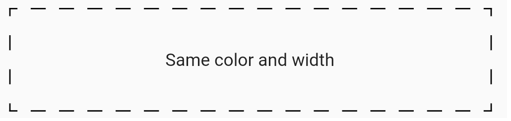
This sample shows border that has same color ,width and non radius corner
Sample code:
Container (
height: 75 ,
decoration: const BoxDecoration (
border:
DashedBorder .fromBorderSide (dashLength: 10 , side: BorderSide (color: Colors .black, width: 1 ),
),
),
child: const Center (
child: Text (
'Same color and width' ,
),
),
),
Output of this code:
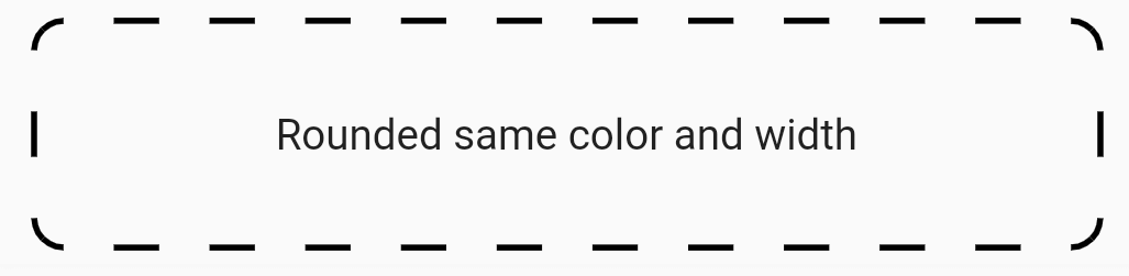
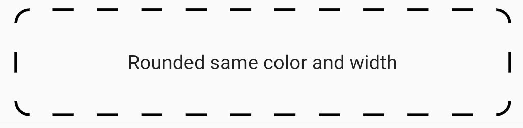
This sample shows border that has same color ,width and radius corner
Sample code:
Container (
height: 75 ,
decoration: const BoxDecoration (
border: DashedBorder .fromBorderSide (
dashLength: 15 , side: BorderSide (color: Colors .black, width: 2 )),
borderRadius: BorderRadius .all (Radius .circular (10 ))),
child: const Center (
child: Text (
'Rounded same color and width' ,
),
),
),
Output of this code:
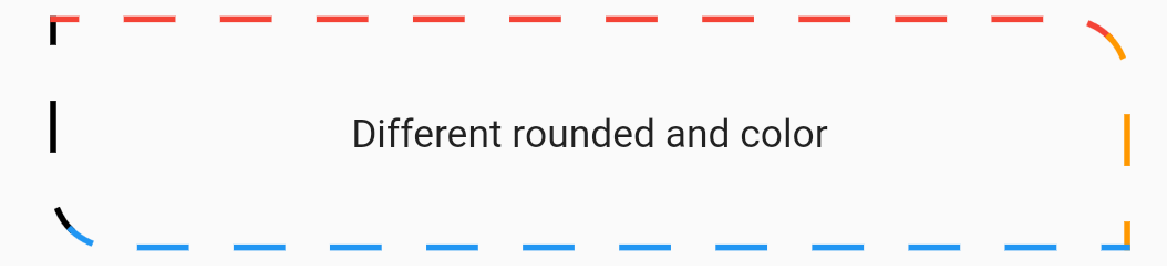
This sample shows border that has different color ,width and radius corner
Sample code:
Container (
height: 75 ,
decoration: const BoxDecoration (
border: DashedBorder (
dashLength: 15 ,
left: BorderSide (color: Colors .black, width: 2 ),
top: BorderSide (color: Colors .red, width: 2 ),
right: BorderSide (color: Colors .orange, width: 2 ),
bottom: BorderSide (color: Colors .blue, width: 2 ),
),
borderRadius: BorderRadius .only (
topLeft: Radius .circular (0 ),
topRight: Radius .circular (20 ),
bottomLeft: Radius .circular (20 ),
bottomRight: Radius .circular (0 ),
),
),
child: const Center (
child: Text (
'Different rounded and color' ,
),
),
),
Output of this code:
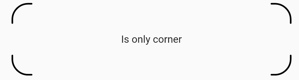
This sample shows a border drawn only on the corners.
Sample code:
Container (
height: 90 ,
decoration: BoxDecoration (
border: DashedBorder .all (
color: Colors .black,
dashLength: 40 ,
width: 2 ,
isOnlyCorner: true ,
strokeAlign: BorderSide .strokeAlignInside,
strokeCap: StrokeCap .round,
),
borderRadius: BorderRadius .circular (20 ),
),
child: const Center (
child: Text (
'Is only corner' ,
),
),
),
Output of this code: