搜索插件、代码仓与 APP 分类

multi_trigger_autocomplete 封面
插件详情v1.0.0

multi_trigger_autocomplete

一个 Flutter 小部件,可为您的应用添加基于触发器的自动补全功能。

AndroidiOSWebmacOSWindowsLinux
近 30 天下载
1980
喜欢数
120
Pub 分数
160

安装插件

flutter pub add multi_trigger_autocomplete

插件介绍

基于插件公开信息、社区数据与项目使用情况整理的选型参考。

一个 Flutter 小部件,可启用基于触发器的自动完成功能,当输入特定字符(如 @ 或 #)时,允许用户动态建议和选择选项。非常适合社交媒体应用、消息界面或任何需要上下文建议的输入字段。该包支持多个触发器,并可无缝集成到 Android、iOS、Web、macOS、Windows 和 Linux 平台。

适合场景

  • 社交媒体标签
  • 消息应用提及
  • 标签建议
  • 表单输入增强
  • 实时搜索文本字段

主要特点

  • 多触发器支持
  • 跨平台兼容性
  • 可自定义的建议模板
  • 与文本框的轻松集成
  • 轻量且高效

适合对象

  • 开发聊天或社交应用的开发者
  • 需要上下文感知自动补全的应用
  • 需要多触发器输入处理的项目
  • 使用 Flutter 进行全栈开发的团队

使用建议

  • 需要手动设置自定义触发器
  • 仅限文本输入上下文
  • 可能需要额外的样式来处理复杂的用户界面
  • 依赖外部状态管理来处理动态数据

原始 README

以下为关联源码仓库的 README 原文快照,最新内容请访问源码仓库。

Multi Trigger Autocomplete

Open Source Love License Dart CI CodeCov Version

A flutter widget to add trigger based autocomplete functionality to your app.

Show some ❤️ and star the repo to support the project
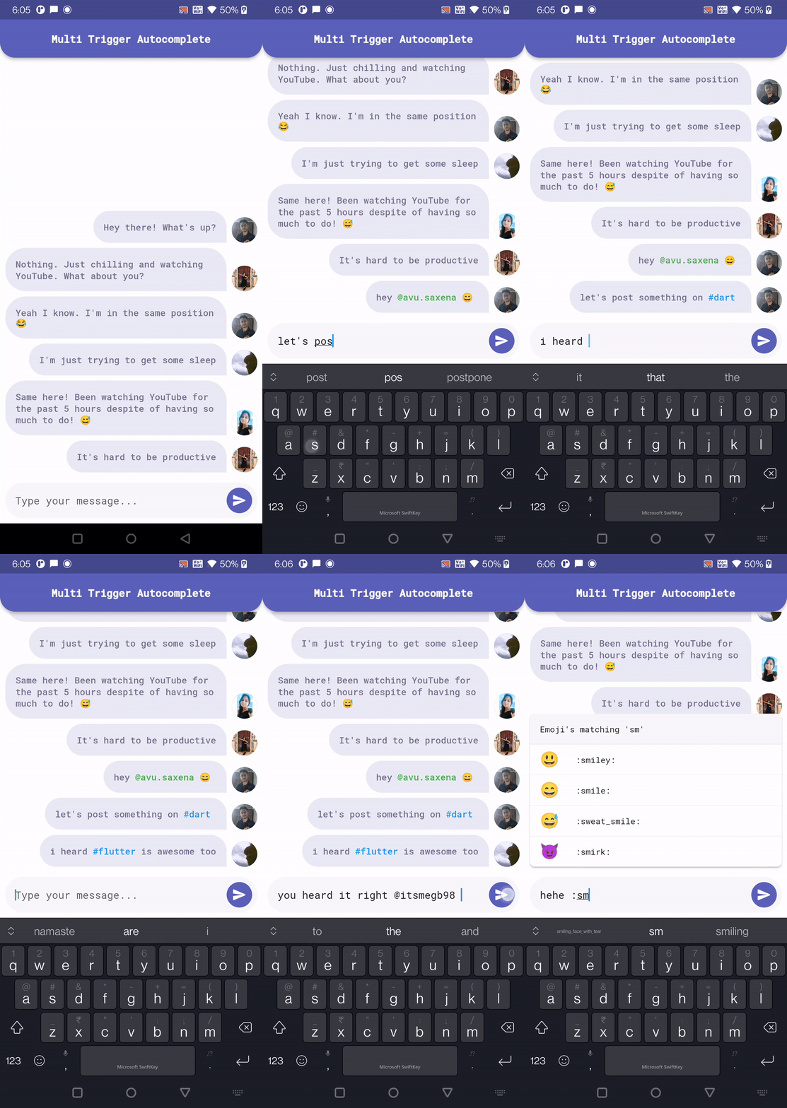
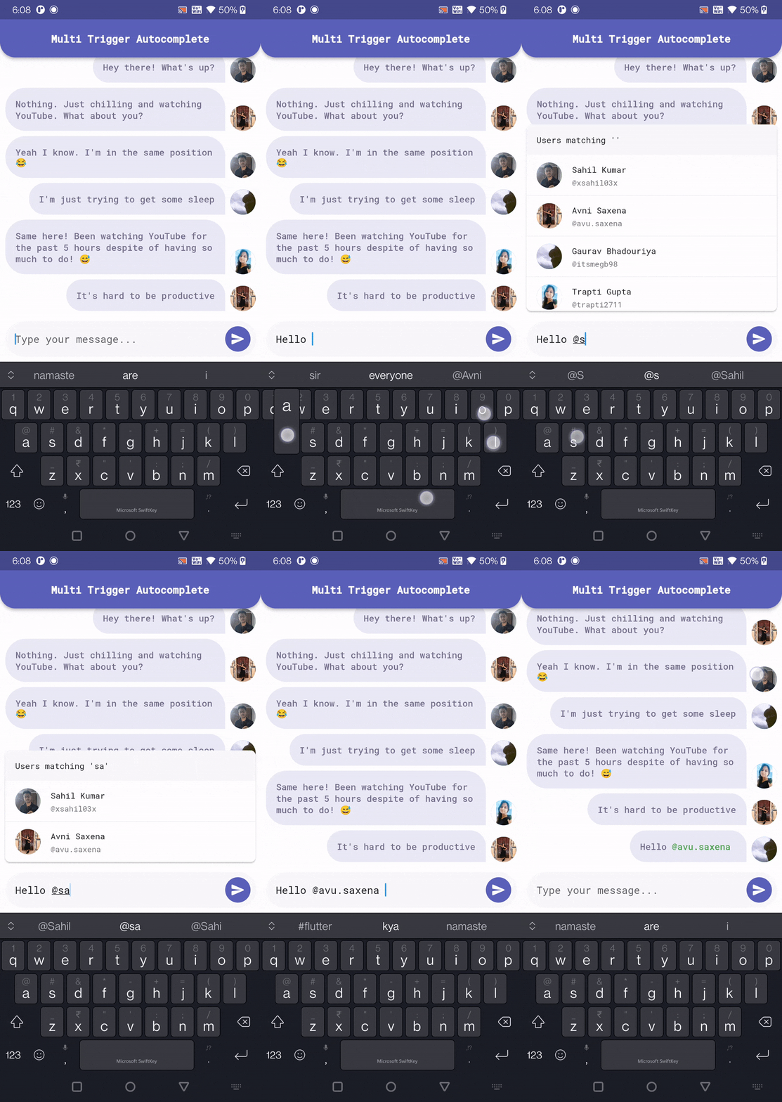
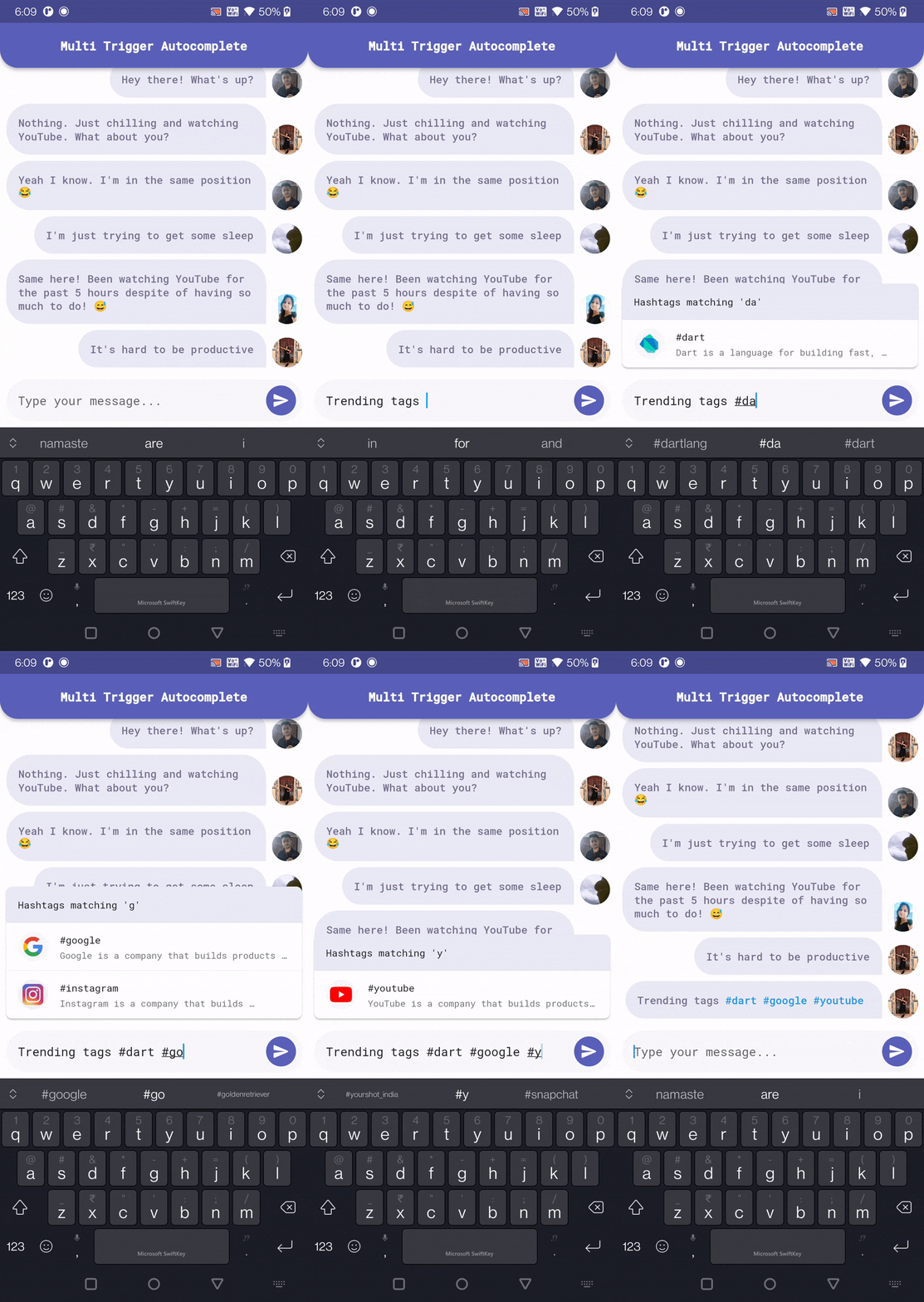
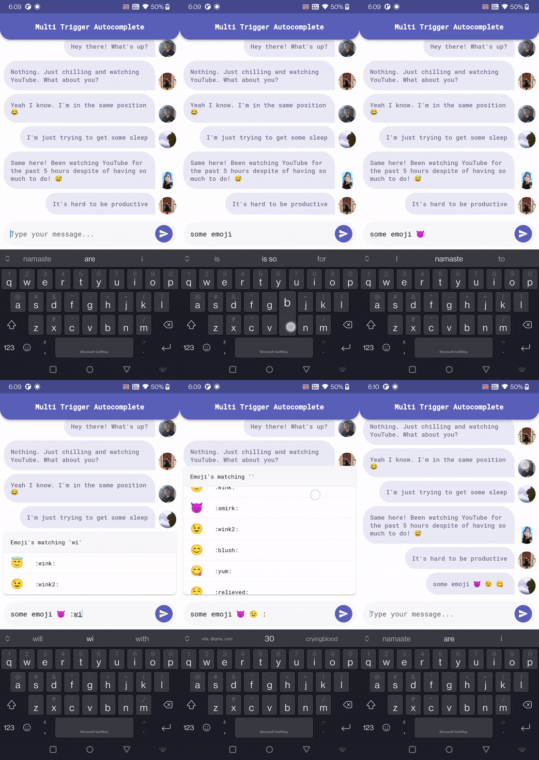
An animated image of the MultiTriggerAutocomplete

Installation

Add the following to your pubspec.yaml and replace [version] with the latest version:

dependencies:
  multi_trigger_autocomplete: ^[version]

Usage

To use this package you must first wrap your top most widget with Portal as this package uses flutter_portal to show the options view.

(Credits to: Remi Rousselet)

Portal, is the equivalent of [Overlay].

This widget will need to be inserted above the widget that needs to render under your overlays.

If you want to display your overlays on the top of everything, a good place to insert that Portal is above MaterialApp:

Portal(
  child: MaterialApp(
    ...
  )
);

(works for CupertinoApp too)

This way Portal will render above everything. But you could place it somewhere else to change the clip behavior.

Import the package:

import 'package:multi_trigger_autocomplete/multi_trigger_autocomplete.dart';

Use the widget:

MultiTriggerAutocomplete(
  optionsAlignment: OptionsAlignment.topStart,
  autocompleteTriggers: [
    // Add the triggers you want to use for autocomplete
    AutocompleteTrigger(
      trigger: '@',
      optionsViewBuilder: (context, autocompleteQuery, controller) {
        return MentionAutocompleteOptions(
          query: autocompleteQuery.query,
          onMentionUserTap: (user) {
            final autocomplete = MultiTriggerAutocomplete.of(context);
            return autocomplete.acceptAutocompleteOption(user.id);
          },
        );
      },
    ),
    AutocompleteTrigger(
      trigger: '#',
      optionsViewBuilder: (context, autocompleteQuery, controller) {
        return HashtagAutocompleteOptions(
          query: autocompleteQuery.query,
          onHashtagTap: (hashtag) {
            final autocomplete = MultiTriggerAutocomplete.of(context);
            return autocomplete
                .acceptAutocompleteOption(hashtag.name);
          },
        );
      },
    ),
    AutocompleteTrigger(
      trigger: ':',
      optionsViewBuilder: (context, autocompleteQuery, controller) {
        return EmojiAutocompleteOptions(
          query: autocompleteQuery.query,
          onEmojiTap: (emoji) {
            final autocomplete = MultiTriggerAutocomplete.of(context);
            return autocomplete.acceptAutocompleteOption(
              emoji.char,
              // Passing false as we don't want the trigger [:] to
              // get prefixed to the option in case of emoji.
              keepTrigger: false,
            );
          },
        );
      },
    ),
  ],
  // Add the text field widget you want to use for autocomplete
  fieldViewBuilder: (context, controller, focusNode) {
    return Padding(
      padding: const EdgeInsets.all(8.0),
      child: ChatMessageTextField(
        focusNode: focusNode,
        controller: controller,
      ),
    );
  },
),

Demo

Mention Autocomplete Hashtag Autocomplete Emoji Autocomplete

Customization

MultiTriggerAutocomplete
MultiTriggerAutocomplete(
  // Defines the autocomplete trigger that will be used to match the
  // text.
  autocompleteTriggers: autocompleteTriggers,
  
  // Defines the alignment of the options view relative to the
  // fieldView.
  //
  // By default, the options view is aligned to the bottom of the
  // fieldView.
  optionsAlignment: OptionsAlignment.topStart,
  
  // Defines the width to make the options as a multiple of the width
  // of the fieldView.
  //
  // Setting this to 1 makes the options view width matches the width
  // of the fieldView.
  //
  // Use null to remove this constraint.
  optionsWidthFactor: 1.0,
  
  // Defines the duration of the debounce period for the
  // [TextEditingController].
  //
  // This is the time between the last character typed and the matching
  // is performed.
  debounceDuration: const Duration(milliseconds: 350),
  
  // Defines the initial value to set in the internal
  // [TextEditingController].
  //
  // This value will be ignored if [TextEditingController] is provided.
  initialValue: const TextEditingValue(text: 'Hello'),
  
  // Defines the [TextEditingController] that will be used for the
  // fieldView.
  //
  // If this parameter is provided, then [focusNode] must also be
  // provided.
  textEditingController: TextEditingController(text: 'Hello'),
  
  // Defines the [FocusNode] that will be used for the fieldView.
  //
  // If this parameter is provided, then [textEditingController] must
  // also be provided.
  focusNode: FocusNode(),
  
  // Defines the fieldView that will be used to input the text.
  //
  // By default, a [TextFormField] is used.
  fieldViewBuilder: (context, controller, focusNode) {
    return TextField(
      controller: controller,
      focusNode: focusNode,
    );
  },
),
AutocompleteTrigger
AutocompleteTrigger(
  // The trigger string/character that will be used to trigger the
  // autocomplete.
  trigger: '@',
  
  // If true, the [trigger] should only be recognised at
  // the start of the input text.
  //
  // valid example: "@luke hello"
  // invalid example: "Hello @luke"
  triggerOnlyAtStart: false,
  
  // If true, the [trigger] should only be recognised after
  // a space.
  //
  // valid example: "@luke", "Hello @luke"
  // invalid example: "Hello@luke"
  triggerOnlyAfterSpace: true,
  
  // A minimum number of characters can be provided to only show
  // suggestions after the user has input enough characters.
  //
  // example:
  // "Hello @l" -> Shows zero suggestions.
  // "Hello @lu" -> Shows suggestions for @lu.
  minimumRequiredCharacters: 2,
  
  // The options view builder is used to build the options view
  // that will be shown when the [trigger] is detected.
  optionsViewBuilder: (context, autocompleteQuery, controller) {
    return MentionAutocompleteOptions(
      query: autocompleteQuery.query,
      onMentionUserTap: (user) {
        // Accept the autocomplete option.
        final autocomplete = MultiTriggerAutocomplete.of(context);
        return autocomplete.acceptAutocompleteOption(user.id);
      },
    );
  },
)

License

MIT License

所属分类

依赖

依赖清单 1 项

源码仓库

使用此插件的项目

暂无相关数据。