- A simple multiselect dropdown which has Select All and Search options.
- You can use a simple list or a list of maps.
Features
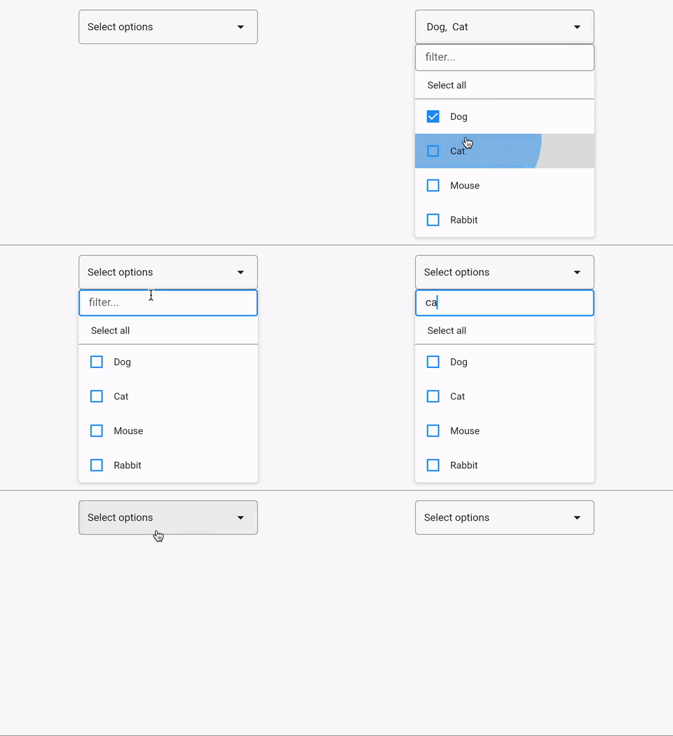
- Use
MultiSelectDropdown for list of maps.
- Use
MultiSelectDropdown.simpleList for a simple list.
Getting started
- Add the package in your flutter project.
- Import the package
import 'package:multiselect_dropdown_flutter/multiselect_dropdown_flutter.dart';.
Usage
class MultiSelectExample extends StatelessWidget {
const MultiSelectExample({super.key});
final List myList2 = const ['Dog', 'Cat', 'Mouse', 'Rabbit'];
final List myList = const [
{'id': 'dog', 'label': 'Dog'},
{'id': 'cat', 'label': 'Cat'},
{'id': 'mouse', 'label': 'Mouse'},
{'id': 'rabbit', 'label': 'Rabbit'},
];
@override
Widget build(BuildContext context) {
return Scaffold(
body: Column(
children: [
MultiSelectDropdown(
list: myList,
initiallySelected: const [],
onChange: (newList) {
},
),
const SizedBox(height: 50),
MultiSelectDropdown.simpleList(
list: myList2,
initiallySelected: const [],
onChange: (newList) {
},
includeSearch: true,
includeSelectAll: true,
),
],
),
);
}
}
Parameters
| Parameter Name |
Description |
| list |
List of options to select from |
| label |
label key in a Map to show as an option. Defaults to 'label' |
| id |
id key in a Map to identify an item. Defaults to 'id' |
| onChange |
onChange callback, passes new list as argument |
| numberOfItemsLabelToShow |
Number of items to show as text, beyond that it will show n selected |
| initiallySelected |
Initially selected list |
| boxDecoration |
Decoration for anchor element |
| isLarge |
Dropdown size |
| width |
Anchor and modal width |
| whenEmpty |
Text to show when nothing is selected |
| includeSelectAll |
Includes a select all button when true |
| includeSearch |
Includes a search option when true |
| textStyle |
TextStyle? for the text on anchor element |
| duration |
Duration? for debounce in search option. Defaults to 300 milliseconds. |
| checkboxFillColor |
checkbox fill color |
| splashColor |
splash color on list tile |
| listTextStyle |
text style for text on list tile |
I will keep adding more functionalities.
You can raise an issue/feature request on github.
Please leave a like if you find this package useful.
