搜索插件、代码仓与 APP 分类

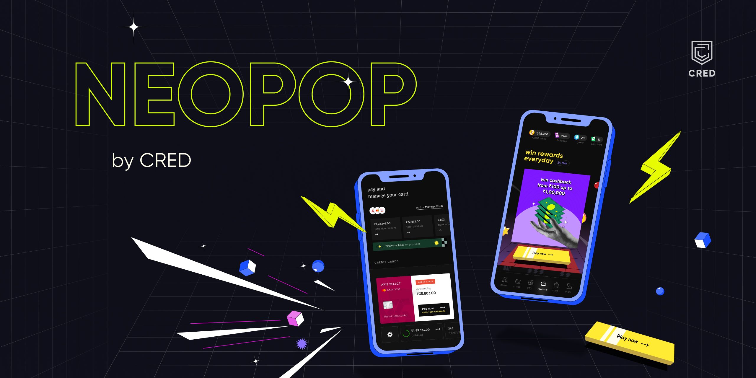
neopop 封面
插件详情v1.0.2

neopop

NeoPop 是 CRED 内置的库,用于在您的应用中使用 NeoPop 组件。

AndroidiOSWebmacOSWindowsLinux
近 30 天下载
864
喜欢数
336
Pub 分数
150

安装插件

flutter pub add neopop

插件介绍

基于插件公开信息、社区数据与项目使用情况整理的选型参考。

NeoPop 是由 CRED.club 开发的 Flutter 包,提供可自定义且视觉效果出色的组件,用于构建现代用户界面。它使开发者能够轻松集成具有动画效果和交互性的元素,如按钮和进度指示器,并采用简洁、现代的设计语言。该库通过细微的动画和响应式反馈来提升用户体验,非常适合追求精致、动态界面的应用程序。NeoPop 支持多种平台,包括 Android、iOS、Web、macOS、Windows 和 Linux,确保在各种设备上都能保持一致的性能。

适合场景

  • 在移动应用中创建动画按钮
  • 实现交互式进度指示器
  • 通过现代视觉效果增强用户界面
  • 构建引人入胜的入门屏幕
  • 设计高保真原型
  • 向表单添加微交互

主要特点

  • 预构建的、可自定义的 NeoPop 组件
  • 流畅的动画和触觉反馈
  • 跨平台兼容性
  • 通过 pub add 轻松集成
  • 轻量且高效
  • 对深色模式的支持

适合对象

  • 寻求现代组件的UI设计师
  • 开发交互式 Flutter 应用的开发者
  • 专注于用户参与度的团队
  • 初创公司创建精美的最小可行产品
  • 从事跨平台项目的前端工程师

使用建议

  • 可能需要额外的样式才能适应复杂主题
  • 除了基本用法外,文档有限
  • 最适合具有现代审美目标的应用程序
  • 不太适合极简或传统用户界面设计
  • 过度使用动画带来的性能影响

原始 README

以下为关联源码仓库的 README 原文快照,最新内容请访问源码仓库。

NeoPOP

NeoPOP is CRED's inbuilt library for using NeoPOP components in your app.

What really is NeoPOP?

NeoPOP was created with one simple goal; to create the next generation of a beautiful, affirmative design system. NeoPOP stays true to everything that design at CRED stands for.

NeoPOP is built for Android, iOS, Flutter and Web

NeoPOP Banner

Installation

Add neopop as a dependency in your pubspec.yaml file.

dependencies:
    neopop: ^1.0.2

NeoPopButton

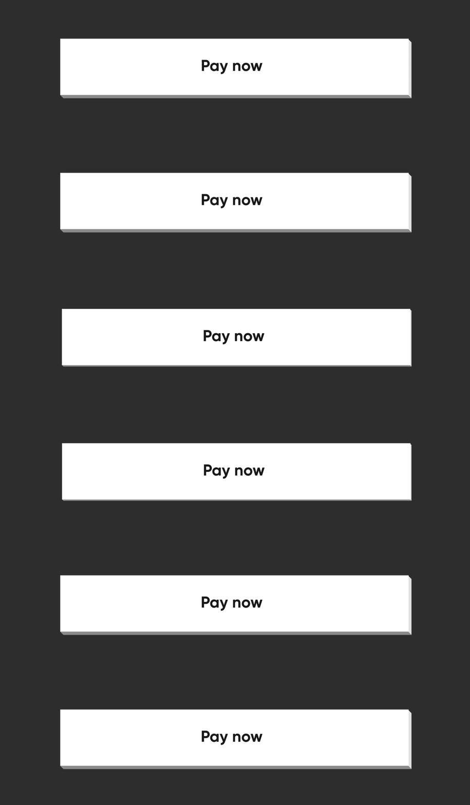
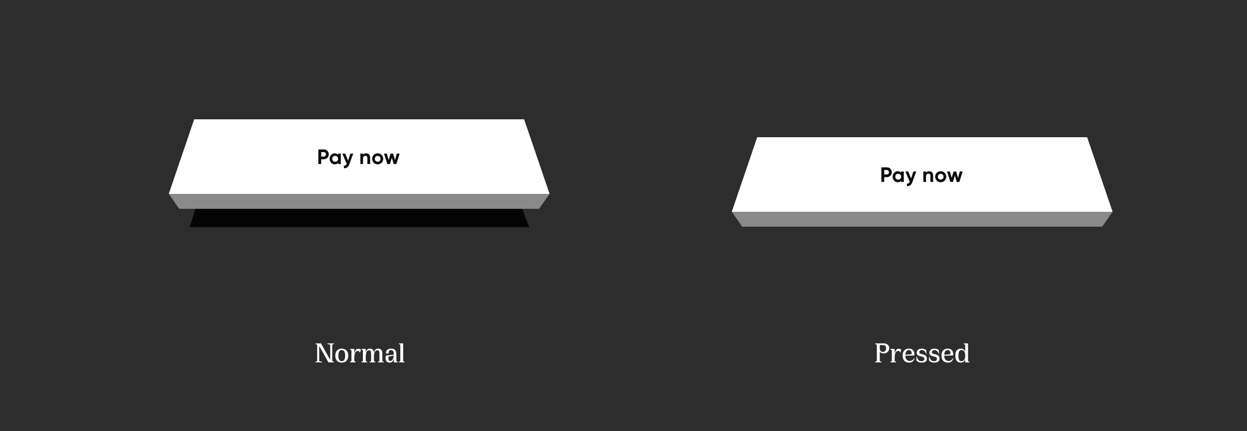
Configs NeoPopButton render 5 surfaces, top, left, right, bottom and center. NeoPopButton widget gives you mutliple configs that you can use for your widget.

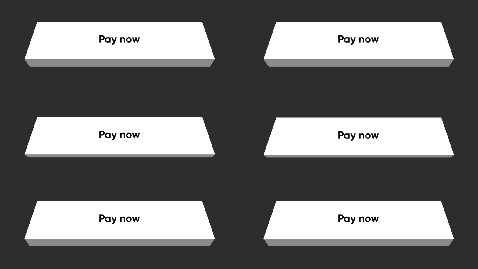
Elevated

Elevated elevated

NeoPopButton(
    color: Colors.white,
    onTapUp: () => HapticFeedback.vibrate(),
    onTapDown: () => HapticFeedback.vibrate(),
    child: Padding(
        padding: EdgeInsets.symmetric(horizontal: 20, vertical: 15),
        child: Row(
            mainAxisAlignment: MainAxisAlignment.center,
            children: [
                Text("Pay now"),
            ],
        ),
    ),
),

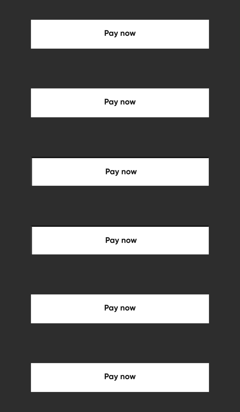
Flat

Flat flatButton

By specifying the buttonPosition as Position.center, NeoPOP will compute right and bottom surface's color according to color. Top and left surface's color is computed w.r.t parentColor and grandparentColor

NeoPopButton(
    color: Colors.white,
    onTapUp: () => HapticFeedback.vibrate(),
    onTapDown: () => HapticFeedback.vibrate(),
    parentColor: Colors.transparent,
    buttonPosition: Position.center,
    child: Padding(
        padding: const EdgeInsets.symmetric(horizontal: 20, vertical: 15),
        child: Row(
            mainAxisAlignment: MainAxisAlignment.center,
            children: const [
                Text("Pay Now"),
            ],
        ),
    ),
),

Shimmer

const NeoPopShimmer(
    shimmerColor: Colors.yellow,
    child: Padding(
        padding: const EdgeInsets.symmetric(horizontal: 100, vertical: 15),
        child: Text("Hello"),
    ),
),

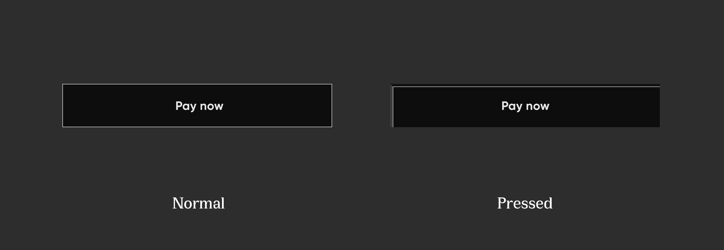
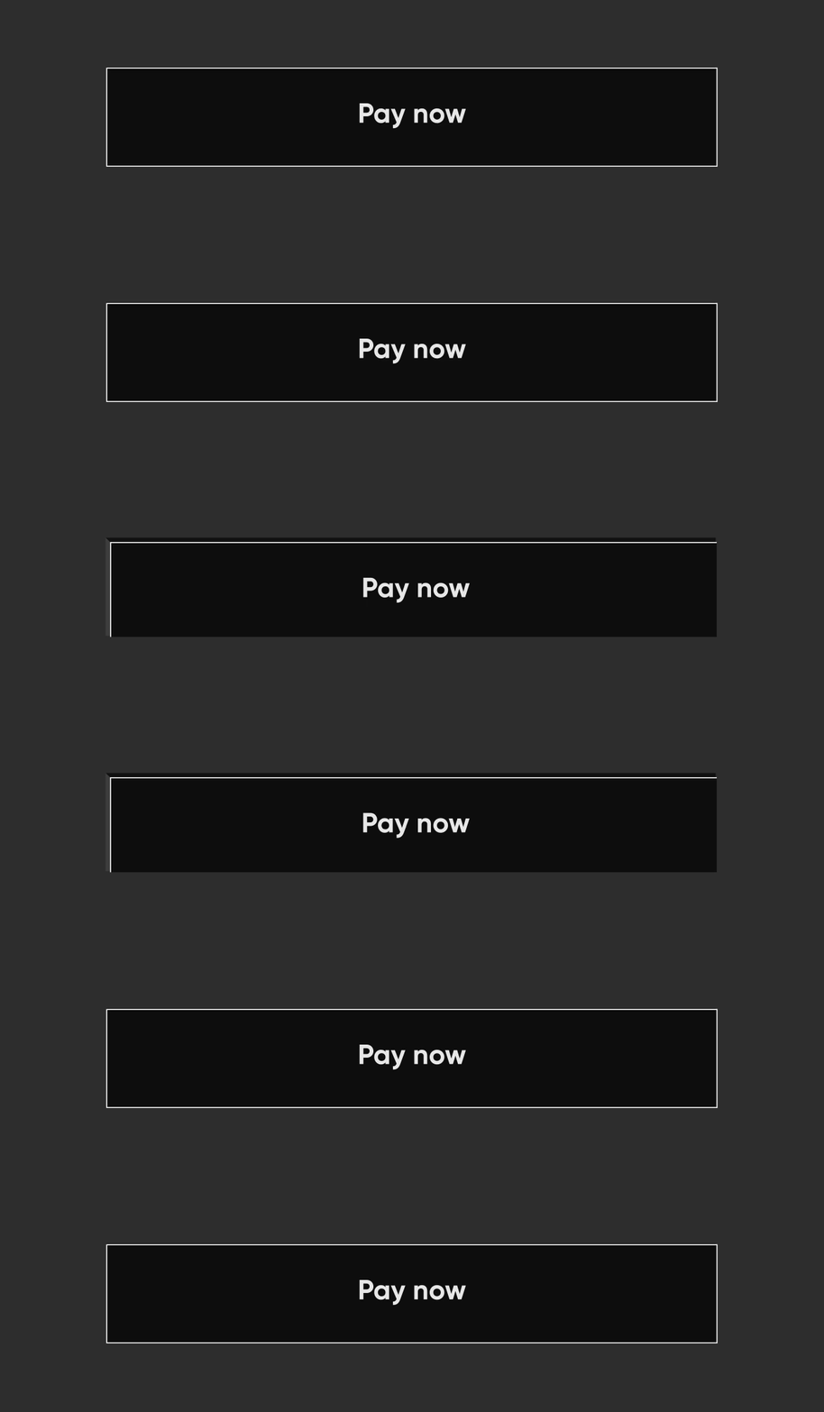
Flat Strokes

Flat Strokes flatStroked

To add border on a flat button, add border

NeoPopButton(
    color: const Color.fromRGBO(0, 0, 0, 1),
    buttonPosition: Position.center,
    onTapUp: () {},
    border: const Border.fromBorderSide(
        BorderSide(color: kBorderColorWhite, width: kButtonBorderWidth),
    ),
    child: Padding(
        padding: const EdgeInsets.symmetric(horizontal: 20, vertical: 15),
        child: Row(
            mainAxisAlignment: MainAxisAlignment.center,
            children: const [
                Text("Pay Now", style: TextStyle(color: Colors.white)),
            ],
        ),
    ),
),

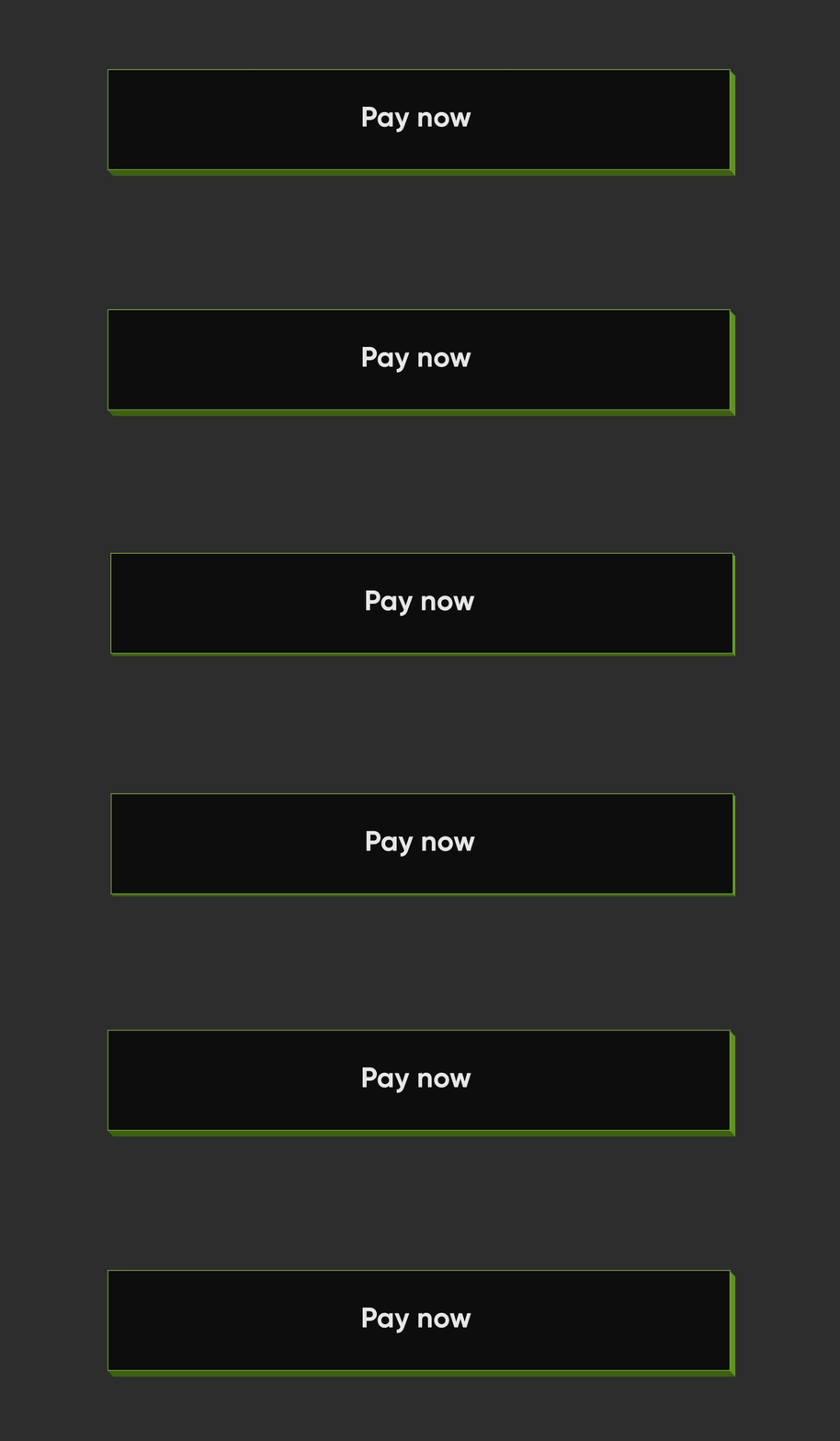
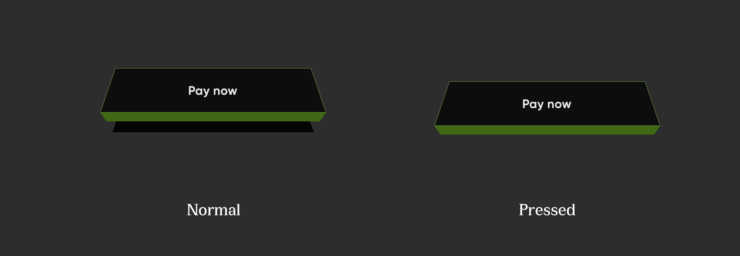
Elevated Strokes

Elevated Strokes elevatedStroked

NeoPopButton(
    color: kSecondaryButtonLightColor,
    bottomShadowColor: ColorUtils.getVerticalShadow(kBorderColorGreen).toColor(),
    rightShadowColor: ColorUtils.getHorizontalShadow(kBorderColorGreen).toColor(),
    animationDuration: kButtonAnimationDuration,
    depth: kButtonDepth,
    onTapUp: () {},
    border: Border.all(
        color: kBorderColorGreen,
        width: kButtonBorderWidth,
    ),
    child: Padding(
        padding: const EdgeInsets.symmetric(horizontal: 20, vertical: 15),
        child: Row(
            mainAxisAlignment: MainAxisAlignment.center,
            children: const [
                Text("Scan & Pay", style: TextStyle(color: Colors.white)),
            ],
        ),
    ),
),

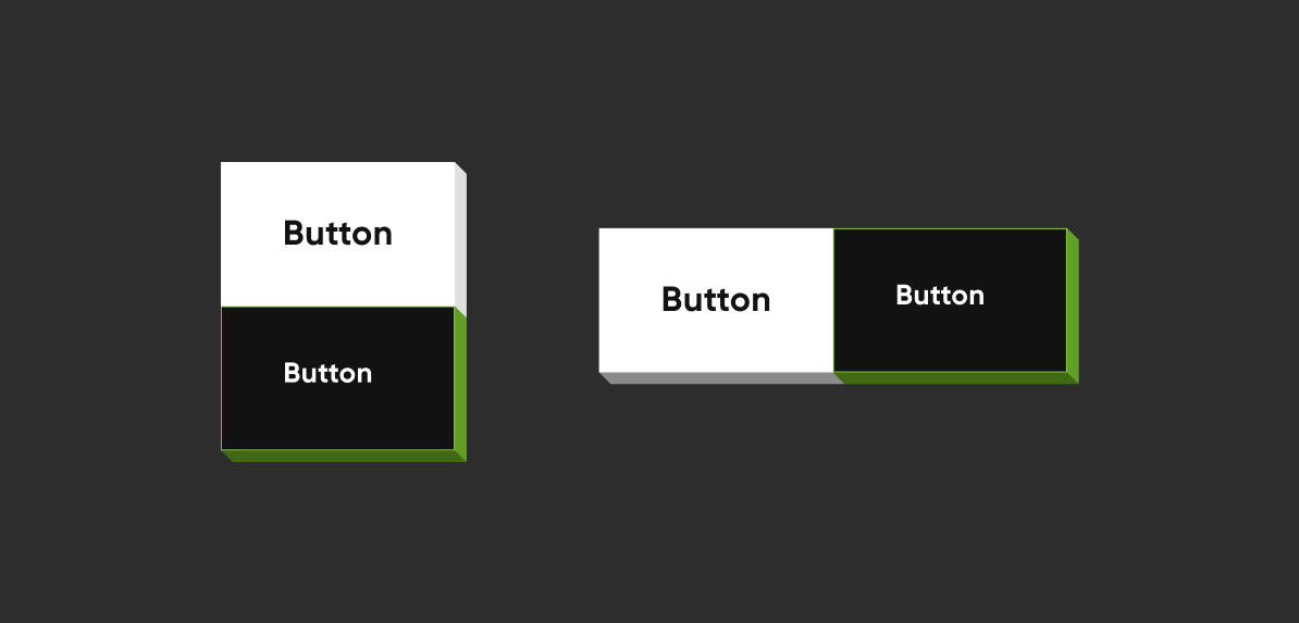
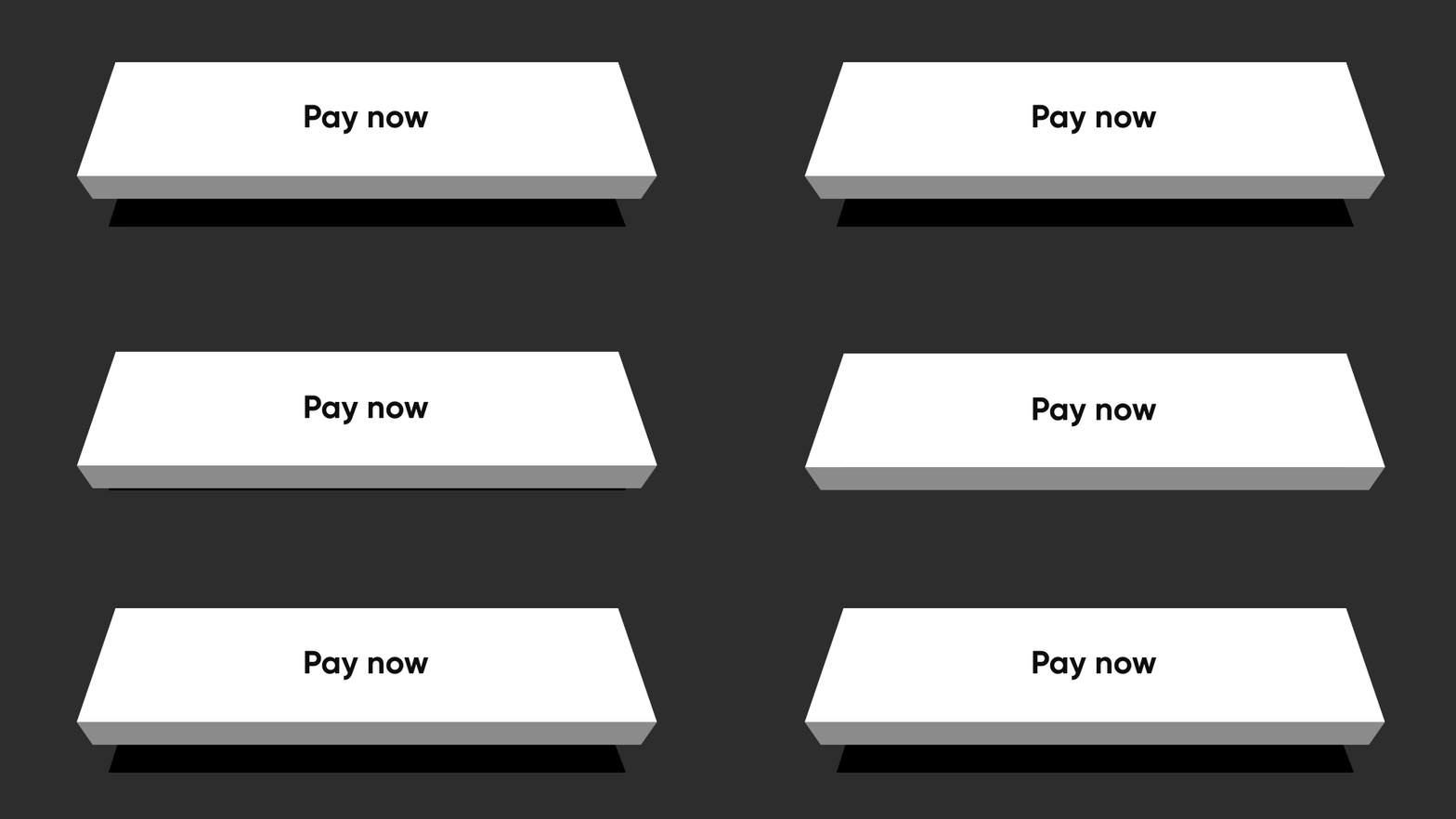
Adjacent Buttons

Adjacent Buttons

Vertically Aligned Buttons
Column(
    mainAxisSize: MainAxisSize.min,
    children: [
        NeoPopButton(
        color: kSecondaryButtonLightColor,
        bottomShadowColor: kShadowColorDarkGreen,
        rightShadowColor: kShadowColorGreen,
        buttonPosition: Position.fullBottom,
        onTapUp: () {},
        border: Border.all(
            color: kBorderColorGreen, width: kButtonBorderWidth,
        ),
        child:  const Padding(
                    padding: EdgeInsets.symmetric(horizontal: 8.0, vertical: 15.0),
                    child: Text(
                    "Button",
                    style: TextStyle(color: Colors.white),
                ),
            ),
        ),
        NeoPopButton(
            color: kPrimaryButtonColor,
            buttonPosition: Position.fullBottom,
            onTapUp: () {},
            child:  const Padding(
                padding: EdgeInsets.symmetric(horizontal: 8.0, vertical: 15.0),
                child: Text("Button"),
            ),
        ),
    ],
),
Horizontally Aligned Buttons
Row(
    mainAxisSize: MainAxisSize.min,
    children: [
        Expanded(
        child: NeoPopButton(
            color: kPrimaryButtonColor,
            buttonPosition: Position.fullBottom,
            depth: kButtonDepth,
            onTapUp: () {},
            child: const Center(
            child:  Padding(
                    padding: EdgeInsets.symmetric(
                        horizontal: 8.0, vertical: 15.0),
                    child: Text("Button"),
                    ),
                ),
            ),
        ),
        Expanded(
            child: NeoPopButton(
                color: kSecondaryButtonLightColor,
                bottomShadowColor: kShadowColorDarkGreen,
                rightShadowColor: kShadowColorGreen,
                buttonPosition: Position.fullBottom,
                depth: kButtonDepth,
                onTapUp: () {},
                border: Border.all(
                    color: kBorderColorGreen, width: kButtonBorderWidth,
                ),
                child: const Center(
                child: Padding(
                    padding: EdgeInsets.symmetric( horizontal: 8.0, vertical: 15.0),
                    child: Text(
                            "Button",
                            style: TextStyle(color: Colors.white),
                        ),
                    ),
                ),
            ),
        ),
    ],
),

NeoPopButton Attributes

Attribute Type Description
child Widget The child of button widget
color Color Color of the button
depth double The depth of the button if it is elevated
onTapUp VoidCallback? Callback triggered when the forward & reverse button animation is finished
onTapDown VoidCallback? Callback triggered as soon as the user clicks the enabled button
onLongPress VoidCallback? Callback triggered when user has long pressed the cta
disabledColor Color Color of the button when it is disabled
parentColor Color Button's immediate ancestor's color
grandparentColor Color Button's second level ancestor's color
buttonPosition Position The position of button in reference to parent view. default - Position.fullBottom
animationDuration Duration Animation duration of the button click. default - const Duration(milliseconds: 50)
forwardDuration Duration? If you want different forward duration for button click, use forwardDuration
reverseDuration Duration? If you want different reverse duration for button click, use reverseDuration
border Border? The border to be painted around the button
enabled bool If set to false, the button will be disabled. default - true
shadowColor Color? The base color of the shadow. The shadow colors will be derived from this
rightShadowColor Color? The color of the right shadow.
leftShadowColor Color? The color of the left shadow.
topShadowColor Color? The color of the top shadow.
bottomShadowColor Color? The color of the bottom shadow.

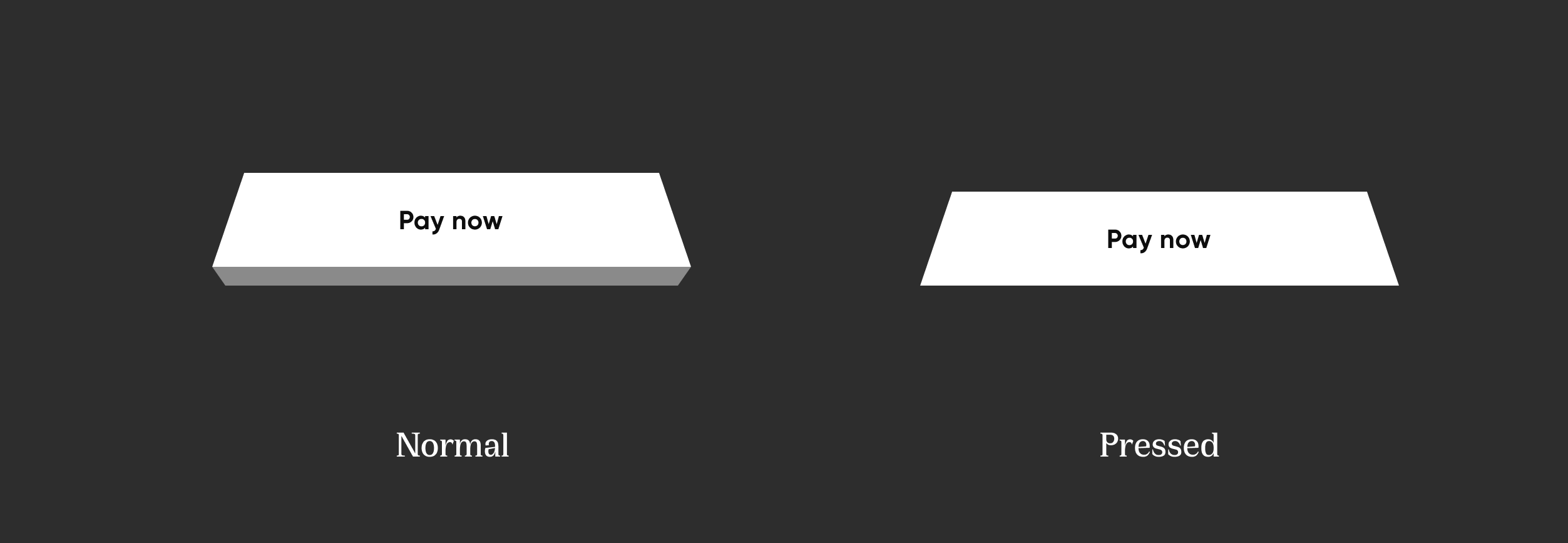
NeoPopTiltedButton

NeoPopTiltedButton

Non Floating

Non Floating tiltNonFloating

 NeoPopTiltedButton(
    color: kPrimaryButtonColor,
    onTapUp: () {},
    child: Padding(
        padding: const EdgeInsets.symmetric(
        horizontal: 80.0,
        vertical: 15,
        ),
        child: SvgPicture.asset('assets/svg/cta_text_view.svg'),
    ),
),

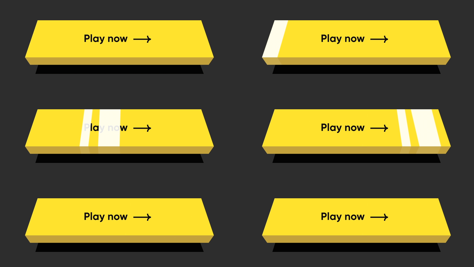
Floating

Floating tiltFloating

NeoPopTiltedButton(
    isFloating: true,
    onTapUp: () => HapticFeedback.vibrate(),
    onTapDown: () => HapticFeedback.vibrate(),
    decoration: const NeoPopTiltedButtonDecoration(
        color: kPopYellowColor,
        plunkColor: kPlunkColorYellow,
        shadowColor: kTiltedButtonShadowColor,
    ),
    child: Padding(
        padding: const EdgeInsets.symmetric(
        horizontal: 70.0,
        vertical: 15,
        ),
        child: SvgPicture.asset('assets/svg/cta_text_play_now.svg'),
    ),
),

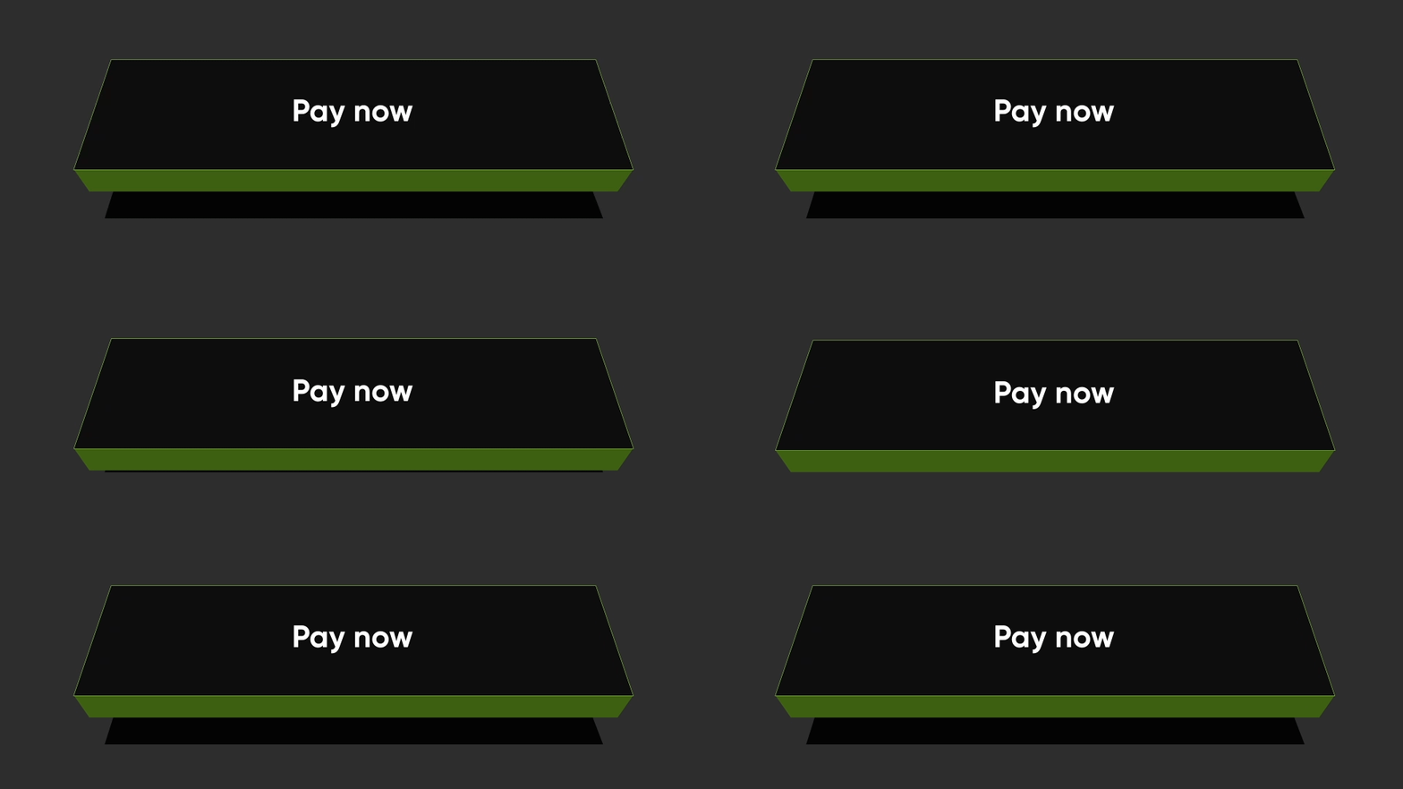
Strokes

Strokes TiltStroked

NeoPopTiltedButton(
    isFloating: true,
    onTapUp: () {},
    decoration: const NeoPopTiltedButtonDecoration(
        color: Color(0xFF0D0D0D),
        plunkColor: Color(0xFF3F6915),
        shadowColor: Colors.black,
        border: Border.fromBorderSide(
        BorderSide(color: Color(0xFF8DD04A), width: 1),
        ),
    ),
    child: const Padding(
        padding: EdgeInsets.symmetric(horizontal: 70.0, vertical: 15),
        child: Text('Play Now', style: TextStyle(color: Colors.white)),
    ),
),

Shimmer

shimmer

NeoPopTiltedButton(
    isFloating: true,
    onTapUp: () {},
    decoration: const NeoPopTiltedButtonDecoration(
        color: Color.fromRGBO(255, 235, 52, 1),
        plunkColor: Color.fromRGBO(255, 235, 52, 1),
        shadowColor: Color.fromRGBO(36, 36, 36, 1),
        showShimmer: true,
    ),
    child: const Padding(
        padding: EdgeInsets.symmetric(
        horizontal: 70.0,
        vertical: 15,
        ),
        child: Text('Play Now'),
    ),
),

NeoPopTiltedButton Attributes

Attribute Type Description
child Widget The child of the button
color Color? Color of the button
decoration NeoPopTiltedButtonDecoration? The decoration to paint the button. The color and decoration arguments cannot both be supplied, since it would potentially result in the decoration drawing over the background color. To supply a decoration with a color, use decoration.
buttonDepth double? The depth of the tilted button. default: 8.0
onTapUp VoidCallback? A callback triggered when a pointer that will trigger a tap with button has stopped contacting the screen
onTapDown VoidCallback? A callback triggered when a pointer that might cause a tap with button has contacted the screen
shadowDistance double? The maximum distance from the button at which the shadow is painted. default: 20
yPosFactor double? Factor that defines the floating positions of buttons and shadow along vertical-axis. default: 5
isFloating bool Whether the button is floating. default: false
floatingDuration Duration? The duration of the floating animation. One floating cycle i.e to-and-fro movement of the button and shadow accounts for two floating durations. default: Duration(milliseconds: 1500)
floatingDelay Duration? The delay between two floating cycles. default: Duration(milliseconds: 750)
tapDuration Duration? The duration of the animation when button is pressed or released. default: Duration(milliseconds: 100)
enabled bool Whether the button is enabled. default: true

Contributing

Pull requests are welcome! We'd love help improving this library. Feel free to browse through open issues to look for things that need work. If you have a feature request or bug, please open a new issue so we can track it.

License

Copyright 2022 Dreamplug Technologies Private Limited.  
  
Licensed under the Apache License, Version 2.0 (the "License");  
you may not use this file except in compliance with the License.  
You may obtain a copy of the License at  
  
 http://www.apache.org/licenses/LICENSE-2.0  
Unless required by applicable law or agreed to in writing, software  
distributed under the License is distributed on an "AS IS" BASIS,  
WITHOUT WARRANTIES OR CONDITIONS OF ANY KIND, either express or implied.  
See the License for the specific language governing permissions and  
limitations under the License.  

所属分类

源码仓库

使用此插件的项目