not_static_icons | animated icons for Flutter
Features
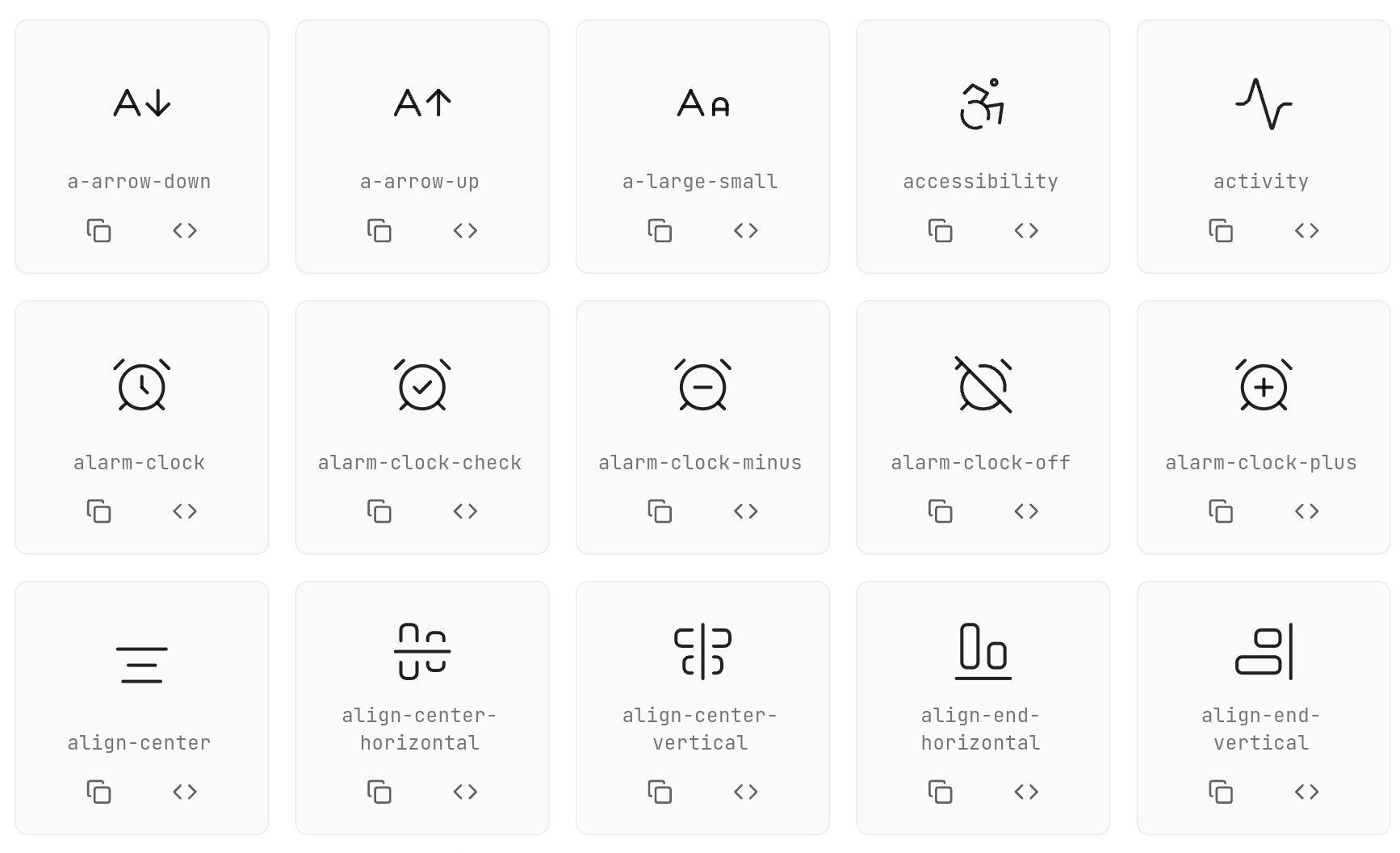
- 700+ Animated Icons: Based on popular Lucide icon set
- Interactive Animations: Hover and touch effects
- Customizable: Size, color, animation duration, stroke width
- Flexible Integration: Works with GestureDetector, InkWell, IconButton
- Programmatic Control: AnimatedIconController for external animation control
Usage
Basic Usage
AirplayIcon()
AArrowDownIcon(
size: 45,
color: Colors.blue,
animationDuration: Duration(milliseconds: 800),
strokeWidth: 3.0,
hoverColor: Colors.red,
enableTouchInteraction: true,
infiniteLoop: false,
reverseOnExit: false,
)
Using onTap Callback
Use onTap instead of wrapping the icon in GestureDetector:
CheckIcon(
  size: 40,
  color: Colors.green,
  onTap: () {
    print('Icon tapped!');
  },
)
Using with IconButton
Use interactive: false and AnimatedIconController for IconButton integration:
class MyWidget extends StatefulWidget {
@override
State<MyWidget> createState() => _MyWidgetState();
}
class _MyWidgetState extends State<MyWidget> {
final _iconController = AnimatedIconController();
@override
Widget build(BuildContext context) {
return IconButton(
onPressed: () {
_iconController.animate();
},
icon: HeartIcon(
size: 32,
color: Colors.red,
interactive: false,
controller: _iconController,
),
);
}
}
Using with InkWell
final _iconController = AnimatedIconController();
InkWell(
onTap: () {
_iconController.animate();
},
child: Padding(
padding: EdgeInsets.all(8),
child: CopyIcon(
size: 24,
interactive: false,
controller: _iconController,
),
),
)
All Configuration Options
ActivityIcon(
size: 48.0,
color: Colors.black87,
hoverColor: Colors.blue,
animationDuration: Duration(milliseconds: 600),
strokeWidth: 2.0,
reverseOnExit: true,
enableTouchInteraction: true,
infiniteLoop: false,
resetToStartOnComplete: false,
onTap: () {},
interactive: true,
controller: AnimatedIconController(),
)
AnimatedIconController Methods
| Method |
Description |
animate() |
Triggers the animation to play forward |
stop() |
Stops the current animation |
reset() |
Resets the animation to its initial state |
Available Icons


Animation Types
Each icon has its own unique animation:
- Rotation: Icons rotate around their center
- Scale: Icons scale up/down
- Path Drawing: Icons draw their paths progressively
- Morphing: Icons transform between states
Contributing
Contributions are welcome! Please feel free to submit a Pull Request.



Contacts
 [
 ](mailto:khlebobul@gmail.com)


Support

License

Credits
Icons based on Lucide Icons inspired by pqoqubbw/icons
Used by