Numeric Selector
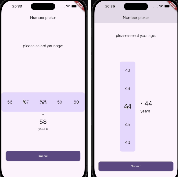
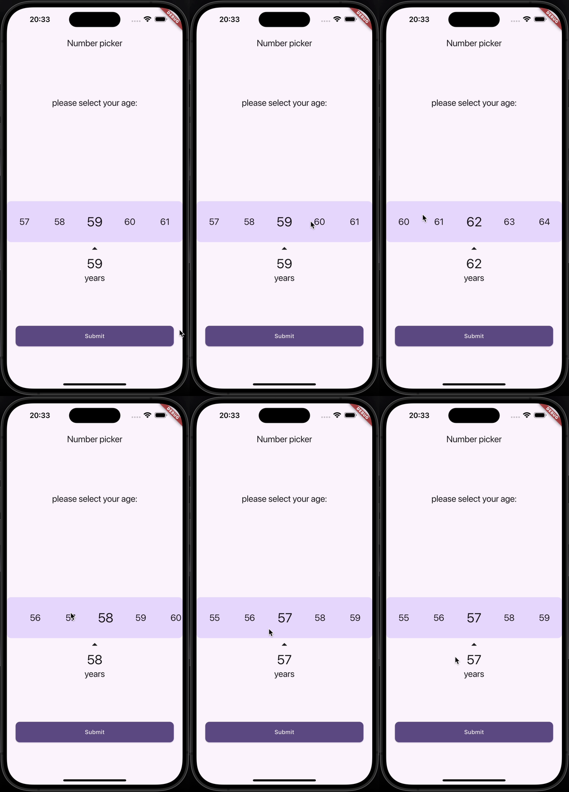
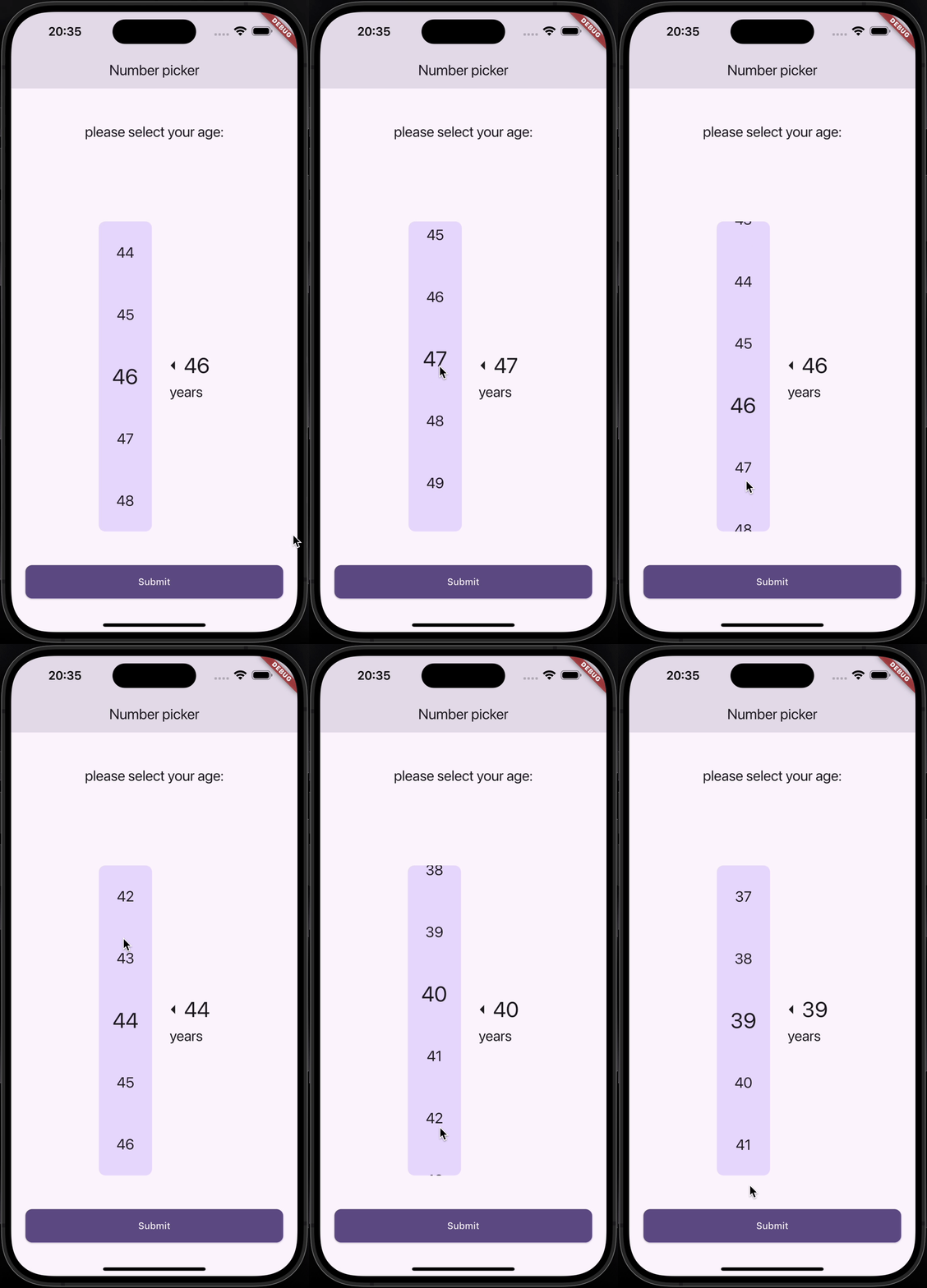
A customizable Numeric Selector package for Flutter, providing both Horizontal and Vertical Numeric Selector with smooth scrolling and optional vibration feedback.
Features
✅ Horizontal and Vertical pickers
Installation
Add the following dependency to your pubspec.yaml file:
dependencies:
  numeric_selector: latest_version
Then, run:
flutter pub get
Demo
Horizontal Numeric Selector
Vertical Numeric Selector
Usage
Horizontal Numeric Selector
HorizontalNumericSelector (
minValue: 0 ,
maxValue: 100 ,
step: 1 ,
initialValue: 50 ,
onValueChanged: (value) {
print ("Selected Value: $value " );
},
viewPort: 0.3 ,
selectedTextStyle: TextStyle (fontSize: 32 , fontWeight: FontWeight .bold),
unselectedTextStyle: TextStyle (fontSize: 24 , color: Colors .grey),
backgroundColor: Colors .white,
showLabel: true ,
label: "Quantity" ,
showArrows: true ,
enableVibration: true ,
)
Vertical Numeric Selector
VerticalNumericSelector (
minValue: 1 ,
maxValue: 10 ,
step: 1 ,
initialValue: 5 ,
onValueChanged: (value) {
print ("Selected Value: $value " );
},
viewPort: 0.3 ,
selectedTextStyle: TextStyle (fontSize: 32 , fontWeight: FontWeight .bold),
unselectedTextStyle: TextStyle (fontSize: 24 , color: Colors .grey),
backgroundColor: Colors .white,
borderRadius: BorderRadius .circular (10 ),
showLabel: true ,
label: "Speed" ,
showArrows: true ,
enableVibration: true ,
)
Parameters
Parameter
Type
Description
minValueintMinimum selectable value
maxValueintMaximum selectable value
stepintStep between values
initialValueintDefault selected value
onValueChangedValueChanged<int>Callback when value changes
viewPortdoubleFraction of viewport occupied by picker
selectedTextStyleTextStyle?Style for selected value
unselectedTextStyleTextStyle?Style for unselected values
backgroundColorColor?Background color
borderRadiusBorderRadius?Corner radius for picker background
showLabelboolShow label text below selected value
labelString?Custom label text
showArrowsboolShow navigation arrows
arrowIconIconData?Custom arrow icon
enableVibrationboolEnable vibration feedback
Contributing
Contributions are welcome! Feel free to submit a PR or open an issue.
Contact
👤 Amirmahdi Nourkazemi
License
This project is licensed under the MIT License.