搜索插件、代码仓与 APP 分类

pie_menu 封面
插件详情v3.8.3

pie_menu

一个提供高度可定制的圆形/径向上下文菜单的Flutter包

AndroidiOSWebmacOSWindowsLinux
近 30 天下载
2110
喜欢数
247
Pub 分数
150

安装插件

flutter pub add pie_menu

插件介绍

基于插件公开信息、社区数据与项目使用情况整理的选型参考。

Pie_menu 是一个 Flutter 包,提供可自定义的圆形或径向上下文菜单,非常适合直观且节省空间的用户交互。它允许开发者创建带有可配置切片、动画和手势的交互式饼状菜单。该包支持 Android、iOS、Web、macOS、Windows 和 Linux 多个平台,确保在不同设备上行为一致。通过丰富的颜色、大小和行为自定义选项,它增强了需要快速访问多个操作的应用程序的 UI 设计。

适合场景

  • 移动应用中的快速操作选择
  • 创意工具中的直观导航
  • 增强游戏界面的用户界面
  • 在生产力应用中优化工作流程
  • 在AR/VR应用中提供基于手势的控制

主要特点

  • 高度可定制的径向布局
  • 支持触摸、轻触和拖动手势
  • 流畅的动画和过渡
  • 跨平台兼容性
  • 可配置的切片大小和间距
  • 可扩展的事件处理

适合对象

  • 开发手势丰富的界面的开发者
  • 寻求现代菜单替代方案的UI设计师
  • 需要紧凑操作面板的应用程序
  • 互动式教育或游戏应用程序
  • 针对多个设备平台的项目

使用建议

  • 可能需要仔细的用户体验测试以确保可访问性
  • 大量菜单项带来的性能影响
  • 复杂配置的潜在学习曲线
  • 不太适合简单的线性菜单
  • 需要关注小屏幕上的触摸目标大小

原始 README

以下为关联源码仓库的 README 原文快照,最新内容请访问源码仓库。

Flutter Pie Menu 🥧

pub pub likes web apk app github buy me a coffee

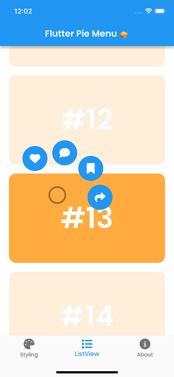
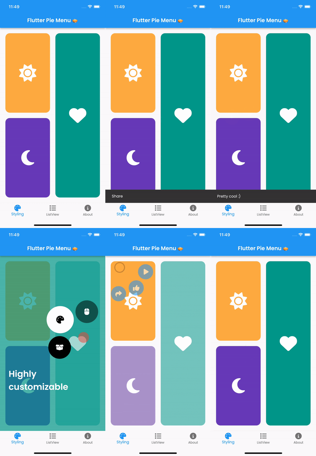
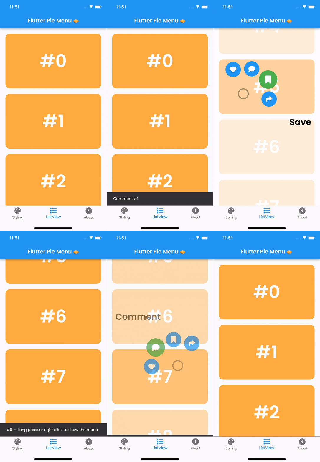
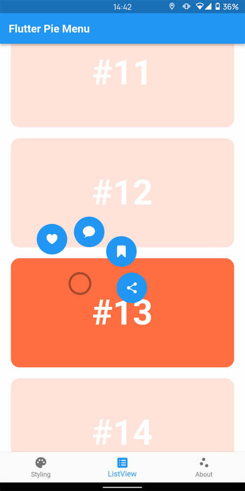
A Flutter package providing a highly customizable circular/radial context menu, similar to Pinterest's.

Click here to try Flutter Pie Menu online!

Table of Contents

Usage

Wrap the widget that should respond to gestures with the PieMenu widget, and provide the menu with a list of PieActions to display as circular buttons.

PieMenu(
  onPressed: () => print('pressed'),
  actions: [
    PieAction(
      tooltip: const Text('like'),
      onSelect: () => print('liked'),
      child: const Icon(Icons.favorite), // Can be any widget
    ),
  ],
  child: ChildWidget(),
),

💡 Note that PieMenu must be a descendant of a PieCanvas widget.

Wrap your page, or any other desired widget for drawing the menu and the background overlay, with the PieCanvas widget.

For instance, if you want the menu to be displayed at the forefront, wrap your Scaffold with a PieCanvas as follows:

PieCanvas(
  child: Scaffold(
    body: YourScaffoldBody(
      ...
        PieMenu(),
      ...
    ),
  ),
),

💡 You can use the onPressed callback defined in PieMenu to handle tap events without needing an extra widget like GestureDetector.

Customization

You can customize the appearance and behavior of menus using PieTheme.

Using the theme attribute of the PieCanvas widget, you can specify a theme for all descendant PieMenu widgets.

PieCanvas(
  theme: PieTheme(),
  ...
    PieMenu(), // Uses the canvas theme
  ...
    PieMenu(), // Uses the canvas theme
  ...
),

If you want to specify menu-specific themes, you can use the theme attribute of the PieMenu widget.

PieMenu(
  theme: PieTheme(), // Overrides the canvas theme
),

It is also possible to copy the canvas theme with additional parameters, but ensure you are accessing it with the correct context.

PieMenu(
  theme: PieTheme.of(context).copyWith(
    ...
  ),
),
Button themes

Button background and icon colors are defined by the theme's buttonTheme and buttonThemeHovered properties. You can create custom PieButtonTheme instances for your canvas and menu themes.

PieTheme(
  buttonTheme: PieButtonTheme(),
  buttonThemeHovered: PieButtonTheme(),
),

You can also style the buttons using the decoration property of PieButtonTheme.

PieButtonTheme(
  decoration: BoxDecoration(),
),
Custom button widgets

If you wish to use custom widgets inside buttons instead of just icons, use PieAction.builder(). Its builder provides the hover state as a parameter.

PieAction.builder(
  tooltip: const Text('like'),
  onSelect: () => print('liked'),
  builder: (hovered) {
    return Text(
      '<3',
      style: TextStyle(
        color: hovered ? Colors.green : Colors.red,
      ),
    );
  },
),
Display angle of menu buttons

To disable dynamic angle calculation and have the menu appear at a fixed angle, set the customAngle and customAngleAnchor attributes of PieTheme.

PieTheme(
  customAngle: 90, // In degrees
  customAngleAnchor: PieAnchor.center, // start, center, end
),

You can also use customAngleDiff or spacing to adjust the angle between buttons, and angleOffset to rotate the menu.

Specific menu position

Use the menuAlignment attribute of PieTheme to make the menu appear at a specific position regardless of the press location. Combine it with menuDisplacement to fine-tune the position.

PieTheme(
  menuAlignment: Alignment.center,
  menuDisplacement: Offset(0, 0),
),
Regular press, long press or right click to open the menu

Use the regularPressShowsMenu, longPressShowsMenu, and longPressDuration attributes of PieTheme to customize the menu opening behavior.

PieTheme(
  regularPressShowsMenu: true,
  longPressShowsMenu: true,
  longPressDuration: const Duration(milliseconds: 500),
),

Use the rightClickShowsMenu and leftClickShowsMenu attributes of PieTheme to customize mouse button behavior.

PieTheme(
  rightClickShowsMenu: true,
  leftClickShowsMenu: false,
),

Controllers and callbacks

To open, close, or toggle a menu programmatically, assign a PieMenuController to it.

// Create a controller inside a stateful widget.
final _pieMenuController = PieMenuController();

// Assign the controller to a PieMenu.
PieMenu(
  controller: _pieMenuController,
  ...
),

// Control the menu using the controller.
_pieMenuController.open(
  menuAlignment: Alignment.center,
);

If you need to perform actions when the menu is toggled, use the onToggle callback of PieMenu or the onMenuToggle callback of PieCanvas.

PieMenu(
  onToggle: (menuOpen) => print('Menu ${menuOpen ? 'opened' : 'closed'}'),
  ...
),

PieCanvas(
  onMenuToggle: (menuOpen) => print('A menu ${menuOpen ? 'opened' : 'closed'}'),
  ...
),

Contributing

Pull requests are welcome. For major changes, please open an issue first to discuss what you would like to change.

github

Donation

If you find this package useful, please consider donating to support the project.

buy me a coffee

所属分类

依赖

依赖清单 1 项

源码仓库

使用此插件的项目