搜索插件、代码仓与 APP 分类

quickalert 封面
插件详情v1.1.0

quickalert

使用 QuickAlert,可立即显示动画警报对话框,例如成功、错误、警告、确认、加载,甚至自定义对话框。

AndroidiOSWebmacOSWindowsLinux
近 30 天下载
2万
喜欢数
590
Pub 分数
150

安装插件

flutter pub add quickalert

插件介绍

基于插件公开信息、社区数据与项目使用情况整理的选型参考。

QuickAlert 是一个 Flutter 包,可让开发者快速显示带有预设类型(如成功、错误、警告、确认和加载)的动画化、可自定义的弹出对话框。它通过极少的代码即可简化用户反馈的展示过程,支持 Android、iOS、Web、macOS、Windows 和 Linux 等多个平台。该包提供流畅的动画效果,并可通过单次方法调用轻松集成,非常适合需要即时视觉反馈的应用程序以提升用户体验。同时,也支持自定义对话框,适用于特殊使用场景。

适合场景

  • 表单提交后显示成功消息
  • 显示无效输入的错误警报
  • 通过是/否提示确认操作
  • 在异步操作期间指示加载状态
  • 为特定的UI需求创建自定义警报设计

主要特点

  • 预定义的警告类型(成功、错误、警告等)
  • 用于视觉吸引力的动画过渡
  • 对自定义对话框内容的支持
  • 简单的单行调用
  • 跨平台兼容性
  • 轻量且易于集成

适合对象

  • 初学者 Flutter 开发者
  • 需要快速用户反馈的应用程序
  • 表单和身份验证流程
  • 频繁弹出提醒的交互式 UI
  • 优先考虑快速实现的项目

使用建议

  • 超出基础样式的定制有限
  • 可能需要额外的样式设置以适应复杂布局
  • 不太适合高度动态或持久的对话框
  • 最适合临时通知
  • 依赖外部动画库以实现效果

原始 README

以下为关联源码仓库的 README 原文快照,最新内容请访问源码仓库。

QuickAlert Banner

An instantly ready, full-featured alerts for development on any platform with flutter. Enabling you to complete projects and deploy quickly. With QuickAlert, you can display animated alert dialogs such as success, error, warning, confirm, loading or even a custom dialog.

Key Features 🔮

Easy To Use

The alerts are very flexible and can be customized very easily. In QuickAlert, the QuickAlert.show() triggers the alert, which informs the user about the situations that need acknowledgment.

Predefined Beautiful Alert Styles

Make use of the predefined alerts are very beautiful and can also be customized very easily. In QuickAlert there are 6 different types of alerts, they are Success, Error, Warning, Info, Confirm & Loading.

Predefined Title & Actions

In QuickAlert all the 6 different types of alerts have predefined title & actions matching the alert type.

Super Customizable

Build your custom alert with power of QuickAlert using the flutter widgets.

Change Animation

Set your favorite animation by choosing from scale, rotate, slideInDown, slideInUp, slideInLeft, slideInRight.

Set Auto close

Auto close the alert by setting auto close duration.

Set Overlay Tap to Dismiss

Control the alert's Barrier Dismissible Property by setting barrierDismissible to true or false.

And Many More...


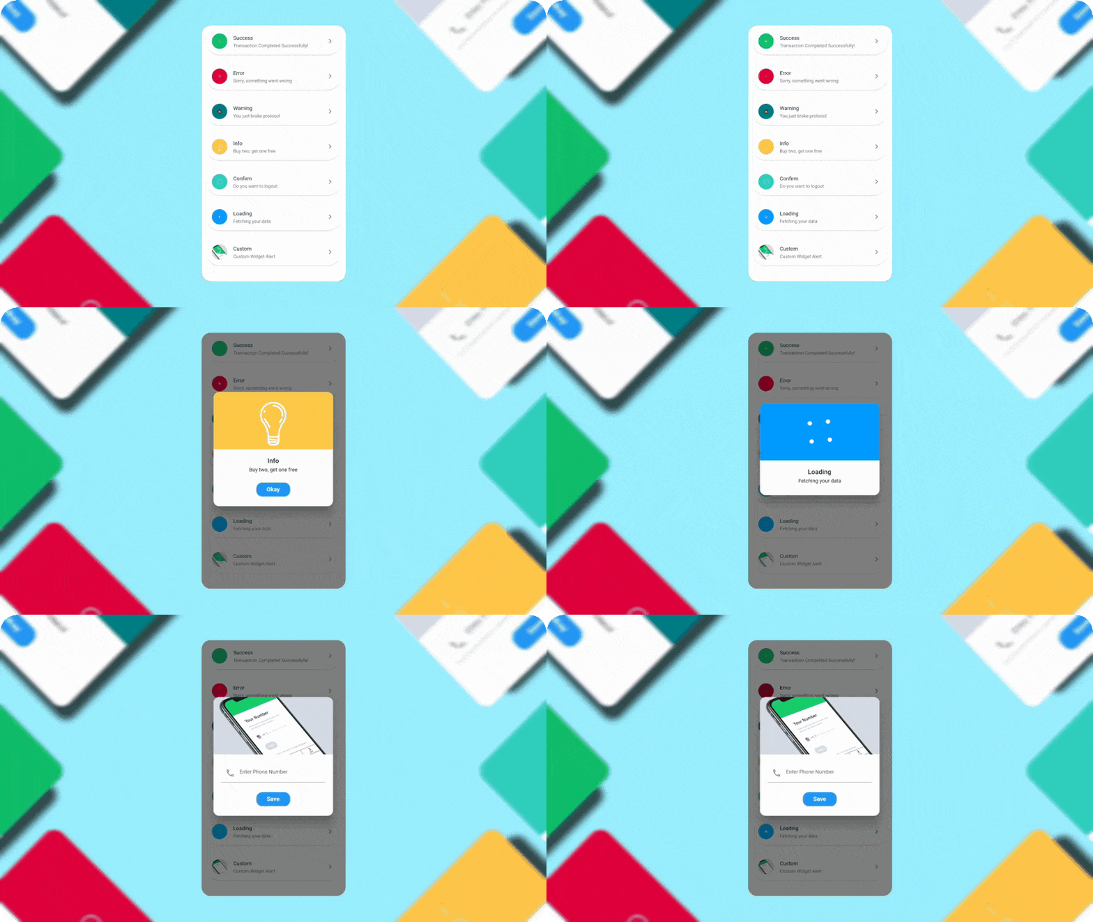
QuickAlert Demo

QuickAlert Demo

Getting Started 🔥

Start by adding the library as a dependency to your project.

dependencies:
  quickalert: <latest version>

Run the command get the dependency

$ flutter pub get

Import it in your dart code, you can use

import 'package:quickalert/quickalert.dart';

To display alert use QuickAlert.show() and define the type of alert.

QuickAlert.show(
  context: context,
  type: QuickAlertType.success,
); // That's it to display an alert, use other properties to customize.

Examples ⚡

There is a detailed example project in the example folder. You can directly run and play on it. There are code snippets from example project below.

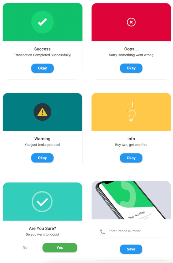
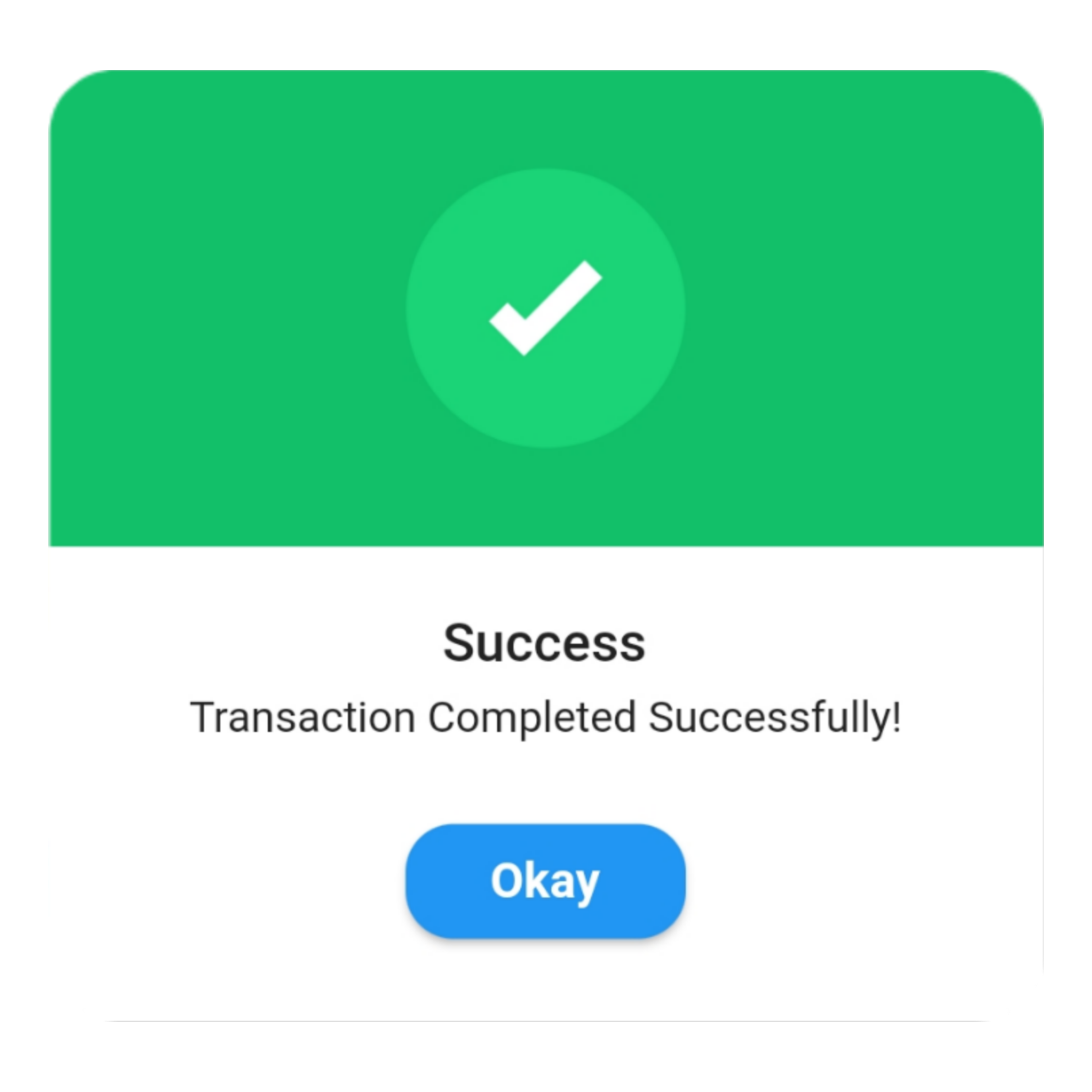
Success
QuickAlert.show(
 context: context,
 type: QuickAlertType.success,
 text: 'Transaction Completed Successfully!',
);

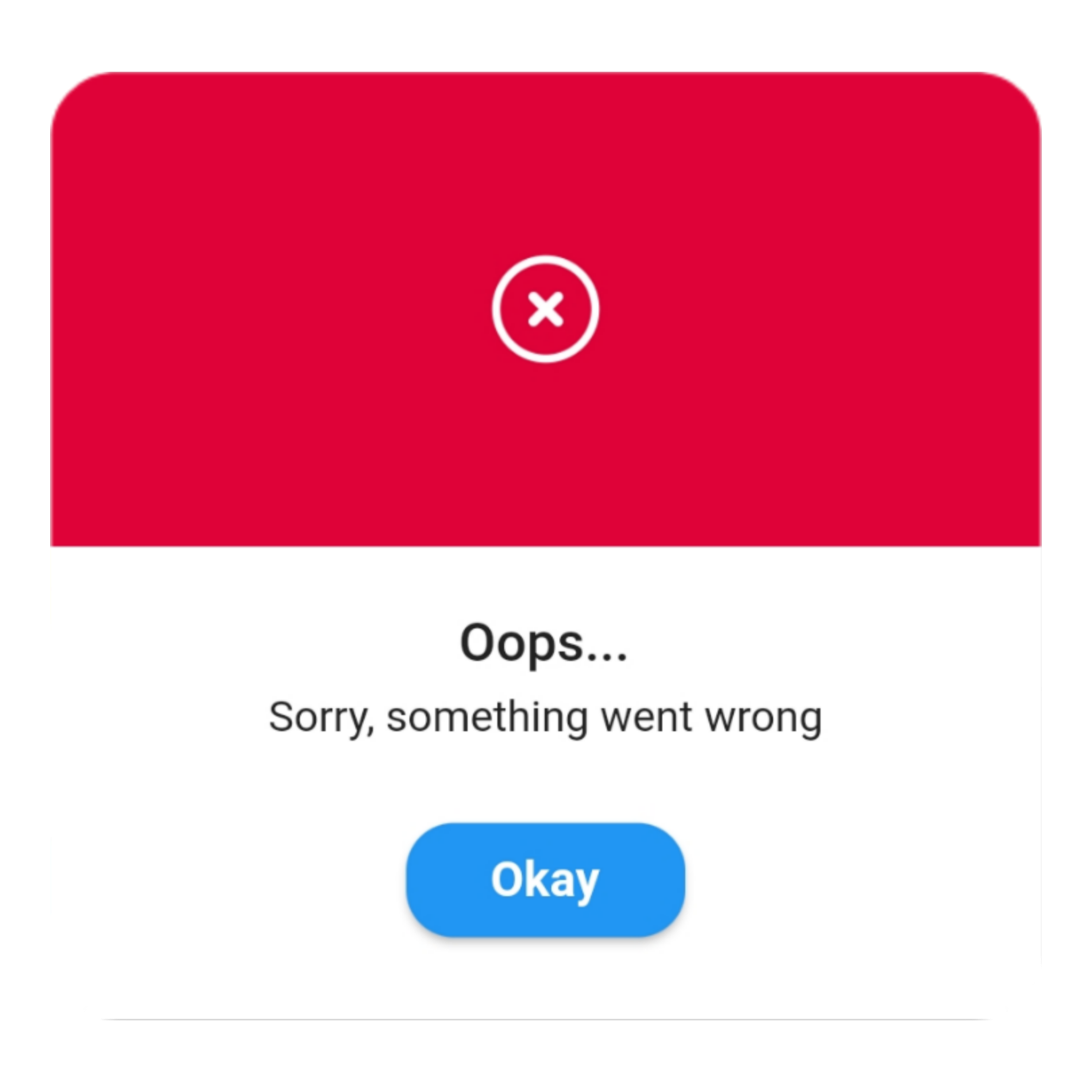
Error
QuickAlert.show(
 context: context,
 type: QuickAlertType.error,
 title: 'Oops...',
 text: 'Sorry, something went wrong',
);

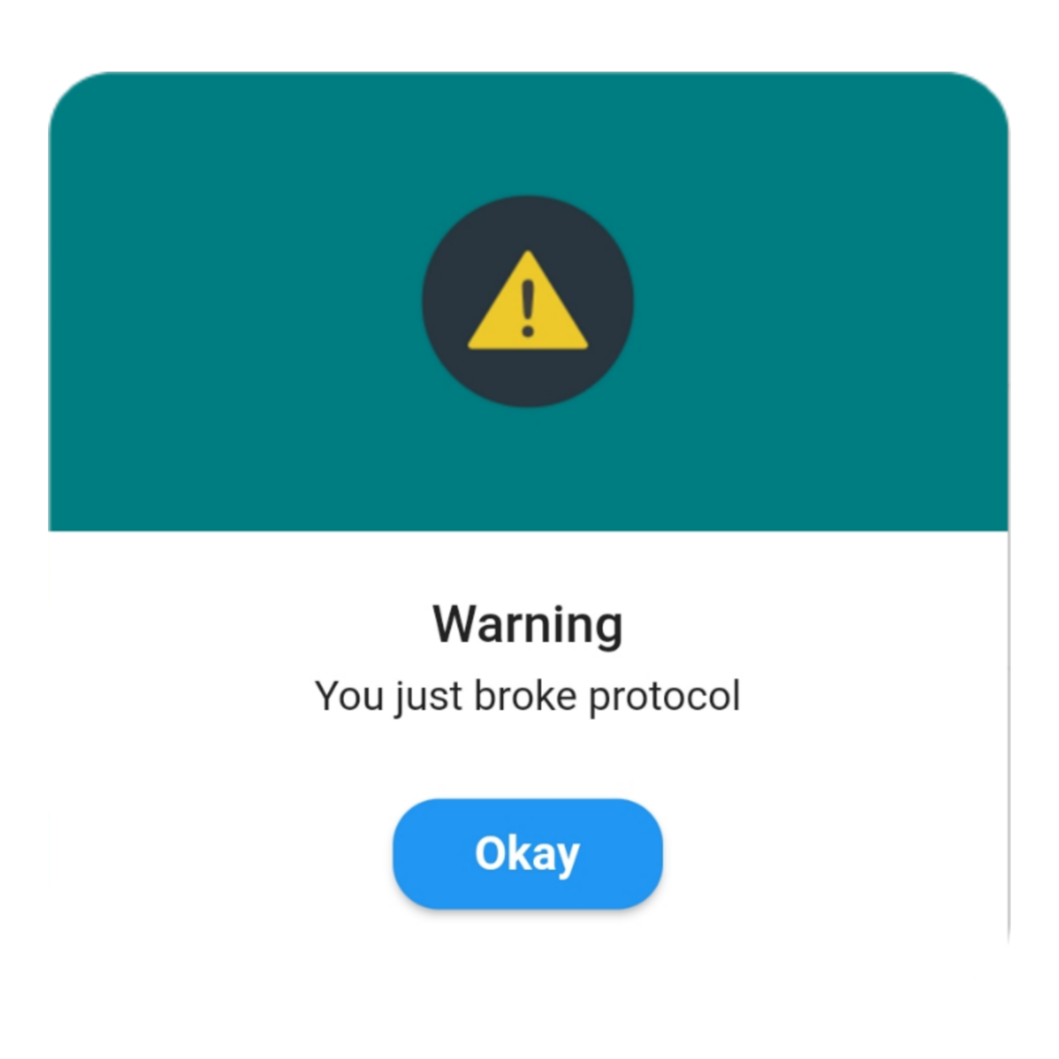
Warning
QuickAlert.show(
 context: context,
 type: QuickAlertType.warning,
 text: 'You just broke protocol',
);

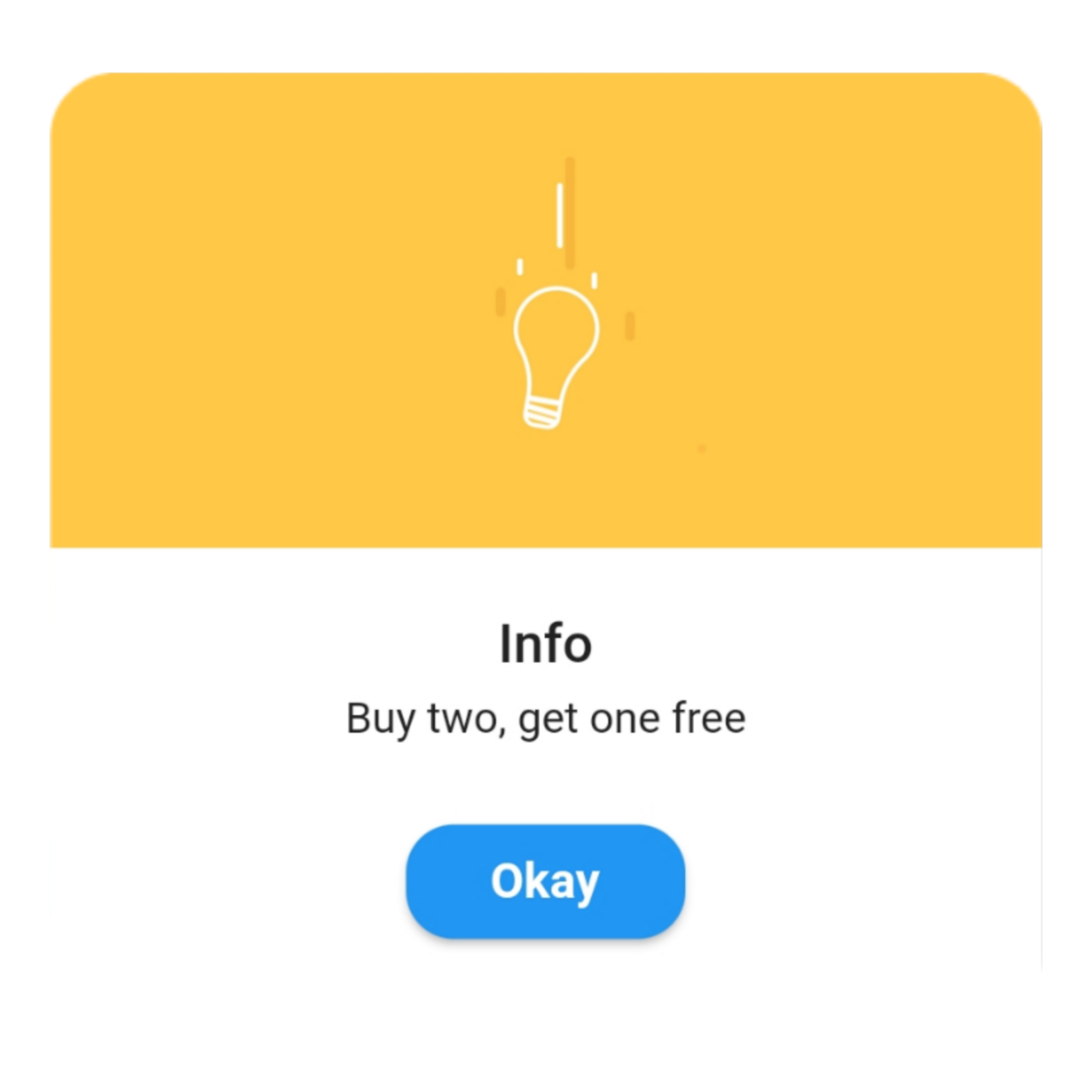
Info
QuickAlert.show(
 context: context,
 type: QuickAlertType.info,
 text: 'Buy two, get one free',
);

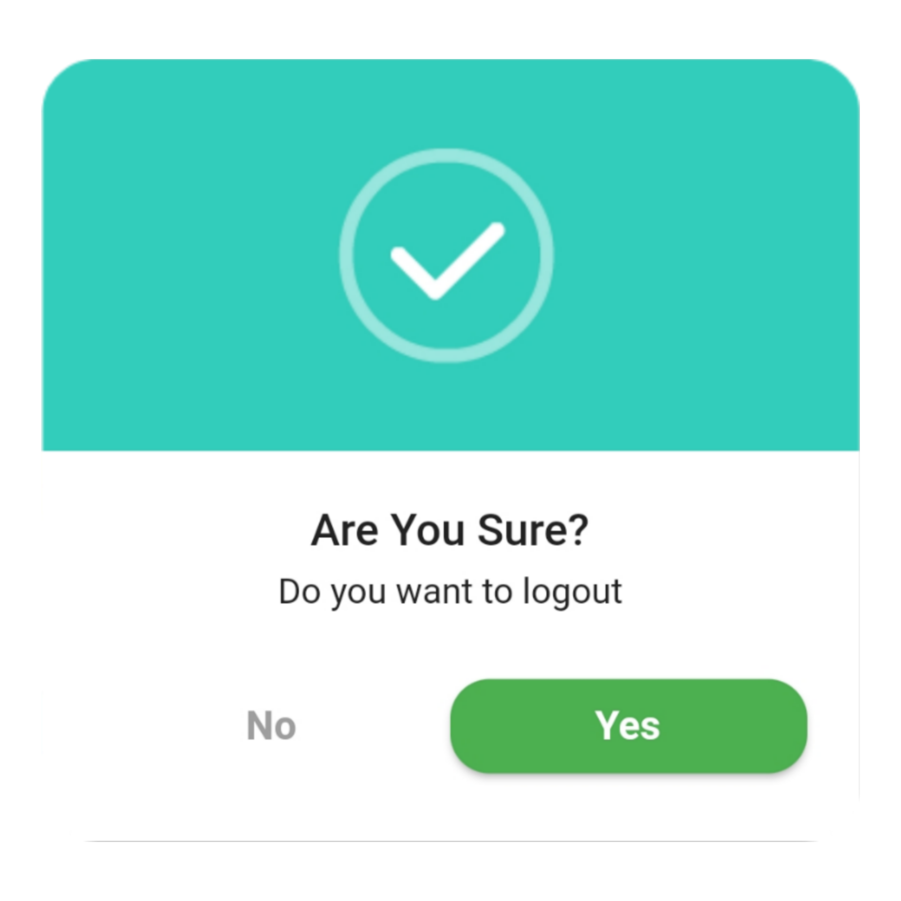
Confirm
QuickAlert.show(
 context: context,
 type: QuickAlertType.confirm,
 text: 'Do you want to logout',
 confirmBtnText: 'Yes',
 cancelBtnText: 'No',
 confirmBtnColor: Colors.green,
);

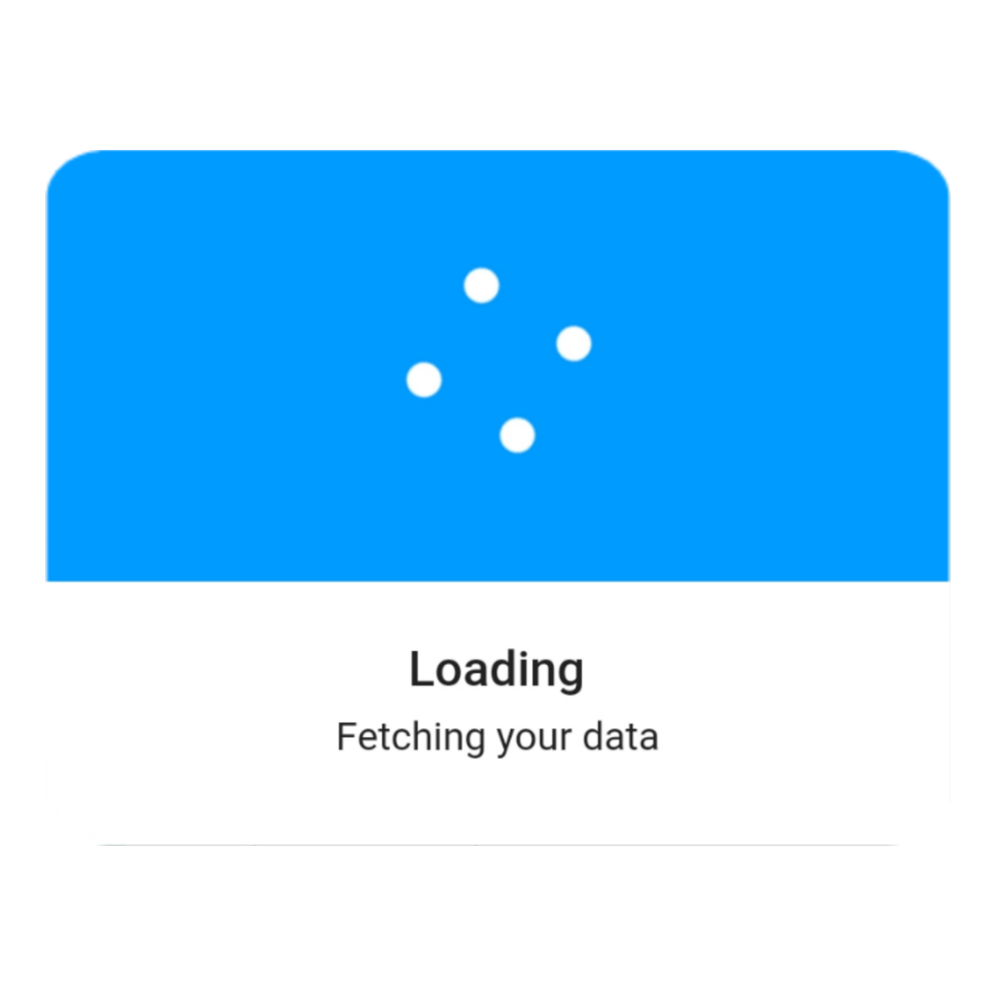
Loading
QuickAlert.show(
 context: context,
 type: QuickAlertType.loading,
 title: 'Loading',
 text: 'Fetching your data',
);

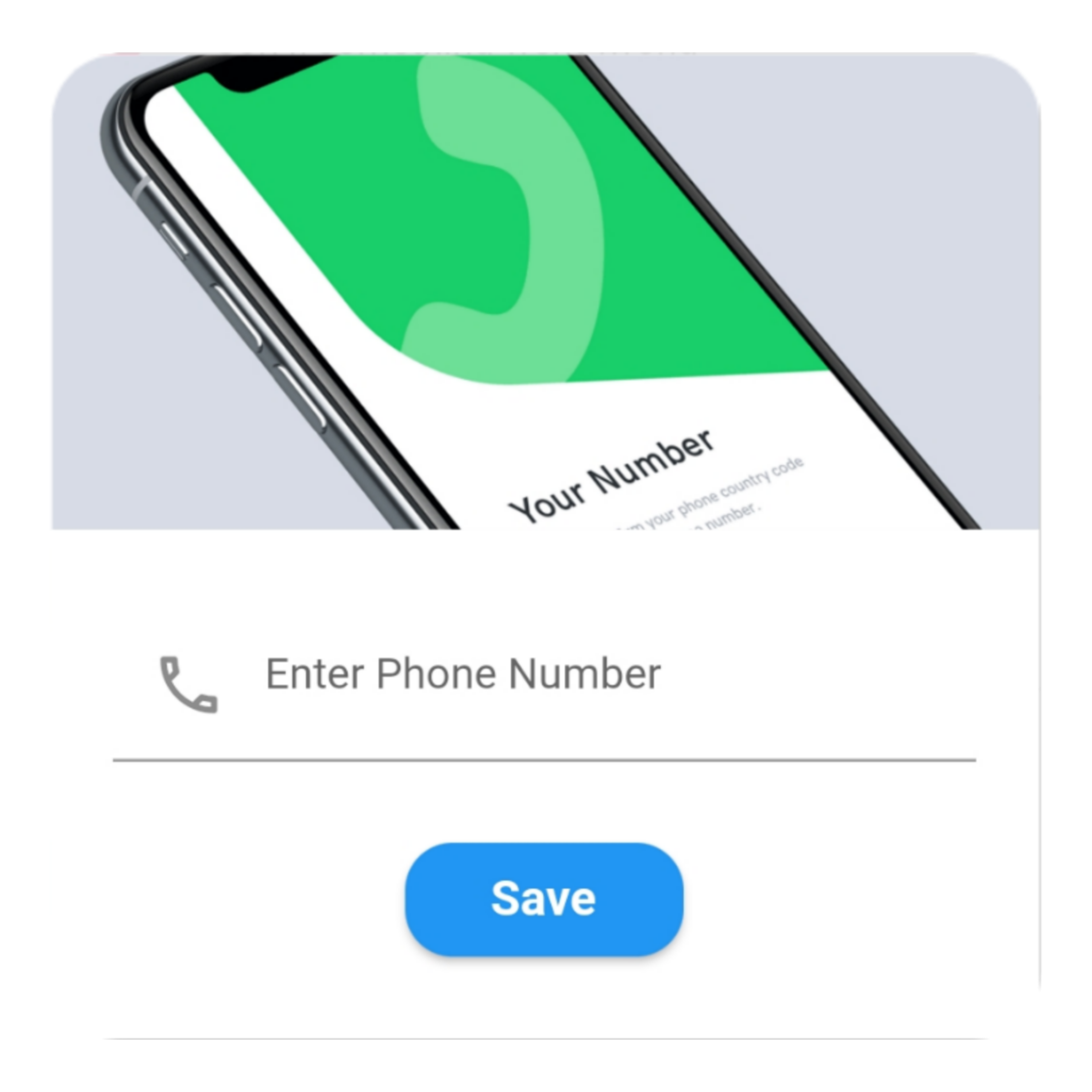
Custom
QuickAlert.show(
  context: context,
  type: QuickAlertType.custom,
  barrierDismissible: true,
  confirmBtnText: 'Save',
  customAsset: 'assets/custom.gif',
  widget: TextFormField(
  decoration: const InputDecoration(
     alignLabelWithHint: true,
     hintText: 'Enter Phone Number',
     prefixIcon: Icon(
     Icons.phone_outlined,
     ),
    ),
    textInputAction: TextInputAction.next,
      keyboardType: TextInputType.phone,
      onChanged: (value) => message = value,
    ),
    onConfirmBtnTap: () async {
     if (message.length < 5) {
      await QuickAlert.show(
       context: context,
       type: QuickAlertType.error,
       text: 'Please input something',
      );
      return;
    }
    Navigator.pop(context);
     await Future.delayed(const Duration(milliseconds: 1000));
     await QuickAlert.show(
      context: context,
      type: QuickAlertType.success,
      text: "Phone number '$message' has been saved!.",
     );
    },
  );
 },
 title: 'Custom',
 text: 'Custom Widget Alert',
 leadingImage: 'assets/custom.gif',
); 

Screenshots ✨

Here are some screenshots of the QuickAlert Dialogs.

QuickAlert Options 📖

These are the options available in QuickAlert Class.

Attribute Data type Description Default Value
context BuildContext @required BuildContext N/A
type QuickAlertType @required - Type of alert dialog, ex: QuickAlertType.success for success dialogs NULL
title String Set a custom title for dialog Based on the QuickAlertType selected
text String Set the description text of the dialog. NULL
widget Widget Set custom widget of the dialog. NULL
confirmBtnText String Text of confirm button 'Okay'
onConfirmBtnTap Function Function that handle click of confirm button () => Navigator.pop(context)
confirmBtnColor Color Color of confirm Button Colors.blue
showCancelBtn bool Determines if cancel button is shown or not false
showConfirmBtn bool Determines if confirm button is shown or not true
cancelBtnText String Text of cancel button 'Cancel'
onCancelBtnTap Function Function that handle click of cancel button () => Navigator.pop(context)
barrierDismissible bool Dismiss dialog on touch overlay true
animType QuickAlertAnimType Type of dialogue enter animation QuickAlertAnimType.scale
confirmBtnTextStyle TextStyle Confirm button text theme TextStyle(color: Colors.white, fontWeight:FontWeight.w600,fontSize: 18.0)
cancelBtnTextStyle TextStyle Cancel button text theme TextStyle(color: Colors.grey, fontWeight:FontWeight.w600,fontSize: 18.0)
backgroundColor Color Color of dialog background Colors.white
headerBackgroundColor Color Background Color of dialog Header Background Colors.white
titleColor Color Color of title Colors.black
textColor Color Color of text Colors.black
barrierColor Color Color of Barrier NULL
customAsset String Asset path of your custom asset NULL
autoCloseDuration Duration Determines how long the dialog stays open for before closing NULL
width double Dialog width MediaQuery.of(context).size.shortestSide
titleAlignment TextAlign Title Alignment of the dialog NULL
textAlignment TextAlign Text Alignment of the dialog NULL
borderRadius double Dialog's border radius 15.0
disableBackBtn bool Determines if the dialog should be closed when back button is pressed false

所属分类

依赖

依赖清单 1 项

源码仓库

使用此插件的项目