搜索插件、代码仓与 APP 分类

rounded_loading_button 封面
插件详情v2.1.0

rounded_loading_button

Flutter 的一个简单动画加载按钮小部件实现

近 30 天下载
876
喜欢数
539
Pub 分数
60

安装插件

flutter pub add rounded_loading_button

插件介绍

基于插件公开信息、社区数据与项目使用情况整理的选型参考。

一个 Flutter 包,提供了一个动画加载按钮小部件,可实现从标准按钮到带有圆形进度指示器的加载状态之间的平滑过渡。它设计简洁,易于集成,使开发者能够在异步操作期间增强用户反馈。该按钮支持自定义颜色、大小和动画持续时间,非常适合表单、登录界面以及任何需要用户确认的操作。使用干净的 Dart 代码构建,可无缝融入现代 Flutter 应用程序。

适合场景

  • 表单提交
  • 登录或注册流程
  • API 调用触发
  • 用户操作确认
  • 加载状态反馈

主要特点

  • 动画加载过渡
  • 可自定义的颜色和大小
  • 圆形进度指示器
  • 简单的 API 集成
  • 流畅的动画

适合对象

  • 初学者 Flutter 开发者
  • 以UI为主的应用程序
  • 交互式表单
  • 移动应用界面
  • 快速原型设计

使用建议

  • 有限的平台特定自定义
  • 无内置错误状态
  • 需要手动处理异步逻辑
  • 不适合复杂的按钮行为
  • 依赖外部动画时间

原始 README

以下为关联源码仓库的 README 原文快照,最新内容请访问源码仓库。

rounded_loading_button

pub package build codecov style: effective dart License: MIT Awesome Flutter

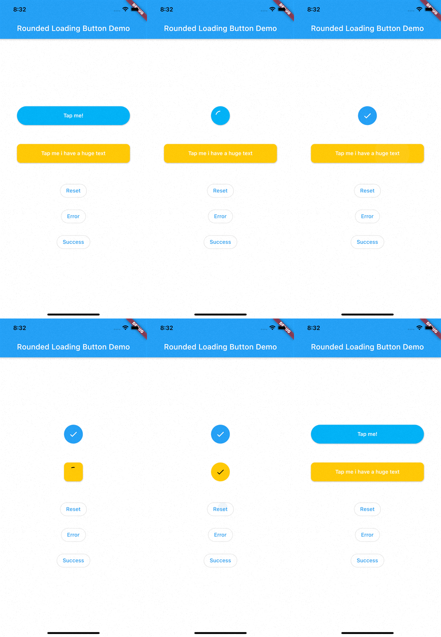
RoundedLoadingButton is a Flutter package with a simple implementation of an animated loading button, complete with success and error animations.

Installation

Add this to your pubspec.yaml:

dependencies:
    rounded_loading_button: ^2.0.8

Usage

Import
import 'package:rounded_loading_button/rounded_loading_button.dart';
Simple Implementation
final RoundedLoadingButtonController _btnController = RoundedLoadingButtonController();

void _doSomething() async {
    Timer(Duration(seconds: 3), () {
        _btnController.success();
    });
}

RoundedLoadingButton(
    child: Text('Tap me!', style: TextStyle(color: Colors.white)),
    controller: _btnController,
    onPressed: _doSomething,
)

The Rounded Loading Button has many configurable properties, including:

  • duration - The duration of the button animation
  • loaderSize - The size of the CircularProgressIndicator
  • animateOnTap - Whether to trigger the loading animation on the tap event
  • resetAfterDuration - Reset the animation after specified duration, defaults to 15 seconds
  • errorColor - The color of the button when it is in the error state
  • successColor - The color of the button when it is in the success state
  • successIcon - The icon for the success state
  • failedIcon - The icon for the failed state

Contributions

All contributions are welcome!

所属分类

依赖

依赖清单 1 项

源码仓库

使用此插件的项目