搜索插件、代码仓与 APP 分类

scrollable_list_tabview 封面
插件详情v0.1.6

scrollable_list_tabview

一个 Flutter 小部件,用于同步 ScrollView 和自定义标签视图。

近 30 天下载
49
喜欢数
166
Pub 分数
40

安装插件

flutter pub add scrollable_list_tabview

插件介绍

基于插件公开信息、社区数据与项目使用情况整理的选型参考。

一个Flutter widget,可将可滚动列表与自定义标签视图同步,确保两个组件之间的平滑对齐。它使用户可以通过滚动浏览内容,同时更新选中的标签,反之亦然。非常适合创建列表项和标签紧密相关的连贯、交互式界面。该包轻量级,专为无缝集成到现有的Flutter项目中而设计。

适合场景

  • 同步列表和标签导航
  • 创建内容丰富的仪表板
  • 构建引导式入门流程
  • 实现可滚动的标签页界面

主要特点

  • 滚动与标签页的实时同步
  • 可自定义的标签样式
  • 支持动态内容
  • 与现有小部件的简单集成
  • 跨设备的响应式行为

适合对象

  • 开发 tabbed 内容布局的开发者
  • 需要同步滚动和标签选择的应用
  • 寻求交互式导航模式的UI设计师

使用建议

  • 需要手动处理选项卡项数据
  • 有限的平台特定优化
  • 无内置动画
  • 不适合高度复杂的嵌套导航

原始 README

以下为关联源码仓库的 README 原文快照,最新内容请访问源码仓库。

scrollable_list_tabview

Build Status Codemagic build status Coverage Status

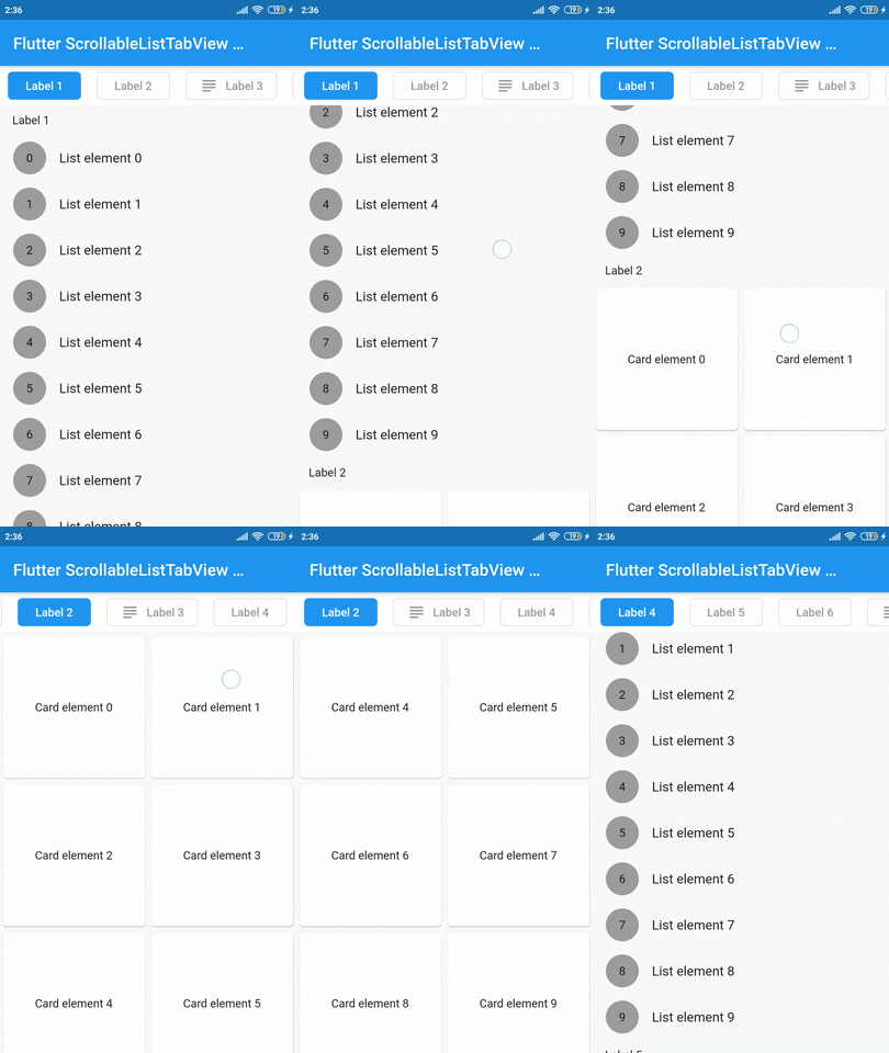
A Flutter widget which synchronize a ScrollView and a custom tab view.

The main idea is to create a custom tab view synchronizing with inner ScrollView. The scroll activity will trigger custom tab view at the top to follow the index of the inner scroll view widget.

Demo

Installation

Add dependency for package on your pubspec.yaml:

dependencies:
    scrollable_list_tabview: <latest>

Usage

To use this widget we must first define how our tabs will look like.

ListTab
Parameter Definition
Widget icon Trailing widget for a tab, typically an Icon.
Widget label Label to be shown in the tab, must be non-null.
BorderRadiusGeometry borderRadius BorderRadius value for a single tab.
Color activeBackgroundColor Color to be used when the tab is selected.
Color inactiveBackgroundColor Color to be used when the tab isn't selected.
bool showIconInList Decide whether show icon widget in the scrollable view.
Color borderColor Color of the border of tab when its not selected

Then we can use LisTab in ScrollableListTab.

ScrollableListTab
Parameter Definition
ListTab tab Data model used for rendering tab widgets.
ScrollView body An individual inner scrollable widget.

Then ScrollableListTabView will take a list of ScrollableListTab as an argument.

ScrollableListTabView
Parameter Definition
List<ScrollableListTab> tabs List of tabs to be built.
double height Height of the tab at the top of the view.
Duration tabAnimationDuration Duration of tab change animation.
Duration bodyAnimationDuration Duration of inner scroll view animation.
Curve tabAnimationCurve Animation curve used when animating tab change.
Curve bodyAnimationCurve Animation curve used when changing index of inner ScrollView(s).

Example

import 'package:flutter/material.dart';
import 'package:scrollable_list_tabview/scrollable_list_tabview.dart';

void main() {
  runApp(MyApp());
}

class MyApp extends StatelessWidget {
  // This widget is the root of your application.
  @override
  Widget build(BuildContext context) {
    return MaterialApp(
      title: 'Flutter Demo',
      debugShowCheckedModeBanner: false,
      theme: ThemeData(
        primarySwatch: Colors.blue,
        visualDensity: VisualDensity.adaptivePlatformDensity,
      ),
      home: MyHomePage(title: 'Flutter ScrollableListTabView Example'),
    );
  }
}

class MyHomePage extends StatefulWidget {
  MyHomePage({Key key, this.title}) : super(key: key);

  final String title;

  @override
  _MyHomePageState createState() => _MyHomePageState();
}

class _MyHomePageState extends State<MyHomePage> {
  @override
  Widget build(BuildContext context) {
    return Scaffold(
      appBar: AppBar(
        title: Text(widget.title),
      ),
      body: ScrollableListTabView(
        tabHeight: 48,
        tabs: [
          ScrollableListTab(
              tab: ListTab(label: Text('Label 1'), icon: Icon(Icons.group)),
              body: ListView.builder(
                shrinkWrap: true,
                physics: NeverScrollableScrollPhysics(),
                itemCount: 10,
                itemBuilder: (_, index) => ListTile(
                  leading: Container(
                    height: 40,
                    width: 40,
                    decoration: BoxDecoration(
                        shape: BoxShape.circle, color: Colors.grey),
                    alignment: Alignment.center,
                    child: Text(index.toString()),
                  ),
                  title: Text('List element $index'),
                ),
              )),
        ],
      ),
    );
  }
}

Limitations & Considerations

There are some limitations on this package. For example we only support ScrollView to be the body. Also, we could have used builder pattern to build the widgets.

I would like to thank Google developers for creating awesome package called ScrollablePositionedList.

Contribution

Contributions are accepted via pull requests. For more information about how to contribute to this package, please check the contribution guide.

License

This project is licensed under the MIT license, additional knowledge about the license can be found here.

所属分类

依赖

依赖清单 1 项

源码仓库

使用此插件的项目

暂无相关数据。