搜索插件、代码仓与 APP 分类

插件详情v1.0.4

search_autocomplete

一个带有自定义下拉菜单和 Cubit/BLoC 支持的 Flutter 自动完成搜索小部件。

AndroidiOSWebmacOSWindowsLinux
近 30 天下载
1280
喜欢数
3
Pub 分数
150

安装插件

flutter pub add search_autocomplete

插件介绍

基于插件公开信息、社区数据与项目使用情况整理的选型参考。

一个用于实现自动完成搜索功能的 Flutter 小部件,支持可自定义的下拉菜单,并与 Cubit 或 BLoC 状态管理无缝集成。它使用户能够输入文本并实时接收建议,从而提升搜索密集型应用的用户体验。该包支持多种平台,包括 Android、iOS、Web、macOS、Windows 和 Linux,适用于跨平台开发。凭借简洁、模块化的设计,它简化了响应式和交互式搜索界面的创建。

适合场景

  • 应用中的实时搜索
  • 筛选大型数据集
  • 增强用户输入体验
  • 可自定义的建议下拉菜单
  • 跨平台搜索 UI

主要特点

  • 可自定义的下拉菜单 UI
  • Cubit/BLoC 集成
  • 实时过滤
  • 多平台支持
  • 快速设置的简单 API

适合对象

  • 电子商务应用中的搜索功能
  • 仪表板中的数据过滤
  • 用户友好的输入字段
  • 使用 BLoC/Cubit 的开发者
  • 跨平台 Flutter 项目

使用建议

  • 需要具备状态管理知识
  • 可能需要样式自定义
  • 性能取决于数据大小
  • 有限的内置主题
  • 最适合中等大小的数据集

原始 README

以下为关联源码仓库的 README 原文快照,最新内容请访问源码仓库。

Search Autocomplete Flutter Package

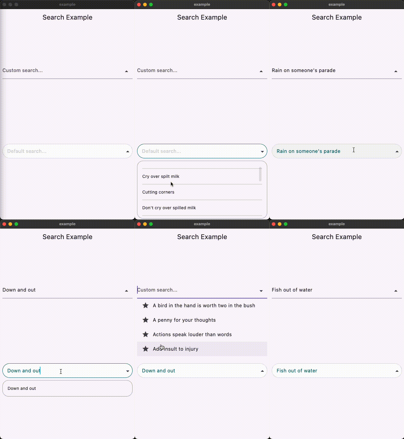
Video

Buy Me A Pizza

Overview

This Flutter package provides a SearchAutocomplete widget for implementing autocomplete functionality with a dropdown menu. The package offers extensive customization options for the search field, dropdown items, and includes hooks for search logic.

Installation

To use this package, add search_autocomplete as a dependency in your pubspec.yaml file:

dependencies:
  search_autocomplete: ^1.0.3

Features

  • Customizable search field
  • Customizable dropdown items
  • Hooks for search logic
  • Initial value support
  • Placeholder text support
  • Widget to display when the dropdown is empty
State Management Compatibility
  • Designed to work seamlessly with Cubit/Bloc and other orthodox state managers. Since the list updating logic resides higher up in the widget tree, it allows for a clean separation between UI and logic.

Usage

Here's a simple example demonstrating how to use the SearchAutocomplete widget:

Basic example:
SearchAutocomplete<String>(
  options: state.filteredItems, // Like: ['Apple', 'Banana', 'Orange'],
  initValue: state.currentItem, // Like: 'Apple',
  getString: (item) => item,
  onSearch: (query) {
    // Call your Bloc/Cubit/Provider method to filter options based on the query
    context.read<SearchCubit>().search(query);
  },
  onSelected: (item) {
    // Update your Bloc/Cubit/Provider state when an item is selected
    context.read<SearchCubit>().select(item);
  },
  hintText: 'Search fruits...',
)
Customization example:

You can customize both the search field and dropdown items appearance using provided builders:

SearchAutocomplete<String>(
  options: state.filteredItems,
  initValue: state.currentItem,
  getString: (item) => item,

  onSearch: (query) {
    context.read<SearchCubit>().search(query);
  },

  onSelected: (item) {
    context.read<SearchCubit>().select(item);
  },

  fieldBuilder: (controller, onFieldTap, showDropdown, onPressed) {
    return TextFormField(
      controller: controller,
      onTap: onFieldTap,
      decoration: InputDecoration(
        hintText: 'Custom search...',
        suffixIcon: IconButton(
          icon: Icon(
            showDropdown ? Icons.arrow_drop_up : Icons.arrow_drop_down,
          ),
          onPressed: () => onPressed(showDropdown),
        ),
      ),
    );
  },

  dropDownBuilder: (options, onSelected, controller) {
    return ListView.builder(
      itemCount: options.length,
      itemBuilder: (context, index) {
        final option = options[index];
        return ListTile(
          leading: Icon(Icons.star),
          title: Text(option),
          onTap: () => onSelected(option),
        );
      },
    );
  },

  emptyDropDown: (controller, close) {
    return Center(child: Text('No results found.'));
  },
)

License

This package is licensed under the MIT License. See the LICENSE.md file for details.

所属分类

源码仓库

使用此插件的项目

暂无相关数据。