搜索插件、代码仓与 APP 分类

select2dot1 封面
插件详情v2.0.9

select2dot1

Select2dot1 为您提供一个完全可自定义的单选/多选框,支持搜索、分组选项、额外信息和头像。通过覆盖层和模态框实现。

AndroidiOSWebmacOSWindowsLinux
近 30 天下载
386
喜欢数
46
Pub 分数
150

安装插件

flutter pub add select2dot1

插件介绍

基于插件公开信息、社区数据与项目使用情况整理的选型参考。

Select2dot1 是一个高度可定制的 Flutter 包,用于创建单选或多选下拉菜单,具备高级功能,如搜索功能、分组选项、自定义选项详情和头像支持。该包使用覆盖层和模态框构建,可在所有平台上提供无缝的用户体验。该包非常适合需要丰富交互和视觉自定义的表单和数据选择界面。它支持所有主要平台,包括 Android、iOS、Web、macOS、Windows 和 Linux。

适合场景

  • 带可搜索选项的表单输入
  • 仪表板中的多选下拉菜单
  • 分组类别选择
  • 用户资料选择带头像
  • 大型数据集的动态筛选

主要特点

  • 可搜索的下拉菜单
  • 对分组选项的支持
  • 可自定义选项小部件
  • 头像和附加信息显示
  • 基于叠加层的模态实现

适合对象

  • 需要丰富选择组件的开发者
  • 具有复杂数据选择需求的应用程序
  • 跨平台应用程序
  • UI 密集型表单和管理面板

使用建议

  • 需要仔细的样式设计以获得最佳用户体验
  • 处理非常大的数据集时可能需要性能调优
  • 叠加行为可能需要平台特定的调整

原始 README

以下为关联源码仓库的 README 原文快照,最新内容请访问源码仓库。

platform build pub package pub points License: MIT Buy Me A Coffee

Select2dot1

Introduction

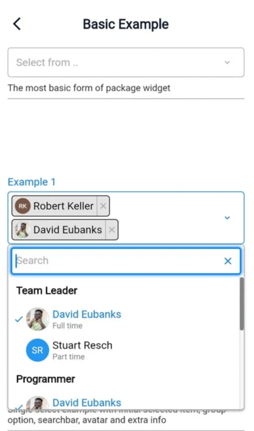
Select2dot1 gives you a customizable single/multiple select box with support for searching, group option, extra info and avatar. Select2dot1 utilizes overlays on (web, desktop) and modal for mobile. Its entirely customizable through settings and builder.

Screenshots

Desktop Example Mobile Example

Table of Contents

Platform Support

Android iOS Web Linux macOS Windows
✔ ✔ ✔ ✔ ✔ ✔

Installation

  1. Add the dependency below in pubspec.yaml
flutter pub add select2dot1
  1. Add this import to your file.
import 'package:select2dot1/select2dot1.dart';
  1. Go to the usage section for further details on how to use it.

Usage

  1. The first step is you need to create a list of the data that you would like to display.
static const List<SingleCategoryModel> exampleData = [
    SingleCategoryModel(
      nameCategory: 'Team Leader',
      singleItemCategoryList: [
        SingleItemCategoryModel(
          nameSingleItem: 'David Eubanks',
          extraInfoSingleItem: 'Full time',
          avatarSingleItem: CircleAvatar(
            backgroundColor: Colors.transparent,
            foregroundColor: Colors.transparent,
            backgroundImage: AssetImage('assets/images/avatar1.jpg'),
          ),
        ),
        SingleItemCategoryModel(
          nameSingleItem: 'Stuart Resch',
          extraInfoSingleItem: 'Part time',
          avatarSingleItem: CircleAvatar(
            backgroundColor: Colors.blue,
            child: Text('SR', style: TextStyle(color: Colors.white)),
          ),
        ),
      ],
    ),
  ];
  1. Use the select2dot1 widget and insert your data. You can also pass scrollController if you want to use it.
Select2dot1(
    selectDataController: SelectDataController(data: exampleData),
    scrollController: scrollController,
),

Features

Scroll Controller

ScrollController is used to control anchor position of dropdown menu. You can pass your own ScrollController to Select2dot1 widget.

Fully Customizable

If you want to change something that is not available in settings, you will have to make your own component through using the builder option. Check the customization section for more information.

Components and Settings

Components View

In this section you can see how the components of Select2dot1 widget look like as well as their hierarchy. You can also see how to customize them by settings and builder. For more details hierarchy of components , go to Tree View Components with Settings section.

Component Pillbox Configuration 1

  1. Pillbox
  2. PillboxTitle
  3. PillboxContent
  4. PillboxContentMulti / PillboxContentSingle
  5. SelectEmptyInfo
  6. PillboxIcon

Component Pillbox Configuration 2

  1. Pillbox
  2. PillboxTitle
  3. PillboxContent
  4. PillboxContentMulti
  5. SelectChip
  6. PillboxIcon

Component Pillbox Configuration 3

  1. Pillbox
  2. PillboxTitle
  3. PillboxContent
  4. PillboxContentMulti
  5. SelectOverloadInfo
  6. PillboxIcon

Component Pillbox Configuration 4

  1. Pillbox
  2. PillboxTitle
  3. PillboxContent
  4. PillboxContentSingle
  5. SelectSingle
  6. PillboxIcon

Component Dropdown Overlay Configuration 1

  1. DropdownOverlay, DropdownContentOverlay
  2. SearchBarOverlay
  3. ListDataViewOverlay
  4. CategoryNameOverlay
  5. CategoryItemOverlay

Component Dropdown Overlay Configuration 2

  1. DropdownOverlay, DropdownContentOverlay
  2. SearchBarOverlay
  3. ListDataViewOverlay
  4. SearchEmptyOverlay

Component Dropdown Overlay Configuration 3

  1. DropdownOverlay, DropdownContentOverlay
  2. SearchBarOverlay
  3. ListDataViewOverlay
  4. LoadingDataOverlay

Component Dropdown Modal Configuration 1

  1. showModalBottomSheet, DropdownModal, DropdownContentModal
  2. TitleModal
  3. ButtonModal
  4. SearchBarModal
  5. ListDataViewModal
  6. CategoryNameModal
  7. CategoryItemModal

Component Dropdown Modal Configuration 2

  1. showModalBottomSheet, DropdownModal, DropdownContentModal
  2. TitleModal
  3. ButtonModal
  4. SearchBarModal
  5. ListDataViewModal
  6. SearchEmptyModal

Component Dropdown Modal Configuration 3

  1. showModalBottomSheet, DropdownModal, DropdownContentModal
  2. TitleModal
  3. ButtonModal
  4. SearchBarModal
  5. ListDataViewModal
  6. LoadingDataModal

Tree View Components with Settings

If you want to see treeview components with all settings you can access here.

Miro is an absolutely wonderful app that im familiar with, i would highly recommend you checking it outTree View was created by . If you want to customize any of the components of Select2dot1 widget, you can use Tree View to see all the components and settings.

Customization

If you want to customize Select2dot1 widget you can do it through utilizing the settings and builder. The first option you can try to use is to use settings to customize, if you have a hard time with that you can use builder.

By Settings
Use global settings to customize all components of Select2dot1 widget

You can pass global settings to Select2dot1 widget. Global settings will be used by the components of Select2dot1 widget.

In the following example you will be shown how to customize mainColor and fontFamily for all the components of Select2dot1 widget.

Select2dot1(
  selectDataController: SelectDataController(data: exampleData),
  globalSettings: const GlobalSettings(
    fontFamily: 'Roboto',
    mainColor: Colors.blue,
  ),
);
Use single component settings to customize only one component of Select2dot1 widget

You can pass the single component settings to Select2dot1 widget. Single component settings will be used only by one component of Select2dot1 widget.

In the following example you will be shown how to customize the CategoryNameOverlay component and CategoryItemOverlay component in Dropdown (modification of the design only be done through desktop overlay).

Select2dot1(
  selectDataController: SelectDataController(data: exampleData),
  categoryNameOverlaySettings: CategoryNameOverlaySettings(
    constraints: const BoxConstraints(minHeight: 27),
    textStyle: const TextStyle(
      color: Color(0xFF6B7893),
      fontSize: 14,
      fontWeight: FontWeight.w500,
     ),
    defaultDecoration: const BoxDecoration(color: Colors.transparent),
    hoverDecoration:
        BoxDecoration(color: const Color(0xFF00183D).withOpacity(0.5)),
  ),
  categoryItemOverlaySettings: CategoryItemOverlaySettings(
    constraints: const BoxConstraints(minHeight: 35),
    defaultTextStyle: const TextStyle(
      color: Colors.white,
      fontSize: 14,
      fontWeight: FontWeight.w500,
    ),
    selectedTextStyle: const TextStyle(
      color: Color(0xFF1DEDB2),
      fontSize: 14,
      fontWeight: FontWeight.w500,
    ),
    iconSize: 14,
    iconSelectedColor: const Color(0xFF1DEDB2),
    defaultDecoration: const BoxDecoration(color: Colors.transparent),
    hoverDecoration:
        BoxDecoration(color: const Color(0xFF00183D).withOpacity(0.5)),
    showExtraInfo: extraInfoInDropdown,
  ),
);
By Builder

Using builder you can customize all components of Select2dot1 widget. You can use your own components or you can use the default components that are available in Select2dot1 widget.

Create your own component completely

You can create your own component by using Select2dot1Builder class. You have to pass your own component to Select2dot1Builder class and then pass this class to Select2dot1 widget. When you are using builder you have access to all data that you need to create your own component.

Select2dot1(
    selectDataController: SelectDataController(data: exampleData),
    selectChipBuilder: (context, selectChipDetails) {
          return Container(
            height: 29,
            padding: const EdgeInsets.symmetric(horizontal: 12, vertical: 6),
            constraints: const BoxConstraints(maxWidth: 200),
            decoration: BoxDecoration(
              color: const Color(0xFF001029),
              borderRadius: BorderRadius.circular(16),
              border: Border.all(color: Colors.white),
            ),
            child: Row(
              mainAxisSize: MainAxisSize.min,
              children: [
                Flexible(
                  child: Text(
                    selectChipDetails.singleItemCategory.getNameSingleItem,
                    softWrap: false,
                    overflow: TextOverflow.ellipsis,
                    style: const TextStyle(color: Colors.white),
                  ),
                ),
                Padding(
                  padding: const EdgeInsets.only(top: 1.0, left: 2.0),
                  child: MouseRegion(
                    cursor: SystemMouseCursors.click,
                    child: GestureDetector(
                      onTap: () {
                        selectChipDetails.selectDataController
                            .removeSingleSelectedChip(
                          selectChipDetails.singleItemCategory,
                        );
                      },
                      child: const Icon(
                        Icons.clear,
                        color: Colors.white,
                        size: 14,
                      ),
                    ),
                  ),
                )
              ],
            ),
          );
        },
    ),
Use default components

If you want to change the layout of your component you can utilize other component templates, so you can use the default components that are available. Remember that when using this builder, you must make sure that the code thats written is correct before you do anything else.

Select2dot1(
  selectDataController: SelectDataController(data: exampleData),
  pillboxTitleSettings:
      const PillboxTitleSettings(title: 'Example use builder'),
  pillboxBuilder: (context, pillboxDetails) => Material(
    color: Colors.transparent,
    child: InkWell(
      onTap: pillboxDetails.showDropdown,
      mouseCursor: SystemMouseCursors.click,
      onHover: (hoverState) => mounted
          ? setState(() => pillboxDetails.hover = hoverState)
          : null,
      splashColor: Colors.transparent,
      highlightColor: Colors.transparent,
      hoverColor: Colors.transparent,
      focusColor: Colors.transparent,
      child: Row( // In this builder I changed layout of pillbox (Column to Row)
        mainAxisSize: MainAxisSize.min,
        children: [
          pillboxDetails.pillboxTitle(),
          const SizedBox(width: 8),
          Expanded(child: pillboxDetails.pillboxContent()),
        ],
      ),
    ),
  ),
);

Model Structur Data

To use Select2dot1 widget you have to pass data to SelectDataController. Data must be on the list of SingleCategoryModel.

The SingleCategoryModel is a model which contains data about single category. Parameters:

  • nameCategory - name of category (It is optional if you don't want to show group select)
  • singleItemCategoryList - list of SingleItemCategoryModel (It is required)

SingleItemCategoryModel is a model which contains data about single item in category. Parameters:

  • nameSingleItem - visible name of single item (It is required)
  • value - value of single item (It is optional)
  • extraInfoSingleItem - extra info about single item (It is optional)
  • avatarSingleItem - avatar of single item (It is optional)
Value parametr in SingleItemCategoryModel

It's used to get the specific id of a single item. It's necessary when you want to distinguish between single items with the same nameSingleItem.

static const List<SingleCategoryModel> exampleData = [
  SingleCategoryModel(
    singleItemCategoryList: [
      SingleItemCategoryModel(nameSingleItem: 'Alabama', value: 'Alabama1'),
      SingleItemCategoryModel(nameSingleItem: 'Alabama', value: 'Alabama2'),
      SingleItemCategoryModel(nameSingleItem: 'Arkansas'),
      SingleItemCategoryModel(nameSingleItem: 'Illonois'),
    ],
  ),
];
Example data
static const List<SingleCategoryModel> exampleData = [
    SingleCategoryModel(
      nameCategory: 'Team Leader',
      singleItemCategoryList: [
        SingleItemCategoryModel(
          nameSingleItem: 'David Eubanks',
          extraInfoSingleItem: 'Full time',
          avatarSingleItem: CircleAvatar(
            backgroundColor: Colors.transparent,
            foregroundColor: Colors.transparent,
            backgroundImage: AssetImage('assets/images/avatar1.jpg'),
          ),
        ),
        SingleItemCategoryModel(
          nameSingleItem: 'Stuart Resch',
          extraInfoSingleItem: 'Part time',
          avatarSingleItem: CircleAvatar(
            backgroundColor: Colors.blue,
            child: Text('SR', style: TextStyle(color: Colors.white)),
          ),
        ),
      ],
    ),
    SingleCategoryModel(
      nameCategory: 'UX Designer',
      singleItemCategoryList: [
        SingleItemCategoryModel(
          nameSingleItem: 'Jan Foxstein',
          extraInfoSingleItem: 'Full time',
        ),
        SingleItemCategoryModel(
          nameSingleItem: 'Jhony Steward',
          extraInfoSingleItem: 'Part time',
          avatarSingleItem: CircleAvatar(
            backgroundColor: Colors.blue,
            child: Text('JS', style: TextStyle(color: Colors.white)),
          ),
        ),
      ],
    ),
  ];

Controllers

SelectDataController

ATTENTION: For better performance create SelectDataController as field in class not in build

class _BasicExample1State extends State<BasicExample1> {
  final SelectDataController selectDataController = SelectDataController(
    data: ExampleData.exampleData1,
  );

    @override
  Widget build(BuildContext context) {
    // Do not create SelectDataController in build method!
    // return Select2dot1(selectDataController: SelectDataController(data: ExampleData.exampleData1))
    return Select2dot1(selectDataController: selectDataController);
  } 
}

SelectDataController is a controller that is used to manage the data in Select2dot1 widget. You can use it to add, remove, select and deselect data. All the data that you want to display in Select2dot1 widget must be added to SelectDataController Remember that when isMultiple is false, you can add only one position to initialSelectedData.

In SelectDataController you can also set:

  • inital selected data
  • multiple select or single select
Select2dot1(
  selectDataController: 
    SelectDataController(
      data: exampleData, 
      isMultiple: false, 
      initialSelectedData: [ // Remember that when isMultiple is false, you can add only one position to initialSelectedData.
        SingleItemCategoryModel(
          nameSingleItem: 'Stuart Resch',
          value: 'Stuart Resch 1', 
        ),
      ],
    ),
);

Contributing

Pull requests (the pull request template is available for use) are welcome. For major changes, please open an issue first to discuss what you would like to change. More information about contributing you can find here. Remember to follow the code of conduct.

Issues

If you find any issues (bug, feature, performance or other), please report them here.

Please do not ask questions in the issue tracker. Use Q&A section instead.

Please do not report security vulnerabilities on the public issue tracker. The SECURITY page details the procedure for disclosing security issues.

Security

If you discover any security related issues, please go to SECURITY page.

Contributors

  • Roman Dykyj (@romanjrdykyj)

QA

If you have any questions, feel free to ask them here.

FAQ

How to get selected item?

Use 'onChanged' Callback Function

You can pass callback function to Select2dot1 widget. This function will be called every time when user select an item.

Select2dot1(
    selectDataController: SelectDataController(data: exampleData),
    onChanged: (value) {
        print(value); // value is a list of selected items
    },
),
How to init selected data?
Select2dot1(
    selectDataController: SelectDataController(data: exampleData, 
    initialSelectedData: [
        SingleItemCategoryModel(
          nameSingleItem: 'Alabama',
        ),
        SingleItemCategoryModel(
          nameSingleItem: 'California',
        ),
      ],
    ),
),
How to used only overlay or modal mode on all platforms?

It is not possible to use only overlay or modal mode on all platforms. It is automatically set by the package. Overlay mode is used on desktop and modal mode is used on mobile.

How to set NO group select?

If you dont want to group select, you dont need to use name parameter in SingleCategoryModel.

static const List<SingleCategoryModel> exampleData3 = [
  SingleCategoryModel(
    nameCategory: null, // If you dont want to group select, you dont need to use name parameter in SingleCategoryModel or set it to null.
    singleItemCategoryList: [
      SingleItemCategoryModel(nameSingleItem: 'Alabama',),
      SingleItemCategoryModel(nameSingleItem: 'Arkansas'),
      SingleItemCategoryModel(nameSingleItem: 'Illonois'),
    ],
  ),
];

License

This package is licensed under the MIT license. To see the full license text, see the LICENSE file.

所属分类

源码仓库

使用此插件的项目

暂无相关数据。
