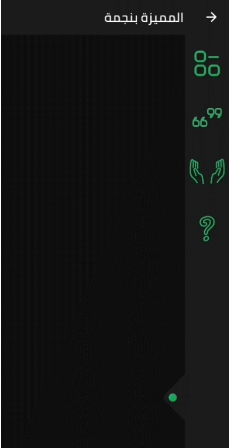
A Flutter side bar slider can be with any widget you want
Features
The SlidableBar can have four positions: top, bottom, right and left.
Customizable clicker, you can change the clicker widget with what you want.
Just like Flutter's Drawer, but with new way.
Things to note
The SlidableBar should have specific width and height, it works fine with scaffold's body.
The SlidableBar doesn't create it's own context, so it will appear under floating action button if you add one.
Usage
finalSlidableBarController controller = SlidableBarController(initialStatus: true);
SlidableBar(
size: 50, // this will be bar's height in case Side is bottom or top and width in case Side is left or right
children: <Widget>[], // here is the widgets inside the bar
child: Container(), // here is your widget that will be under the bar // optional
frontColor: Colors.green, // the color of the cycle inside the default clicker
slidableController: controller, // the contoller to change and listen to the bar status
barRadius: constBorderRadius.circular(10.0), // the contoller to change and listen to the bar status
side: Side.bottom, // Side.right is the default
clickerPosition: 1.0, // the position of the clicker, 0.0 is the default
clickerSize: 60, // the sizer of the default clicker, 55 is the default
onChange: (int index){
print(index); // this will print the index of the widget you clicked inside the bar
},
duration: Duration(milliseconds: 500), // the duration of the animation, (300 mil) is the default
isOpenFirst: true, // the initial state of the bar, false is default
backgroundColor: Colors.black, // primary color is default
curve: Curves.ease, // the animation curve, linear is defualt
clicker: Icon(Icons.arrow_forward_ios), // this will build instead of the default clicker
)
Getting started
In the pubspec.yaml of your flutter project, add the following dependency:
dependencies:slidable_bar:"^1.1.0"
Then run $ flutter pub get. In your library, add the following import: