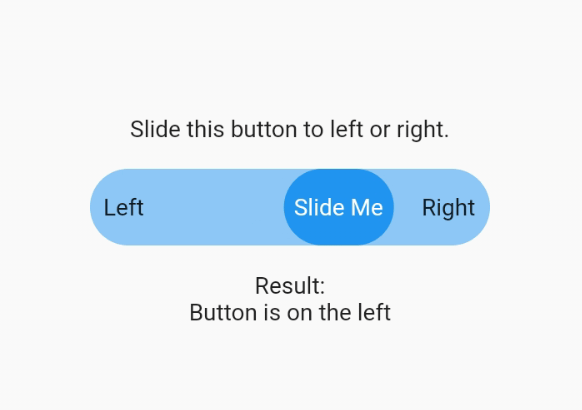
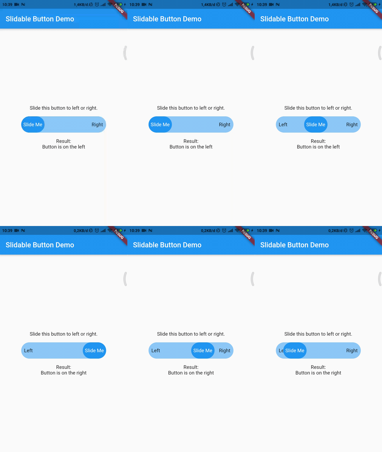
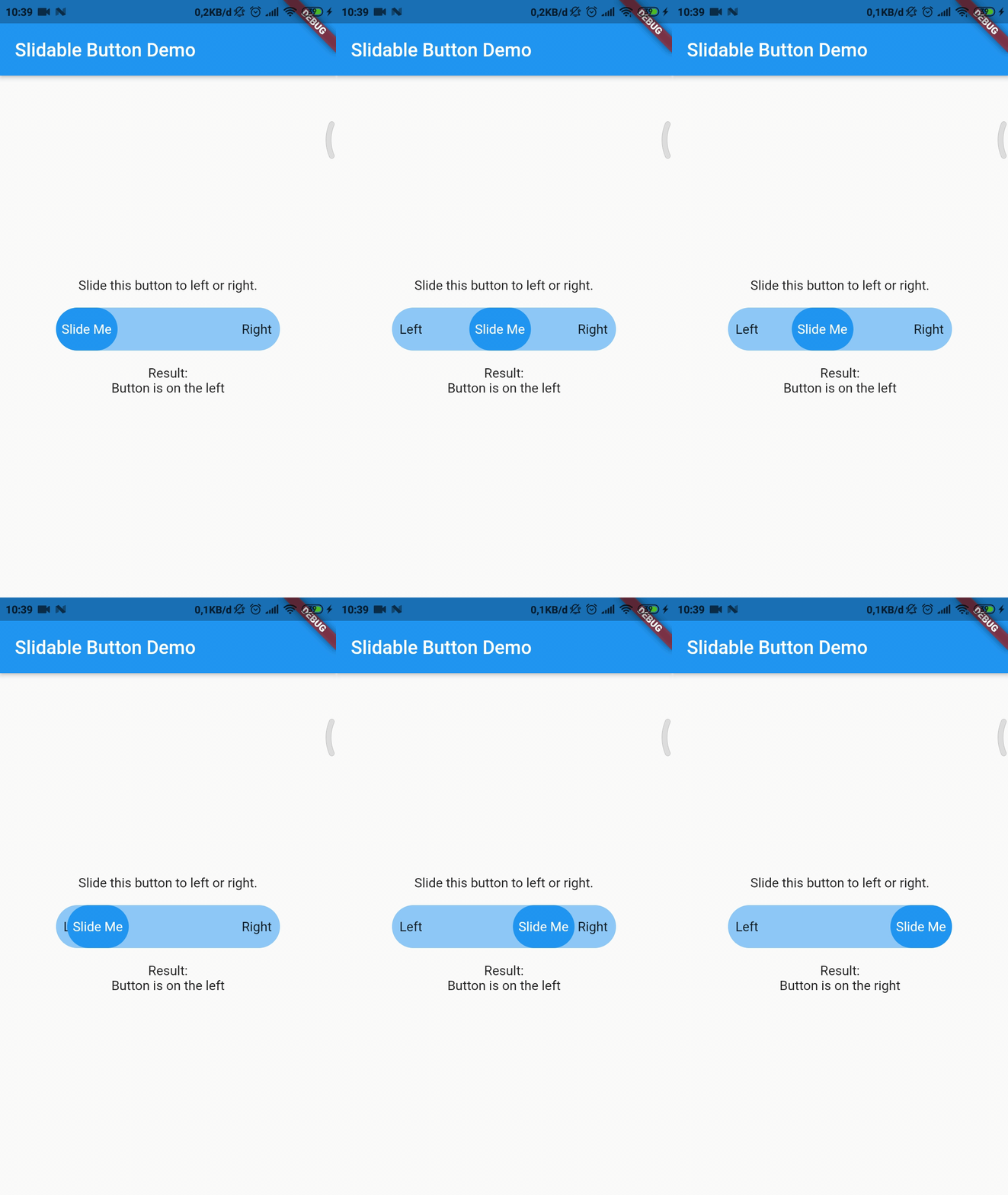
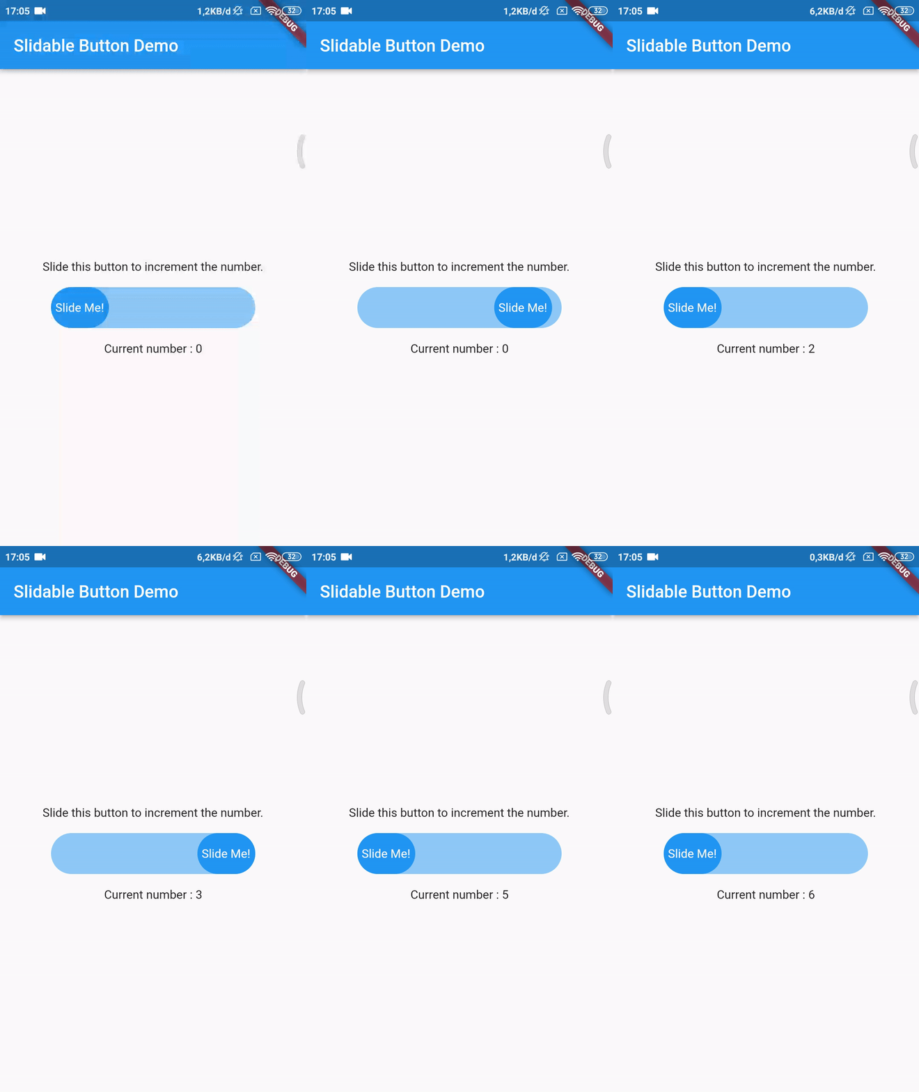
Now you can make your slidable button vertically or horizontally by using one of them widget. For horizontal usage example :
HorizontalSlidableButton(
width: MediaQuery.of(context).size.width / 3,
buttonWidth: 60.0,
color: Theme.of(context).accentColor.withOpacity(0.5),
buttonColor: Theme.of(context).primaryColor,
dismissible: false,
label: Center(child: Text('Slide Me')),
child: Padding(
padding: constEdgeInsets.all(8.0),
child: Row(
mainAxisAlignment: MainAxisAlignment.spaceBetween,
children: [
Text('Left'),
Text('Right'),
],
),
),
onChanged: (position) {
setState(() {
if (position == SlidableButtonPosition.end) {
result = 'Button is on the right';
} else {
result = 'Button is on the left';
}
});
},
),
Vertical usage example :
VerticalSlidableButton(
height: MediaQuery.of(context).size.height / 3,
buttonHeight: 60.0,
color: Theme.of(context).accentColor.withOpacity(0.5),
buttonColor: Theme.of(context).primaryColor,
dismissible: false,
label: Center(child: Text('Slide Me')),
child: Padding(
padding: constEdgeInsets.all(8.0),
child: Column(
mainAxisAlignment: MainAxisAlignment.spaceBetween,
children: [
Text('Top'),
Text('Bottom'),
],
),
),
onChanged: (position) {
setState(() {
if (position == SlidableButtonPosition.end) {
result = 'Button is on the bottom';
} else {
result = 'Button is on the top';
}
});
},
),
Migration Guide
If you already use this package before v3.x.x you may need to migrate your code to HorizontalSlidableButton or VerticalSlidableButton for specific direction usage because SlidableButton class has been removed start from v3.0.0.